
A strong supplement label design does more than look good—it clearly communicates your product’s purpose while reflecting your brand’s identity. Working with a design agency can help bring structure and style to your ideas, creating a supplement label that feels cohesive and intentional.
Labels are often a customer’s first impression—your first chance to communicate what matters most. A well-designed supplement label does more than catch the eye. It shares key product details, highlights safety, and reflects your brand’s values. When design and transparency go hand in hand, you build a foundation of trust. Good design shows care—and invites trust.
How to Create an Eye-catching Supplement Label Design that Sells
Posted on May 29, 2024 | Updated June 18, 2024

Lauren Casgren-Tindall has been creating powerful, innovative designs over the past 15 years, working with a team of experts to specialize in designing innovative packaging and labels for supplement brands. She launched the company Crème de Mint design agency to specialize in her passion of designing innovative packaging and labels for supplement brands.
Key Points
- What makes a strong supplement label design
- How to incorporate emotion into your design
- Creating FDA-compliant labels and packaging
- Benefits of working with an agency
- A 5-step process to create your supplement label design
- Long-term success through marketing, testing, and beyond
Today’s supplement shoppers are more informed—and more selective—than ever. In a $35.7 billion industry, success isn’t just about having a great product. It’s about how you present it.
Strategic design and cohesive branding are essential to cut through the noise, build trust, and connect with your niche audience. The right label doesn’t just check boxes for compliance—it becomes a key part of your brand experience. From premium materials to thoughtful typography, every choice contributes to how your product is perceived.
Strong supplement labels communicate credibility, reflect quality, and tell a story—visually and verbally. Details like color, texture, and embellishments all play a role in making your product stand out on the shelf and stick in the mind. Think about the brands you trust. Chances are, they’ve invested in more than just great packaging—they’ve built consistency across touchpoints, used messaging that resonates, and created a design system that feels intentional and aligned.
After helping over 150 brands launch, we know what works—and what doesn’t. Keep reading to explore how to design a supplement label that connects and creates a foundation for long-term brand growth.
Introduction to Label Design
In the supplement world, your label isn’t just there to inform—it’s there to inspire. A well-crafted, eye-catching label often makes the difference for today’s discerning consumer. High-quality materials and sleek, thoughtful designs elevate your brand’s presence and durability. By adding the right design elements—like bold colors and subtle embellishments—you can turn a curious look into a confident “yes.” It’s all about making your product impossible to overlook.
Let’s dive into further.
Supplement Label Design: Why It Matters

In the crowded supplement space, your label is more than just a design—it’s your first impression. Thoughtfully crafted labels don’t just grab attention; they build trust and communicate the value behind your product at a glance.
What makes a great label design?
A well-designed label is a strategic blend of storytelling and style. From typography that feels trustworthy to color palettes that signal wellness, every element plays a role in making your product stand out—and stay remembered. The right design draws the eye, shares your product’s value, and makes a lasting impression.
Investing in professional label design means you’re not just packaging a product—you’re telling a story, building a brand, and guiding your customer toward the right choice with confidence.
75% of US consumers take supplements
52% of those consumers use a “specialty” supplement
15% annual increase in revenue was seen in brands that used clean labels
While supplement use remains high, consumer trust is wavering. It’s more important than ever to be transparent, clear, and trustworthy with your supplement label design.
Recent lawsuits have revealed untrue or misleading claims on packaging, leading customers to become more wary and skeptical of what’s on the label and what’s in the supplements they are taking.
Building Trust Through Your Supplement Label Design
Your label is more than packaging—it’s your promise. The right supplement label doesn’t just catch the eye—it builds confidence, creates connection, and tells your customer, “You can trust what’s inside.”
Trust is built through consistency. Strategic design, thoughtful layout, clear communication, and premium materials all work together to position your brand as credible and dependable. From the font you choose to the way you word your benefits, every detail shapes perception.
A well-designed label feels intentional. It’s not just about looking good or checking off compliance boxes—it’s about aligning with your brand values, evoking the right emotion, and standing out for the right reasons. The design should be clean, the claims clear, and the tone authentic. That’s how you turn a curious glance into a confident choice.
Working with experienced designers to develop your custom label helps your brand to feel polished and professional—and meets industry standards along the way. Paired with the right materials, your packaging becomes a tactile representation of your brand’s quality, ready to withstand shelves, shipping, and daily use.
Good design shows care. And care is what earns trust.
Examples of Strong Supplement Label Design
Simple but Powerful
Supplement labels need to be clean and not cluttered, allowing customers to easily focus on the important information.
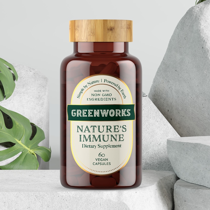
Why it works: Greenworks is an all-natural herbal supplement brand focused on creating potent and effective products. We created this eye-catching supplement label design with subtle elements, like a leaf shape in the “O,” that reflect the brand’s values and reinforce its natural, clean essence.
The retro fonts and minimalistic oval label design are a nod back to a simpler time, while the bamboo cap and pops of gold elevate the packaging with a premium feel, setting the product apart from competitors.
Audience-Focused
Great supplement label designs speak directly to the audience, combining every element to build trust and connection.
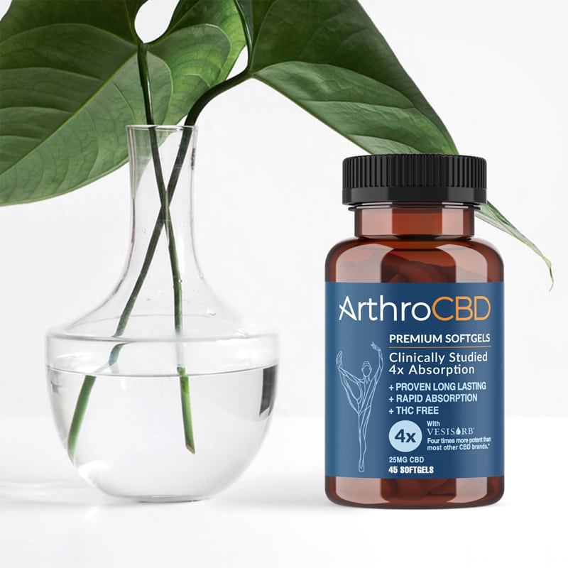
Why it works: ArthroCBD is a science-backed CBD product to target pain and mobility struggles in an older audience. Strong imagery in the packaging design highlights mobility, playing on the pain point and emphasizing the benefits of the product.
Emotional Design
Design is about emotion, connection, forming a relationship with your audience. Humor, compelling visuals, incorporating a snippet of your brand story can help create that emotional appeal.
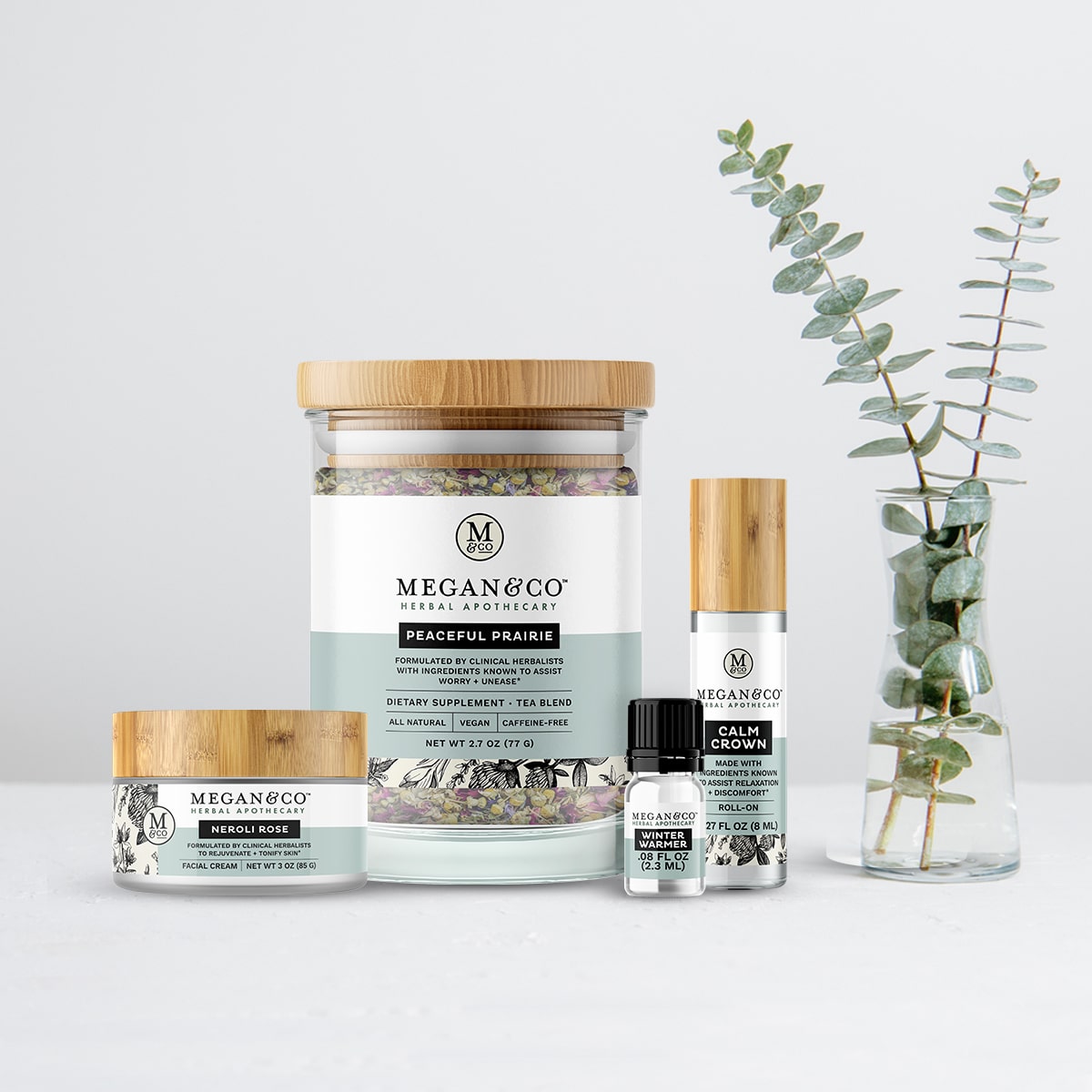
Why it works: Megan &Co’s elegant packaging conveys a sophisticated, high-end feel with premium elements such as glass and bamboo materials but still feels approachable and appealing to the target rural audience.
The handdrawn botanicals emphasize the root of the brand and draw in the eye, offering a unique visual unlike many competitors, while the simple color blocking balances these illustrations.
Examples of Bad Supplement Label Design
Unprofessional Designs
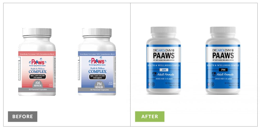
The founder of this pet supplement brand originally had a family member create the design, not understanding how much supplement label design matters for a product’s success.
Dr. Carol, DVM‘s original supplement label design is cluttered and unclear. It doesn’t inspire trust or create a sense of warmth. Our rebranded version is clean, minimalistic, and focused. It shows the brand’s credibility and their commitment to pets, but without all of the excess distractions.
Most importantly, the bright, cheerful colors and fun animal icon create a warm and engaging feel to resonate with pet parents who want to give their fur babies the healthiest life.
Cluttered Packaging
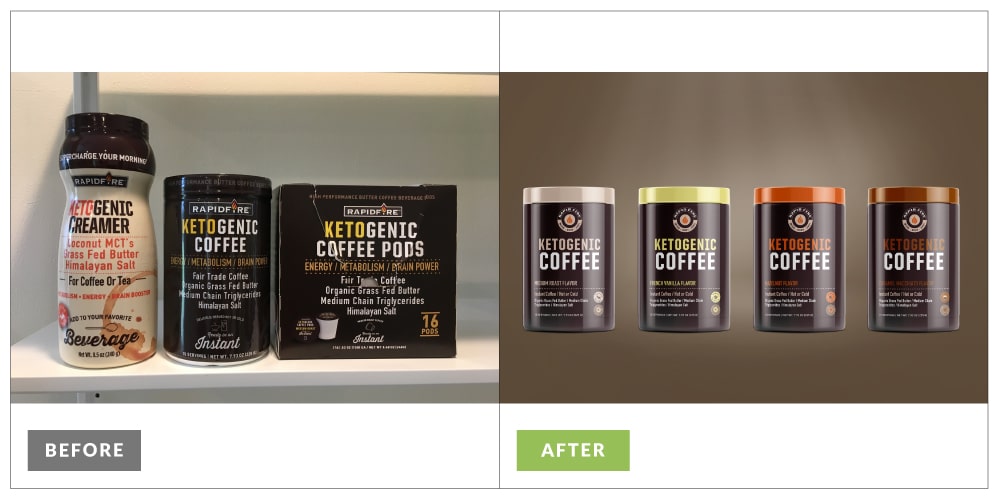
Rapid Fire, a ketogenic coffee and tea line, originally had a very busy and cluttered packaging design. With so much information on the label, consumers don’t know where to look or how to find out whether a product is right for them.
The bold and sleek redesign minimized the information with clear and concise messaging. Ultimately, the brand found success with Target, Amazon, Walmart, and other major retailers.
Non-Compliant or Misleading Labels
The FDA has strict requirements for dietary supplement labeling to ensure that consumers get accurate, transparent information. When supplement brands choose to skirt or ignore these requirements, they set themselves up to lose integrity, brand reputation, and potentially bankrupt their company through expensive payouts.
For example, Balance of Nature, a supplement company founded in Utah, offered claims that their health products cured cancer, boosted the immune system, and combatted COVID-19. They eventually faced a class-action lawsuit and were ordered to pay out $1.1 million.
It isn’t worth your reputation or your business to include misleading or false claims on your supplement label design. Consumers deserve clear, transparent, accurate information.
Supplement Labels and FDA Regulations
So, how do you ensure that your supplement label design is compliant? When it comes to supplement labels, clarity is everything. Your content needs to inform, reassure, and comply—all while remaining visually appealing and easy to digest.
The FDA requires that supplement label design include specific information, such as the name and address of the manufacturer, the net quantity of contents, and a list of ingredients. Clear, FDA-compliant supplement labels protect your brand from risk while reinforcing your commitment to transparency and quality.
There are many regulations to consider, including:
- Products should be labeled with “dietary supplement” or an approved alternative such as “herbal supplement,” “calcium supplement,” or “protein supplement.”
- Claims stating the supplement can cure any specific disease (or alleviate a disease’s symptoms) are not permitted.
- A legal disclaimer of “These Statements have not been evaluated by the Food and Drug Administration: This product is not intended to diagnose, treat, cure, or prevent any disease” is required for any supplement that hasn’t been safety tested through the FDA.
- There are legal thresholds for stating claims such as “an excellent source of fiber,” “high in protein,” or “low fat.”
Additionally, supplements must include:
- Serving Size
- List of dietary ingredients
- Amount per serving size (by weight)
- Percent of daily value (%DV)
What to Know About Your Supplement Facts Panel
Your Supplement Facts panel does more than list ingredients—it reinforces trust, transparency, and compliance. But how do you know if you need a Supplement Facts panel or a Nutrition Facts panel? With more products blending food and function, it can get confusing fast. Here’s how to make sense of it and get your label right from the start.
The key to determining which label you need lies in the product’s purpose and how it’s consumed.
A nutritional supplement is typically offered in a dose form—think capsules, powders, drops, or concentrated liquids. These products are designed to supplement the diet with specific nutrients (like vitamins, minerals, or botanicals), not to be consumed as meals. They usually contain little to no calories, fat, or protein, and focus instead on micronutrients.
A food product, on the other hand, is primarily made of food ingredients and is intended to nourish or satisfy hunger. It’s consumed in a serving size, not a dose. Even if it includes added vitamins or supplements, its main purpose is to function as food. For example, a protein bar may have added health benefits, but because it’s consumed like a snack or mini meal, it falls under the food category—and would require a Nutrition Facts panel.
When to Use a Supplement Facts Label
Use a Supplement Facts label if your product is:
- Not intended to be a meal or beverage
- Delivered in a dose form (pill, dropper, shot, scoop, etc.)
- Primarily made of vitamins, minerals, herbs, or amino acids
- Designed to enhance health rather than satisfy hunger
An example? Something like “Joint Juice”—it may look like a drink, but it’s not intended to hydrate. It’s formulated to support joint health with specific nutrients, so a Supplement Facts panel is the right fit.
When to Use a Nutrition Facts Panel
Use a Nutrition Facts panel if your product:
- Is primarily food-based
- Serves the purpose of nourishing, hydrating, or satisfying hunger
- Is consumed in a typical serving size (bar, beverage, snack)
- Includes added functional benefits—but still acts as food
For example, if a soda is enhanced with antioxidants, but still functions as a beverage first, a Nutrition Facts panel would apply.
Following compliance with these regulations is important for building trust with your customers and avoiding legal pitfalls. It can be difficult to communicate the benefits of your product without breaking compliance and claim regulations.
Working with a team of experts who are familiar with these regulations not only protects your business but also ensures that your products are safe and effective for consumers. Well-designed supplement labels should have smart hierarchy, strategic typography, and thoughtful color choices to guide the eye effortlessly and highlight what matters most. An experienced supplement packaging design company can help you determine what you can and cannot include on your label, and an attorney can verify legalities and compliance.
When you balancing regulatory requirements with clean design, your supplement label feels both credible and compelling. Because when information is well-organized and beautifully presented, customers don’t just read it—they trust it.
DIY and AI vs. Hiring an Agency for Your Supplement Label Design
You might be tempted to DIY your supplement packaging design using an online generator or template, especially if you are a new brand with limited capital. But it’s important to consider the pros and cons carefully before deciding what is best for your supplement brand.
DIY Templates:
Pro:
- Short-term savings—a low upfront cost can be appealing for new brands.
- Quick turnaround—with plug-and-play options, you can have a complete design in just a few hours.
Cons:
- Limited customization options—with a template, you can only change so many elements. Ultimately, your design might not stand apart from competitors. This also leaves you vulnerable to copycat branding, where other brands can easily mimic your design.
- Lack of cohesive branding—with a template, you are choosing speed over depth. Without intentional research, branding strategy, and approaching the brand as a whole from the beginning, you fail to establish a brand story and identity.
- Compliance risk—if you create your own supplement label design, you run the risk of misinterpreting FDA regulations and creating a non-compliant label opening yourself up to legal risk.
AI (Artificial intelligence)
Pros:
- Cost—AI options are either free or minimal cost, typically cheaper than templates.
- Speed—Like templates, AI offers convenience and speed. In fact, some AI generators can design a logo or label in a matter of moments.
- More customization than a template—AI is also capable of generating more unique elements, offering you more creative and customization options.
Cons:
- Lack of cohesive branding—even with creative possibilities, using AI is essentially creating an individual element rather than intentional, strategic branding built on your audience and your brand story.
- Ownership rights—the United States Copyright Office has ruled that images or artwork created by AI are not eligible for copyright. Instead of owning your business assets, the ownership rights belong to the platform producing the design—which means they can repurpose and use the images as they see fit.
- Compliance risk—just like with a template, if you use AI, you run the risk of misunderstanding FDA regulations and creating non-compliant supplement label design, opening yourself up to legal risk.
Working with an Agency
Pros:
- Industry expertise—The level of experience, market research, and strategy an agency offers can be the difference between a supplement line that struggles to get off the ground and one that carves out a successful position in a crowded marketplace.
- Compliance and claim understanding—Agencies also have experience creating compliant labels and claims. They know how to communicate the benefits of your product without exposing you to legal risk.
- Unique, custom design built on your brand—When you work with a supplement packaging design agency, your designs are created from scratch—meaning they are truly unique to your brand. They are designed with your brand values, brand story, unique differentiators in mind, specifically to form a connection with your audience.
- Choosing the right partner for your label design can ensure the success of your supplement brand. It’s about more than just a label—it’s about communicating your product’s value and connecting with your audience in a way that lasts.
Cons:
- Cost—branding and supplement label design are expensive services. It can be hard to make the investment early on.
- Turnaround time—quality agencies create branding based on research, strategy, and cohesive branding—all of which do take time. This will likely take 6 weeks or more depending on how quickly you make decisions and provide feedback.
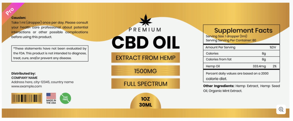
Templated design from Vecteezy
This stock template shows the quality of supplement label design you can expect if you go this route. While the layout is clean and readable, there is little in this design that would reflect the brand story or essence.
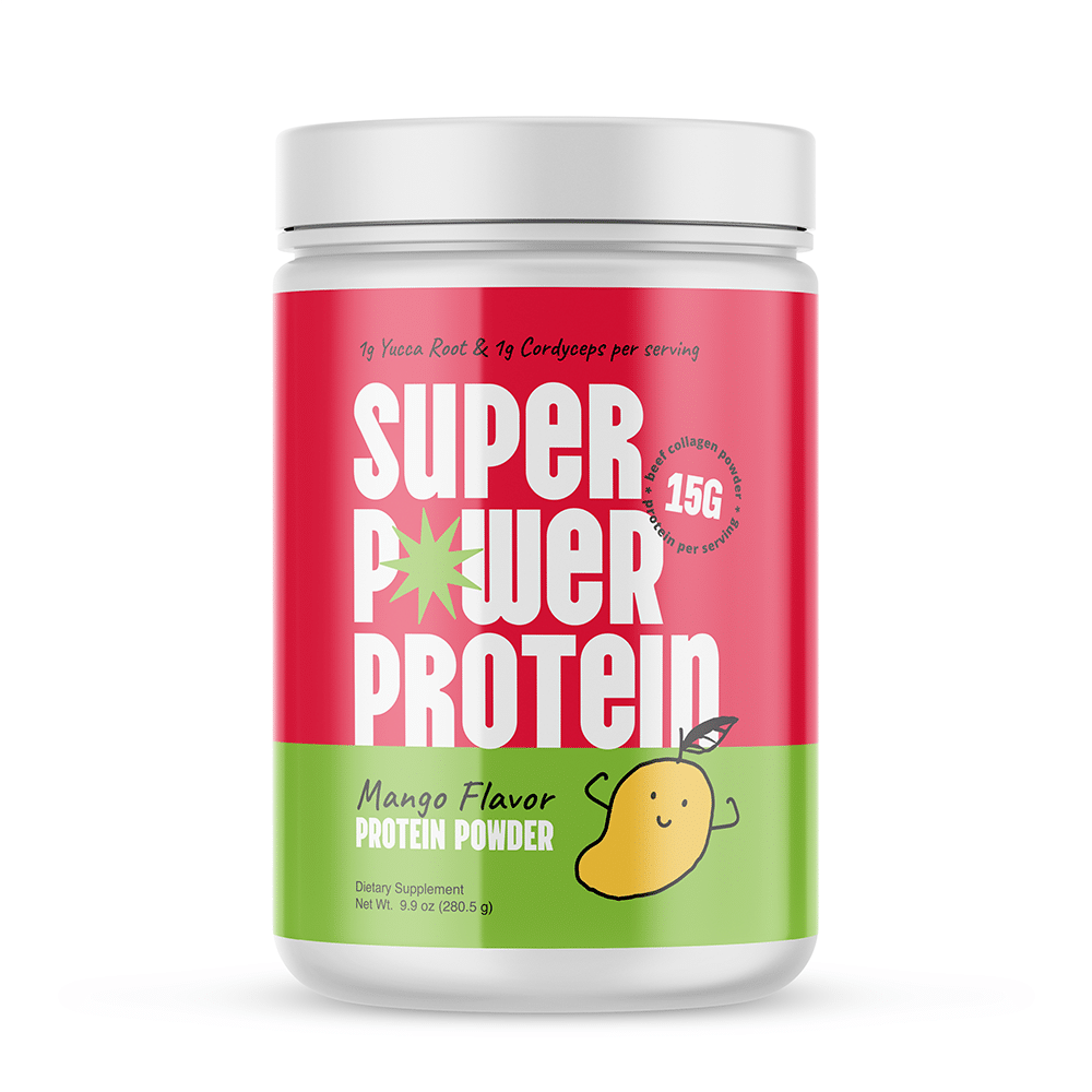
Super Power Protein wanted to bring the benefits of protein supplements to a wider audience, targeting more than just fitness enthusiasts. In this custom supplement label design, we used bold colors and an eyecatching, fun fruit illustration to set the brand apart and speak to that broader audience.
The Supplement Label Design Guide Process in 5 Steps

Step 1: Understanding Your Audience
You can create the most innovative, effective supplement in the world, but if it isn’t branded and marketed strategically to the right audience, it isn’t going to sell. Great supplement label designs are created intentionally and crafted strategically.
Determine Your Target Audience
Your target audience is the foundation for every element of your branding and packaging. You can’t create a quality supplement label design without getting clear on your customers.
When determining your target audience, you need to understand your target demographic, or who it is that you are going to sell to.
Your demographic is based on measurable statistics such as:
- Age
- Gender
- Race
- Religion
- Marital Status
- Education
- Income Level
But you also need to dive deeper—what problems does your target audience have? How can your product solve it? How do they want to feel? How will your supplement change their lives?
If you are creating CBD gummies for chronic pain, your audience is much different than a functional beverage for hydration or an herbal apothecary brand. Different imagery, colors, and messaging will appeal to these audiences.
Research Your Competition
You also need to get clear on what your competitors are doing. Your competitors include:
Direct Competitors: these competitors sell a similar product as yourself at a similar price point, to a similar audience.
Secondary Competitors: these competitors may sell something similar to your product or service, but it is at a different price point or to a different audience (maybe you both offer CBD products, but one is geared toward an older audience and one is for a younger demographic).
Tertiary Competitors: these competitors may actually be collaborators, as they sell different yet related products to a similar audience.
You can likely learn from each of these types of competitors. Start compiling a list and begin researching their branding, messaging, and positioning.
It’s important to understand what your competitors are (and aren’t) doing. Spend time going into the store and physically interacting with other health products similar to yours.
- What features and benefits do they offer?
- How are they wording their claims?
- Are most similar products organic? Vegan? GMO free?
- What colors are the most successful products using?
- What imagery are they incorporating?
- How are they appealing to consumers?
Pay attention both to what is working, and what is missing—this will reveal gaps in the marketplace where your brand can succeed.
Identify Your Niche
As you research your competition, it’s important to determine what sets you apart from the rest of the crowd. Niching is important in any industry, but in the vitamin and supplement industry it’s even more vital.
Consumers want specialized products that suit their individual needs—the more specific you can get, the better. For example, natural herbal supplements were once a specific niche—now, consumers have a sea of natural options. But if your brand offers higher potency of ingredients or a unique plant-based protein, that starts to limit the pool of competition.
Once you’ve honed in on your niche, your supplement label is the perfect way to bring that uniqueness to life. Custom labels don’t just showcase your product—they tell the story of what makes your brand distinct. Thoughtful design communicates your values, highlights key benefits, and ensures your product catches the eye of the right audience, building trust and setting you apart from the competition.
There are four different approaches you can use to help better define your niche:
- Targeting a specific audience
- Offering unique products
- Solving particular problems
- Aligning with a distinct mission or values
Do you have a special clinically-proven ingredient? Are you allergen-free? Do you have unique education or experience that lends credibility to your brand? Are your ingredients organic? These unique elements should be highlighted in your supplement label design.
Define Your Goals
What do you ultimately want for your supplement? Do you want to be sold in specialty shops such as Natural Grocers or sports nutrition stores? Major retailers like Target or Walmart? Do you envision your product in the office of holistic doctors or naturopaths? Or do you plan to launch on Amazon or your own website?
Your supplement label design often needs to appeal to potential vendors as well as your target audience.
Step 2: Define Your Brand
Determine a Clear Brand Direction
Once you have an understanding of your audience, niche, and goals, it’s time to establish who you are as a brand.
You need to define:
- Your values
- The emotions you want your customers to feel when they look at your package
- What positives your product brings to your customer’s lives
- What the tone and energy of your brand should be
These will become the cornerstone of your branding and your designs.
Know Your “Why”
Remember that your brand should have its own personality, one that informs every decision you make and establishes a strong image and reputation. It’s helpful to define the “why” behind what you are doing and use that as a launching pad for your branding and designs.
Do you have a special mission that led you to start your brand? What positive or negative experiences have you had with vitamins and supplements in the past? What are you hoping to do differently?
Take the time to carve this out and write down your “why.” This will become a cornerstone for your branding and decision-making.
Understand the Emotion You Want to Evoke
Branding and marketing success depend on the emotional connection you form with your audience. As you define your brand direction, think about how each element of design can strike an emotional chord.
Look at the difference between these two prenatal vitamin packaging designs:
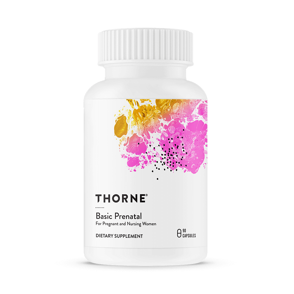
Credit: Thorne
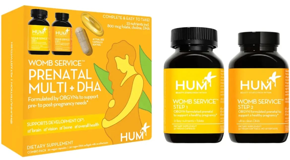
Credit: Hum
While the products might be similar, the branding is completely different. Thorne’s minimalistic design is clean, basic, and straightforward. Hum’s is warm, engaging, nurturing, and even humorous (with the name “womb service.”)
Neither branding is “right” or “wrong,” but they speak to different audiences, have opposite tones, and evoke contrasting emotions.
You need to uncover what your brand stands for and how you want it to be perceived. Your brand story and image will determine whether you are successful with your target audience.
This is an area where working with an agency becomes very valuable. An experienced agency can establish strong and strategic branding, offering tone and voice guides, mood boards, and cohesive branding along with your supplement label design.
Set Yourself Apart
You also want to consider how to incorporate your unique differentiators into your design. This can determine the colors, logo, imagery, or tagline you will choose in step 5.
Create a Brand Name that Captures Who You Are
Many new brands make the mistake of coming up with a brand name before they have established who they are as a brand, often resulting in boring, unmemorable names that don’t connect with the audience or build brand recognition.
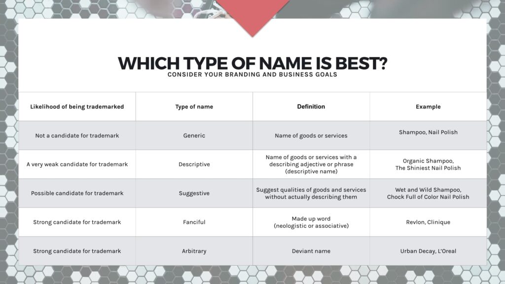
Your brand name and product name should communicate who you are and what your product offers. Brand names and product names can be basic and straightforward, but are often more creative and unique instead, making them easier to trademark. Powerful brand names are created deliberately to evoke specific emotions, not chosen at random.
For example, at Crème de Mint, we start our brand naming process with a deep dive interview, followed by market research and competitor analysis. We then create a content brief outlining the branding direction and create names that align with the overall brand vision.
The right brand name lays the groundwork for a strong brand story. Naming your brand without a strategic and deliberate approach is like building a house without a foundation. The tagline you choose, the brand language you use, and all of your design elements should be created from a strong cornerstone, establishing your brand’s identity and telling its story.
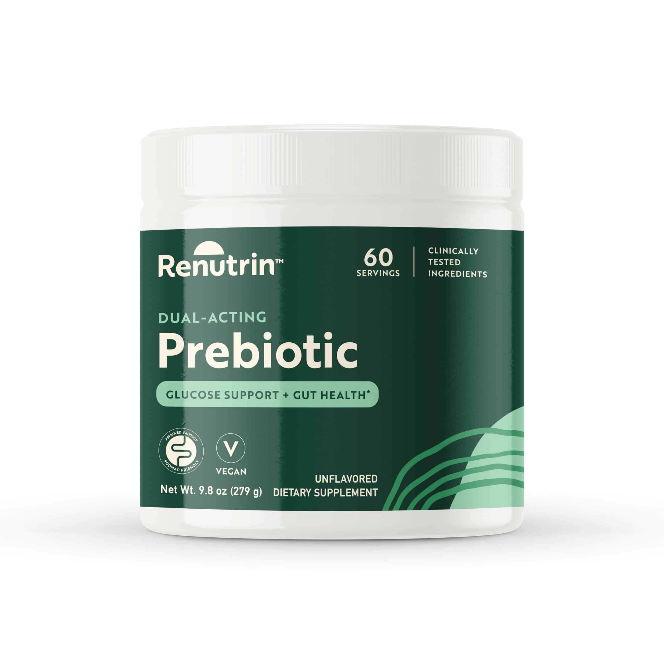
We developed the brand name Renutrin for a nutritionist-created brand dedicated to producing quality, research-backed supplements using resistant starch. The catchy name flows well and plays both on the brand differentiator (resistant starch) and its big benefit (nutrition and wellness).
Creating a Label Design Brief
A solid label design brief is the foundation of a successful design process. It’s your opportunity to communicate what you want and need from your design team, ensuring that your label accurately reflects your brand and resonates with your audience.
Start by defining your target audience—who they are, what they care about, and how your product serves their needs. This insight will guide your design team to craft a label that connects with the right people. Next, give an overview of your product line, highlighting any unique features or benefits that should be front and center on the label.
Your brand identity is essential to the design brief. Outline your brand’s values, mission, and the feeling you want to evoke in your customers. This ensures that the label is aligned with your broader brand vision.
Finally, specify any design preferences such as colors, typography, and imagery. If there are specific styles or themes you envision, include those details as well. The more information you provide, the better the result will be.
A well-crafted label design brief is more than just a starting point—it’s a key factor in creating labels that reinforce your brand identity and build customer trust. When done right, it sets the stage for successful product launches and growth in a competitive market.
Step 3: Hire a Manufacturer
If you haven’t already done so, you’ll need to determine how you are going to manufacture your supplements. There are three options for manufacturing:
- Private label—meaning the manufacturer uses stock formulations to build your product
- Semi-custom—which uses a stock formula for the base but allows you to customize certain elements, such as the scent, color, or flavor of your product
- Custom—when the manufacturer sources your ingredients and uses a chemist to create a unique formula that meets your specifications
Private label is the easiest and most affordable way to start a supplement line, while custom allows your product to truly stand apart. Semi-custom is often a nice middle-ground depending on your product and niche.
Whatever method you choose, finding reliable vendors is important. You also need to find a printer. Some manufacturers offer turnkey service and can print your supplement label design as well as manufacture your product.
Your manufacturer or printer will determine many of your supplement packaging design choices, such as your material options and customization possibilities.
It can be helpful to ask around in your industry or check manufacturing directories. (When you work with Crème de Mint, we share our resource lists of reliable vendors.)
Make sure to vet your vendors, ask questions, and read reviews to find vendors who meet your needs and can work within your budget. It’s also important to check legal requirements related to vitamins and supplements in your area and seek legal counsel if necessary.
Understand Your Bottom Line
Your budget will determine what vendors you can work with, what your supplement label design possibilities are, and whether you can afford to work with an agency for your design.
You need to understand your:
- Minimum order quantity (MOQ)
- Cost objectives per unit
- Shipping costs
- Market price
- Profit per unit
These numbers will decide what options you have for your packaging. Can you afford sustainable packaging options? Custom bottles? More high-end opaque glass? Or will you need to choose a basic plastic stock option?
Understanding these numbers also helps you price your vitamins or supplements correctly. You don’t want to underprice yourself and miss out on profit, or overprice yourself out of the market. (Use our free product pricing worksheet to help you make these decisions!)
MOQ (Minimum Order Quantity)
Many vendors require a minimum order quantity in order to manufacture your supplements. You need to know what you can afford to produce upfront. If you have a low budget, you might have to find a manufacturer who is willing to offer a lower MOQ.
Cost Objectives Per Unit
You also need to get clear on the production cost of each unit, including shipping costs, labor, manufacturing, and printing. Add all of those costs together, then divide them to find your cost per unit.
(Cost of production + Cost of packaging + Shipping costs + Labor) / (Number of items)
This number will determine your product’s price point.
Profit Per Unit
Once you understand your cost per unit, it’s time to determine your price and your profit. In the supplement industry, the average profit margin is between 30-50% (which can vary by niche or specialty).
That means that you will want to mark your product up 30-50% from your cost per unit. You will likely need to price your product lower if you plan to sell wholesale, meaning your profit per unit will also be on the lower end.
Don’t forget to conduct competitor research to see if your price is in line with the rest of the market and adjust accordingly!
Shipping Costs
Shipping costs can take up a lot of capital, so it’s important to factor these in when deciding how to price and market your product.
Your shipping costs will depend on the weight of your product, the amount you will ship, and where you will ship to. If your supplement has specific requirements related to heating and cooling, your shipping costs might be higher.
The initial costs of overseas manufacturing is often temptingly low, but remember to factor in shipping and import fees. We recommend working with US-based manufacturers whenever possible.
Step 4: Choose The Right Packaging Materials
The materials you select for your packaging play a key role in how your supplement label looks, feels, and performs. Exploring different options early in the process helps ensure your design works seamlessly with the shape and surface of your packaging.
Partnering with a packaging design agency can help you avoid common pitfalls—like a label that looks great flat but doesn’t translate well to a curved bottle. The right materials not only elevate your brand visually, but also streamline production, reduce costs, and create a better experience for your customers.
Understanding the Packaging Components
Most vitamins and supplements only use primary packaging—the bottle or pouch that contains the product itself.
You might also need to consider different shipping materials and filler materials—especially if your brand is committed to sustainability or if you plan to ship directly to customers.
For ecommerce sales, you want to ensure a great unboxing experience, complete with branded outer packaging, and informative, but engaging, inserts or postcards if needed.
Cost Factors
Packaging varies widely in cost, and your budget will determine what options are available to you. Most manufacturers will offer stock containers (ready made, generic packaging) that they recommend for your product. These stock containers will be less expensive, and are often the starting point for new brands.
Affordable supplement packaging options most often include plastic bottles. Depending on your budget and the manufacturer’s MOQ, you might be able to afford other material or color options.
Some supplements need other packaging options. For example, you might need darker amber bottles to preserve the integrity of the product, which will come at a higher cost.
More sustainable options, such as paper pouches, bamboo lids, or glass bottles, cost more—but might be important to your customers. You’ll need to balance cost with your company’s values and what your target audience prefers.
You’ll also need to consider seals for freshness, along with any necessary safety mechanisms, and factor those costs into the overall packaging budget.
If you are thinking of bringing in your own packaging or want a custom design, you will need to be sure the manufacturer’s equipment can support your new packaging.
Safety Mechanisms
Pharmaceuticals, CBD products, and some dietary supplements require child-resistant packaging. Child-resistant safety mechanisms go through testing to prove that they are difficult for a child to open and easy for an adult.
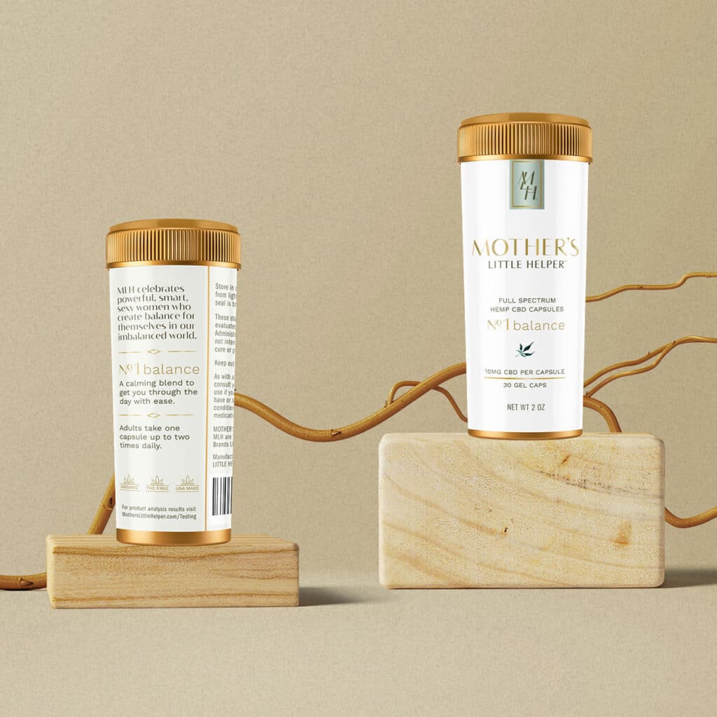
Depending on your product, you might need child-resistant twist caps or flexible pouches with zippers that are difficult for children to open.
If you are creating your own supplement label design, make sure to research and understand these regulations and explore your options for child-resistant packaging.
Accessible Packaging
In the supplement industry, it’s also important to consider if your products are inclusive and easy for adults with disabilities or older customers to open. This can be difficult if you are also using child-resistant mechanisms. Packaging material options are likely to change in the future to meet both needs.
In the meantime, try to consider accessibility and frustration-free packaging if possible.
Sustainable Materials
It’s becoming more important for companies to embrace eco-friendly packaging materials. 71% of customers actively choose their products based on sustainability and 82% are willing to pay a higher price point for it.
While these materials might come at a higher cost, if you can raise your price point accordingly, you might build brand loyalty and trust in the process without sacrificing your profits.
Sustainable packaging often conveys a premium look and feel that can help set your brand apart.
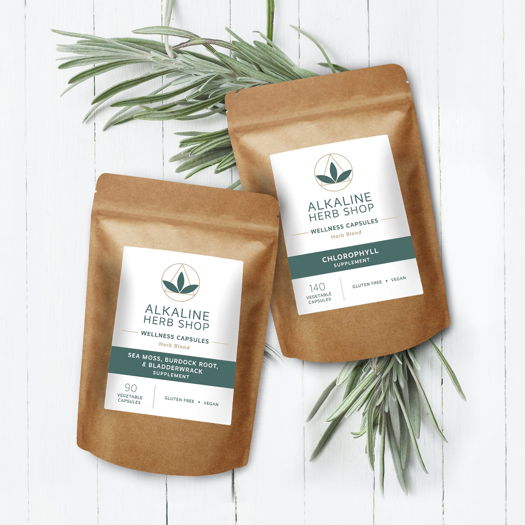
These paper pouches reflect Alkaline Herb Shop’s values, while also looking and feeling different than other herbal products that come in plastic bottles.
Even if you can’t afford higher-end packaging options, consider whether there is a way you can still embrace sustainability.
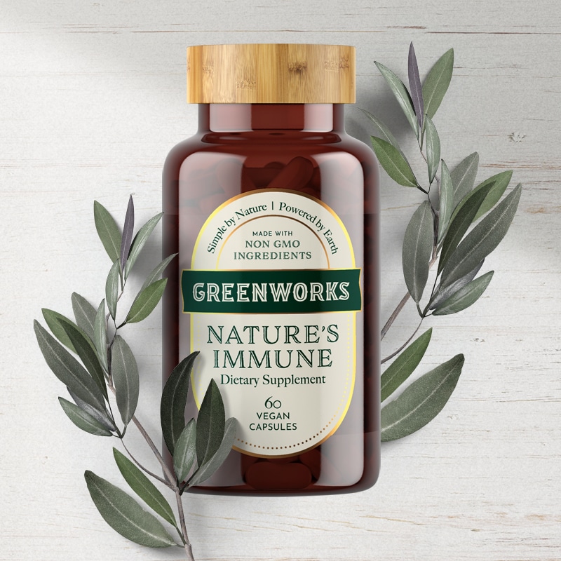
Greenworks wanted an aesthetically-appealing packaging that could be displayed and reused by their customers, reducing waste and adding memorability to the brand.
Step 5: Create Your Supplement Label Design
Now it’s time for the creative side—bringing everything together into your supplement label design!
Design is the silent ambassador of your supplement brand. From the typography to the texture, every element on your label plays a role in telling your story and shaping how customers perceive your product.
Color palettes and fonts aren’t just aesthetic choices—they’re signals. Earthy tones and refined serif fonts can instantly communicate a natural, high-quality, and organic feel. Paired with specialty finishes like spot varnish, gloss laminate, or cold foil, your label can exude sophistication while standing up to real-world handling. Partnering with a packaging design agency helps you craft a label that not only looks beautiful, but also communicates your product’s purpose with clarity and intention.
When thoughtfully chosen, design elements do more than beautify—they clarify, connect, and convert. They bring your brand to life on the shelf and make your benefits unmistakably clear in a glance.
There are several components to consider in your design:
Color Psychology
Color changes the way we feel—and when it comes to branding that can make a big difference. In fact, color alone can influence 85% of consumer decision-making.
That’s why it’s important to strategically choose your brand colors. Studies on consumer preferences in nutrition labels show that:
Certain colors evoke a sense of health, including:
- Red
- Yellow
- Blue
- Green
While other colors give an artificial and unhealthy feeling, including:
- Heather
- Brown
- Pink
This doesn’t mean you can never use those colors or that all supplements should be green, blue, yellow, or red—but color psychology should be considered in your supplement label design. What emotions are you evoking with your color palette?
The shades of color also play a role. Bright colors often represent energy or vivacity. Neutral colors reflect nature and earthiness. Black symbolizes power and strength. Your color choices need to evoke the right emotion in your audience, while creating a cohesive brand image.
Typography
While the average person might not realize it, the typography on a package also evokes certain emotions. Different fonts have subconscious psychological associations:
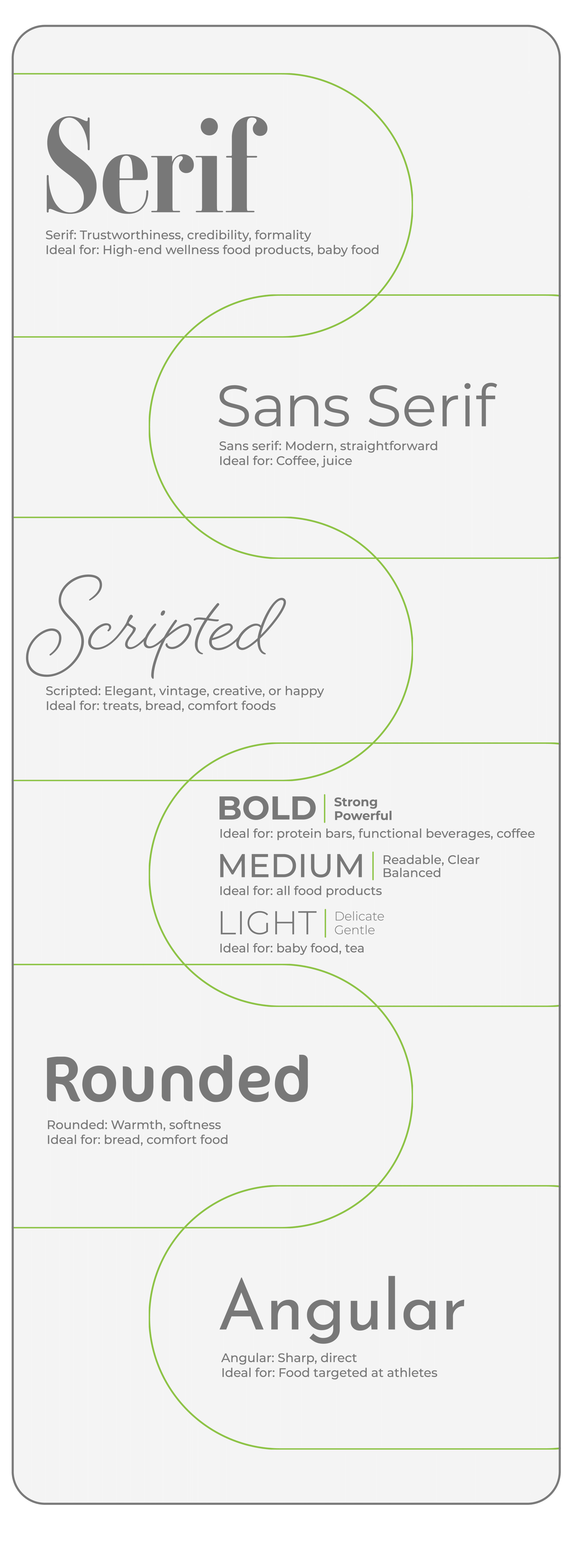
Serif: Trustworthiness, credibility, formality
Sans serif: Modern, straightforward
Bold: Strong, powerful
Light: Delicate, gentle
Medium: Readable, clear, balanced
Scripted: Elegant, vintage, creative, or happy
Rounded: Warmth, softness
Angular: Sharp, direct
Other important typography factors to consider:
Readability:
It’s important that consumers are able to easily get the information they need from your vitamins or supplements label. Typefaces that are too small, angled or positioned oddly, or don’t show up on the background, can be frustrating for consumers.
Typographic Hierarchy:
Order your fonts to best communicate your message to the consumer. Center your product name near the top in the biggest font. Isolate special ingredients and big benefits without clutter or distraction, and use eye-catching fonts to make them easy to read.
Size:
The size of the font tells the consumer where to look first. Use larger font to highlight the most valuable information—the selling points. Keep disclaimers, Preparation directions, basic ingredients, and nutrition facts in smaller, but still readable, font.
Spacing:
Along with size, bring symmetry into the overall packaging design by playing with spacing. Higher end or premium supplements tend to have minimalistic designs with plenty of negative space.
Custom Fonts:
Incorporating custom elements into your typography can create engagement and interest in your logo or packaging.
Our custom “O” for this pharmaceutical-grade CBD mobility product reflects the movement and agility the target customers are hoping for.
Graphic Design: Logos and Imagery
Since your logo is the visual representation of the brand, it’s important to place it where it will get noticed—centered in the top or middle of your supplement label design. A memorable logo might stick in the mind of your customer’s even if they forget other elements about your brand.
Your logo can often determine whether a customer remembers your brand or not (That’s why it’s vital to design your logo along with your packaging, ensuring that your brand is aligned).
Other imagery on your packaging might include hand drawn illustrations or symbols. Don’t crowd your design—less is often more.
Featured Icons
Featured icons give you a way to highlight the most important information that sets you apart, such as organic certification, current good manufacturing practice certifications, or allergen-free.
Consumers with dietary needs or ethical preferences tend to immediately look for these most common symbols:
NON GMO

Cruelty Free (Leaping Bunny)

Certified Gluten Free
Certified USDA Organic

Certified Vegan
Choose 3-5 icons and display them clearly on your packaging. Remember that some icons, such as Leaping Bunny or USDA organic, require special certifications. Using these icons without the official certification process opens you up to litigation. You can create your own icons for certain features, including vegan and non-GMO. However, if you can afford to go through the certification process to use an official icon, it increases consumer trust and builds your brand reputation.
Taglines, Messaging, and Product Copy
A catchy tagline is a great way to set yourself apart and build brand recognition. It should communicate your brand’s unique features and motivate your audience.
Keep these short with 8 words or less, snappy enough to catch people’s attention, like a jingle or alliteration, and include benefits such as convenience or affordability. Creativity is encouraged, but clarity also matters!
You can also incorporate a 1-2 sentence brand story snippet that reflects on who you are, why your brand is special, or why you do what you do. Even a couple of sentences can help you build trust and loyalty with your customers.
(If coming up with these elements seems overwhelming, we can help! Contact us for a consultation.)
Think about the Design (and Your Brand) as a Whole
As you create the elements of your supplement label design, remember that everything has to weave together, like a tapestry. If you don’t center everything on your “why,” your brand story, and your target audience, your brand will appear haphazard and disjointed. Everything needs to work together to build a strong, consistent brand.
Note that certain aspects, such as color, embellishments, line thickness, and type size, can have limitations that should be carefully considered during the design process.
It’s also important to remember that your design doesn’t just lay on paper—it’s a 3D design. Make sure to consider the entire overall package. (One of the benefits of working with a design agency is access to their expertise and understanding of how the flat design translates to a 3D container. At Crème de Mint, we create detailed 3D mockups to help our clients visualize the final result.)
Most supplement packaging options don’t have a lot of room to work with. Keep the front label simple and engaging, with only the most important information. There are many compliance requirements for your back label, including a Supplement Facts panel, ingredients, and contact information for the manufacturer or distributor.
With the little space left, add in any additional icons, benefits, or brand story snippets to engage the audience and show some personality.
Remember that the materials you use, the way your product sits on a shelf, and the opacity of your packaging all factor into the overall supplement label design.
If possible, construct your 3D design using a product sample and a printed dieline (or design template) to check for any mistakes before you send your work off to the printer.
Printing Your Supplement Label
Your label is your brand’s first impression. When designing custom supplement labels, material choice matters just as much as design. The right label material not only supports the look and feel of your brand, but also ensures your packaging holds up through real-world use.
Custom printing lets you choose the materials, finishes, and textures that bring your vision to life while standing up to real-world wear. The material you choose for your supplement labels plays a key role in both shelf appeal and product performance. Whether you’re using paper, film, or foil, each material offers distinct advantages depending on the product’s needs.
For health products exposed to moisture or temperature changes, film labels, like polypropylene or polyester, offer superior durability and water resistance. Foil labels, especially those with cold foil stamping, create a premium, eye-catching look that adds value to your product.
Gloss laminate is another great option, offering both a high-end look and added protection against wear and tear. It enhances color vibrancy and helps maintain the label’s appearance over time. Label finishing options, such as embossing, debossing, and spot varnishing, can also be used to add texture and visual interest to the label.
When you’re first starting out, it’s important to check what material options your manufacturer offers. Whether they work with third-party vendors or allow you to send your own labels from a separate printer, it’s essential to understand their capabilities. Be sure to get samples to review the look and feel before moving forward. And before going to print, always ask for a matchprint to ensure the final product meets your expectations.
Choosing the right material and right print techniques helps your supplement stand out and signals to your customers that every detail—inside and out—has been thoughtfully considered. When you work with an experienced packaging design agency, they will understand the way materials work or don’t work, where mistakes might happen, and what issues might arise—and can navigate these challenges for you.
Current Trends in Supplement Label Design
Supplement label design is constantly evolving, keeping pace with the ever-changing preferences of the wellness-minded consumer. Today’s labels are all about simplicity, clean lines, and a connection to nature. Minimalist designs, ample white space, and earthy tones are making their mark, reflecting the healthy, natural essence of supplements.
To add personality and intrigue, more brands are incorporating subtle illustrations, icons, and patterns. Think hand-drawn botanical elements or gentle textures that evoke purity and align with health-focused values. Sustainability is another trend that’s gaining ground, with eco-friendly materials and messaging speaking directly to consumers who care about the planet.
Premium design elements like foil stamping, embossing, or spot varnishing are adding depth and tactility to labels, making them feel as good as they look. These finishing touches create a sense of quality and elevate the customer experience.
A well-designed label doesn’t just attract attention—it helps build your brand identity and sets your product apart in a competitive market. Thoughtful design can be the key to connecting with customers and driving business success.
Ecommerce Supplement Label Design
When it comes to ecommerce, your supplement label has to work harder. It needs to grab attention in a scroll, not just on a shelf. Exploring different design ideas helps you find what truly stands out online—and what aligns with your brand. Partnering with a seasoned packaging design agency ensures your label isn’t just eye-catching, but thoughtfully crafted to perform across digital platforms.
Cohesive branding is key, from your product page to your packaging. And don’t overlook the unboxing experience. Every detail—how the product arrives, how it feels in hand—should reflect the care and quality behind your brand.
Selling on Amazon
On Amazon, you’ll be competing with even more options than you would on the shelves—which means catching the eye is even more vital. Every word and image must be strong and focused on hooking the audience in. You might need strong visuals or captivating colors.
Your Amazon platform provides a place to implement SEO strategy and communicate with your audience. You’ll also need your own website, which will give customers a place to learn more about you.
Your Amazon store should contain high-quality photographs, lifestyle images, or information about your process and the quality of ingredients. Remember, customers have many online choices—make sure they know why they should choose your brand.
Selling on Your Website
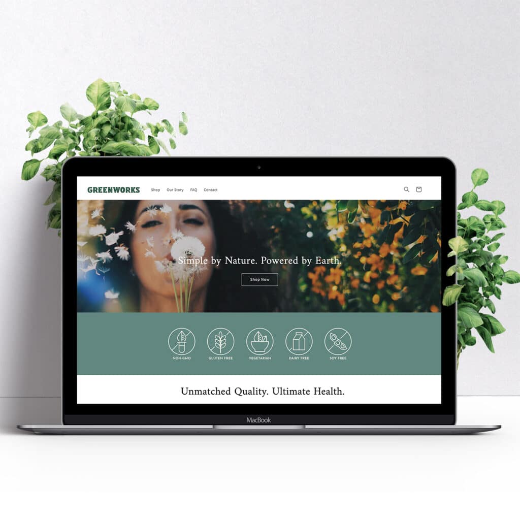
If you plan to sell exclusively online, you might end up needing to opt for cheaper materials or smaller products to save shipping and production cost, which means your designs might need to be even more minimalistic than if you are primarily selling in stores.
But selling your supplements directly on your website also allows you to create strong branding and messaging in a way that you can’t on the shelves. Shopify offers a simple, all-in-one platform to set up your online supplement store for easy check-out.
You can include photos and videos, more detailed product information, and expand on your brand story and include more information about your mission and values, which can all help you build stronger relationships with your audience. You can even offer subscription services to increase repeat purchases and brand loyalty.
Keep your website engaging and easy-to-navigate—and make sure that it reflects the same tone as your packaging design and overall branding.
Selling on Social Media
When selling on social media, relationships with your followers are key. Having a strong brand voice and messaging, along with cohesive brand visuals across social media, can help you build relationships.
Remember that it can take many touchpoints on social media for a consumer to make a purchase from a brand. Consistent and cohesive branding helps customers remember you and stay interested even in a crowded newsfeed.
Consumer Testing and Iteration
After you design your supplement label, you want to ensure that it resonates with consumers. Consumer testing helps you understand how your packaging connects—before you invest in a full print run. A designer brings a trained eye and strategic perspective, helping translate your brand story into packaging that resonates. That kind of creative partnership adds a level of polish and intention that’s hard to achieve alone. Iteration is part of the process—and often, it’s where the magic happens.
You can conduct consumer testing by:
- Asking for volunteers in groups to offer feedback on your packaging design and messaging
- Showing friends and family and asking for their thoughts
- Holding formal focus groups (which can be expensive)
- Conducting surveys about tone, feeling, and associations with your packaging design
- Speaking directly to customers
While it’s most effective to print the packaging and show an actual product for consumer feedback, many small brands need to conduct this testing before printing. You can use a 3D rendering of your design to gather feedback.
If you are not sure where to find potential consumers, spend time networking online and finding where your customers hang out. Contact your local gym, yoga studio, or natural food store to see if they are holding any events you could attend to meet potential customers. People are often happy to provide feedback.
Remember that iteration leads to success—it is better to make changes to your packaging design early on and help pave the way for a successful launch.
Launching a supplement brand and ready to work with a branding agency?
Book a call today to get started!
About the Author

Lauren Casgren-Tindall is a professional packaging designer and the founder of Crème de Mint and has been creating powerful, innovative designs over the past 15 years for companies such as Alkaline Herb Shop, Earth’s Bounty, Greenworks, ArthroCBD, Megan & Co., and more.

