
Creating Food Packaging Designs that Sell: Everything You Need to Know
Author

Lauren Casgren-Tindall has been creating powerful, innovative designs over the past 15 years. She launched the company Crème de Mint branding agency to specialize in her passion of designing innovative food packaging.
January 26, 2024
Key Points
Article Summary
-
- Great food product packaging creates a comprehensive brand that hooks consumer attention, evokes emotion, and builds a relationship.
-
- The food packaging design process begins with defining your brand and choosing imagery, photography, logos, colors, and typography that strike an emotional chord.
-
- Food packaging design also includes accounting for materials, compliance, safety mechanisms, practicality, and regulations.
-
- It’s important to remember the three-dimensional element of packaging and convey the information consumers are looking for while telling your brand’s story.
Packaging Design and Branding Will Make or Break Your Business
There are 20,000 new food products launched each year—but only 11-20% stay on shelves beyond a year.1
If you want your food product to last, you need to stand out in a competitive market, connect with your audience, and establish a loyal following. The right packaging design allows products to cut through the noise and entice customers.
But don’t take our word for it—the numbers speak for themselves:2
-
- 72% of consumers are influenced by packaging when making a purchase
-
- 81% of consumers buy new items because packaging catches their eye
-
- 65% make repeated purchases due to packaging
So, how do you make sure that you are in that 11-20% of products that last? By creating engaging food packaging design that resonates with your audience. Great food packaging design communicates what makes your product great, reflecting freshness, taste, and quality.
Examples of Good Food Packaging Design
Inviting Colors

Great food packaging draws your audience in. “You eat with your eyes” is a saying for a reason. Food design should be warm, inviting, and eye-catching, creating a welcoming atmosphere. SurfSnax’s bright contrasting colors pull the eye and reflect bold flavors.
Benefits-Focused

It isn’t enough to just command attention—your food packaging design also needs to clearly communicate what makes your product special and what benefits it brings to the client. These Keto Science supplements lead with the biggest benefits, from “performance enhancing hydration formula” to “keto + paleo friendly,” with added advantages listed on the front so the consumer can immediately understand the product’s value.
Examples of Bad Food Packaging Design
Cluttered Packaging

Consumers don’t have time to hunt for the information they need. If your packaging is cluttered with too much information, your customers will move on to other options. Focus on simplifying and highlighting the most important features—including convenience, taste, and quality.
RapidFire’s original packaging was cluttered and left consumers wondering where to look first. The simplified, minimalistic rebrand makes it easy to identify ingredients and flavors.
Unappetizing Designs or Colors

Customers want many features—natural ingredients, clean processes, and more. But they don’t want to sacrifice taste. Food packaging design needs to reflect great flavor with appetizing colors and appealing imagery.
MiSO Good’s original packaging didn’t evoke freshness or health—major benefits of the product. The rebrand pivoted to brighter colors with hand drawn illustrations of vegetables that symbolizes freshness and brought an upbeat feel to the packaging.
Using a Design DIY Template vs. Hiring an Agency
While there are some advantages to a DIY approach, such as lowered short-term cost and a fast turnaround time on design, there are also drawbacks.
Using a template can limit your customization abilities and make it difficult to replicate the same branding across different products. Working with a food packaging design agency is more of a front-loaded business expense, but packaging design agencies provide an exclusive level of market research and branding expertise that keep customers coming back for decades.

[Templated image, from Deposit Photos]
Pro: Short-term Savings
Many DIY design templates are affordable, saving you initial capital upfront.
Pro: Fast Turnaround
Since a template doesn’t have many customization options, using a DIY template is a quick option. You can plug and go with your product copy, company logo, and have a complete design in a matter of hours.
Con: A Lack of Expertise
Food packaging is more complicated than designing a simple label. A template doesn’t account for materials, compliance regulations, how something looks on the shelf and in the customer’s hands, or what your competitors are doing.
Con: Limited Customization
DIY templates often offer little to no customization options. Branding agencies can create custom fonts, logos, and imagery to establish cohesive branding that can be used across many different products
Con: Vulnerable to Copycats
Using a template makes your brand extra vulnerable to copycat branding—other brands can use the same template and look so similar that it might be hard for consumers to distinguish your brand. The copycat effect can lead to customer confusion, resulting in less brand loyalty. You want your branding to be distinguished and memorable, built on your unique elements, and designed for your target audience.
The Food Packaging Design Process in 5 Steps
Step 1: The “Pre-work”: Market Research and Strategy
Good package design doesn’t happen by accident—it’s created intentionally and strategically. Before you get creative, you need to gather research and create a plan of action. Strong market research, budget planning, and strategy lay the groundwork for successful packaging design.
Determine Your Target Audience
You might create the world’s most visually stunning package, but if it doesn’t speak to your audience, it won’t sell. Every branding and packaging decision you make should be centered on your target audience.
When determining your target audience, you need to understand your target demographic, or who it is that you are going to sell to.
Your demographic is based on measurable statistics such as:
-
- Age
-
- Gender
-
- Race
-
- Religion
-
- Marital Status
-
- Education
-
- Income Level
Most importantly, ask yourself what problems your target audience has that your product solves—you’ll use your packaging design elements to speak to this.
Successful packaging for a children’s granola bar would look completely different than packaging for a protein bar for athletes. A CBD-infused beverage might appeal to Gen Z, but wouldn’t resonate with an older audience.
Research Your Competition
The first step in researching your brand’s competitors is compiling a list of all of them. However, before doing this, it’s important to understand the three different types of competitors that may oppose your business.
Direct Competitors: these competitors sell a similar product as yourself at a similar price point, to a similar audience.
Secondary Competitors: these competitors may sell something similar to your product or service, but it is at a different price point or to a different audience. Therefore, regardless of the similarity in the product, the positioning strategy varies.
Tertiary Competitors: these competitors may actually be collaborators, as they sell different yet related products to a similar audience.
It’s important to understand what your competitors are (and aren’t) doing. Spend time going into the store and physically interacting with other products similar to yours.
-
- What features and benefits do they offer?
-
- Are most similar products organic? Vegan? GMO free?
-
- What colors are the most successful products using?
-
- What imagery are they incorporating?
-
- How are they appealing to consumers?
As you take a look at your competitors, pay attention both to what is working, and what is missing. This will help you define your competitive edge.
Identify Your Niche
If you want your packaging design to stand out, you need to understand what makes your food product special. Maybe you use an ingredient that nobody else does, or you bring a unique flavor to the table.
It might be tempting to try to appeal to everyone, but successful brands know who they sell to and focus on them.
There are four different approaches you can use to help better define your niche:
-
- Targeting a specific audience
-
- Offering unique products
-
- Solving particular problems
-
- Aligning with a distinctive mission or values
Are you allergen-friendly? Are your ingredients simple and clean? Is your bread softer than the competition? These are the unique features you want to highlight in your packaging!
Define Your Distribution Goals
What do you ultimately want for your food product? Do you want to be sold in Whole Foods, Costco, or Walmart? Would you rather partner with influencers for eCommerce success? Or do you envision your product at specialty food shops, such as Graziano’s Market?
Your goals are important to understand before you embark on the design specifics, because not only are you selling to the end customer—you’re also selling to potential vendors.
Warmer earth tones might appeal to specialty vegan stores, while sleek and bold packaging would pique the interest of sports nutrition stores, like GNC.
Choose packaging elements that speak to the distributors you want to target.
Step 2: Create Impactful Food Branding
Establish Your Company’s Identity
Once you have an understanding of your audience, niche, and goals, it’s time to establish who you are as a brand.
Start by thinking about what you stand for, your mission and vision for your brand, and how your product can impact your customers—from great taste to quality ingredients to nutrition-focused wellness.
Ask yourself these questions:
-
- What do I want my customers to feel when they look at my package? (Inspired on their health journey? Comforted by the thought of a delicious sweet treat? Empowered by ingredients they know and trust?)
-
- What does my product bring to my customers’ lives? (Energy through a natural boost? Calmness and tranquility in the form of tea or coffee?)
-
- What do I want to do to change or improve my industry? (Better ingredients? Freshness? Less additives? More whole foods?)
The answers to these questions will form your brand’s identity and essence.
Figure Out Your Hook: First Impressions Matter
Your packaging design needs to capture your audience’s interest and encourage them to pick up your product.
-
- 73% of consumers purchase impulsively3
-
- 72% of consumers are influenced by packaging4
-
- You only have 8 seconds to hook your audience in5
How will you hook your audience? Eye-catching logos, bold colors or contrasting color palettes, creative and catchy product names, unique fonts, and photos or illustrations of ingredients are great ways to attract attention and encourage those all-important impulse buys.
Your packaging is like a mini-billboard for your product—you need to convey something special in a split-second.
Brainstorm colors, images, or words that would instantly appeal to your target audience—even on a crowded shelf. If a certain color or image is associated with your product, chances are your competitors are already using it. An agency with experience in food packaging design can help you stand out from your competition by avoiding cliches.
Capture the Emotional Elements of Food Packaging
It’s vital that your food packaging design strike an emotional chord with your audience, whether that means the nostalgic comfort of family dinners or a sense of fitness, health, and adventure.
What do you want your audience to feel when they interact with your food product? Empowered in their wellness journey? Trust that the food is safe and free from allergens? Relief at time saved and convenience? Proud of the ingredients they are going to consume?
How will you paint that picture? Your food packaging design should:
-
- Use a color palette that evokes the emotion your customer wants to feel—such as rich or bright colors to convey health and energy.
-
- Incorporate images that speak to your customer—such as fun mascots to engage children, photos of mouthwatering ingredients, or lifestyle images that show energy and adventure.
-
- Communicate benefits to your customer with simple but engaging copy and icons—highlight natural ingredients, special features, or great taste.
Food Brand Logos
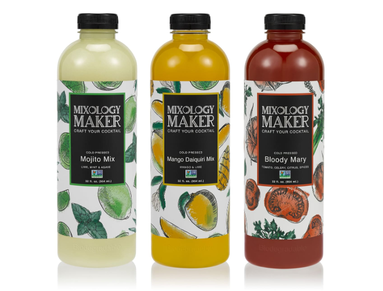
Great food packaging logos are simple, distinct, clear, and memorable. It’s helpful to center your logo on a powerful feature of your brand—such as your brand name or an ingredient you use.
It’s important to remember that rather than representing your brand in its entirety, a logo expresses the essence of your brand—a visual shorthand.
Put another way, you can’t pack everything about your brand into your logo, because a good logo is simple. But your logo should convey the central feelings and perceptions you want your customers to associate with your brand.
Logos are a tangible way to express some of the essence and characteristics of your brand, but there’s no way a logo can represent or illustrate everything about your brand. Your logo serves as a visual shorthand for your brand.
Your logo doesn’t just appear on your food packaging. It needs to be versatile enough to stand out on its own and appear on marketing materials and social media.
This logo drew inspiration from ginger—an ingredient that set the juice brand apart.
It’s also important to ensure that your logo is actually available for use. If it resembles a brand’s logo that is already trademarked, your business could face legal ramifications. A trademark protects your assets, such as your business name or logo, from being used by other businesses, both in your state and federally.
Once you are confident about your brand name, you’ll need to secure a trademark for your name and logo. The trademark process can be long and costly, but is vital for protecting your brand and assets.
Searching the Trademark Electronic Search System can help you determine if your company or product names are already taken, but we recommend consulting with a trademark attorney who can provide comprehensive insight on the likelihood of approval for your trademark.
Step 3: Hire a Manufacturer
Finding reliable vendors is important. You will likely need a quality manufacturer to produce the product itself, a printer to print the packaging, and a co-packer to package and label your product. Many co-packers can handle all three jobs together, streamlining the process.
When starting out, your food brand might fall under cottage laws or be able to work out of a commercial kitchen without hiring a manufacturer. But when you start to scale your business, you will need to move to a copacker.
Your manufacturer will determine many of your packaging design choices, such as your material options and customization possibilities. Your minimum order quantity, the materials available from your manufacturer, and the stock packaging options they offer can all play a factor in your design.
Take the time to vet your vendors. Ask around in your industry, check reliable directories, and read reviews. You need someone you can trust if issues arise or you need to tweak your packaging design during the process.
You’ll need to spend time asking questions and finding vendors who can work within your budget and needs.
Understand Your Bottom Line
Your packaging design is important—but it also needs to fit your budget. You need to know your:
-
- Minimum order quantity (MOQ)
-
- Cost objectives per unit
-
- Shipping costs
-
- Market price
-
- Profit per unit
These numbers will decide what options you have for your packaging. Can you afford biodegradable cellophane? Or will you need to stick to a cheaper plastic? Is a custom bottle shape within your budget? Or will you choose a stock bottle?
Taking the time to get clear on your numbers will streamline the packaging design process and ensure that your food product remains profitable. Crème de Mint offers a free product pricing worksheet to help you learn how to price your products correctly.
MOQ (Minimum Order Quantity)
Many vendors require a minimum order quantity in order to manufacture your product. You need to know what you can afford to produce upfront. If you have a low budget, you might have to find a manufacturer who is willing to offer a lower MOQ.
Cost Objectives Per Unit
You also need to determine how much each unit will cost you to produce. Factor in production, printing, shipping costs, and labor. Add all of those costs together, then divide them to find your cost per unit.
(Cost of production + Cost of packaging + Shipping costs + Labor) / (Number of items)
This number will determine your product’s price point.
Profit Per Unit
Once you understand your cost per unit, it’s time to determine your price and your profit. In the food industry, the average profit margin is between 20-30% (which can vary by niche or specialty).
That means that you will want to mark your product up 20-30% from your cost. If you plan to sell wholesale, remember that your profit will be lower—you’ll have to price your product at a lower cost in order for retailers to mark it up for themselves as well.
Use the 20-30% guide to calculate your price range—then cross-reference this with competitors. If you find yourself on the low end, don’t be afraid to raise your price.
Shipping Costs
Shipping costs can take up a lot of capital, so it’s important to factor these in when deciding how to price and market your product.
Your shipping costs will depend on the weight of your product, the amount you will ship, the locations you ship to, and whether or not your product needs to be refrigerated or frozen.
Step 4: Choose the Right Packaging Materials
The materials you use in your packaging have a big impact on the design. You don’t want to design something impractical or create a label that looks great on paper but doesn’t lay on a wrapper correctly. Using the right packaging components will help you save on cost and allow the consumer to easily enjoy your product.
Understanding the Packaging Components
As you consider packaging materials, you need to understand all of the components involved. Depending on your product, you might need multiple materials.

Primary packaging: The packaging that holds the product itself, such as a can or jar, a wrapper, a milk carton, or a juice bottle.
Secondary packaging: The next layer that holds your packaged food product, such as a box of individually-wrapped granola bars. Not all food products have secondary packaging, but many do.
Other packaging: You might also need to consider shipping packaging, filler materials, and safety seals if necessary for your product. If you are shipping directly to consumers, your packaging should provide a great unboxing experience that is seamless and engaging.
It’s also important to remember that each of these layers might need design elements depending on your product. For example, if you produce individually wrapped snacks, you will likely need a design for both the primary and secondary packaging.

Cost Factors
Packaging varies widely in cost, and your budget will determine what options are available to you. The co-packer you choose will determine many of your cost factors. For example, they might require a higher minimum order quantity, overall lowering your available budget for packaging and limiting your options on materials.
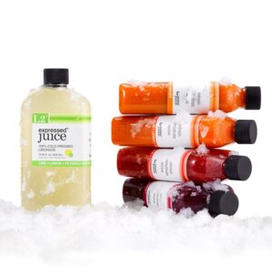
This custom-designed bottle for Expressed Juice was created to allude to both a flask and a medicine bottle.
Cheaper packaging options often include plastic or cellophane while more sustainable options, such as bamboo, might come at a higher cost. However, consumers often want to see more eco-friendly packaging options. You’ll need to balance cost with your company’s values and what your target audience prefers.
You also need to consider cost versus quality. Is your material going to be leak-proof? Is it going to be durable during shipping? And is it easy to use for your customer?
Materials That Make Sense to The Consumer
It’s great to want your packaging to stand out—but not at the expense of what makes sense. Consumers are used to products looking a certain way, and they might not embrace change. Unique packaging is a great idea, but it still needs to work for your consumer.

[credit: Liquid Death]
Some alternative packaging becomes very successful—such as Liquid Death’s canned water. Consumers are used to water coming in either a plastic bottle or occasionally a carton. But Liquid Death opted for something unusual in an aluminum can. Combined with their unique, bold branding (including the tagline “Murder Your Thirst”), Liquid Death’s packaging was different enough to stand out and be interesting, while still remaining practical. As an added bonus, Liquid Death appeals to an eco-conscious audience because aluminum is more sustainable and cools water faster than traditional plastic packaging. This alternative didn’t come without a downside however—consumers can’t close the can back up after opening it—a big convenience of the traditional bottle. If choosing an alternative packaging direction, you’ll need to weigh out what matters most to your consumers.

If you are looking to use packaging that consumers aren’t yet familiar with, working with an experienced food packaging design agency can help make sure your product is successful. Crème de Mint helped Tio Gazpacho, a Spanish soup brand, create to-go soup containers. Because gazpacho is different from many canned soup options, the founder wanted it to be sold in the juice section instead. Crème de Mint designed the bottle to communicate to the consumer that the product was a grab-and-go fresh soup—a similar concept to vegetable juices.
This revolutionary product was featured in Whole Foods and was acquired by General Mills. Crème de Mint received the 2014 HOW International Package Design Award for the innovative packaging design.
It’s also important to choose materials that don’t frustrate your customers. Packages that should re-seal but don’t, straws that are unable to puncture juice pouches, or packaging that is difficult to open are all likely to drive consumers toward other options.
Take the time to get your hands on materials before you place an order. Make sure they are able to be opened and closed properly.
Sustainable Materials
Not all companies are able to embrace sustainable packaging, but it’s something all new brands should at least have on their radar. Sustainable packaging options might include recyclable or recycled materials, or biodegradable/compostable options such bamboo or mushroom mycelium.
Reducing single-use plastics, unnecessary materials, and packaging that is too large or wasteful can show consumers you care about your impact on the environment.
Remember that although customers do want eco-friendly options, they don’t want to sacrifice the customer experience for it. (The soggy paper straw saga is a prime example). Whatever material you choose still needs to preserve freshness and function properly.
Safety Mechanisms
Food packaging also needs to protect the health and safety of your consumers. The FDA guidance and regulatory information requires food production to be safe, with specific food-grade materials in some industries and regulated transportation methods, along with informative labeling and packaging that shows ingredients and nutrition facts, including allergen information.
In an age of transparency and regulation, consumers expect to be protected. The right packaging guards against potential food-borne illnesses or dangers. This might mean choosing:
-
- Tamper-evident seals
-
- Lidding films to vacuum seal and preserve freshness in foods such as chips or nuts
-
- Milk coupling gaskets with o-rings for dairy products or alternatives
-
- Resealable pouches
Quality seals preserve freshness, improving the shelf life of products, protecting your customers from illness, and ensuring the best taste and quality.
If your product contains CBD, THC, or other potentially dangerous substances, it’s also important to consider child-safe packaging, such as mylar bags that can be resealed with a ziplock once opened.
Make sure that all gaskets or seals you select are FDA-compliant and food-grade quality. Working with a manufacturer who understands the food industry can help you determine which materials and options make sense for your product.
Step 5: Design a Food Product Package to Match Your Brand
Once you understand your material options and the components of your packaging, it’s time to get creative! There are many different elements to incorporate into your design decisions.
Printing Process Options
When choosing a printing process, there are 5 common options to consider:
-
- Lithography: Uses aluminum printing plates or rollers to stamp your design onto your packaging. It requires a flat surface and is commonly used on cartons and labels. Designs printed with lithography are typically smooth, with no visible banding. This method works with a wide variety of materials, including cardboard, paper, and plastic.
-
- Flexography: Uses flexible photopolymer plates wrapped around rotating cylinders to apply your design with quick-drying inks. It works well for a wide variety of materials, including flexible wrappers, and it is cheaper than lithography, but should not be used if your design has a color gradient or high-resolution images.
-
- Digital: Can be printed at-home inkjet or laser printing, or commercial digital printing for larger jobs. It’s most often used for labels and package prototypes. It is cheap and simple, with no minimums, but offers minimal coating protection.
-
- Rotogravure: Designs are acid-etched onto metal cylinders then transferred onto the surface of the packaging. It is typically used for designs that need complex color patterns or long-lasting images. It can print well on flexible and thin materials.
-
- Silkscreen (screen printing): Uses a polymer mesh screen to push ink through the screen and onto your container. This method has a low setup cost and can be used on a range of surfaces (including glass, wood, and metal). It’s often used on bottles and tubes.
The printing process you choose will depend on your food product and the options your printing company offers. Flexography is the most common method for most food and beverage products because it is cost-effective and can accommodate many materials.
Types of Food Product Labels
It’s also important to consider whether you want your product to have a printed label (common in soups, jars, juices, or deli products), or to screen-printed directly onto the packaging (common for cartons, pouches, or wrappers)? This factors into your printing process decision.
There are 6 common types of labels used in food packaging:
-
- Pressure-Sensitive Labels: The most common type of label, these use adhesive to attach to a container. They can include lamination, special finishings, or specialty dyes. This is common in jars, cans, and bottles, such as condiments, peanut butter, canned goods, and many other food products.
-
- Shrink Labels: These are made of polymer plastic film that shrinks around a container as it is heated. Shrink labels can accommodate high-quality graphics and can be used with a wide range of containers. They can also handle changes in temperature, making them a great option for refrigerated food and beverage products. They are common in bottles and cans.
-
- Reseal Labels: Reseal labels allow food products to be resealed after opening. They are common in snacks such as cookies, as well as lunch meats.
-
- In-mold Labels: These labels are not separate from the packaging—they become injected into the packaging. They are common in refrigerated or frozen items, such as ice cream, yogurt, or butter.
-
- Dry-peel Labels: Dry-peel labels are created to adhere to the surface for only a temporary period of time. This is common in fold-out labels that include additional information underneath the outer label, and could be used to attach coupons or recipes to food packaging.
-
- Thermal Labels: This process uses heating elements to apply the packaging rather than to a separate label. This is common for wrappers, such as bread or granola bars, as well as cartons.
Different labels make sense for different food products. Your printing company or co-packer will be able to suggest common options for your food product.
Color Psychology
There’s an art and science to choosing packaging and brand colors—and in the food industry, this science can shift the success of your product. Colors can draw the eye, stimulate appetite, or turn customers off of food products altogether.

Red: Stimulates appetite, often indicates sweetness
Ideal for: fruit bars, snacks, sweet treats, sauces, pastas
Orange: Stimulates appetite
Ideal for: juices, beverages, energy bars
Yellow: Grabs attention, creates an uplifting feel
Ideal for: candy, juice, energy drinks or bars
Blue: An appetite suppressant, evokes a sense of trust
Ideal for: baby food products, low calorie/healthy options
Green: Earthy, fresh
Ideal for: teas, natural foods, vegetable-based items
Purple: Luxurious or royal
Ideal for: candy, sweet treats
Brown: Warmth, earthiness, security
Ideal for: comfort foods, grains
Pink: Energy, femininity
Ideal for: Functional beverages
The shades of color also play a role. Bright colors might appeal to younger audiences and are often used in juices, energy drinks, or products marketed toward children. More subdued colors might be great for teas or calming drinks.
Remember that these are just general guidelines for color psychology—you also need to take into account your individual product. Certain colors should be avoided for specific products. For example, pink on meat packaging or light green on bread could bring up associations with illness.
Finally, keep in mind transparency in your food packaging. It is often powerful to show the product itself in food packaging, providing the consumer with a chance to see the freshness and quality for themselves.

Creme de Mint uses a vibrant orange and pink to represent a fruity energy that matches Perfecto’s funky pop art branding.
Typography
Just like the color of your packaging, the font can evoke certain feelings in consumers. The right, or wrong, typography can completely change your packaging design.
Imagine a bold, powerful package for an energy drink, with vibrant colors. Now, picture that with a thin, simple font. It doesn’t pack the same punch as a bold type would.
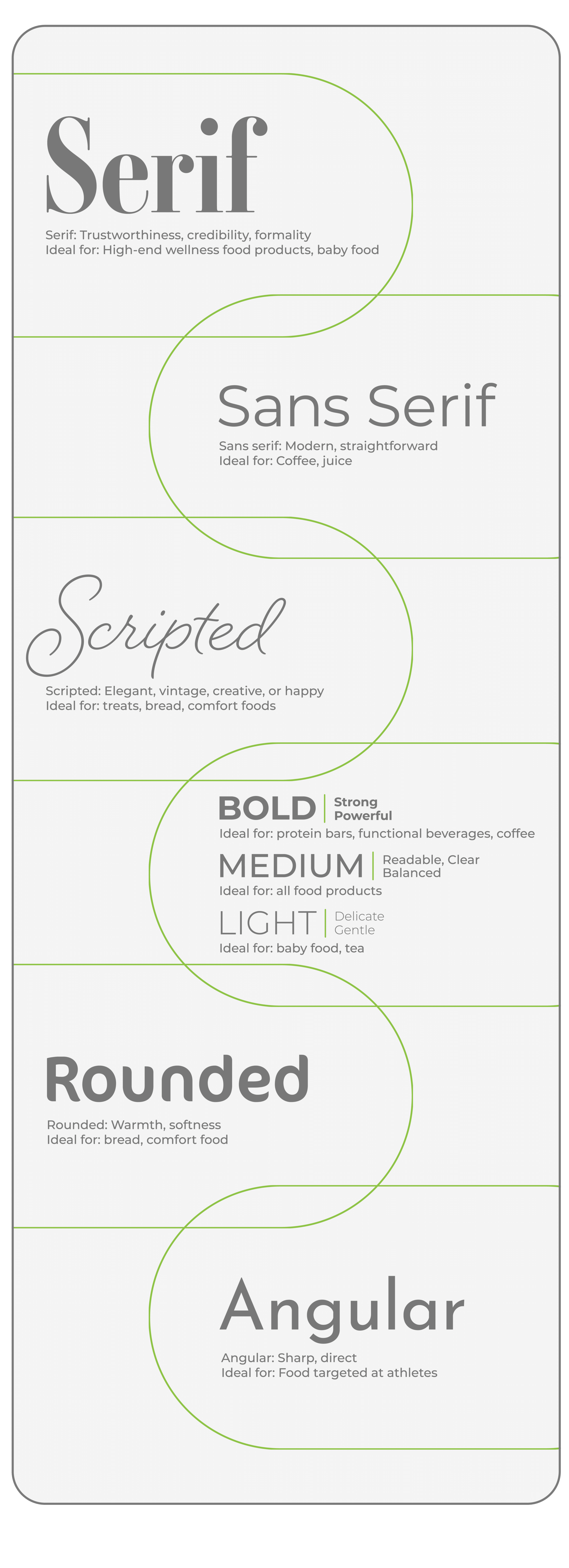
Serif: Trustworthiness, credibility, formality
Ideal for: High-end wellness food products, baby food
Sans serif: Modern, straightforward
Ideal for: Coffee, juice
Bold: Strong, powerful
Ideal for: protein shakes, bars, functional beverages, coffee
Light: Delicate, gentle
Ideal for: baby food, tea
Medium: Readable, clear, balanced
Ideal for: all food products
Scripted: Elegant, vintage, creative, or happy
Ideal for: treats, bread, comfort foods
Rounded: Warmth, softness
Ideal for: bread, comfort food
Angular: Sharp, direct
Ideal for: Food targeted at athletes
Other important typography factors to consider:
Readability
Food packaging messaging should be delivered in a clear and concise manner. Typefaces should be easy to read and shouldn’t wear on the eyes. This means that font is not too small, it shows up well against the chosen background, and the reader doesn’t have to strain their eyes to read it.
Typographic Hierarchy
Order your fonts to best communicate your message to the consumer. The product name is typically the most important information and should be placed near the top. Flavors and ingredients are also important—these should be placed without other copy surrounding them or distracting from the message and should be highlighted with an eye-catching or contrasting font.
Combining Fonts
Most food packaging contains a variety of fonts that contrast yet support each other. This is a great strategy to attract attention, but it’s helpful to choose fonts that are in the same family with different sizes or weights. Using fonts that are too similar can cause the copy to blend together and create a messy blur. Using fonts that are too different can look odd, as if they were all jumbled together at random.
Size
The size of the font tells the consumer where to look first. Use larger font to highlight the product name and medium-sized font to convey flavors or unique ingredients, along with any valuable benefits like “ready in minutes” or “zero grams of trans fat.” Preparation directions and nutrition facts aren’t selling points, so these should be smaller and typically placed on the back label, while still being comfortably readable.
Spacing
Along with size, bring symmetry into the overall packaging design by playing with spacing. Higher end or premium food products tend to have minimalistic designs with plenty of negative space.
Customization
Creating a custom font variant is an excellent way to add a distinct, original element to your packaging.

The custom font in Juicera’s logo plays up the “U” and mimics a drop of juice filling a glass.
Graphic Design: Logos and Imagery Placement
Since your logo is the visual representation of the brand, it’s important to place it where it will get noticed.
On vertical packaging, such as milk cartons, juice bottles, and jars, logos typically work best at the top center of the front label because this is a natural place to look first. It’s helpful to have negative space above and below the logo to draw the eye to it.
On horizontal packaging, such as candy bars, long pasta boxes, or granola bars, the logo should usually be aligned in the top left corner or top center of the front label. Since we read left to right, top to bottom, placing the logo in this area ensures that it gets noticed.
Your logo can often determine whether a customer remembers your brand or not (That’s why it’s vital to design your logo along with your packaging, ensuring that your brand is aligned).
Other imagery on your packaging might include hand drawn illustrations, symbols, or photographs. Remember to keep it simple—sometimes a simple fruit or vegetable illustration is all you need to convey freshness and quality.
Food and Beverage Label Compliance: Icons and Nutrition Facts
It’s vital that your food packaging label follows FDA guidelines. There are certain elements that must be included. Following these guidelines ensures that you are transparent and protects your business from lawsuits and loss of reputation.
The FDA’s food labeling guide provides instructions on how to list and verify nutrition facts, approved claims, and specifics related to individual ingredients. We highly recommend working with an attorney to ensure that your nutrition label and ingredients are compliant.
Label Compliance Requirements for food and beverages in the U.S., as outlined by the FDA:
Front label (also known as the principal display panel, or PDP)
-
- “Statement of identity”: The common name for the food that clearly demonstrates what it is. This is not the same as your brand name, and may not be misleading (ex. peanut butter, sourdough bread).
-
- Modified statement of identity showing the form of food—only applicable if the food comes in different common forms. (ex. sliced cheese, shredded cheese).
-
- The word “imitation” if the food is a substitute for a traditional food—must not be in a different font size than the statement of identity.
-
- Net quantity of contents displayed in both U.S. Customary System (lb, oz, fl oz) and Metric (g, kg, mL)—must be in the bottom 30% of the label, set apart.
Information panel (the panel immediately to the right of the front label)
-
- Ingredients, listed according to amount (highest to lowest), including any added colors, flavors, or preservatives.
-
- Declaration of presence of major allergens: milk, eggs, fish, shellfish, tree nuts, peanuts, wheat, or soybeans. Any ingredient sourced from a major allergen should be noted in the ingredient list. Example: lecithin (soy).
-
- Nutrition facts label, including serving size, calories, total fat, percentage of daily value (%DV), and vitamins and minerals—must be set into a box on the label. You can create your nutrition facts label either through lab testing or using a nutritional database to do it by hand.
-
- Name and address of the manufacturer, packer, or distributor.
Nutrient claims
-
- Claims such as excellent source of…, high in…, reduced…, or “healthy” should be based on nutrient percentages defined by the FDA.
-
- Health claims on food packaging can be about disease risk reduction, but they cannot claim to cure or treat a disease. (for example, “can help lower cholesterol as part of a heart healthy diet” is permitted, but not “prevents heart disease.”)
Beverage requirements
-
- Beverages that contain fruit or vegetable juice must declare the percentage of juice. Beverages that do not contain juice but refer to fruits or vegetables with images or text must state “Contains 0% Juice.”
-
- Ingredient list must be truthful. Terms such as “made from concentrate” or “reconstituted” should appear on the label if applicable.
Country of origin
-
- Certain foods are required to have country of origin labeling (COOL). These foods include ground meats, wild and farm-raised fish and shellfish, and fresh and frozen fruits and vegetables.
-
- Processed foods are typically not required to have this on the label.
Recommended elements
While not required, it is also recommended that you include:
-
- A barcode
-
- A “best by,” “use by,” or “sell by” date for perishable items
-
- Storage suggestions, such as “refrigerate after opening”
Special icons
Featured icons give you a way to highlight the most important information that sets you apart, such as organic certification, current good manufacturing practice certifications, or allergen-free.
Consumers with dietary needs or ethical preferences tend to immediately look for these most common symbols:

(GMO free)
(Certified Vegan)

(USDA Organic seal)

(Dairy or lactose free)

(Nut free)
Choose 3-5 icons and display them clearly on your packaging. Remember that some icons require special certifications, such as USDA organic certified.
Taglines and Copy
Product names and taglines are a way to communicate who you are and what your product offers. Create a brand tagline that encapsulates the personality and positioning of your brand in order to set it apart from competitors.
Keep these short with 8 words or less, snappy enough to catch people’s attention, like a jingle or alliteration, and include benefits such as convenience or affordability. Creativity is encouraged, but clarity also matters!
Many companies will also incorporate a brand story on their product packaging, providing an insight into who they are and what they stand for. People want to see themselves in your story—and this is the perfect opportunity to do so.
Your brand story is a great way to communicate the family or founders behind the brand, connect with your customers on a human level, and pave the way for relationships with your audience. 55% of consumers are more likely to remember a story than a list of facts.6
Try to tell your brand’s story in just 1-2 sentences, highlighting what makes your brand special. Tell enough information to make the consumer want to read more without monopolizing too much valuable package space.
Designing for a Three Dimensional Product
One of the trickiest parts of designing food packaging is visualizing the 3D element. While you create your design on a computer, the end result is a 3D package. It’s vital to visualize what the end product looks like as a whole.
Your printing company or packaging design agency can create a dieline, or template that lays out the overall design and placement of the package.
Keeping the front label minimalistic, clean, and engaging is a great strategy for hooking the audience. Side and back labels offer extra room to convey benefits, engage with your audience, and show some personality.
Remember that the materials you use, the way your product sits on a shelf, and the opacity of your packaging all factor into the overall design.
If possible, construct your 3D design using a product sample and a printed dieline to check for any mistakes before you send your work off to the printer.
When you work with a quality packaging design agency, they will understand the way materials work or don’t work, where mistakes might happen, and what issues might arise—and can navigate these challenges for you.
Ecommerce DTC Food Packaging Design
Designing food packaging for eCommerce requires a closer look at secondary and tertiary packaging, durability, and the unboxing experience.
Selling on Your Own Website

If you plan to sell exclusively online, you might end up needing to opt for cheaper materials or smaller products to save shipping and production cost, which means your designs might need to be more minimalistic.
The biggest advantage to selling on your website is that you can create strong branding and messaging with more information than what appears on the package.
You can include photos and videos, more detailed product information, and expand on your brand story and include more information about your mission and values, which can all help you build stronger relationships with your audience.
Your website is key in keeping your audience interested and engaged. Strong, cohesive branding across your website and packaging reinforces your brand image.
Make sure that your website is simple, user-friendly, and easy to navigate. Use your website to communicate your brand story, share more about what sets you apart, and provide wholesale information to retailers if applicable.
You can also consider offering subscription services on your product, which increases repeat purchases and builds brand loyalty.
Selling on Amazon
On Amazon, you’ll be competing with even more options than you would on the shelves—which means catching the eye is even more vital. Every word and image must be strong and focused on hooking the audience in. Brighter, more vivid colors and contrasting fonts are strong options to catch the eye while scrolling.
Selling on Amazon provides you with the opportunity to convey more information to your audience and use SEO strategy to help your product get ranked higher than your competitors. You’ll also need your own website, which will give customers a place to learn more about you.
Your Amazon store should contain high-quality photographs, helpful tips on preparation or recipes, lifestyle images, infographics showing what sets you apart from similar products, and even videos highlighting your production quality.
Selling on Social Media
When selling on social media, relationships with your followers are key. Having strong branding across social media images that aligns with your food packaging design helps consumers remember your brand and products.
Make sure that your brand personality on your packaging reflects the way you show up on social media. If your packaging is dry and bland, but your online presence is humorous and witty, consumers will feel disconnected and confused. Your tone and messaging should be aligned.
ECommerce Shipping Packaging
There are also other factors you need to consider when selling online. You will likely need more packaging design components.
You’ll need to design shipping packaging, as well as the primary and secondary components (if applicable), along with any necessary padding or filling to protect your product. (This might mean that your cost per unit is higher and impact the materials you can afford as well.)
Think about the impression you want your customer to have when your product arrives on their doorstep. A plain box is not only boring—it doesn’t create an experience.
With eCommerce, it’s even more important to reduce waste in your packaging, ensure that your packaging is durable, and select materials that are easy to open. You want your customer to have a great unboxing experience.
The consumer should feel excited to dig in and try your product. Funny packaging copy, encouraging words, and fun designs are a great way to create an exciting unboxing experience for your customer.
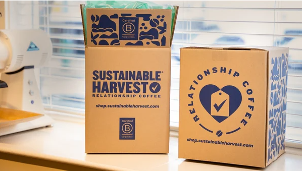
Sustainable Harvest’s subscription coffee box ships in branded packaging with imagery that conveys their mission of sustainability, relationships, and quality. They ship 36 lbs of coffee in each box, delivering more product at once to reduce waste and maintain their eco-friendly commitment.
Consumer Testing and Iteration
Sometimes your packaging ends up perfect the first time. But other times, you’ll need to iterate or change something along the way.
Consumer testing is a valuable way to gauge the success of your packaging, gather feedback, and determine if any changes need to be made before you sink capital into distribution and marketing.
You can conduct consumer testing by:
-
- Asking for volunteers in groups to offer feedback on your packaging design and messaging
-
- Showing friends and family and asking for their thoughts
-
- Holding formal focus groups (which can be expensive)
-
- Conducting surveys about tone, feeling, and associations with your packaging design
-
- Speaking directly to customers—many brands that sell at farmer’s markets will gather direct feedback and then tweak their food packaging design later as needed
While it’s most effective to print the packaging and show an actual product for consumer feedback, many small brands need to conduct this testing before printing. You can use a 3D rendering of your design to gather feedback.
If you are not sure where to find potential consumers, spend time networking online and finding where your customers hang out. Many people are happy to provide feedback and engage with you—and the insights you gather from consumer testing could help you avoid costly mistakes.
Remember to always remain flexible and open to feedback. It is better to make changes to your packaging design early on and help pave the way for a successful launch.
Launching a food product business and ready to enlist a design agency? Contact us to get started!
About the Author

Lauren Casgren-Tindall is the founder of Crème de Mint and has been creating powerful, innovative designs over the past 15 years for companies such as Benihana, Juicera, Farafina, Iberico Club, MiSOgood, and Expressed Juice.
References
1 What Is the Failure Rate of New Items Launched in the Grocery Industry?
2 Your Eyes Eat First: How Food Packaging Directly Influences Sales
3 16 Impulse Buying Statistics Retailers Should Know
5 You’ve Got 8 Seconds to Grab a Customer’s Attention. Here’s What to Do.
6 Brand Storytelling in 2024: The Latest Statistics and Trends