The Challenge: Energy Drink Label Design for Juicera
Juicera, a Florida-based juice brand, launched the sub-brand PerfectO, a healthy energy drink alternative. The founder wanted to create something that provided natural energy, without the jitters, and crash-and-burn of popular energy drinks. But, the energy drink needed a label design and a logo that popped and commanded attention. So, they hired Crème de Mint, an innovative packaging design company, to help PerfectO stand out on the shelves and engage consumers interested in healthy energy drink options.
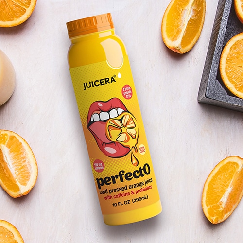
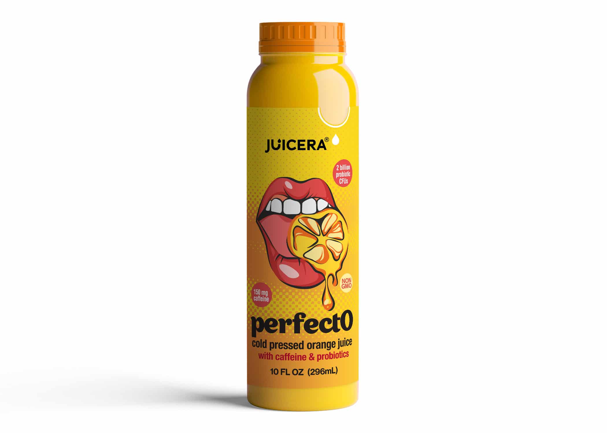
PerfectO used green coffee beans to create an organic caffeine boost. In addition, they added probiotics to nourish the body while lifting energy levels. The beverage also contained no added sugars or artificial flavors.
It’s a complete complement to our portfolio, as it’s centered around health and wellness, non-GMO, organic, kosher and as always, no added water or sugar. PerfectO is a clean option for cold pressed energy.
— Lori Robinson, Vice President at JUICERA
THE PROJECT
PerfectO was interested in Pop Art-inspired designs that would command attention.
PerfectO was interested in Pop Art-inspired designs that would command attention.
They wanted the brand to appeal to a broader demographic than the nutrition enthusiasts who made up Juicera’s consumer base.
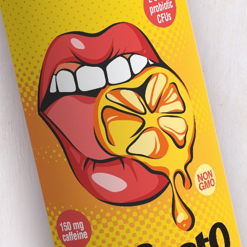
Pop Art merges pop culture with fine art, incorporating bold images, comic strip illustrations and humor. Think of the artistic style of Andy Warhol and Roy Lichtenstein, for instance. Hence, we created the Pop Art style image of the mouth and the juicy orange. It had a bold, eye-catching retro vibe and reflected the flavorful, natural juice base of the product.
We created a branding presentation that showed three different Pop-Art themed brand concepts for the label, each with vivid colors and retro typefaces. This presentation allowed PerfectO to see their vision come to life and choose between three different directions for the energy drink label design.
We also used a funky 60s typeface to play up the Pop art theme and draw focus to the name of the brand. The vibrant pink and orange brand colors represented fruity freshness, fun, and energy. The halftone background is a nod to old comics, continuing the funky Pop Art image and creating an intriguing element on the bottle.
The results: Energy Drink Package Design With a Pop Art EdgE
As a result, Crème de Mint’s designs set the stage for PerfectO to join Juicera as an established and successful healthy beverage brand. The packaging spoke to the brand’s desired demographic, offering a flavorful, enticing, healthy alternative to sugary, caffeine-fueled energy drinks.