Windmill Health Products is a company dedicated to providing high-quality, innovative health products to the market. They needed a new logo and packaging designfor their coffee and tea brand, Rapid Fire. Rapid Fire is a ready-to-mix keto coffee brand designed to promote healthy metabolism and weight loss. The brand uses organic coffee and tea packed with nutrients and healthy fats to align with the keto diet. Windmill is known for many of their top-performing brands, including Keto Science, a line of meal replacement shakes, supplements, and weight loss products.
Rapid Fire targets health and nutrition aficionados and keto diet enthusiasts. Particularly, people who love the taste of coffee and tea but want to get more out of their morning beverages. The original designs for the brand were complex and busy. When Rapid Fire decided to rebrand, they needed designs that were clean, readable, and modern. They also wanted designs that commanded attention and resonated with their target audience.
The Project: Updated Packaging Design for a Coffee and Tea Brand
Brand Presentation
Crème de Mint, our visionary branding agency, created a brand presentation that helped the company visualize the brand elements. This helped them see how new designs could create a cohesive identity under the rebrand. The presentation offered different concepts for the direction of the rebrand. These included inspiration, typography, colors, and images to go with each. The presentation gave the company a clear vision of their branding and helped them make the decisions that shaped the designs.
In addition to the original brand presentation, we also developed a presentation specifically for the tea line. This presentation included consumer research, market analysis, and the process behind the designs for the tea line. It gave the company insight into the purpose and meaning of each design element and the way they wove together to support the brand image.
Brand Identity and Logo
BEFORE
AFTER
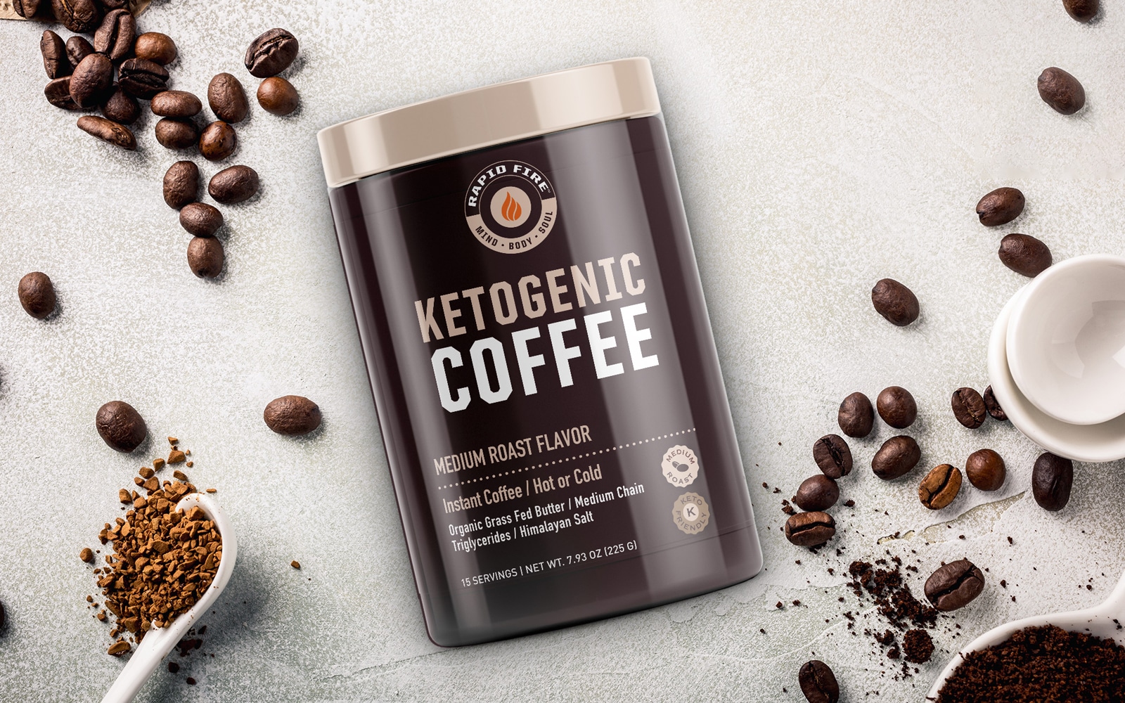
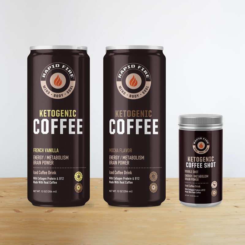
Rapid Fire’s logo was too simple, while the coffee packaging design was convoluted. The containers were packed with words that made it difficult to instantly discover the benefits of the products. We wanted to add pizazz to the logo, designing something that would catch the eye and provide an intriguing element on the package. We kept the fire icon but simplified it and magnified it so that it became the central focus of the logo rather than a minute detail.
The circles symbolize wholeness and totality, reflecting the quality of the ingredients and their impact on health. We added the tagline “Mind | Body | Soul” to communicate the benefits of the product. For the typography of “Rapid Fire,” we selected United San Heavy Condensed—a powerful and commanding font that evoked strength and focus. The secondary, slimmer font of Myriad Pro Regular balanced out the logo and created a layered look. The words arch around the fire symbol, drawing the eye and adding a modern element to the logo.
Tea and Coffee Packaging Design
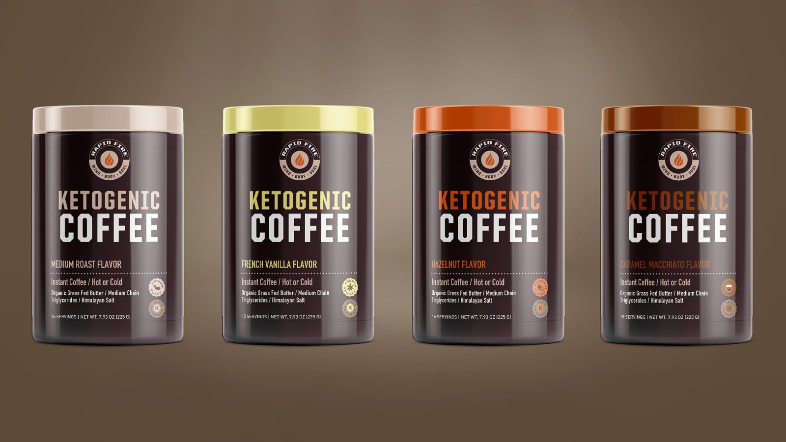
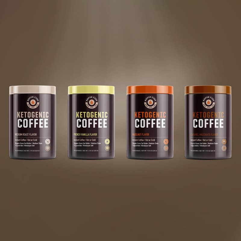
We wanted the coffee packaging design to highlight the nature of the products and their benefits right away. The updated designs were cleaner, sleeker, more modern, and more readable. We removed the excess typography on the packaging, drawing focus to the product names: Keto Coffee, Turbo Creamer, Slim Tea Herbal Detox, Immune Brew. The names indicated the benefits, offering consumers an instant understanding of what they were looking at.
For the brand’s coffee line, we transformed the plain off-white creamer packaging to an inviting hazelnut brown. Pops of color in the lids—yellow, green, and orange, added warmth to the rich brown packages, catching the eye and balancing the look.
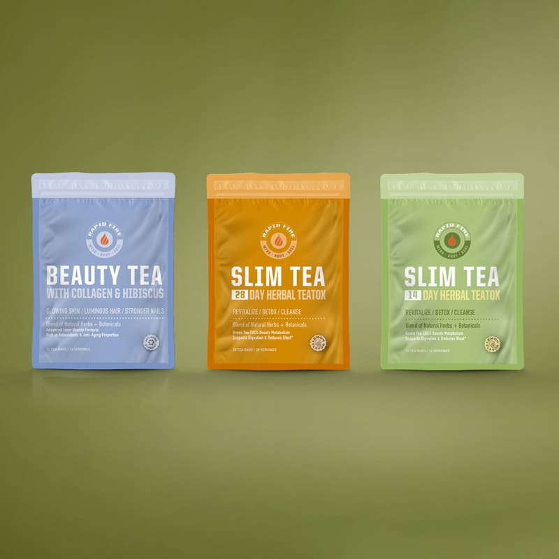
The rebrand also included the launch of a new tea extension line, with hydrating electrolyte beverages, single-serving nutrition shots, and latte mixes.
We brought a nature-inspired element into the tea line, replacing the bright colored packages with a fresh green that evoked health, reminiscent of green smoothies and juices. The tranquil blue of the beauty tea and energetic orange of the detox tea distinguished those products and brought their purposes to life.
The blue of the Opti-Hydrate line packaging represents a refreshing sensation of water, while the colored typeface reflects the main ingredient. The icons highlight the flavor and benefits of the beverages.
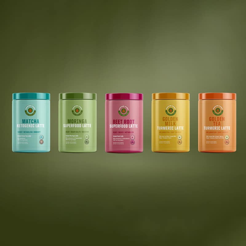
The vibrant colors of the latte line are inspired by the ingredients—earthy green for moringa, deep pink for beetroot, rich gold and orange for turmeric. The packages draw the eye, promising bold, natural flavors.
The shot line’s designs focus on the benefit—joint health, detox, wellness, and beauty. The muted nature colors reflect the products’ organic ingredients.
The results
Our designs laid the foundation for a successful rebrand. They provided a powerful look that reflected the quality of the products and the focus on health and wellness. After the rebrand, the supplements took off, growing in success, attracting followers, and becoming a staple in the keto world.