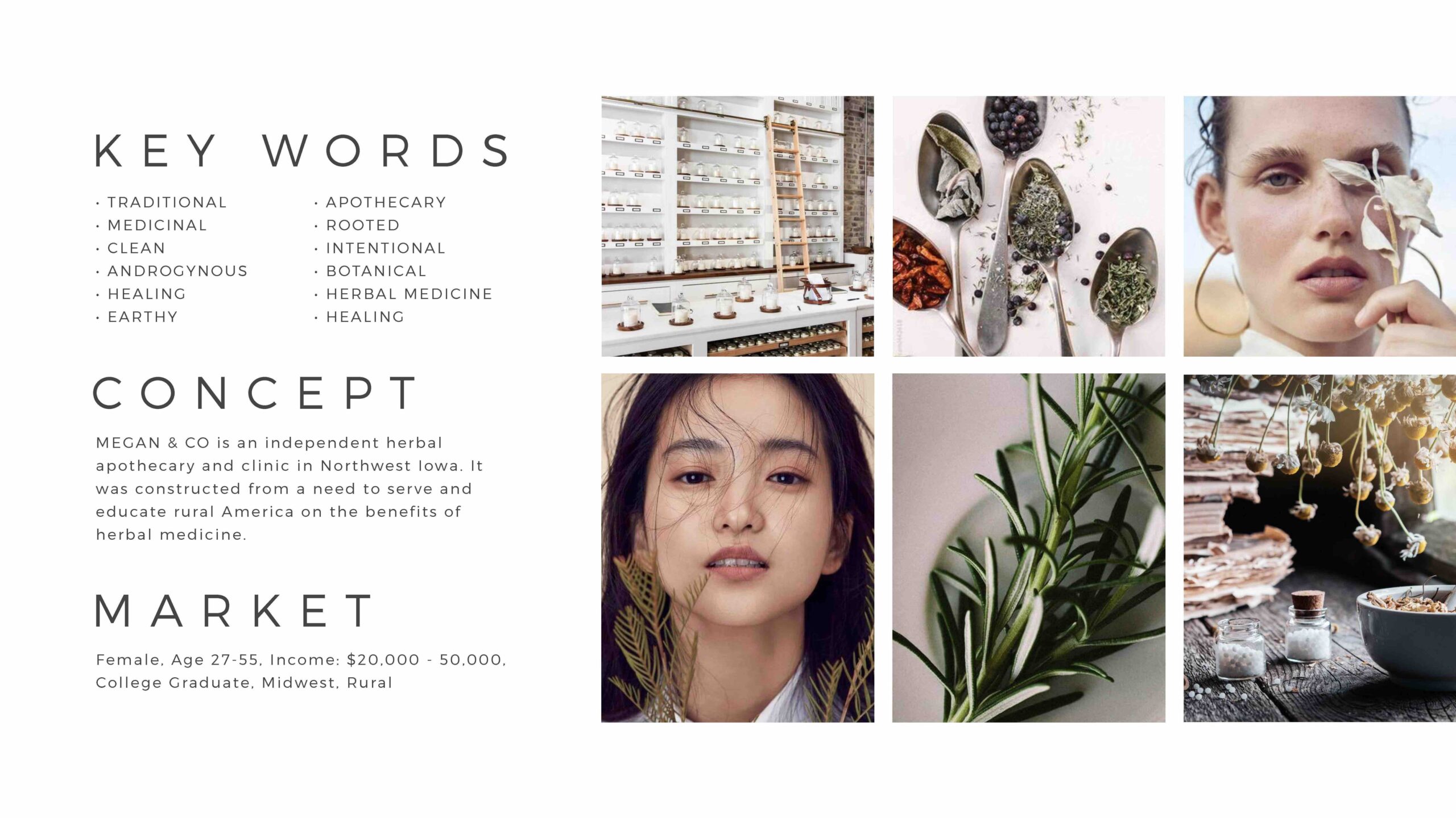
Megan & Co. Herbal Apothecary and Clinic is an herbal education and wellness company in Northwest Iowa. The Herbal Apothecary is staffed by highly educated and experienced Certified Clinical Herbalists, Certified Clinical Nutritionists, and Flower Essence Practitioners who produce organic and wild-crafted supplements, crystals, essential oils, and more.
The Herbal Apothecary is knowledgeable and committed to educating its community on the benefits of herbal medicine. The brand’s founder developed her passion for herbalism and natural medicine through personal experience. As a child growing up in the rural midwest, she was diagnosed with epilepsy. She and her family sought alternative healing options to ease her symptoms but were unable to find guidance or resources. As an adult, Megan discovered sources of natural and herbal healing, improving her health. She made the commitment to spread the knowledge to others in rural America.
Megan & Co. Herbal Apothecary and Clinic produces high-end products, made on-site by herbalists with the best-sourced ingredients available, along with one-on-one healing consultations utilizing the Vitalist approach—a natural healing therapeutic method.
However, when Megan & Co. came to Crème de Mint, a premium branding agency, their designs did not convey trust or connect to the products’ level of quality and credibility. The Herbal Apothecary needed an engaging rebrand and packaging design that inspired trust in its customers and resonated with a rural, small-town audience.
The Brand Presentation Sets the Stage for The Herbal Apothecary
It was important for the branding to convey the healing and natural elements of the brand. The Herbal Apothecary’s products are free of synthetics, chemicals, and preservatives, with premium, simple, natural ingredients, many of which are organic.
The brand’s founder wanted to create a welcoming, approachable atmosphere that appealed to the rural customer base. The Herbal Apothecary served as a welcome into the world of herbal healing. The packaging and branding had to relate to that audience and encourage engagement.
Crème de Mint created a brand presentation that communicated the inspiration for the brand, leaning on natural, botanical images. The presentation solidified the brand image—an iconic and trusted holistic wellness solution, harnessing the earth’s healing properties to create premium plant-based products.
This ensured that all branding elements were cohesive and purpose-driven, working together to position Megan & Co. as a local solution for holistic healthcare.
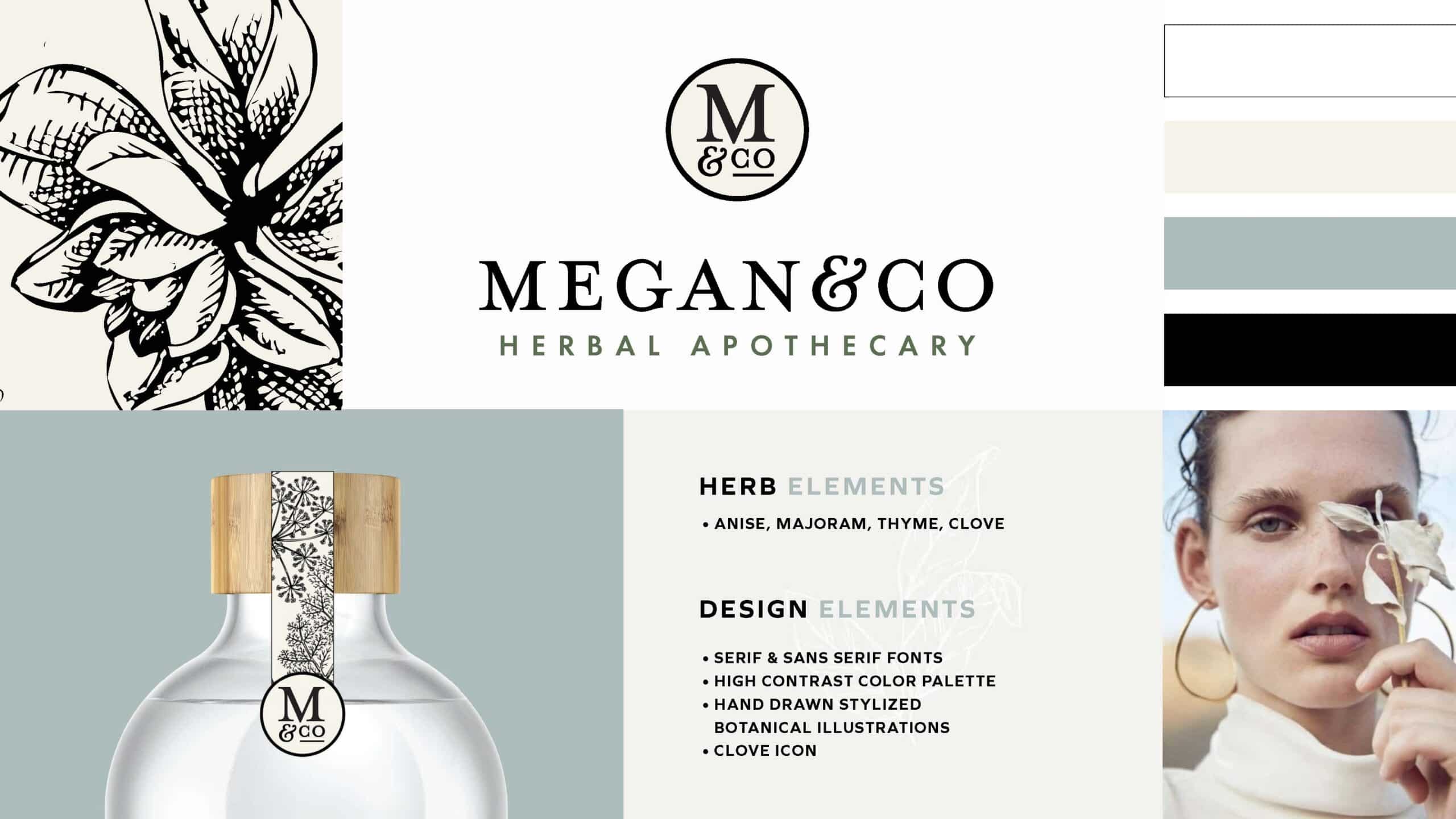
A Sophisticated Logo for The Herbal Apothecary
BEFORE
AFTER
Crème de Mint wanted to establish Megan & Co. as a sophisticated and trustworthy brand. The original logo was plain and lacked visual appeal.
Crème de Mint envisioned a classic logo with modern appeal that was eye-catching and clean, symbolizing the apothecary approach to healing. They designed a distinguished but approachable icon centered around the ‘M.’
The redesigned logo feels like a twist of vintage with modern—a nod to the ancient roots of the herbal wellness industry intertwined with modern research and clinical backing. It also feels trustworthy and warm, connecting to the target audience—rural, small-town America. The brand needed to be friendly and inviting to a local clientele.
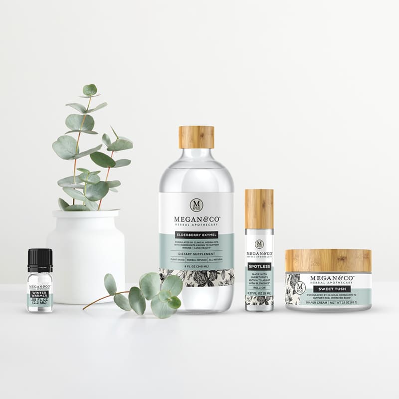
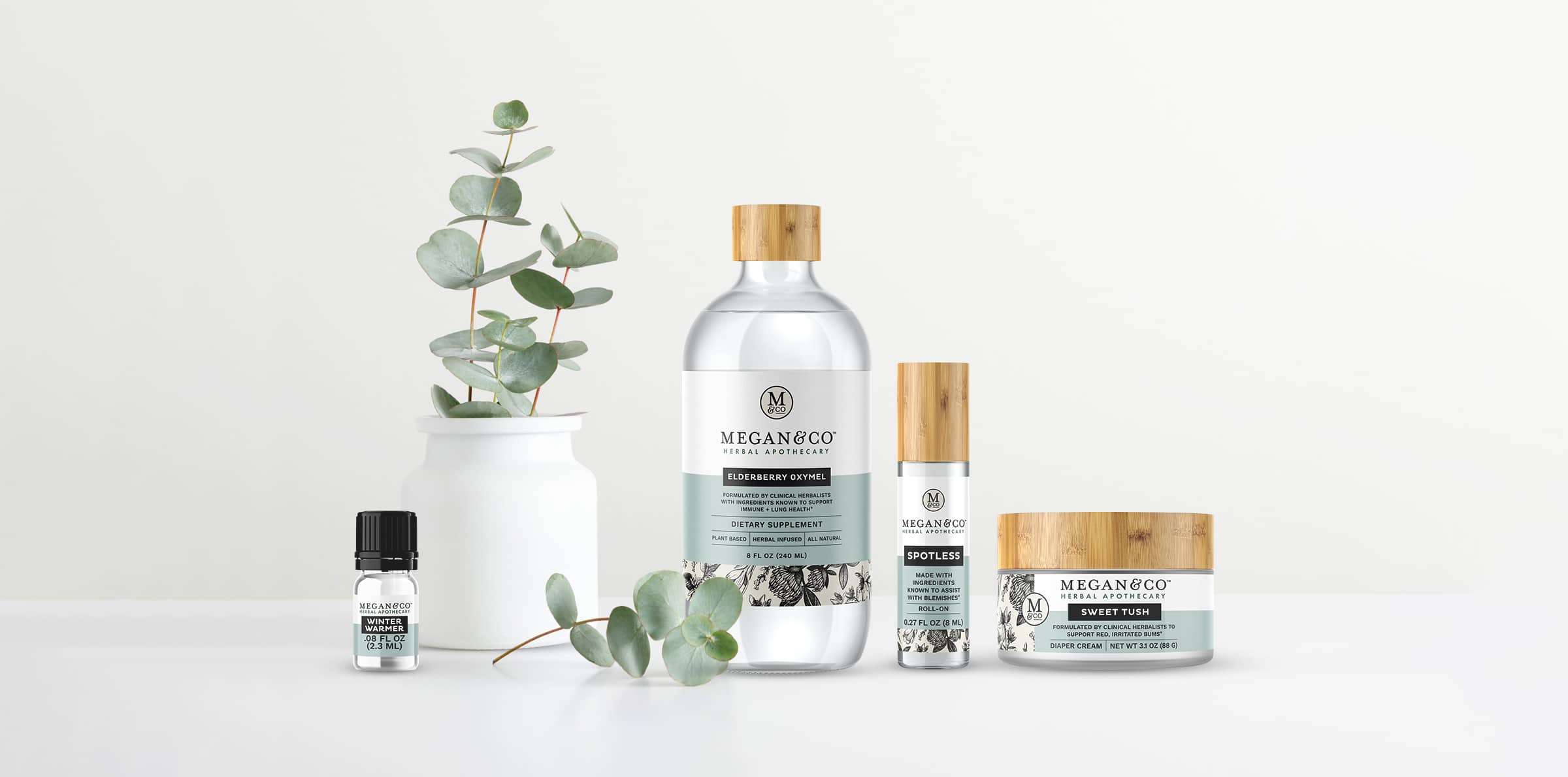
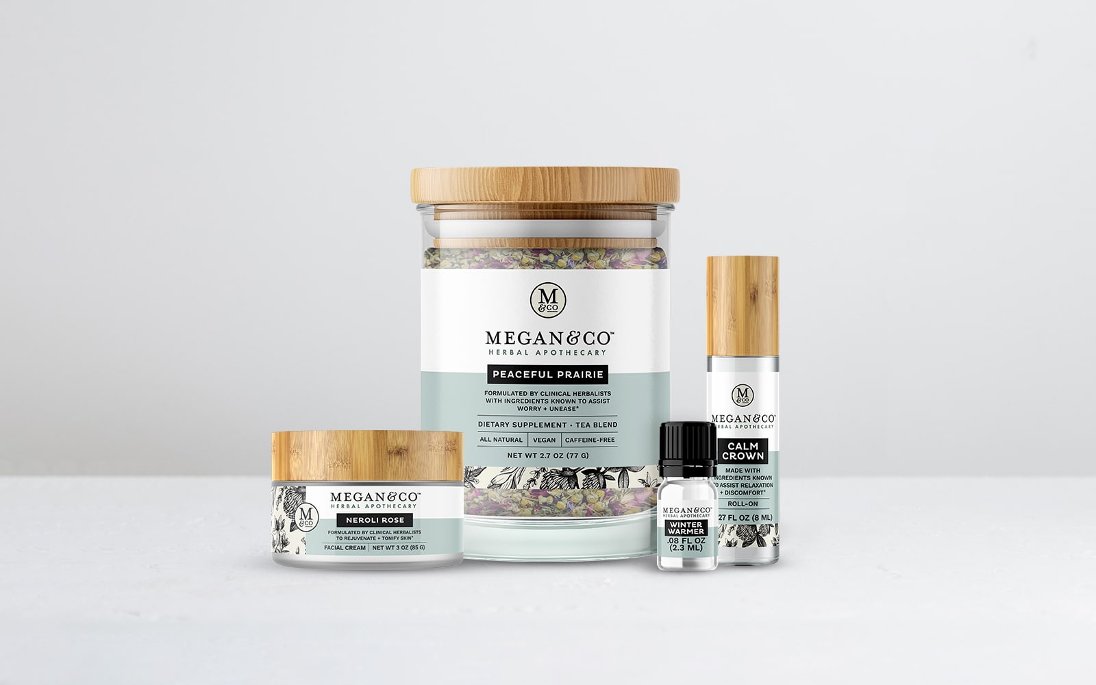
Premium Packaging Conveys Credibility
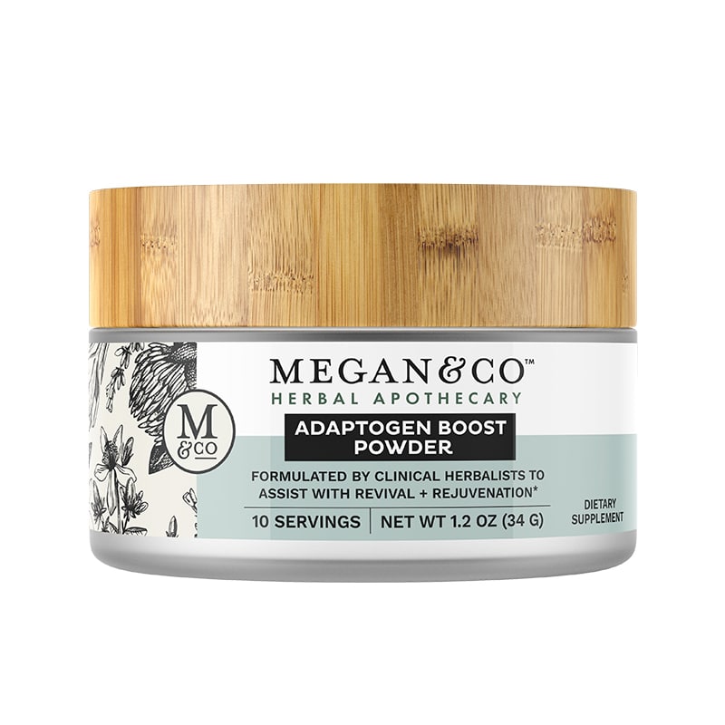
The brand needed a full revamp for over 100 products. Instead of highlighting the quality of the products, the original packaging felt disjointed. It did not elicit trust or connect with the premium image the brand wanted to establish. The stark white labels felt lifeless, while the outlined font of the product names was distracting.
BEFORE
AFTER
Crème de Mint knew that the right package design would draw in Megan & Co.’s audience, encouraging them to learn more, interact with the package, and ultimately make a purchase. Megan & Co.’s packaging needed to reflect their level of dedication to premium ingredients and effective herbal remedies.
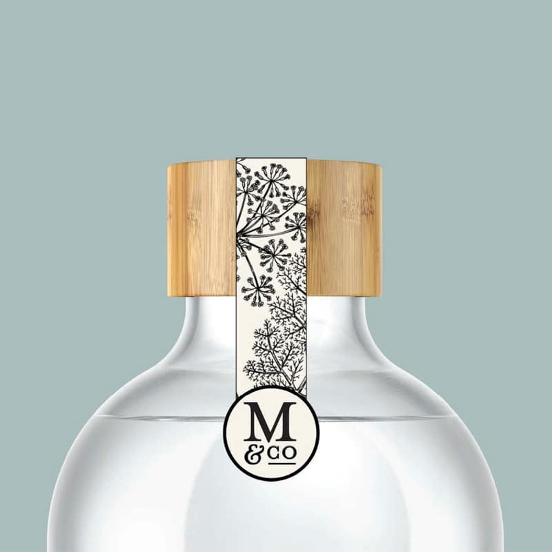
The packaging also needed to pop against the brown wood shelves in the store. Crème de Mint wanted to design something that would stand out and command attention, enticing in-store visitors to engage with the products. The updated packaging design is clean and sophisticated, communicating effectiveness while also remaining warm and inviting. The glass bottles and bamboo lids are visually appealing and more sustainable than plastic alternatives.
Crème de Mint created a custom pattern of hand-drawn illustrations using the store’s actual botanicals. This tied into The Herbal Apothecary’s roots and resonated with the natural-minded audience looking for plant-based wellness solutions.
The hand-drawn botanical elements also appear on tabs sealing the tops of the bottles, continuing that personal touch and herbal inspiration.
Colored bands emphasize product names and share important features while creating aesthetic interest and providing visual contrast against the shop’s shelving, captivating customers. It was important for the designs to appeal to customers in the brick-and-mortar shop. The entire design comes together to show the audience that Megan & Co. is their one-stop shop for natural, plant-based wellness products.
A Unique Twist on an Earthy Color Palette
Crème de Mint wanted Megan & Co. to stand out while still remaining true to its natural roots. Many brands in the space rely on a palette of predictable earth tones. Crème de Mint decided to approach it differently.
Originally, they selected a bolder nature-inspired deep forest green with neutrals. This evolved into a color palette of muted seafoam green, providing an elevated tone and complementing the warmth of the wood background. The palette evokes freshness, warmth, and trust.
Layered Typography Invites the Audience In
Subtle changes to the typography of the brand name reinforce the high-end feel and create a sense of reliability. A mix of serif and sleek san serif fonts creates a warm and engaging layered visual.
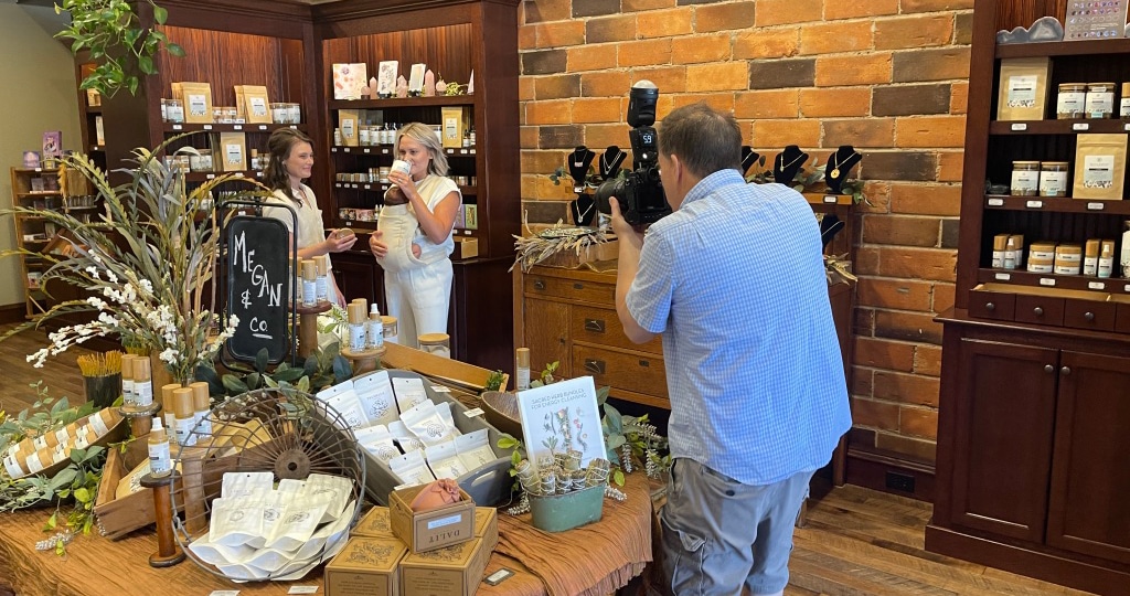
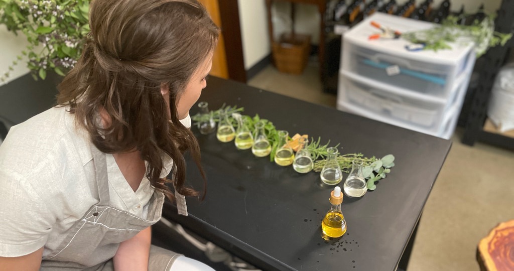
Art Direction and Photoshoot
Crème de Mint wanted to capture a high-end but inviting atmosphere for the brand photography and website. The photoshoot mood boards paved the way for the art direction.
The goals of the photoshoot were to highlight the quality and care that went into the organic, pesticide-free ingredients while creating a calming, warm, and engaging feel with a human element.
The photography needed an approachable human touch, with models representing the rural customer during a social shopping experience. Props would add warmth and reinforce the natural element of the brand, inspiring trust and connection with the audience.
The mood boards laid out the photoshoot vision, providing insight into textures, lighting, and styles, along with a photo list to direct the photographer.
Crème de Mint’s vision and direction led to a streamlined and productive photoshoot, capturing imagery of the faces behind the brand, the quality and integrity involved, and the customer experience at the Herbal Apothecary.
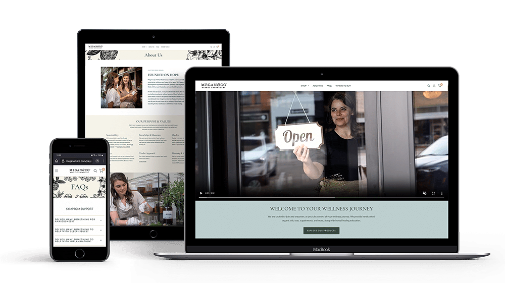
A Polished but warm website
The website for Megan & Co. had to reflect two major themes—a high-end, premium experience and a warm, approachable atmosphere.
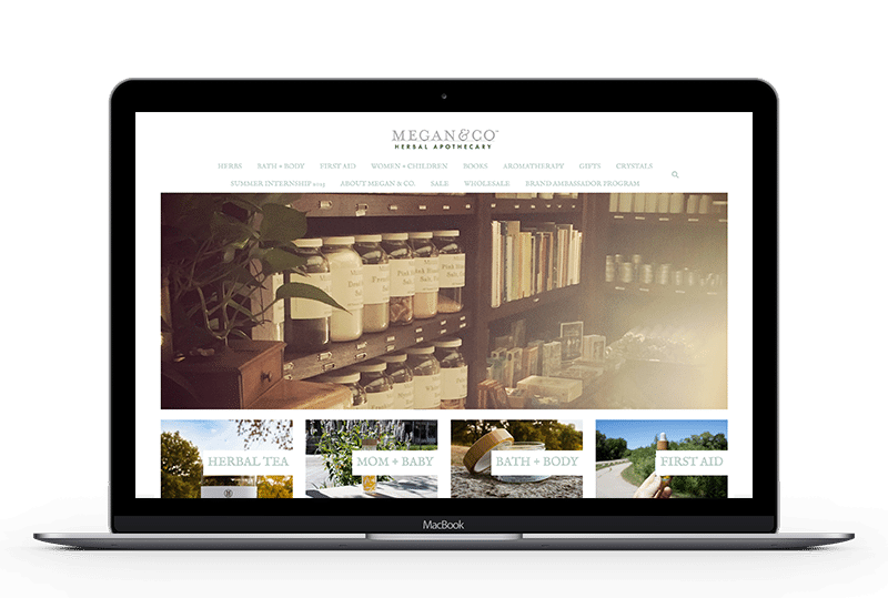
BEFORE
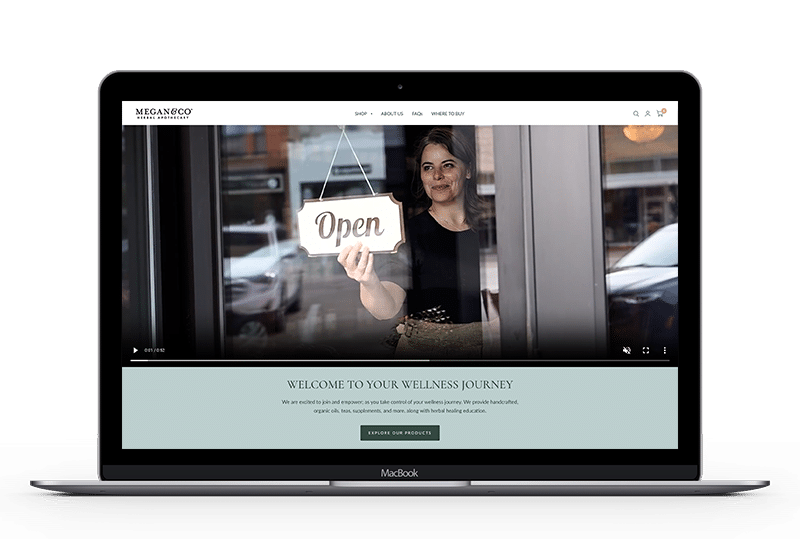
AFTER
Customers visiting the website should feel invited and motivated while understanding the level of quality involved in products and services. The original website didn’t capture the warm and welcoming feeling of the brand —one of the key facets the founder wanted to convey. The redesign focused on the human touch, leading with imagery that established the idea that the same interactive feeling a customer would have when they enter the brick-and-mortar store.
Crème de Mint also created a video that welcomed customers immediately on the website, showing behind-the-scenes processes, the ingredients and attention-to-detail.
Simple but uplifting copywriting contained messaging of empowerment and hope on the journey to wellness.
Clean images highlighted the products while props reflected the plant-based healing. The website was designed to be easily navigated, organizing the 100+ products into simple, clear categories.
Throughout the website, story-driven copywriting established a human connection and provided insight into the brand’s mission and unique benefits.
Simple icons showed customers what made the brand special and conveyed their commitment to the planet, sustainability, and health. The website design is modern, sophisticated, and approachable, providing the same feeling of interaction and positivity that Megan strives for in person.
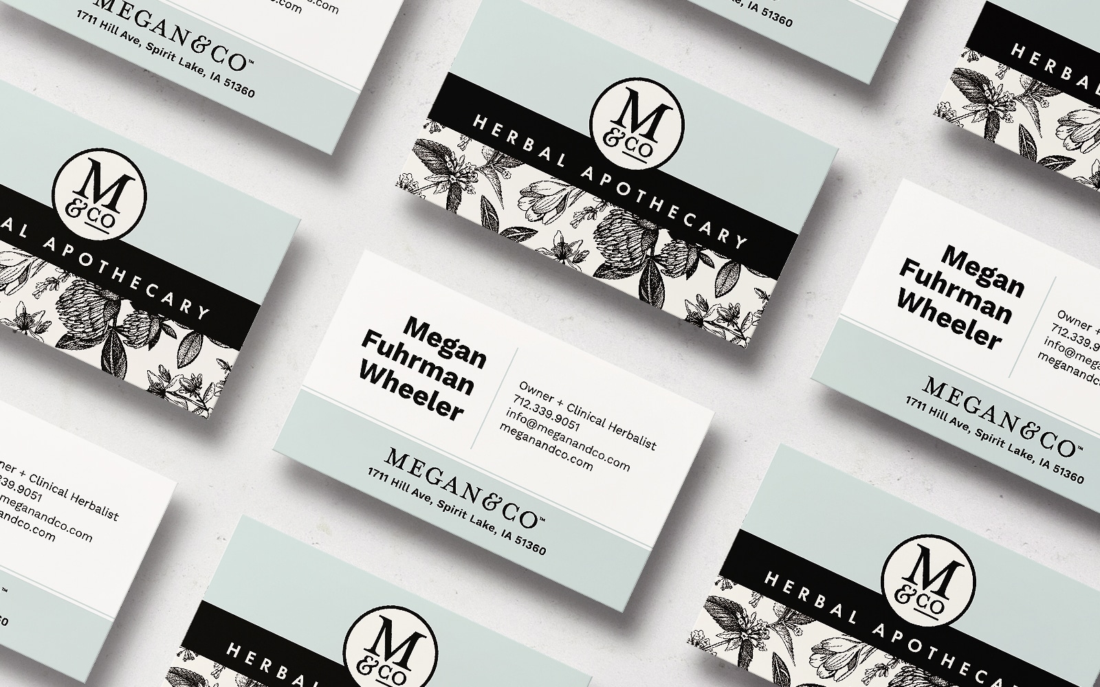
Elevated Branded Marketing Materials
Megan & Co places a heavy emphasis on the value of customer service and a personal touch. They needed marketing materials that aligned with their brand image and communicated the valuable elements of their products to wholesalers and potential clientele.
Crème de Mint created elevated branded business cards to help Megan & Co. make those all-important connections and maintain a cohesive brand image. The hand-drawn illustrations reinforce the natural, organic aspect of the brand. The seafoam band makes “herbal apothecary” pop. The cards are sophisticated, inviting, and memorable.
THE RESULTS
Crème de Mint’s rebrand of Megan & Co. transformed the brand image. Elevated designs and packaging replaced amateur labels, connected to the audience, and formed a brand that could stand out, charge a premium price, and attract new interest. The designs have attracted new customers to the Herbal Apothecary’s brick-and-mortar shop and allowed her to grow her online presence as well.
The packaging design won the 2022 Graphic Design USA award in the Health and Wellness category and has been selected by The Academy of Interactive and Visual Arts for a Davey Gold Award.