Tio Gazpacho is the first of its kind in the market—drinkable gazpacho (a traditional cold Spanish soup). They needed a package design that would highlight what the product was, pique interest, and encourage consumers to try out this wholesome, healthy veggie option.
The founder moved to Spain and fell in love with their to-go gazpacho options. When he returned to the US, he was determined to bring that tradition with him and create the country’s first to-go gazpacho. The product was similar to a savory smoothie, something unlike anything else here.
The designs needed to be eye-catching and offer a peek at the delicious product.
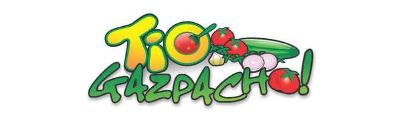
Originally, the client was selling the product at farmer’s markets in plain bottles with a traditional, Spanish-inspired logo.
But he wanted to sell his product in Whole Foods and target a juice-crazed, health-oriented clientele. He had not planned to revamp his logo, but we knew that he needed a more modern approach to resonate with the target consumer.
He agreed to the logo design, and we got to work on a logo that would reach the clientele he desired. The logo is bold, modern, and versatile. We used a leaf as the accent mark over the “i,” a symbol of the fresh, delicious vegetables inside the soup. The brackets around “gazpacho” symbolize what’s inside the bottle.
We created a custom font that was friendly, prominent, and inviting— we wanted “tio” to stand out and be as original as the product itself. For “gazpacho,” we used Myriad Pro Regular, a clean and simple typeface.
For the brand colors, we used a palette of green, red, and orange— the colors of the tomatoes used in each of the three gazpacho variations. The colors also represented nourishment, health, and flavor.
Package Design
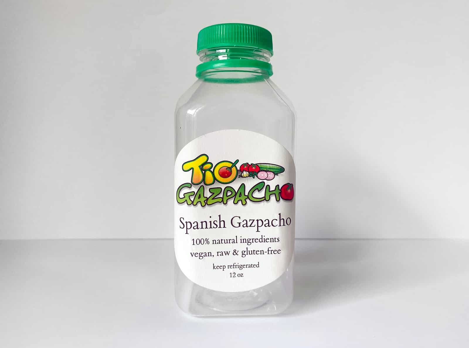
We decided that the bottle needed to be similar to other juice companies. The goal was for consumers to associate it with smoothies, V8s, and other veggie-based juices— a grab and go drinkable soup.
BEFORE
AFTER
The founder wanted a clear label to showcase the product and reveal its freshness and wholesomeness. We kept the label clean and simple to keep the focus on what was in the bottle and to represent the organic simplicity of the ingredients.
We created the tagline “drink your veggies” to appeal to the health-oriented target consumer.
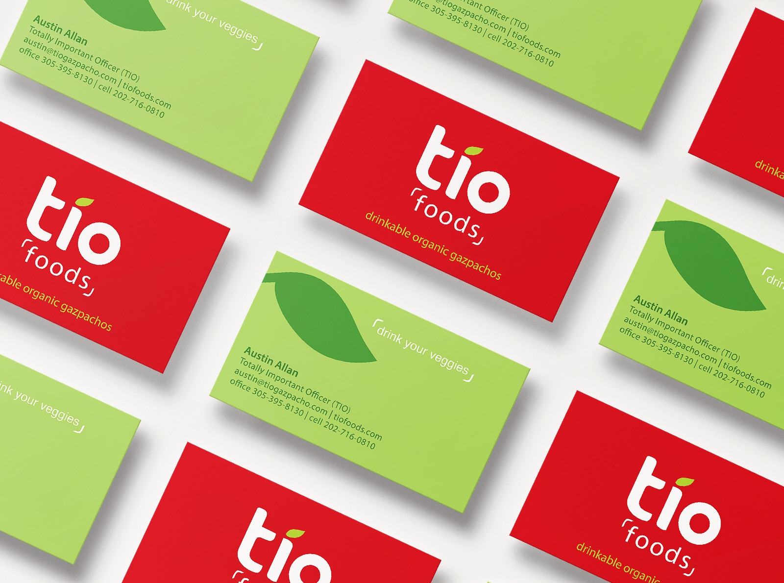
Business Card Design
We designed business cards that highlighted the fresh, organic, modern appeal of the brand, and established the founder as a professional bringing an original product to the market.
The Results
The package design laid the foundation for Tio Gazpacho to expand and grow. Whole Foods did end up selling the product, accomplishing the founder’s original goal. It was even acquired by General Mills four years later. The acquisition brought national attention to the brand, which was featured in Forbes and Food Business News.
We were also honored with the 2014 HOW International Package Design Award for the package design.