

There are several reasons why you might be considering rebranding your packaging.
As much as we might like to think that our initial packaging will last forever, the truth is that design needs change over time.
Changes in consumer behavior and trends, an evolution in your brand, or a decrease in sales might leave you needing new CPG packaging design.
If you’re considering a packaging rebrand, read on to find out why a refresh is often needed and how to successfully rebrand (we’ve also included some examples of our packaging rebrands!)
Why Rebranding Your Packaging Might Make Sense
Rebrands make sense in several scenarios: If you or your retailer notice that your brand isn’t selling as well, if the market or consumer behavior has shifted, or if your original packaging looks outdated.
You also might find that as your brand changes, your packaging doesn’t reflect a cohesive brand image.
Another reason you might rebrand is if your clientele changes over time. (Your packaging should always resonate with the target audience you want to serve!)
Rebranding your packaging can seem intimidating, especially if your brand is well-established and your packaging is easily recognized. So you always want to make sure you have a solid reason behind the rebrand!
But in the right situation, rebranding your packaging can refresh your brand, give it new life, and establish a strong brand story and image that connects to customers.
Why Rebranding Your Packaging Matters
Your package design serves as a mini-billboard for your product. It can communicate what your product does, what sets your brand apart, and why your customer should try your product over every other option!
Great package designs catch the eye, command attention, and encourage engagement and interaction with your customers.
Your packaging should be impossible to resist! Every part of your packaging, from the material you use to the logo to the colors matters, especially if you’re in a competitive industry.
Successful Packaging Rebrands
We have rebranded the packaging for several clients, helping them give new life to their brands and appeal to their audiences. Let’s take a look at some of our rebrands and why they worked:
Amaranth Vase Company: Highlighting the Unique Aspect of a Brand
Amaranth Vase Company created a vase that solved problems for their customers. Their unique product allowed customers to easily water and trim flowers without removing them from the vase and disturbing the floral arrangement.
But their original packaging did not advertise what made the product stand out. Looking at the front of the package, customers didn’t know why they should choose Amaranth.
We wanted the rebrand to bring vibrancy and warmth to the package, as well as highlight the product’s unique design.

The addition of floral imagery caught the eye, while the easy to read infographic showed what made the product special right away. We also added stronger images on the sides that allowed customers to visualize the way the product worked.
After the rebrand, Amaranth got national attention, including a feature on Good Morning America’s Deals and Steals.
Dr. Carol, DVM: Adding Sophistication to a Supplement Brand’s Packaging
Dr. Carol DVM Dog & Cat Formula offers supplements designed to help pets live long and healthy lives, created by an integrative veterinarian. The brand was originally sold in the founder’s office, but when she wanted to expand to online sales, she needed a packaging rebrand with a more professional feel.
The original packaging was busy and distracting. We wanted to simplify and minimize the packaging, creating a sophisticated image while preserving the warmth and personal touch of the brand.

We rebranded the packaging for both the main line of supplements and the sub-brand PAAWS—a supplement line to promote youthful energy and longevity.
In the updated packaging, we replaced the busy color gradients, with a palette of eye-catching solids, designating one color to pair with each important healthcare essential. To keep the brand’s warmth, we also added dog and cat icons to simplify the packaging but still highlight the love of animals.
The updated packaging reflected the trustworthiness and expertise of the brand and appealed to pet owners everywhere.
Juicera: Refreshing Warmth for a Juice Startup
Juicera, a Miami-based juice startup sold in Whole Foods, wanted to expand their brand and reach more vendors. Their original packaging didn’t offer a unique aspect. It blended in with other juices on the shelf.
The rebranded packaging needed to catch the eye and reflect the freshness and natural aspect of the cold-pressed juice brand.
Before:

After:
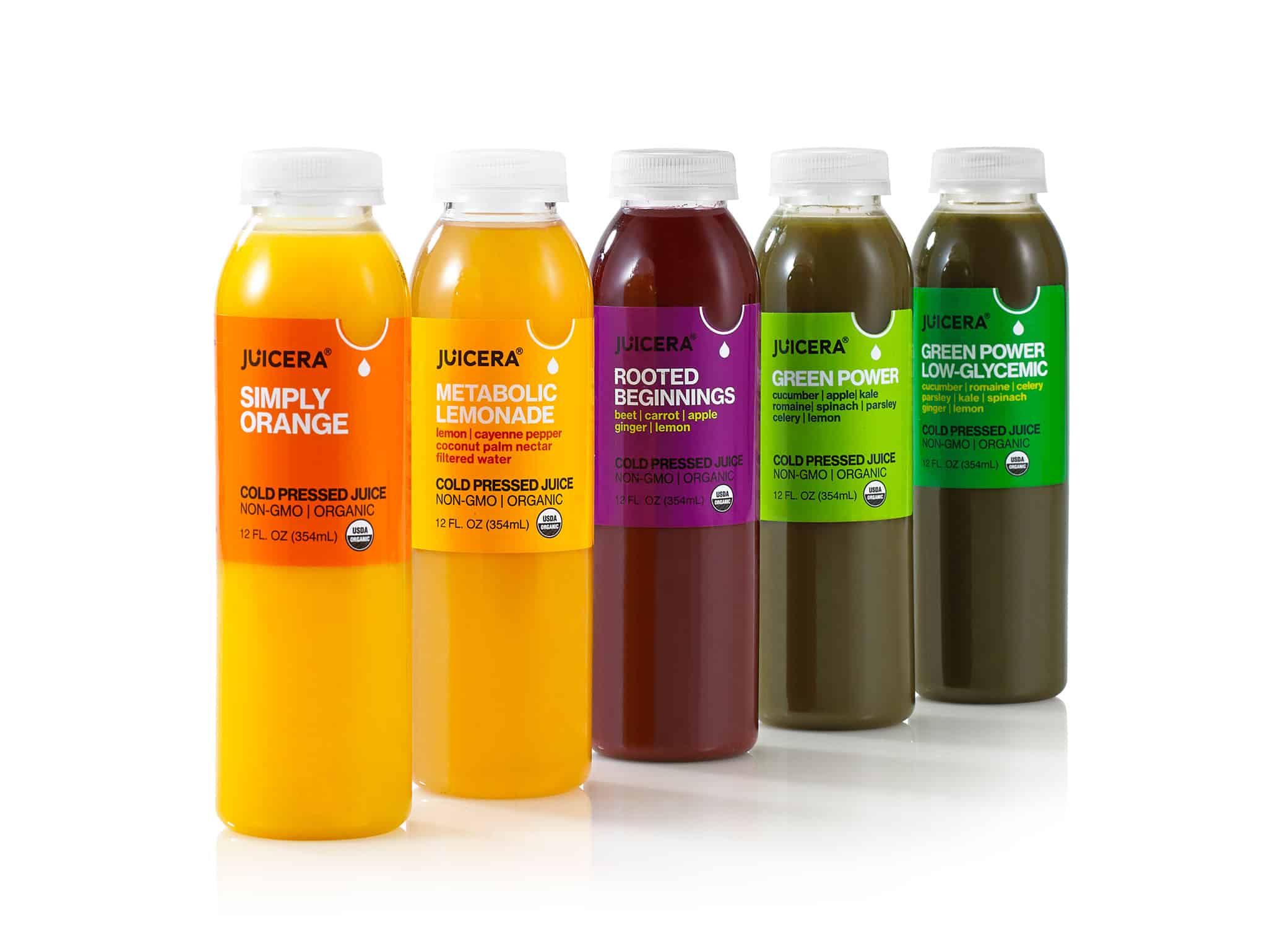
Our new designs for the packaging were simplified but eye-catching. The vibrant colors represented the wholesomeness of the products, while the U-shaped cutout offered an interesting visual.
The packaging designs resonated with Whole Foods and allowed the brand to grow and thrive. Since our work on the project, Juicera has expanded to over 150 locations, including restaurants, hotels, and grocery store chains.
RapidFire: Reducing the Clutter and Adding a Modern Appeal
RapidFire is a ready-to-mix keto coffee brand designed to promote body fuel and healthy weight loss. Their original CPG packaging design was crowded and cluttered.
We wanted the rebrand to be clean and simple, so customers could immediately see what the product offered.

The updated packaging is sleek and modern. The font is elegant and eye-catching, immediately drawing the eye to what the product is—ketogenic coffee. The pops of color in the lids added warmth and balanced the look.
We also rebranded the CPG packaging design for the brand’s tea line.

We brought a nature-inspired element into the tea line, with natural green, tranquil blue, and energetic orange. The new packaging was inviting and warm.
MiSO Good
MiSOgood is a line of organic, GMO-free soup bases and universal condiments created in Japan with authentic ingredients and expertise. The founders wanted to emphasize that healthy ancient superfoods could be incorporated into modern American cooking.
But the original packaging didn’t stand out. There was nothing to distinguish the brand from other miso options. It also didn’t evoke health, freshness, or nutrition. The brand needed updated designs that felt natural, healthy, and delicious.

Our designs brought an upbeat and friendly feel to the brand, with eye-catching pops of bright color, plant graphics to represent the natural ingredients, and a minute timer to reinforce the ease of use.
The white logo stands out and commands attention. The design also draws focus to the product’s differentiators and health benefits: “NEW”, USDA organic, vegan, non-GMO, and gluten-free.
Overall, the rebrand led to designs that were engaging, warm, and inviting.
Tio Gazpacho: Unique Packaging for a One-of-a-Kind Product
Tio Gazpacho was an on-the-go drinkable vegetable soup inspired by authentic Spanish cuisine. It was the first of its kind in the American market. The founder had fallen in love with on-the-go gazpacho in Spain and realized that America didn’t have a similar product, so he decided to bring the idea here.
He had high hopes for his product, aiming to sell it in Whole Foods, and his original DIY packaging needed an upgrade to present his brand as professional, secure retailers, and reach his audience.

The new packaging had a similar feel to healthy, vegetable-based juices. The clear package showed the actual product and highlighted the wholesomeness.
The clean and simple label keeps the focus on the product, aligning with the organic simplicity of the brand. We also added the tagline “drink your veggies” to emphasize the vegetable base and appeal to a health-focused audience.
Alkaline Herb Shop: Updating the CPG Packaging Design for a Wellness Brand
Alkaline Herb Shop is a supplement line made from wildcrafted, organic herbs that promotes holistic wellness.
The original packaging was too understated and plain. The brand needed a packaging refresh that would pop and catch the eye. It also needed to align with a clinical, trustworthy brand image.

The updated CPG packaging is minimalistic, but modern and clean. It feels earthy but professional, with a dark green band to draw the eye to the product name.
Victoria’s Secret Pink: Packaging to Appeal to a Youthful Audience
Pink by Victoria’s Secret wasn’t originally the youthful, fun brand they are now. The original packaging was positioned to appeal to a 30-40 age demographic.
However, the brand quickly evolved to become more playful, selling cute yoga pants and loungewear that appealed to a college-aged audience.
The line needed updated beauty packaging design that matched the young, fun vibe the line had evolved into.

The new packaging incorporated a sporty logo with fun vibrant colors and patterns. The look evoked energy, zest, and fun.
The packaging continued to evolve, using a friendly handwritten font over bold pink packaging with polka dots. The result resonated more strongly with the youthful audience that the brand ultimately attracted.
Rebranding Your CPG Packaging Takes Expertise
There are so many considerations that go into a packaging rebrand, including market research, understanding of materials, and marketing expertise. Your design has to catch the eye, encourage engagement, offer insight into your product, and look good from all angles.
That’s why it’s important to partner with someone who understands the intricate ins-and-outs of package design.
As one of the top small business branding agencies, we specialize in package design, bringing unique visions and creativity along with practical understanding of packaging.
If you’re ready for a rebrand or you need guidance, our CPG packaging design agency would love to help you. Book a call to get started today!