A Vintage Makeup Brand with Mystery and Allure
A new beauty brand was ready to hit the streets of Miami, but it needed to arrive with a bang. Crème de Mint, a unique packaging design company, established the makeup brand identity as well as makeup packaging design and created a cohesive style that guided the direction of the company, from the brand name to the tiny details. The result was 42 Dubonnet—a cosmetics brand full of mystery, secrecy, allure, glamour, and the roaring excitement of the Jazz Age.

AMERICAN PACKAGE DESIGN AWARD, GRAPHIC DESIGN USA

HOW INTERNATIONAL DESIGN AWARD
- Brand identity
- Package design
- Responsive web design
- Email marketing
- Social media branding
- Copywriting
- Brochures
- Posters
- Postcards
- Business cards
- Brand messaging
- Product naming
- Taglines
- Trade show booth
- Social media ads
- Blog post & Content creation
- Magnets
- Art direction for photography
- Product photography
- Print ready artwork mechanicals
A Makeup Brand Identity
Built on Suspense

The brand needed messaging that reflected the mood of the brand.
Crème de Mint, a premium branding agency, knew that 42 Dubonnet needed a strong identity that set them apart from all the other makeup brands out there. The 1920s theme opened the door, but from there Crème de Mint had to make sure the brand story was told through every element.
First, they needed to establish a company name that would evoke mystery and inspire a sense of intrigue. Crème de Mint landed on 42 Dubonnet, the address of an imaginary speakeasy inspired by a popular 1920s wine aperitif. Thus, the name came with style—and a story.
Next, they needed messaging that reflected the mood of the brand. They wove themes of secrecy, mystery, and beauty into every element. For example, both the tagline “your beauty secret,” and the copy speak of secret adventures, romance, and fun:
“You deserve the power of spontaneity, the ability to ignite your own mystical allure and inspiration—tucked away discretely inside your purse at all times. Anywhere you go—you can open the door to your own, personal speakeasy.”
Makeup Packaging
Design: Art Deco
Patterns That Pop
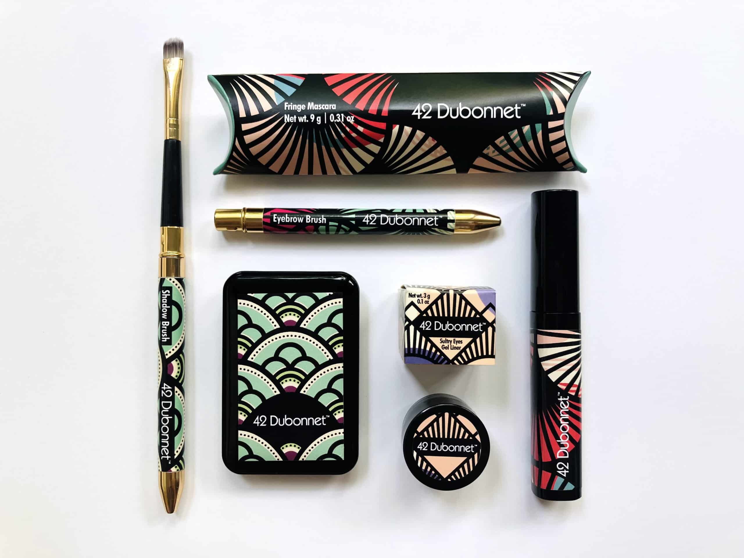
To start, they designed packaging that played up 20s Art Deco with sleek geometric lines and bold strokes of black.
With the basic story established, Crème de Mint moved onto the makeup brand’s visual identity. To start, they created a makeup packaging design that played up 20s Art Deco with sleek geometric lines and bold strokes of black. As a result, the packaging popped with a fresh, original, and dazzling style that built on the brand story. Next, they added unique details to the makeup brand identity.

For instance, images of the Everglades underlay the Art Deco patterns, entwining the vintage feel with a modern aesthetic.
This layering of shape and color feels like you’re peeking through screens to spy secrets, evoking glamour cloaked in mystery.


Thus, the designs set the scene of peering into an exclusive speakeasy you can’t wait to be a part of.
Makeup Packaging Design
That Tells the Story of
The Beauty Brand
Crème de Mint wanted to make sure that 42 Dubonnet stood out. Further, they wanted to create makeup packaging design that was beyond something customers opened, discarded, and forgot about.
To that end, they designed every package with layers, hidden meanings, and connections to the theme. These are more than just containers. Rather, they stand on their own to delight and intrigue the customer.
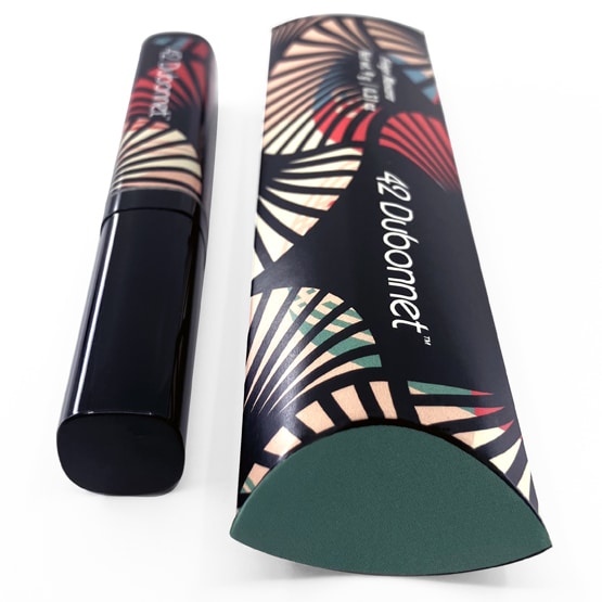
Notice the mascara packaging in the shape of an eye.
The fan-shaped Art Deco pattern on 42 Dubonnet’s mascara packaging reflects 1920’s haute couture. But it is also reminiscent of eyelashes, a theme reinforced by the eye-shaped box. Thus, the package provides interest and visual appeal, telling a story and commanding attention.

The top of the lipstick box forms a sassy pair of lips.
Additionally, the lipstick packaging forms a sassy pucker, a tangible differentiator that’s memorable, bold, and fun to open. Then, a peek inside the box reveals Everglades wildlife—a wink at the brand’s philosophy of sustainable beauty. In fact, a portion of the proceeds for 42 Dubonnet was donated to the Everglades foundation.
Hidden Images With
Important Messages

42 Dubonnet was committed to cruelty-free and sustainable practices. In fact, they donated 1% of their net product sales each year to the Everglades Foundation.
In fact, Crème de Mint wove this mission into the makeup packaging design itself—including hidden images of birds, alligators, geckos, and other wildlife. These hidden features spread the company’s message of sustainability and offered a sense of discovery to customers as they opened their packages.
A gecko hides under the inside flap of the lipstick box. Then, beneath the Art Deco layer is a pattern of Everglade plant life. Finally, each makeup packaging design also contained a secret inspirational beauty message, giving customers another surprise.
Vintage Logo Captures the Beauty Brand Essence
The Art Deco influence reinforced a makeup brand identity with a modern edge.
The Art Deco influence reinforced a makeup brand identity with a modern edge.
42 Dubonnet wanted a logo that was clean and easy to read. In particular, they needed something that could serve as a finishing touch to the Art Deco packaging without distracting from the beauty or getting lost.
Crème de Mint designed a simple logo built on the brand name in a glamorous yet sensible sans serif font. The Art Deco influence reinforced a makeup brand identity with a modern edge. As a result, the logo complemented the elaborate makeup packaging design and served as a reminder of the brand story.
Typography and
Color That Sizzles

For the brand colors, Crème de Mint chose a palette of traditional 1920’s makeup colors of mauve and vermillion.
This selection revealed a glamorous, seductive essence. Then, they combined pops of pastel mint and light blue in a nod to the Art Deco buildings in Miami Beach.
Further, the 1920’s glamour theme also determined the makeup colors. The lipsticks came in shades used in the time period, and the eyeshadow palettes were inspired by the smoky eye trends of the times.
Finally, the typography was clean, sleek, and luxe—suggestive of old world glamour without detracting from the impact of the colors and patterns. Crème de Mint chose Kabel and Futura, geometric typefaces released in 1927 as a nod to the 20’s theme and the Art Deco design.
A Cosmetics Brand
Identity with a
Cocktail Twist
It’s impossible to think of the 20s without cocktails, parties, and Prohibition coming to mind. Crème de Mint named 42 Dubonnet’s products after vintage cocktails and alcohols. Lipsticks and eyeshadows had enticing names like Hotsy Totsy, Pinky Shimmy, Sweet Vermouth. As a result, customers found it more fun to shop for makeup. They enjoyed perusing the color options and reading the unique names. Also, the names reinforced the story and makeup brand identity of 42 Dubonnet.

In addition, Crème de Mint designed cocktail recipe magnets for giveaways to continue the theme and inspire engagement.
The 20s theme continued into the sales sheets, created to attract the eye, inspire interest, and educate about the products. The imagery on the sales sheets is mysterious and intriguing, encouraging the reader to dive in and learn more.

Web Design as Alluring
as the Products
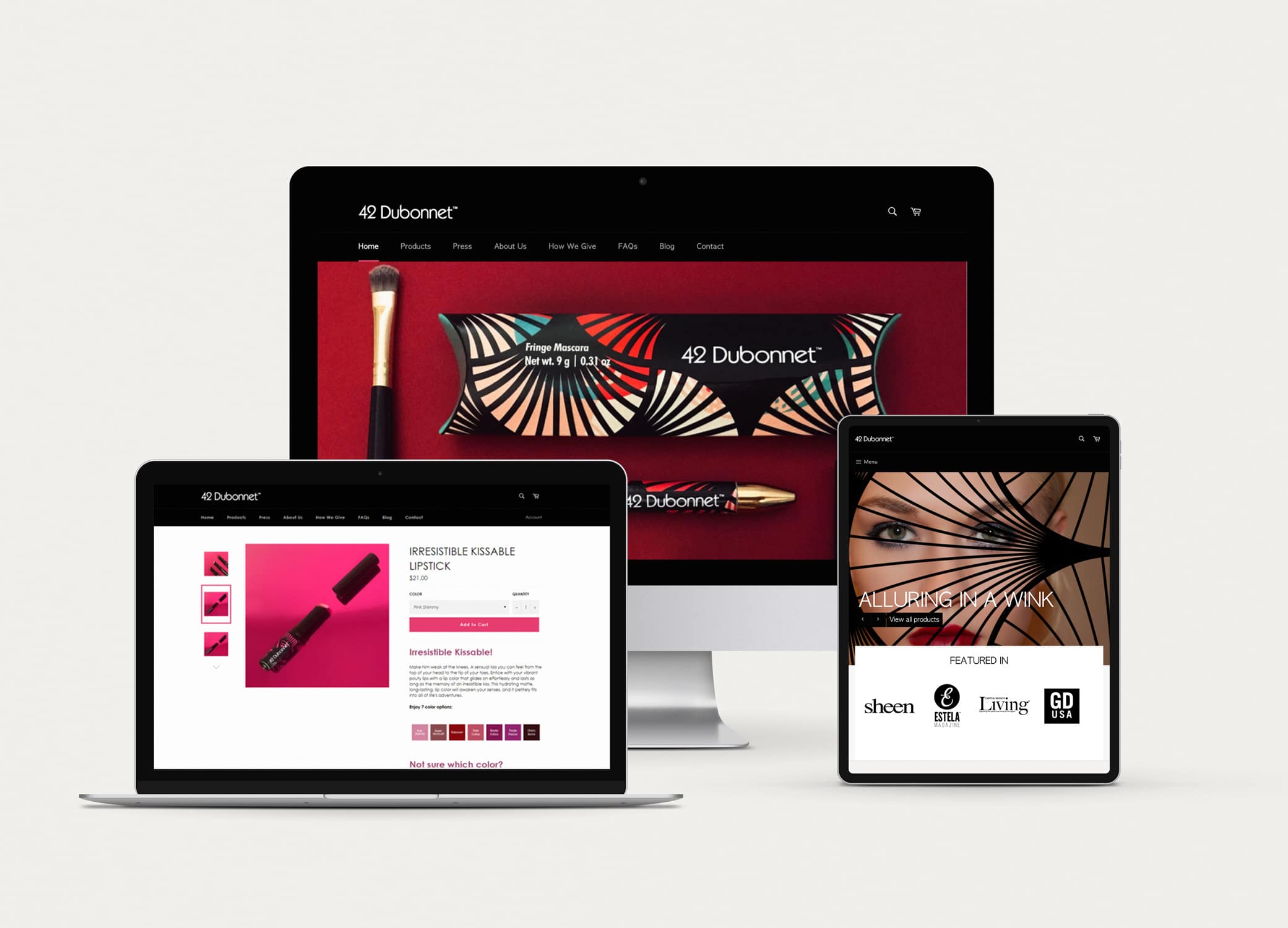
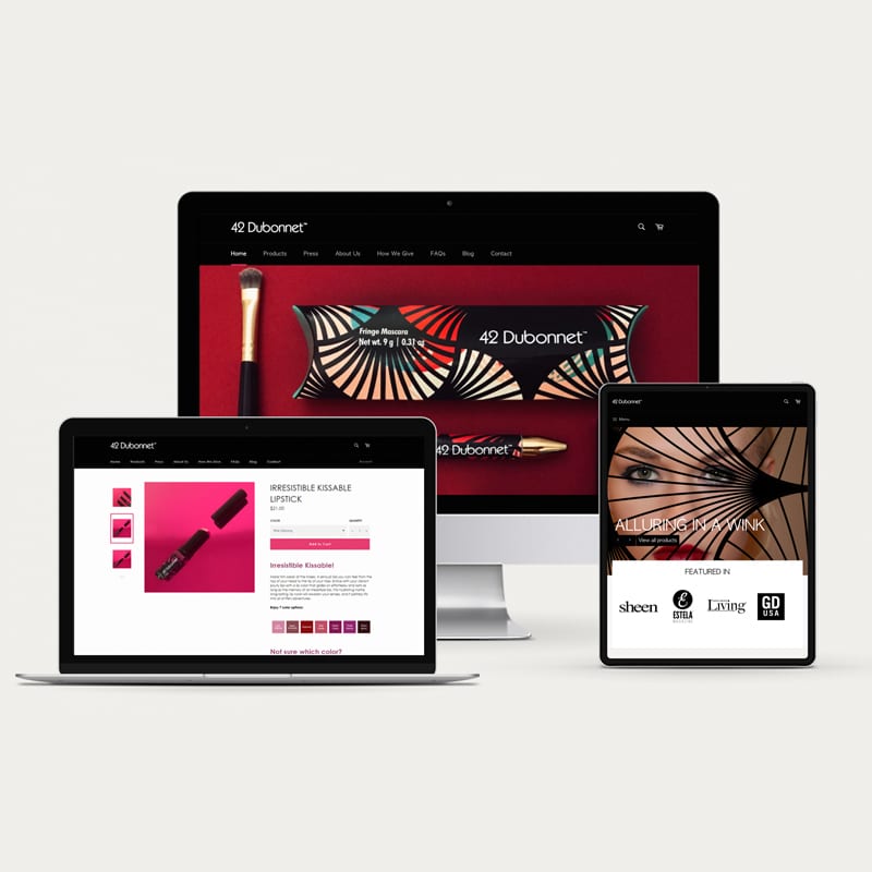
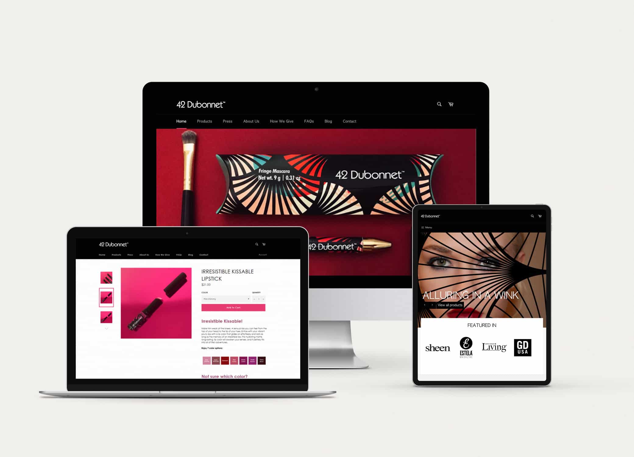
42 Dubonnet’s strategy was to sell primarily online. Of course, Crème de Mint understood that for an online business, its website was the gateway to success. Thus, the design needed to be strong, vibrant, and alluring.
From the hero images to the product photos, every picture pulls the eye and creates the feeling of beauty and romance entwined with excitement, allure, and mystery. Then, the colors pop against the black background, drawing the customer in.
Retro Glamour Meets
Modern Beauty on
Social Media
Crème de Mint designed and wrote all of 42 Dubonnet’s social media posts, weaving the 1920’s mystique with touches of modern beauty ideas. They used a combination of product images, inspirational quotes, and chic model shots, with fun holiday images with pops of bright colors. As a result, this created a consistent presence with visual appeal, intrigue, and allure.
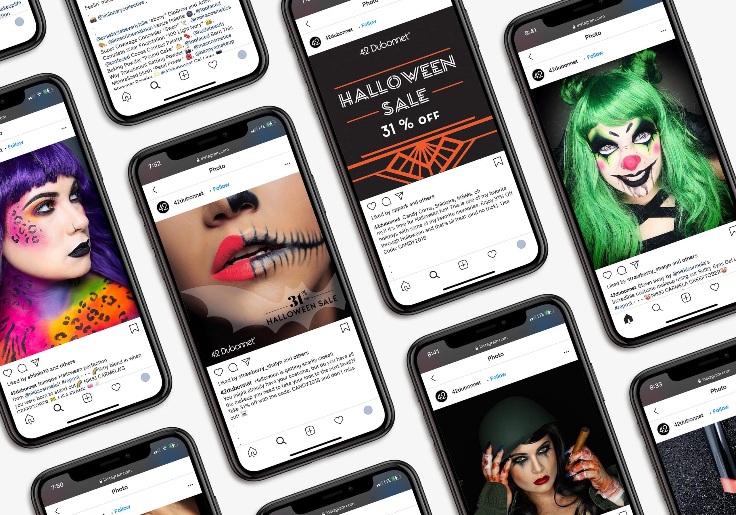
HALLOWEEN CAMPAIGNS
HOLIDAY CAMPAIGN
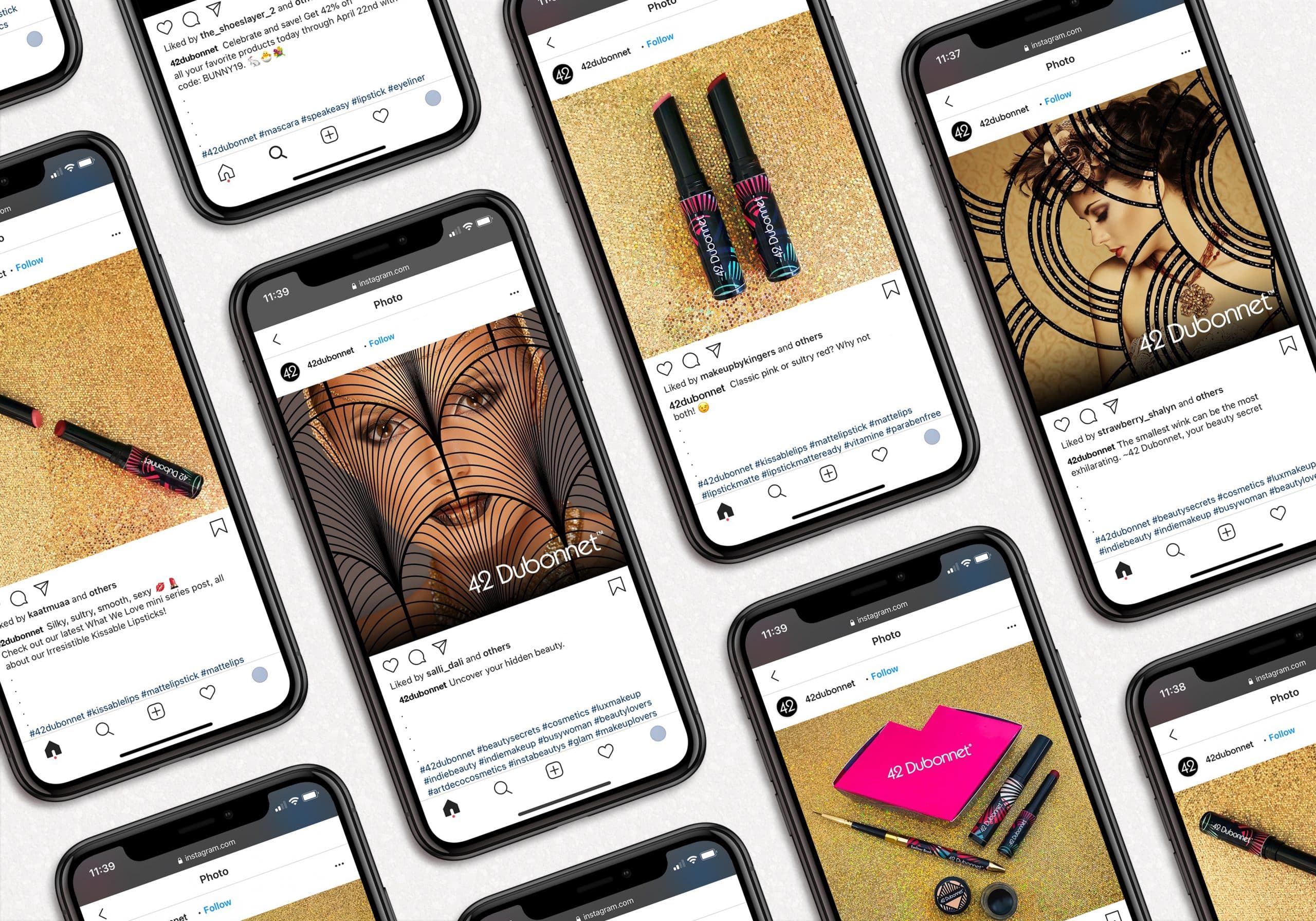

VALENTINE’S DAY CAMPAIGN
Influencer Reach and
Social Web Content

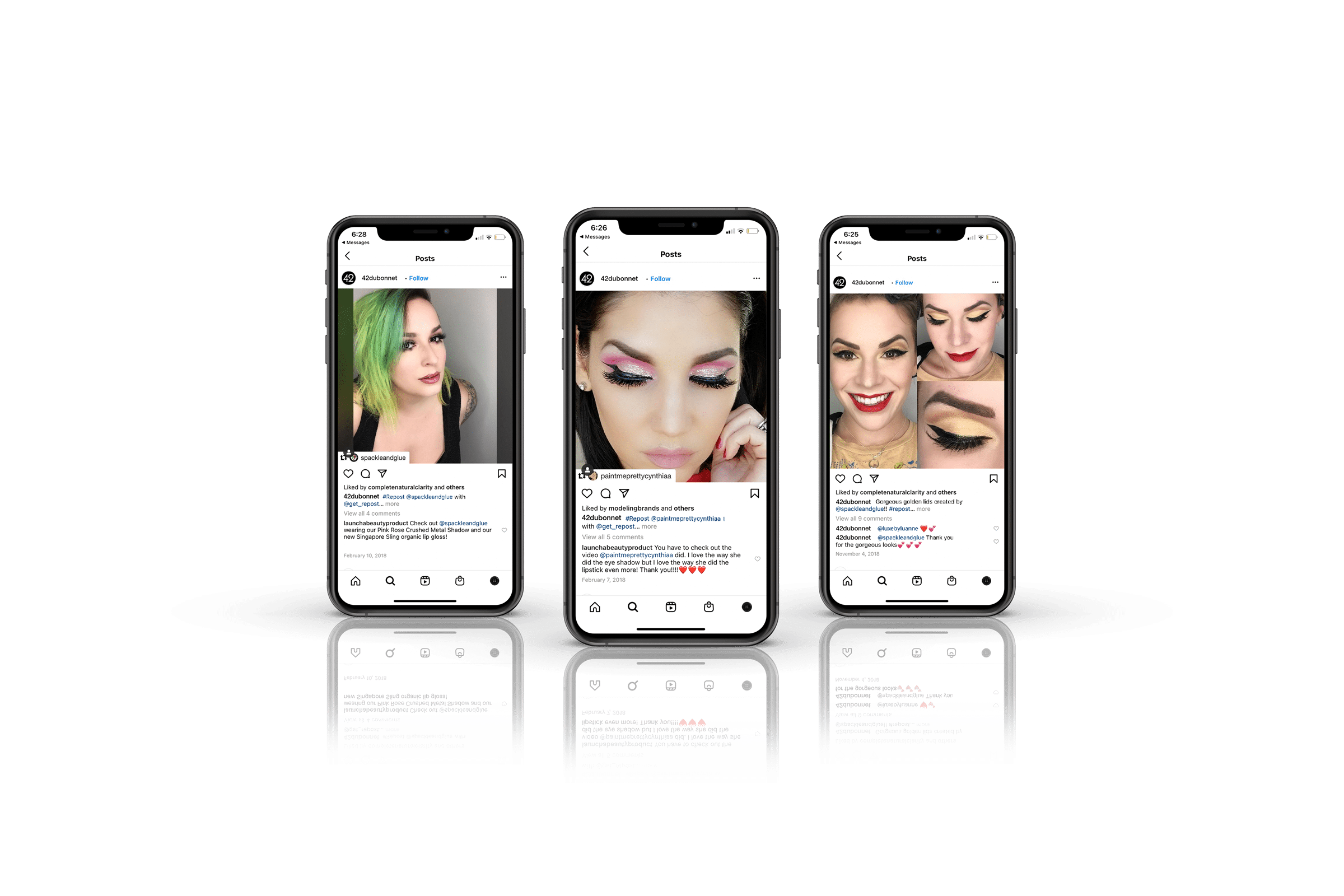
The brand gained attention from influencers and rapidly built a loyal fan following of beauty lovers who were intrigued by the story and impressed by the products. Beauty influencers in particular were drawn to the unique branding and the vintage theme.
The influencers promoted the brand through posts, stories, product descriptions, and interviews. Several of them collaborated with 42 Dubonnet on makeup guides, highlighting the possibilities and potential uses of the products.
Influencer Reach And
Social Web Content
Crème de Mint’s work on their makeup packaging design, brand identity, and web presence opened the doors for 42 Dubonnet.

The brand was intriguing and unique, and Crème de Mint’s work brought focus to that, from customers to influencers to media to design awards organizations.
Finally, the package design won the 2018 American Package Design Award from Graphic Design USA, the 2019 HOW International Design Award, and was featured in The Best of Design 2019 (formerly 365 Days of Design Inspiration), a hardcover book from HOW showcasing the best from today’s leading art directors, studios, and creative professionals.
As a result, Crème de Mint’s designs shaped the brand and carved a place for 42 Dubonnet in the competitive beauty industry, making sure that they would be recognized and remembered.
Are you looking for a glamorous beauty packaging design agency to help you with your new product? Contact us today.


