The Challenge: High-end Social Media Marketing for a Cosmetics Brand
CTRL Cosmetics is a beauty and skincare brand for sensitive skin. The company needed new social media marketing for their cosmetics brand. This included a website refresh, new art direction, and social media branding to help them stand out. They also wanted to make an impression on their target audience. This included women and men who wanted brands that actually deliver on the promise of natural solutions for sensitive skincare.
The founder struggled with skin sensitivities for years and experimented with different products to help. Everything she found was either too expensive, didn’t work at all, or smelled and felt heavy and clinical.
She was determined to find a better way. She collaborated with experienced cosmetics chemists to produce CTRL—a brand dedicated to using science and the best naturally-derived ingredients. Her company’s products are lightweight, moisturizing, and rejuvenating, perfect for sensitive skin.
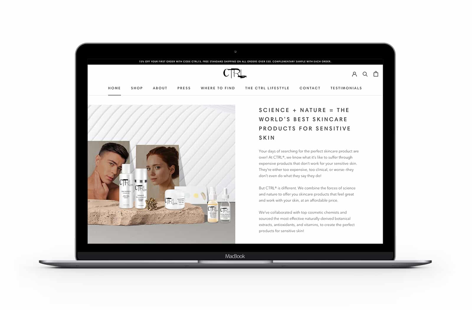
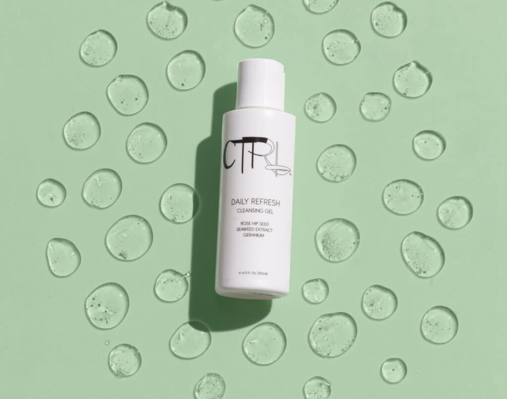
To begin with, the original website lacked a cohesive feel. The images used a wide range of backgrounds in different styles that didn’t flow together. None of the images stood out or captivated the audience.
In our initial website refresh, Crème de Mint, our visionary branding agency, created a unified brand image and elevated the atmosphere. Because the products themselves looked like imitations instead of real items, we faced a challenge. If we placed the products into a real setting, the imagery wouldn’t seem genuine, creating distrust with potential customers. We planned to do a new website photo shoot with a new art direction. However, in the interim we designed the products in complementary surreal settings.
For this, we created images with visually intriguing elements to forge the surreal setting—plants, rocks, and flowers. We added models to bring an element of fashion and luxury to the imagery. The architecturally-inspired backgrounds evoke sophistication, class, and radiance, and tie into the brand’s commitment to naturally derived products.
We rewrote the copy, placing an emphasis on the brand’s distinguishing factor. That is, leveraging science and nature to create products specifically catered to sensitive skin. The copy taps into the audience’s frustrations, constantly searching for affordable products that offer a scientifically-based solution without a medicinal smell.
A Foundational Social Media Branding Kit
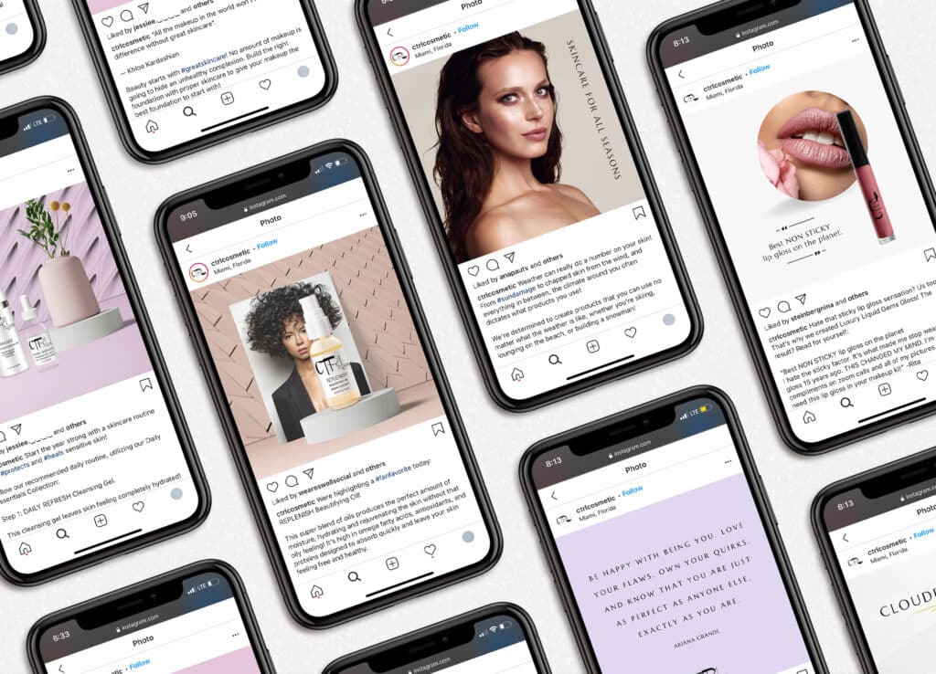
In addition, we created a social media brand kit. This contained all the elements needed to start building a stronger and more unified social media presence. The goal of the brand kit was to lay the foundation for social media success. Our approach was to give CTRL all the components it needed to continue to grow.
We established consistent categories for CTRL’s social media posts, wrote copy and captions, designed the images, and performed hashtag research. Then we utilized a social media scheduling platform, Later, to schedule the posts and set up the tagging. We also designed social media templates on Canva that CTRL could continue using for the future. Finally, we created instructional videos to set them up for future success.
Art Direction Brings the Brand to Life
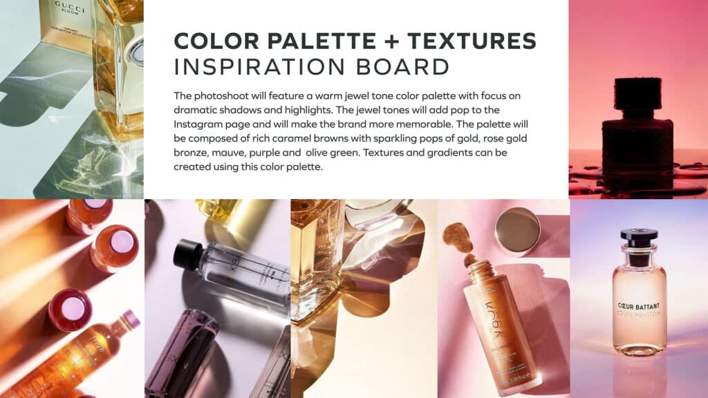
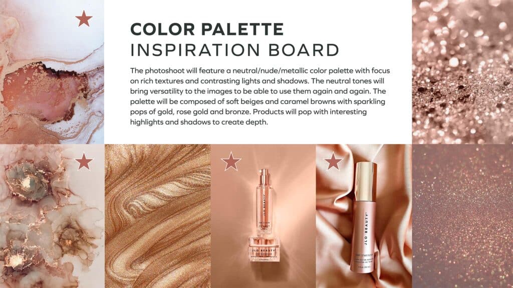
After our initial website refresh, we also created a new art direction for web and social media branding. We designed a presentation that laid out the concept for the future website, along with colors, props, styles, models, and inspiration for a photoshoot for future website and social media images. This presentation communicated a new branding approach. It used color, texture, and natural elements to establish the brand as warm, luxurious, and reliable.
The color palette for the website photoshoot consisted of neutral and metallic tones, including soft beige and caramel brown. In addition, pops of gold, rose gold, and bronze created depth as well as intriguing highlights and shadows.
The new art direction for the website was stylish, chic, and inviting. It was full of nods to nature, modern apothecary elements, and upscale beauty imagery.
The results
The new social media art direction was designed to capture interest and stay memorable in a sea of competitors. The photoshoot images included a warm jewel tone color palette, adding pop and style to the brand’s presence. The lifestyle props showed the products in real settings, creating a sense of connection and relatability.