An Empowered, Sexy Vibe for an Avon Fragrance Line
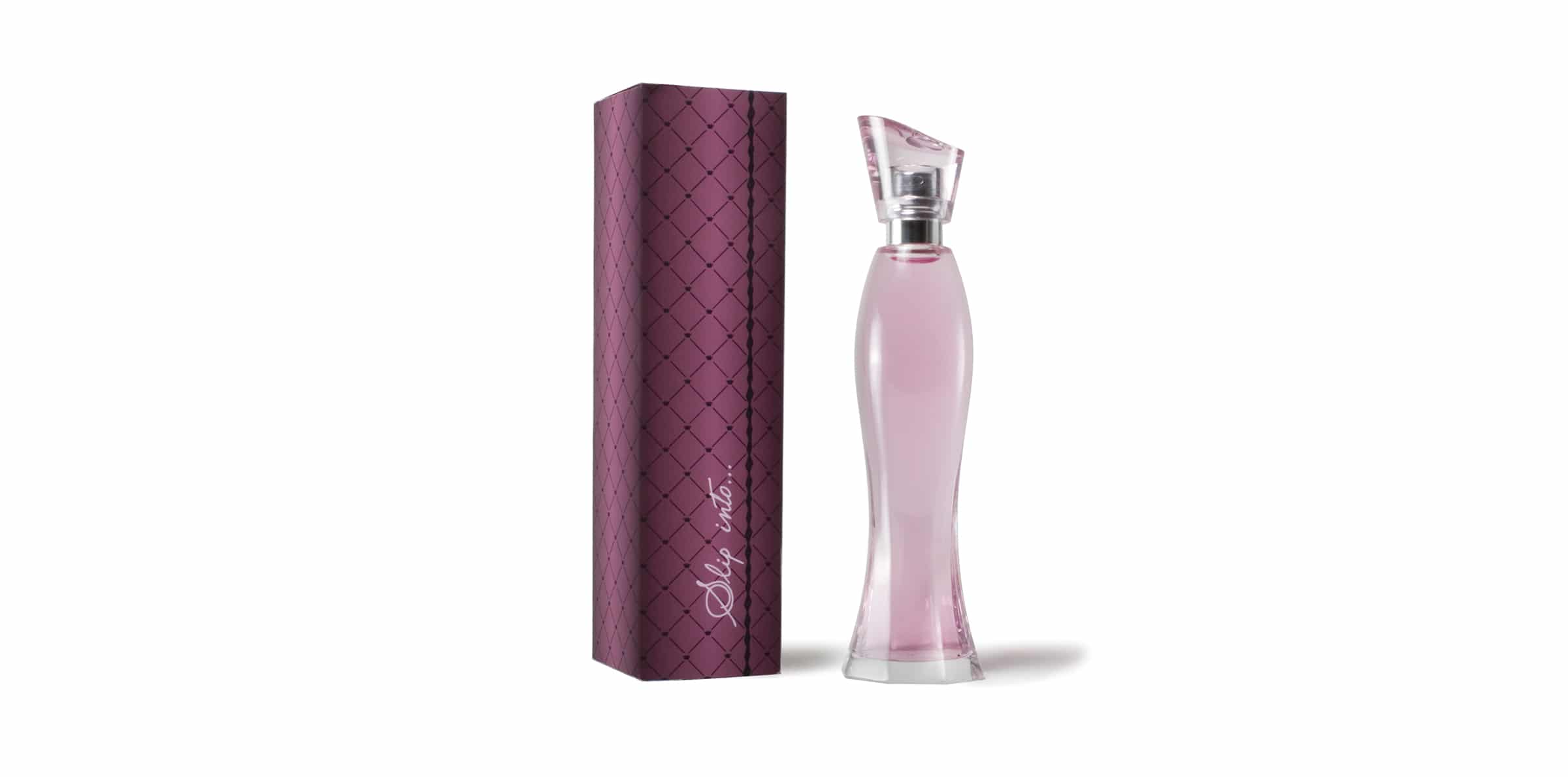
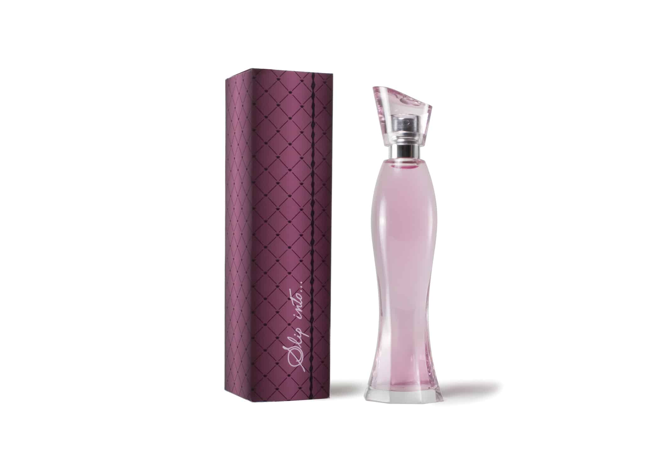
In preparation for its launch, Avon needed branding, packaging design, and a fragrance bottle design for their feminine fragrance Slip Into. Slip Into is a fragrance that “seeks to capture the transformative power of stepping into a high-heel shoe.” It features notes of blackberry, freesia, violet leaf, rosewood, violet, butterfly orchid, cashmeran, sueded orris root, and amber. I managed the project, designing the fragrance bottle design and packaging that reflected that sexy, feminine feeling you get when you put on a fancy dress, get dolled up, and step into the perfect pair of heels.
THE PROJECT:
Fragrance Bottle Design for Avon Slip Into…
The goal was to show women that they could capture strength, power, femininity, and sex appeal. I wanted to create a feeling of empowerment, sensuality, and confidence when women picked up Slip Into.
To begin with, I created a curvaceous fragrance bottle design shaped like the back of a stiletto heel. The hourglass shape is also reminiscent of a woman’s figure, supple, caressable, and electric. The swooping angle on the lid symbolizes the slope of a heel.
Finally, the fragrance is colored with a pink hue, a callback to feminine appeal.
Package Design
The pattern on the box captures the image of fishnets and French seam hosiery. I then selected a color palette of deep pink and black, feminine but full of strength and allure.
For the typeface, I chose a casual, sexy hand-written script font. The ellipses after the product name reflects mystery, wonder, and possibility—the endless opportunity of a night out (or in) in a pair of sexy heels.
The Results
The new launch was a success. The scent was fronted by model Christy Turlington, and subsequently, the fragrance became a successful staple for Avon for years. The fragrance bottle design created the essence of the line and thus helped reflect the intention of the scent.