
Bringing Innovation to the Hair Care World
Crème de Mint, our distinctive cosmetic packaging design agency, was asked to create minimalist packaging design for the HauteHouse Brands new line: Beauty Labs. The brand was a high-tech beauty brand dedicated to bringing science and art together to create innovative hair care products. It was tech-savvy, cutting-edge, but also committed to producing products that visually popped. Combining their technical expertise with their love of beauty, the company wanted designs that would also establish HauteHouse Brands as disruptors in the beauty world.
- Brand identity
- Package Design
- Print ready artwork mechanicals
The Project:
Minimalist Packaging
Design for Hair Tools
Brand Identity and Logo
We took our inspiration for Beauty Labs’ brand identity from laboratories—high-tech, clean, and medical. We wanted to capture that feeling in our designs. To begin with, we presented our ideas to the client in a brand presentation that outlined 3 distinct design concepts for the logo and packaging.

Then, for the typeface we used a hybrid font of Modny Thin and Drugs Regular—clinical, formal, sleek, and modern.
Finally, the color palette of gray, steel blues, stark whites, and metallic silver are inspired by lab equipment, medical supplies, and technology, contributing to the inventive atmosphere of the brand.
Minimalist Packaging Design


Straightaway, we wanted the beauty and the innovation of the products to speak for themselves.
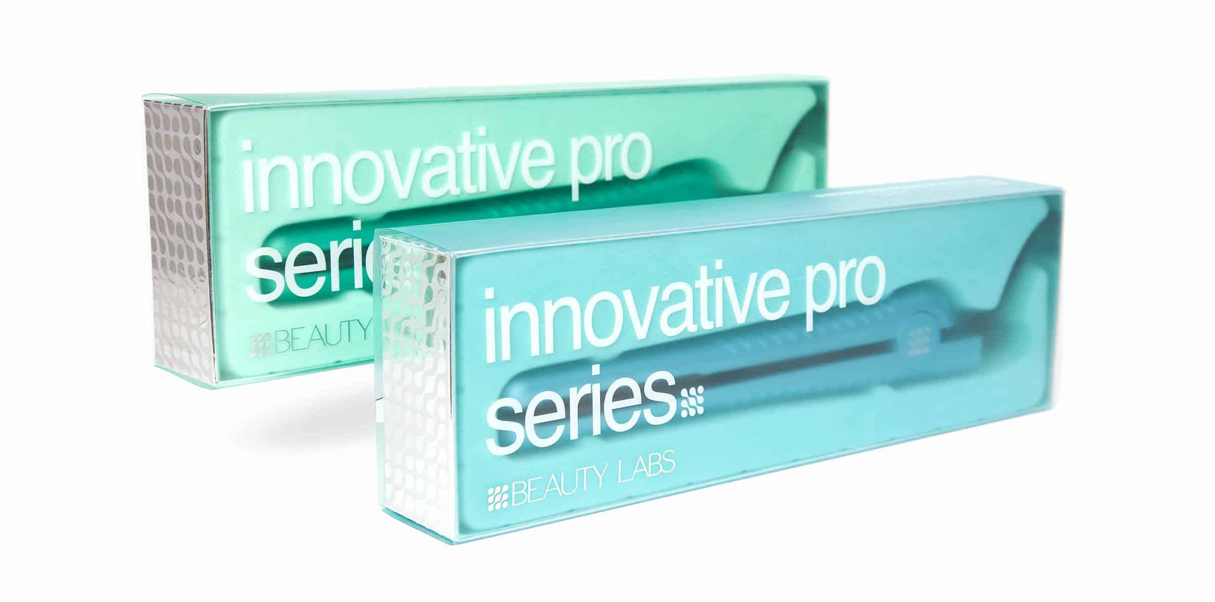
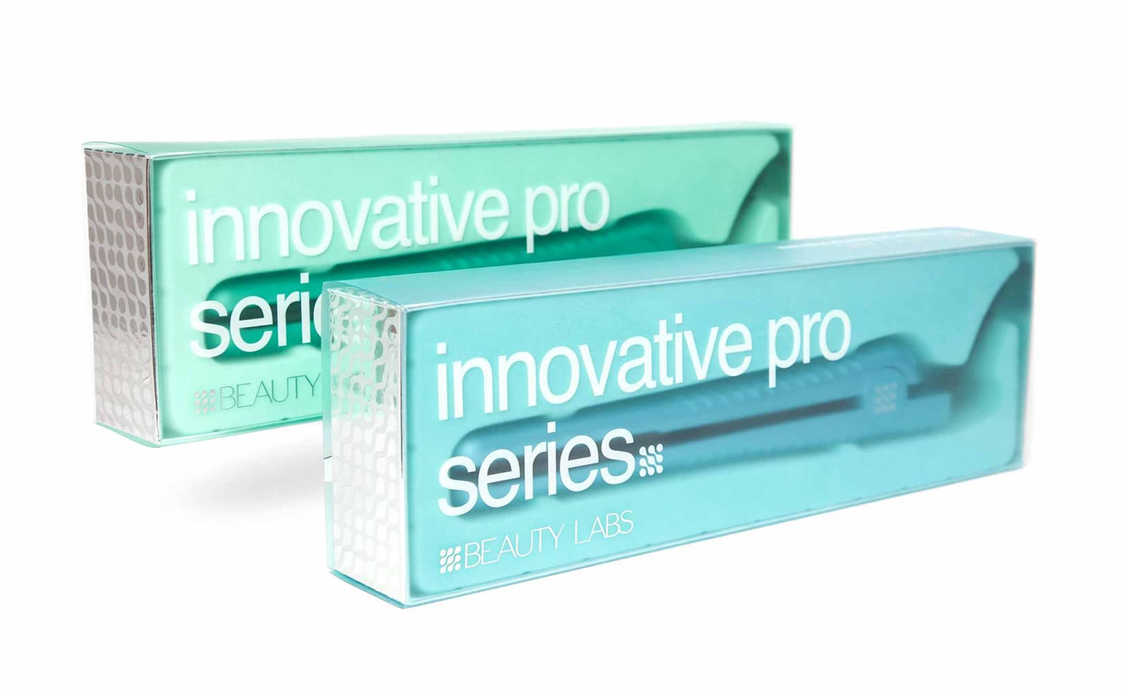
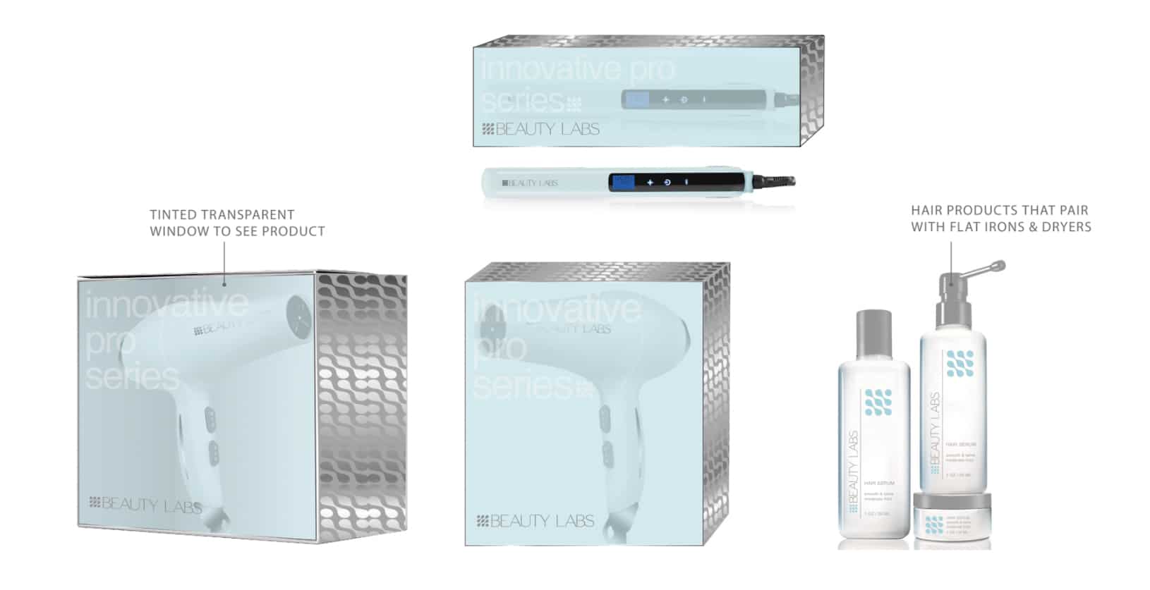
The minimalist packaging design for the hair tools used a frosted semi-transparent tinted sleeve over a silver box. Consumers could view the actual product through the screen. This was also reminiscent of scientific insight—peering through beakers, magnifying glasses, and petri dishes to witness new discoveries.


For the hair products that accompanied the tools, we used stark white bottles to create a medicinal look, with the logo prominently displayed. The icon draws the eye immediately and then carries the view down to the brand name, angled vertically on the side.
The results
As a result, Crème de Mint’s minimalist packaging design and brand identity helped Beauty Labs with a successful launch. Our work also set the stage for the brand to grow and evolve as they established themselves as an innovative haircare brand dedicated to producing superior products.
Are you looking for a creative packaging design agency to help you with your new product? Contact us today.


