
Paving the Way for a Supplement Success
Paving the Way for a Supplement Success
Windmill Health Products is a company dedicated to providing high-quality, innovative health products to the market. Their sub-brand, Keto Science, is a popular nutrition brand that makes meal replacement shakes, supplements, and weight loss products. Keto Science needed a dietary supplement package design, logo design, and web design that would help them stand out from other supplement brands as well as appeal to sports enthusiasts, health and nutrition aficionados, and people following the keto diet. They also needed a landing page that matched the new brand image and presented a professional web presence. The goal of the Keto Science products is to help the body reach ketosis (the same goal as the well-known low-carb and high-protein keto diet) to increase metabolism, reduce body fat, and manage weight. Windmill is also known for many other thriving nutrition lines, including Rapid Fire, a ready-to-mix keto coffee brand.
- Logo design
- Package design
- Website mockups
- Website landing page
The Project
Brand Presentation
To begin with, Crème de Mint, a premium branding agency, created a brand presentation for the client that provided 5 distinct brand concepts along with ketogenic market analysis. Branding included fonts, colors, patterns, packaging ideas, and imagery. The presentation helped the client hone in on a visual strategy while also envisioning the possibilities for the brand.


Brand Identity and Logo
The logo is minimalistic but memorable and powerful. We also chose a commanding font, Azo Sans Bold, for “keto,” catching the eye and communicating the purpose of the products. Furthermore, the sleek, simple Azo Sans Light of “science” reflects balance, knowledge, and expertise.
The band slicing the “O” and the “S” represents cutting out unhealthy products and ridding the body of excess weight.
Dietary Supplement Package Design
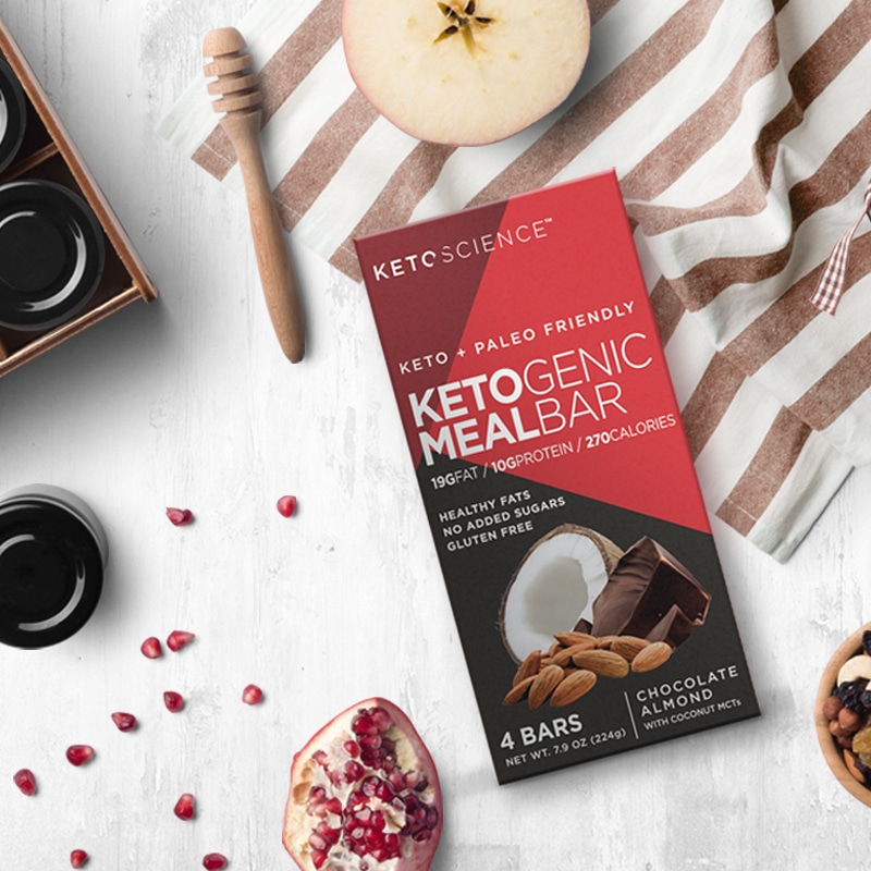
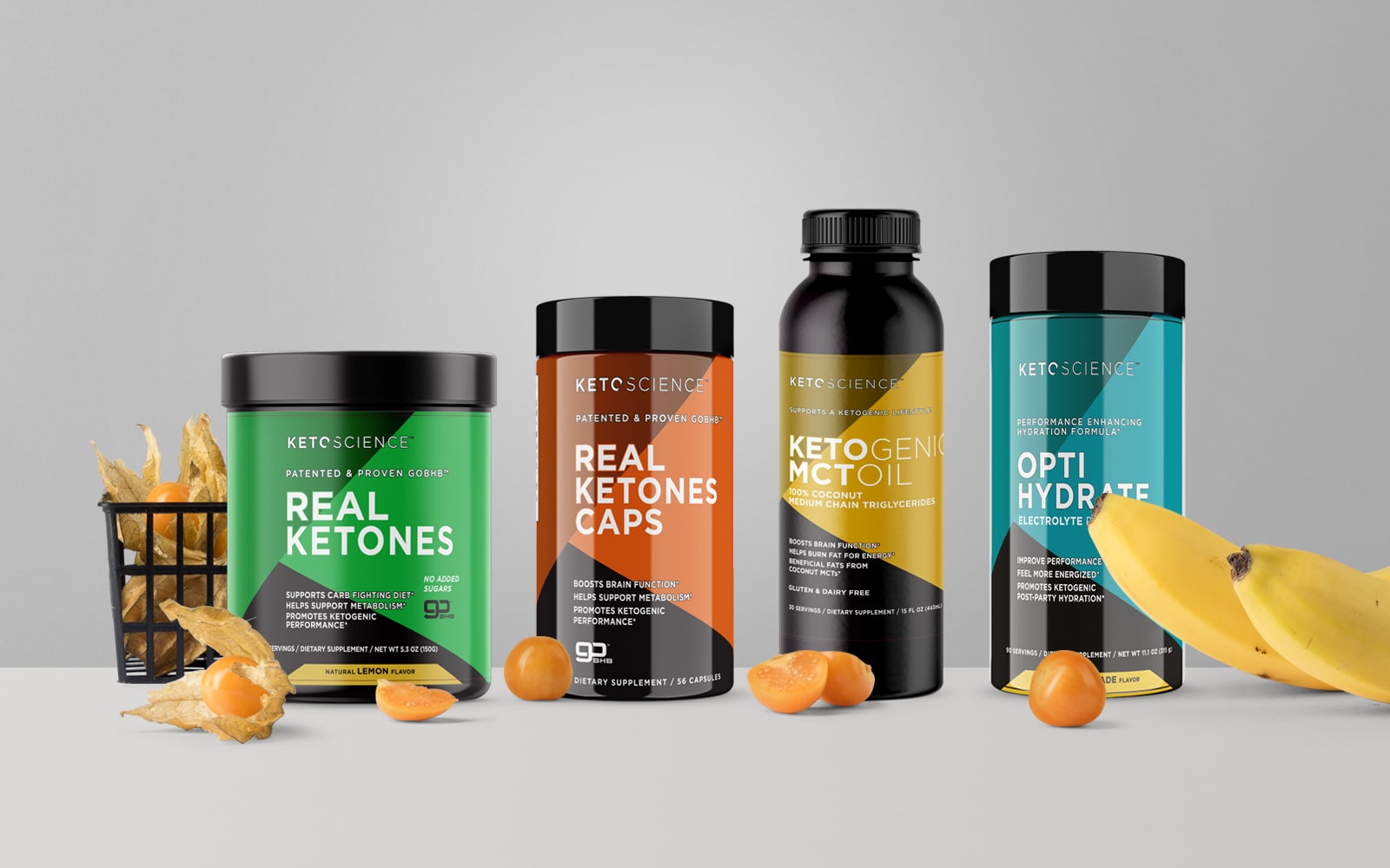
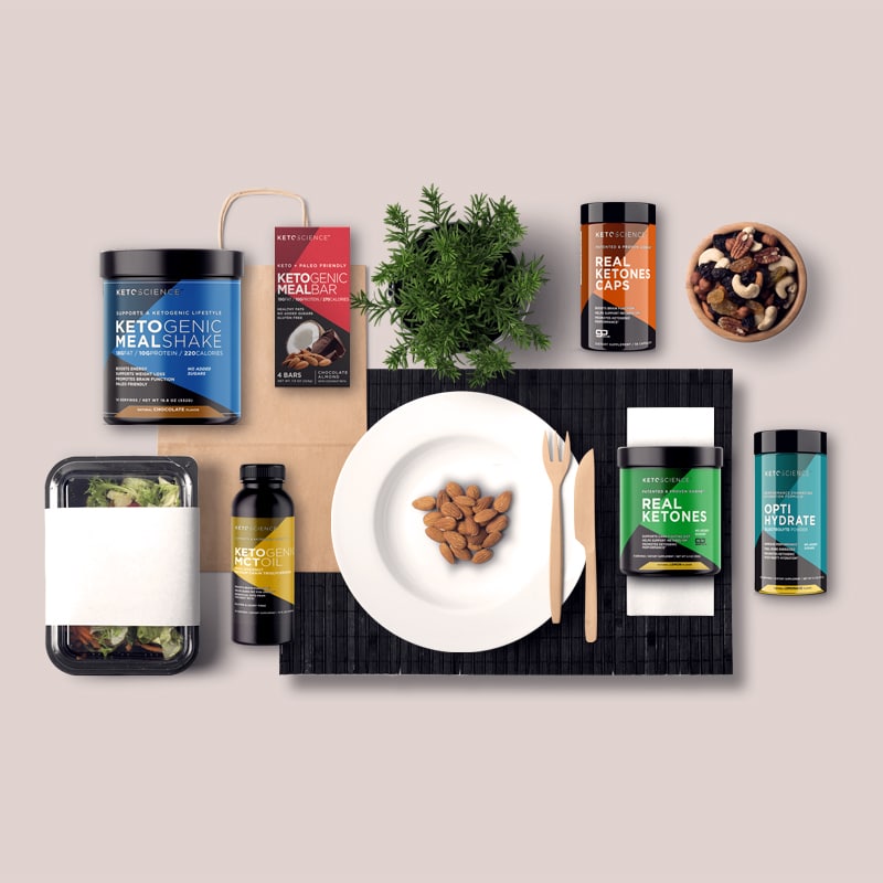
We wanted the dietary supplement package design to capture the feeling that the target customer desires—energy, strength, and power. So the packaging design incorporates geometric shapes and lines, representing structure and order. In addition, the vibrant colors of the packaging—red, orange, yellow, green, blue, and purple, are eye-catching and full of energy and vigor.


Web Design
We also designed a landing page for the website that matched the updated look of the brand, and highlighted the product offerings. The image displays the actual products, while the background contributes to the feeling of wholesomeness and quality. Images of almonds, cashews, and walnuts represent the healthy proteins encouraged by the Keto diet.


The results
Crème de Mint’s designs laid the foundation for the brand to take off. As a result, KetoScience has scaled up into an established and highly successful supplement brand sold at most major retailers. Capturing the boldness and strength that appealed to the target audience, the dietary supplement package designs also positioned the brand as a trusted authority in the industry.
Are you looking for a strategic branding agency to create your eye-catching brand image? Contact us today.
For more resources, check out our Supplement Label Design guide.


