
Stunning and Innovative Cosmetic Logo Design
HUG-ITS makes beautiful and practical makeup organizers and holders for women. The magnetic organizers keep brushes and makeup in place to avoid purse clutter. The company needed cosmetic packaging design and branding for the organizer that resonated with women, communicated the unique value of the product, and drew attention to its benefits.
- Logo design
- Sell Sheets
- Package design
- Postcards
THE PROJECT:
BRAND IDENTITY AND
COSMETIC LOGO DESIGN

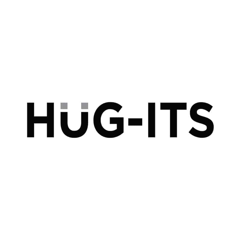
We turned the letter “u” into a magnet, providing an intriguing element and giving the customer a hint about the product.
We turned the letter “u” into a magnet, providing an intriguing element and giving the customer a hint about the product.
The products are targeted at busy women who like the convenience of having makeup on-hand wherever they go, but are tired of digging around in their bags to try to find what they need. HUG-ITS use a smart magnetic design to keep makeup in place, easy to find. The cosmetic logo design is elegant and eye-catching, turning makeup into a sparkling accessory.
Crème de Mint, our high-quality beauty packaging design agency, wanted to establish the brand as practical but alluring. The simple cosmetic logo design catches the eye and evokes a sleek and chic feel. We turned the letter “u” into a magnet, providing an intriguing element and giving the customer a hint about the product.
For the typeface, we modified Gotham Bold, a commanding and clean font. The “U” stands out from the rest, highlighting the magnet icon. We chose black and gray for the colors, reflecting sophistication.
PRINT Design

The company also needed marketing material that explained the product and offered a visual look at the features. We designed sell sheets that flaunted the fashionable look of the product and offered insight into the functional value. We also designed postcards for the brand to mail out, building interest and attracting customers.
The results
The designs laid the foundation for the brand to grow online, providing a professional and stylish brand image that appealed to busy women who loved fashion and makeup. The marketing collateral contributed to the cohesive branding and attracted new interest and customers.
Are you looking for a versatile packaging design agency to help you with your new product? Contact us today.


