Paying Homage to an Italian Grandmother and Her Recipes
When the founders of Tally Butter inherited all their Italian grandmother’s recipes, they knew they had something powerful in their hands. Grandma Tally was an Italian cook who knew her way around the kitchen. Her garlic butter recipe was second to none. So, they decided to launch a business selling that butter. They turned to Crème de Mint, a brand-focused packaging design agency, for their butter packaging design, in particular a vintage inspired logo and food packaging design for the butter that paid homage to Tally. They also wanted to spread the message that great butter is simple and authentic, not over-processed and full of fillers.
We wanted to focus the brand around Tally and her story. The traditions and recipes she passed down to her grandchildren inspired connection, cooking, and togetherness. That sense of nostalgia is what we wanted people to associate with Tally Butter.
Our inspiration for the brand identity was traditional and vintage, a reminder of a simpler time. The retro style gave the feeling of a proven brand that stood the test of time.
We designed the logo to highlight Tally, producing the image based on her photograph.
The combination of Vanilla FY and Branboll Fet typefaces added a human element to the logo—the script fonts contribute to the nostalgic, personal feel. We adorned the ‘T’ with an herb sprig, a call-back to freshness and Italian cooking.
We created the tagline “Tally knows best” based on a story about Tally herself. She was a vibrant woman who spoke her mind. When customers came into her restaurant and ordered an item she didn’t feel was their best choice, she spoke up. Her customers always agreed—Tally knows best.
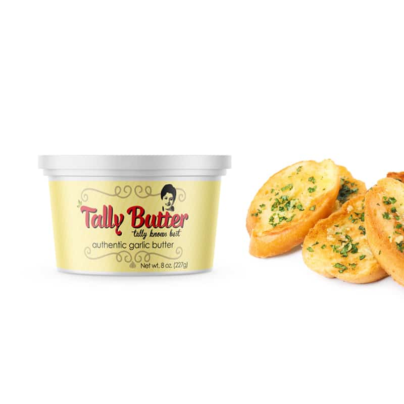
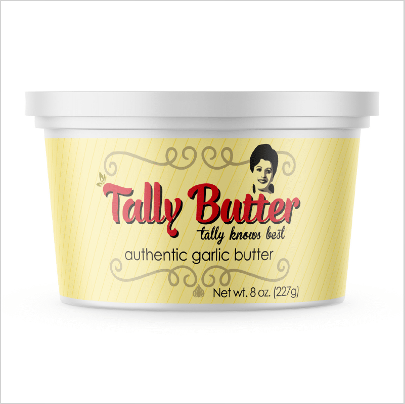
BUTTER PACKAGING DESIGN
The butter packaging concept was inspired by Burro Soresina’s vintage canisters. We chose a similar color palette but put a Tally-twist on it, adding our logo with her image and swirl designs reminiscent of old Italy and an image of a garlic clove.
The simplicity of the butter packaging reflects the brand’s commitment to wholesome food without fillers—authentic butter made with real ingredients.
The results
As a result of Crème de Mint’s work, Tally Butter launched their product and sold at farmer’s markets and food expos. Our designs helped them launch their brand, pay homage to Tally, and share her recipes with the world.