Branding and Packaging
for a Unique Protein Powder
Super Power Protein is a collagen-based protein powder created for a unique audience. Rather than targeting a sports and fitness audience, they wanted to design their product for busy moms, professionals and people on-the-go, believing that protein benefits us all.
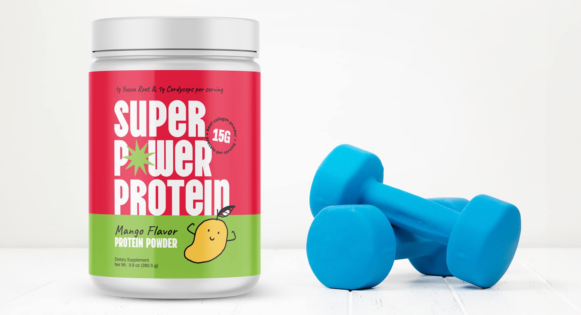
They needed logo and packaging design that would appeal to a broader audience and set the brand apart from other protein powders. We created bold and captivating packaging design that appealed to a larger audience base and conveyed a fresh and flavorful feel.
- Brand identity
- Mood boards
- Package design
- Business cards
Mood Boards Set the
Stage for a New Protein
Powder Brand
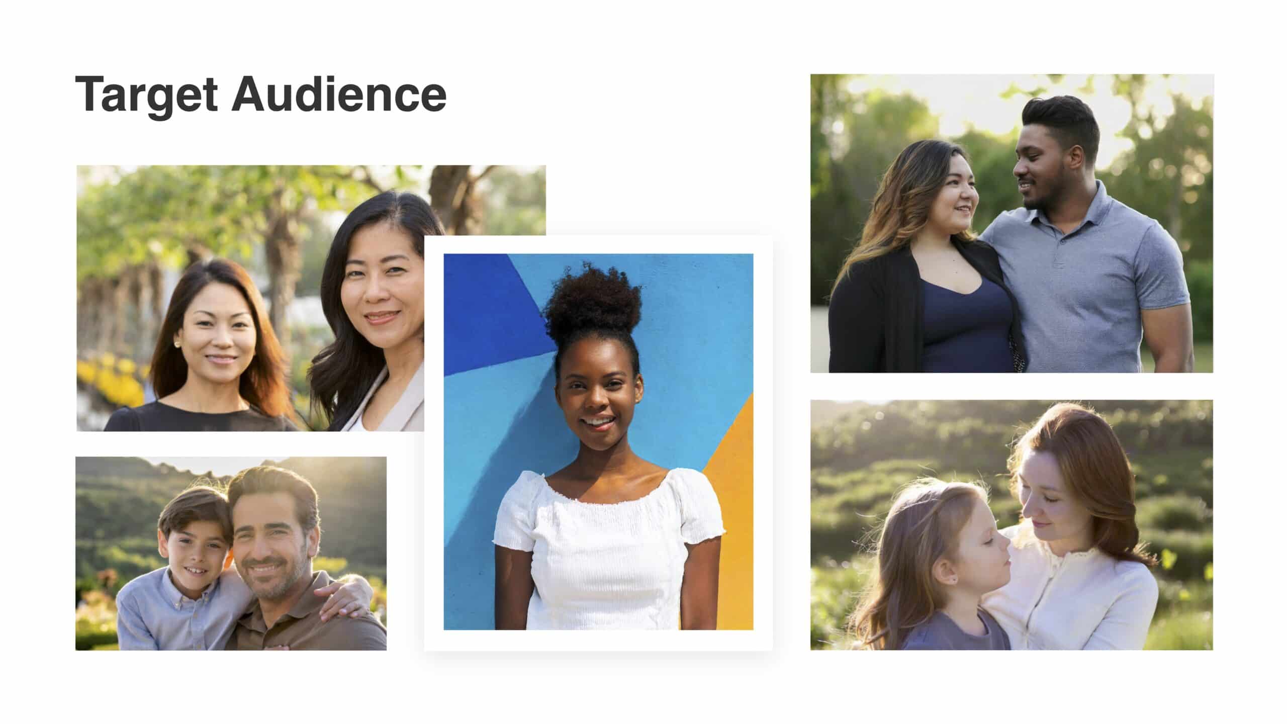
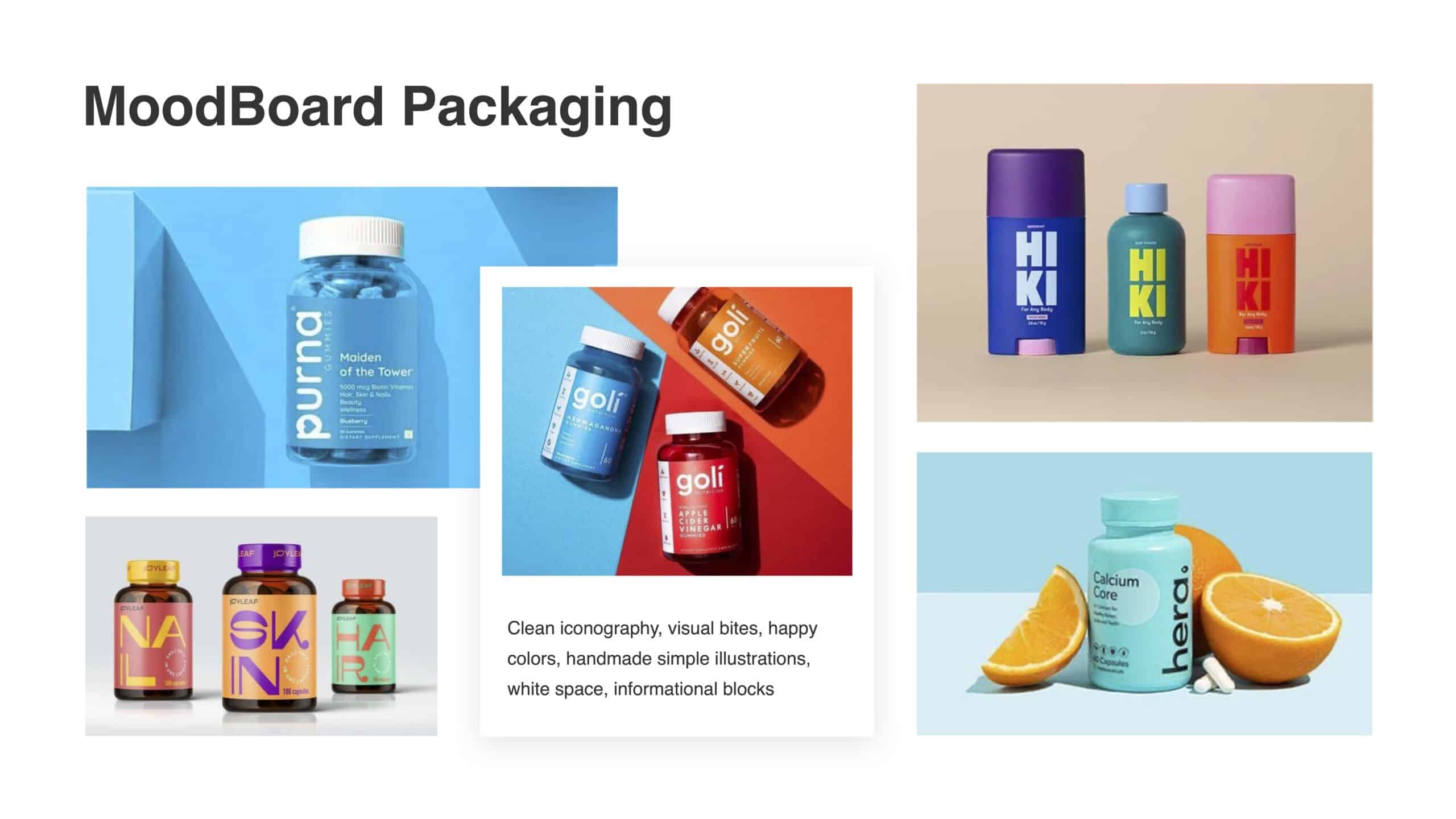
We started with mood boards that captured the inspiration for our branding and designs, highlighting the target audience and exploring font and packaging ideas. For the packaging, we wanted to go in a different direction than other collagen protein powders, which often stick to sleek black designs to appeal to a sporty audience. Bright and bold packaging would convey that same sense of strength while speaking to anyone that could benefit from protein powder—including busy moms, people on-the-go, and an older audience as well.
A Strong and
Bold Logo
The logo creates an approachable and warm feeling for the brand.
Using a bold and rounded font, this logo feels simple but strong and conveys a supportive feeling. “Protein” as the prominent word communicates the product’s purpose.We replaced the “O” in power with a green star symbol inspired by superhero comic “punch” graphics, bringing an energetic and fun visual.
Packaging Design
that Pops
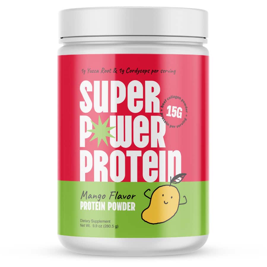
The packaging design is bold and eye-catching, symbolizing strength while maintaining a sense of fun and approachability. We created a hand drawn mango character raising its arms in a strength pose to communicate flavor while tying into the brand messaging and speaking to a wide audience.
The vivid green and pink color-blocking represent strength and trust, creating a captivating package that commands attention and feels welcoming.
Eye-catching Branded
Print Materials
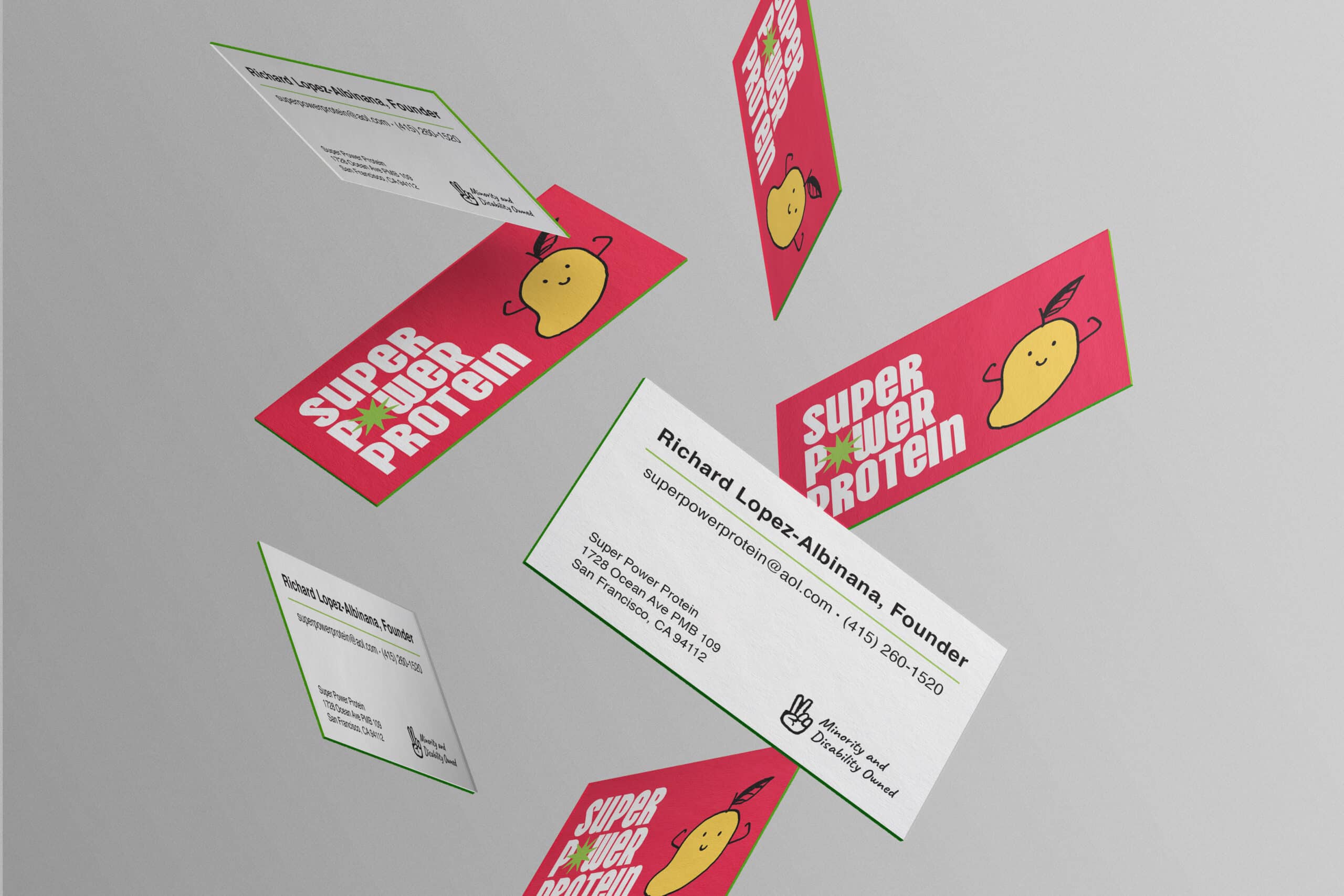
We also designed branded business cards, creating a cohesive brand image. The front maintains the vibrant, eye-catching feel, while the back highlights unique brand differentiators, minority and disability-owned, establishing the brand’s mission of health for all.

The client applied our logo design to a variety of merchandise, including baby onesies, phone cases, and
T-shirts.
The Results
Our designs created a strong brand image that paved the way for the brand’s e-commerce launch and focused on reaching the target audience. The packaging sets the brand apart from other options and highlights the brand’s passion for bringing health to everyone.


