Simply Sharon’s is a gluten-free, dairy-free, and vegan dessert company dedicated to the owner’s late mother, Sharon. They came to Crème de Mint for a logo and eco friendly food packaging design.
The brand had a powerful origin story—the owner and her mother suffered from a shared health condition, lupus. The condition itself is incurable, but the owner was able to improve her symptoms and ease her suffering through lifestyle changes—staying out of the sun and following a gluten-free, dairy-free, and vegan diet. She learned about the power of diet and how it can impact a wide range of medical issues.
That’s how the brand was born—the founder wanted to offer delicious desserts to others with dietary restrictions. The packaging design needed to highlight their story and show the brand’s commitment to creating flavorful, allergen-friendly food for dessert lovers.
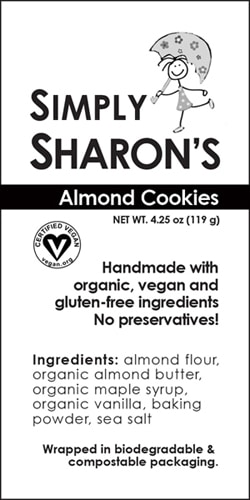
The original packaging and logo lacked personality. It was plain, unmemorable, and devoid of the story that made the brand special. We wanted to play up the brand’s story in the designs. Our goal was to create brand materials that inspired trustworthiness and warmth so customers felt like they were purchasing homemade goods from a friend.
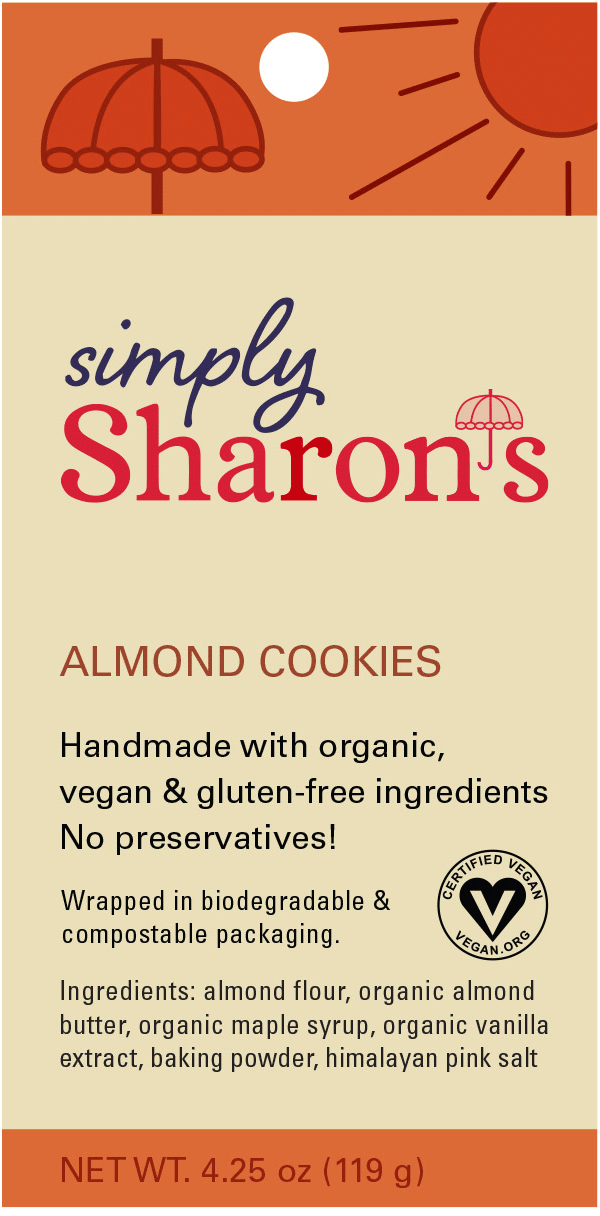
We designed the logo with that goal in mind—to be personable and full of positive energy. The parasol symbol as the apostrophe symbolizes the story (the founder and her mother had to avoid direct sunlight). It also added a touch of whimsy perfect for a dessert brand.
For the brand colors, we used a primary palette of blue, red, and pink to evoke trust, energy, and warmth.
The typeface of ‘Simply’ is Shelby Regular—a scripted font that adds a personal touch to the logo. We balanced that with Vulpa Regular for the word ‘Sharon’s,” a serif font that reflects authenticity and tradition.
THE LABELS
BEFORE
AFTER
The packaging design needed to highlight their story and show the brand’s commitment to creating flavorful, allergen-friendly food for dessert lovers.
Eco friendly food Packaging Design
We added an extra parasol symbol along with a sun along the top to reinforce the brand story. The colors of the eco friendly food packaging design are inviting and appealing.
The eco friendly food packaging design is green, using a biodegradable, compostable plastic pouch and recycled paper and vegetable inks for the tag. This aligned with the brand values and the founder’s commitment to sustainability and health.
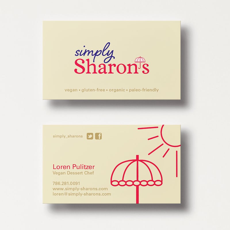
Business Card Design
We also designed memorable, eye-catching business cards for the founder that aligned with the brand identity and allowed her to promote the brand and make connections.
To create consistency across all channels, we also updated the brand’s former website to align with the new image and style.
The Results
Our designs aligned with the brand story, vision, and values. It replaced their original plain packaging with eye catching packaging that told their story and helped bring their products to life. The eco friendly food packaging design also won the 2015 American Package Design Award from Graphic Design USA.
Working with Lauren has been a breeze. She is communicative, open to ideas, and fun to work with. I told her what I wanted and what my ideas were and she magically produced what I envisioned. She really listens to what me (the client’s) needs were and continues to do so as we continue to work together. I highly recommend Lauren and Crème de Mint for all your graphic designer needs.