Petits Miracles was a dessert startup specializing in French delicacies such as macarons, pâte de fruits, and cookies. They planned to launch online, eventually expanding into brick-and-mortar locations in New York City. The company hired Crème de Mint, a high-quality packaging design agency, to create a bakery packaging design for the brand that captured French elegance and appealed to dessert-lovers as well as Francophiles.
We wanted to capture the spirit of French style—effortless sophistication
and simple chic.
We wanted to capture the spirit of French style—effortless sophistication and simple chic.
We wanted to capture the spirit of French style—effortless sophistication and simple chic. To reflect that essence, we designed a simple pink logo with Parisian flavor and effortless elegance.
The graceful serif font is reminiscent of shops along the Champs-Élysées. The slight curvature is delicate and tasteful—just like the desserts the brand offers. In addition, we selected a timeless red and white combination for the brand colors, providing a modern edge to the classic look.
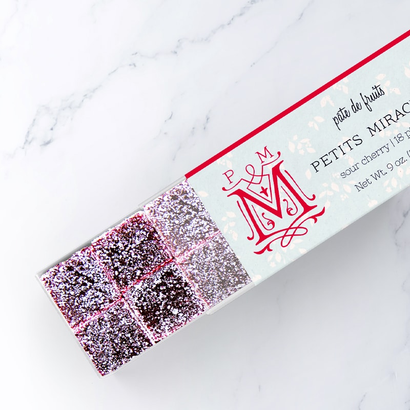
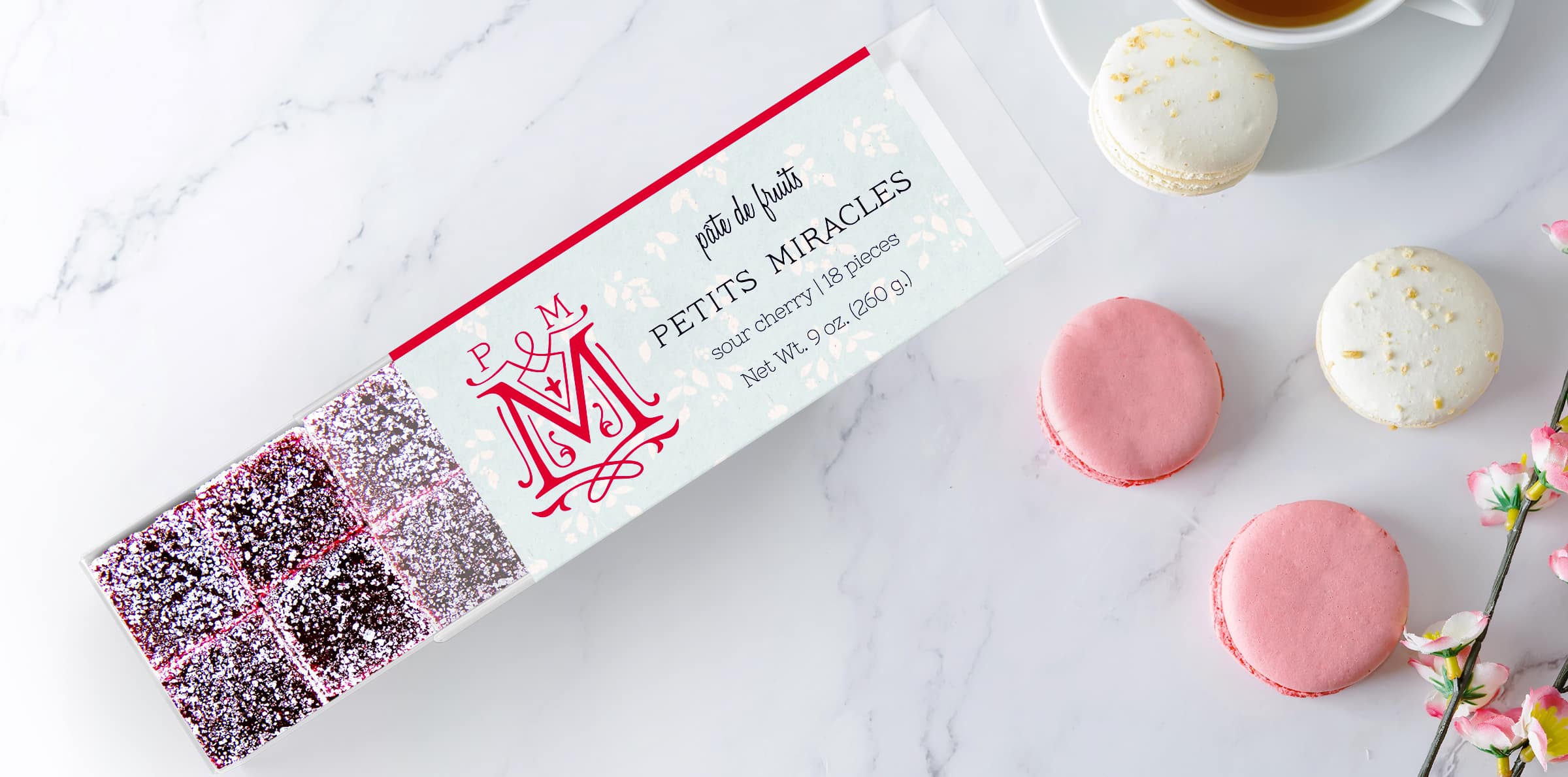
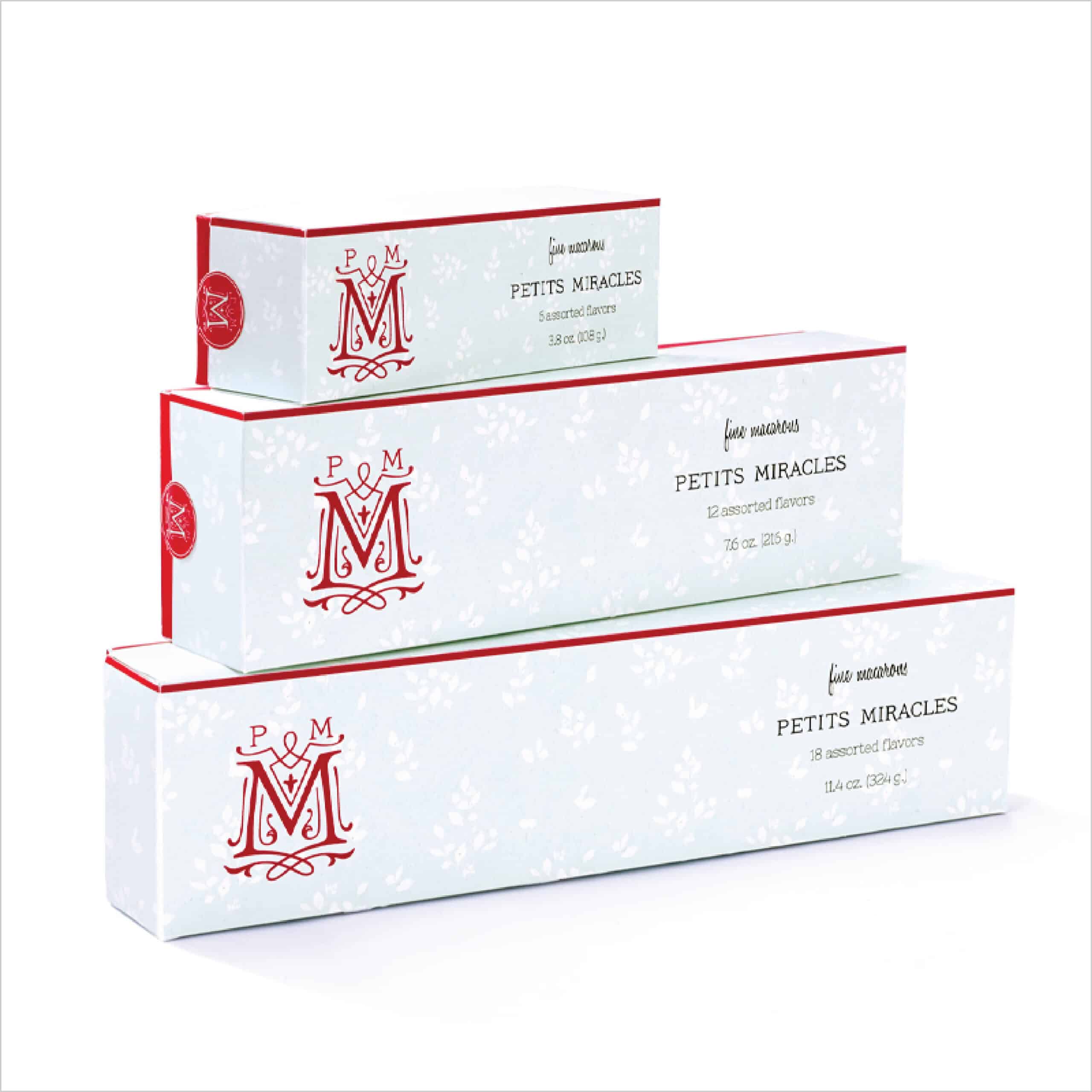
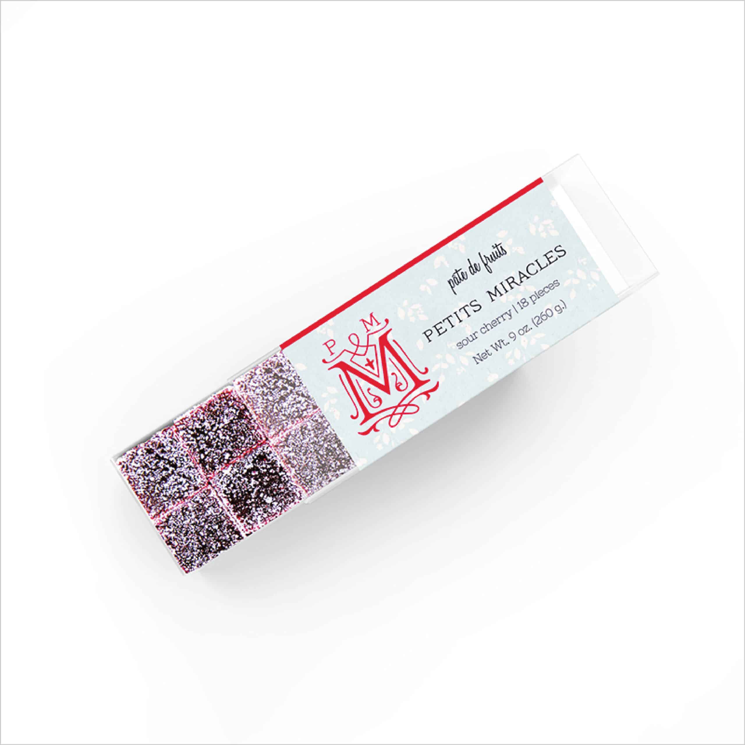
Bakery Packaging Design
Firstly, the bakery packaging design is stylish and distinguished. The bright pink bands on the edges pop with inviting energy. The icon is a dignified “M,” surrounded by fashionable swirls and curves that further reflect the French atmosphere of the brand. Finally, the dainty powder blue of the box with a white leaf pattern emphasizes a refined and luxurious feel.
The results
As a result, Crème de Mint’s designs provided the brand with a high-end look and helped establish Petits Miracles as a trusted source for French dessert. The elegant bakery packaging design looked like something you would buy from a patisserie shop in Paris. Moreover, our designs gave the brand a modern, trendy feel and a sense of refinement.