The Drinks Company had a vision for a line of versatile, easy-to-use bases for cocktails and mocktails—Mixology Maker. They believed that creating cocktails should be fun and simple, but they were also committed to producing flavorful, high-quality products that resulted in delicious drinks. The company hired Crème de Mint to create drink packaging design for the mixes that encompassed both the enjoyment of making at-home cocktails and the authenticity and freshness of their mixers.
Our vision for the brand identity centered around a fun experience—we wanted consumers to picture themselves enjoying the art of mixing drinks, with or without alcohol, for their friends and family.
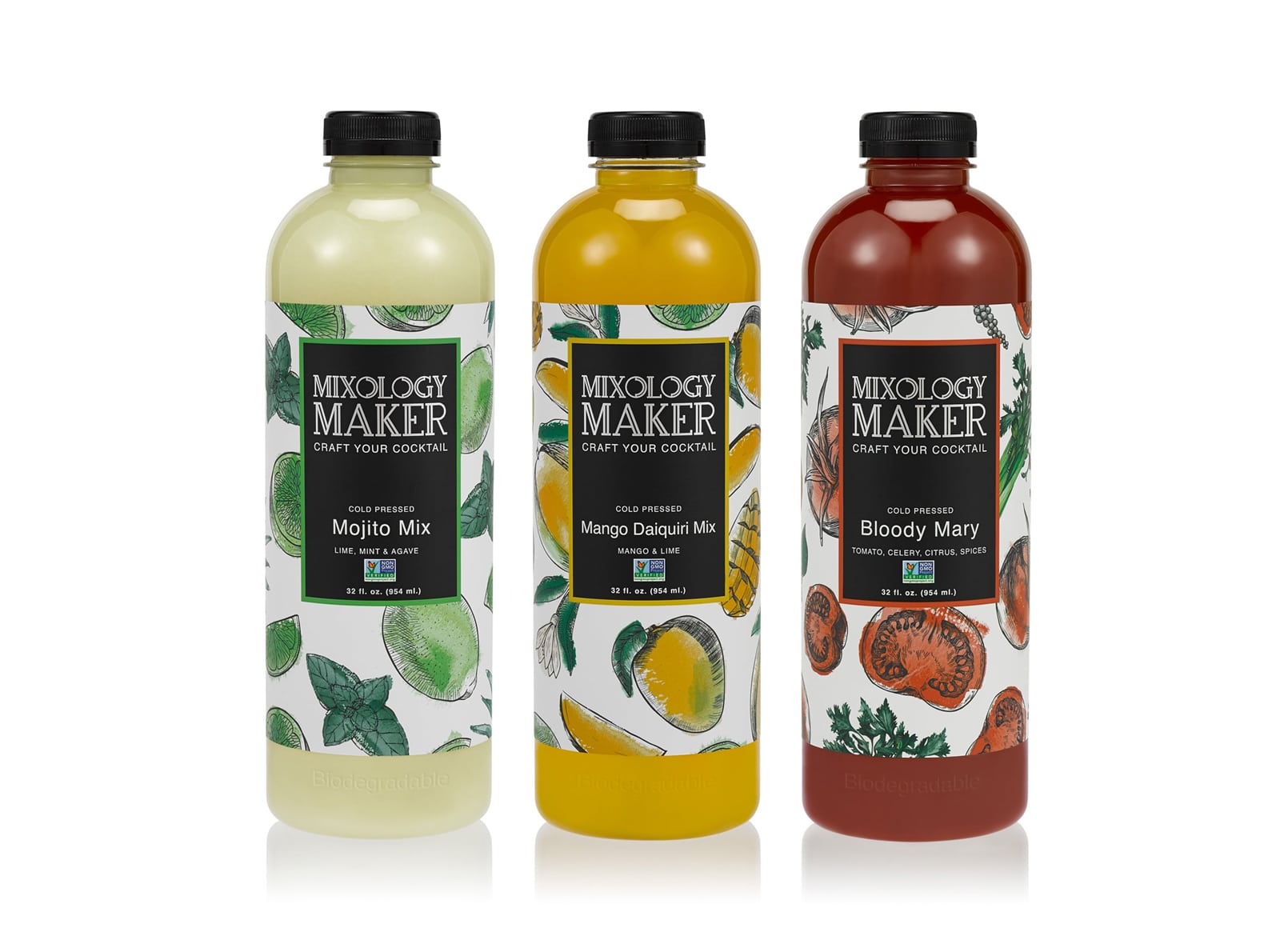
First, we created a branding presentation with 7 different concepts for the design, each showing the various elements that would make up the visual identity of the brand. In the final design, we selected a color palette of bronze with yellows, pinks, and greens for the brand colors to represent freshness, nature, quality, and leisure.
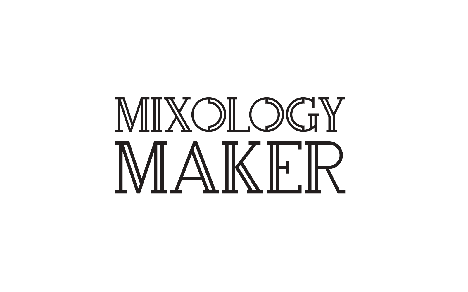
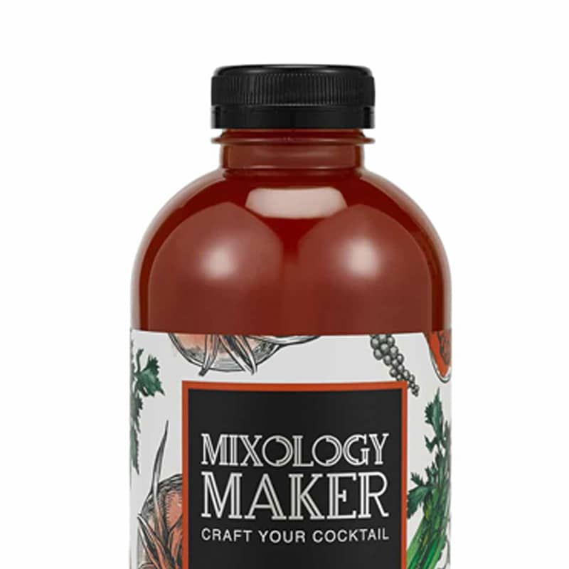
For the logo, we used the typeface Rollfast Regular to evoke a casual, entertaining feeling. A hand sketched martini outline in the background further reinforced the idea of mixing quality cocktails and mocktails.
DRINK PACKAGING DESIGN
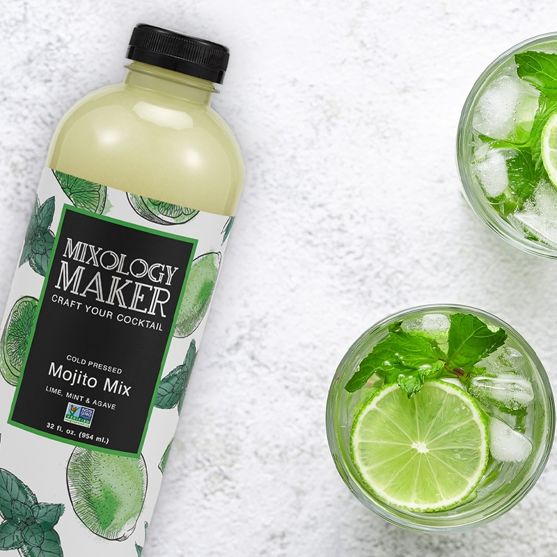
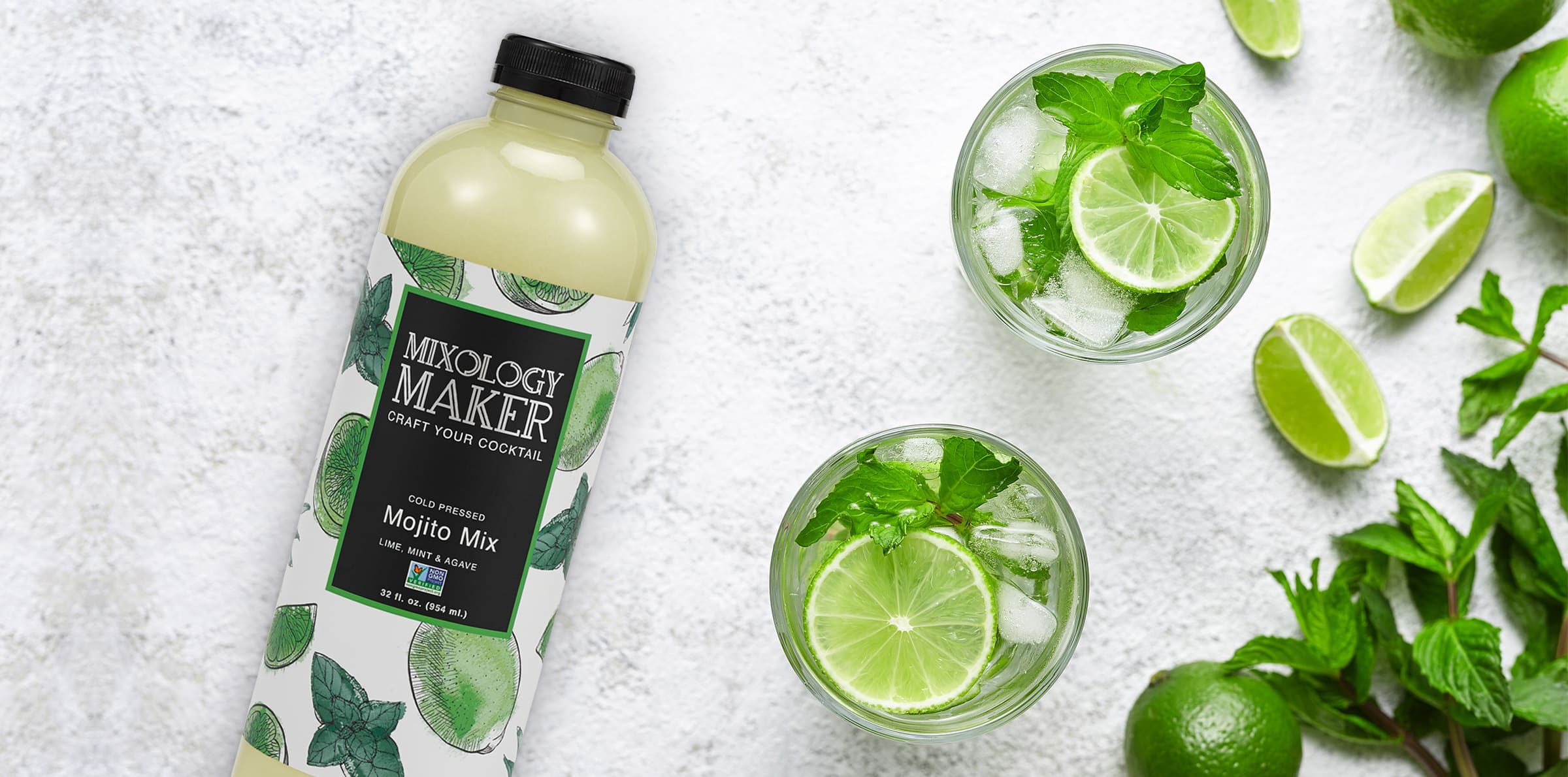
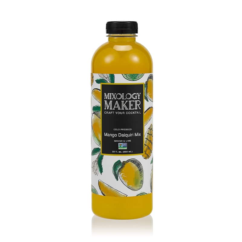
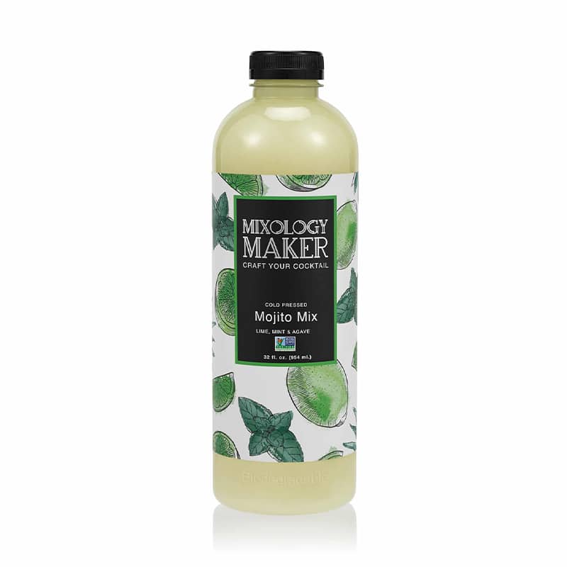
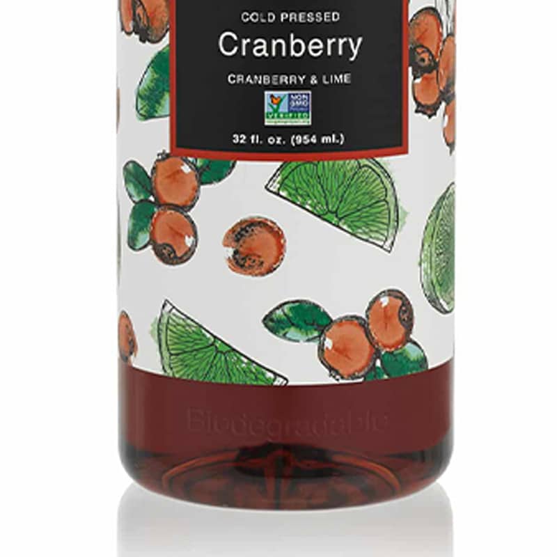
We wanted the drink packaging to be eye-catching and lighthearted while also highlighting the elevated quality of the products. The colorful hand drawn fruit illustrations are fresh and enticing, drawing in the consumer. The black in the center adds sophistication and quality, reflecting a premium brand. Finally, Gotham Medium and Helvetica Regular typefaces balanced the amusement of the Rollfast font.
We wanted the drink packaging to be eye-catching and lighthearted.
The colorful hand drawn fruit illustrations are fresh and enticing, drawing in the consumer.
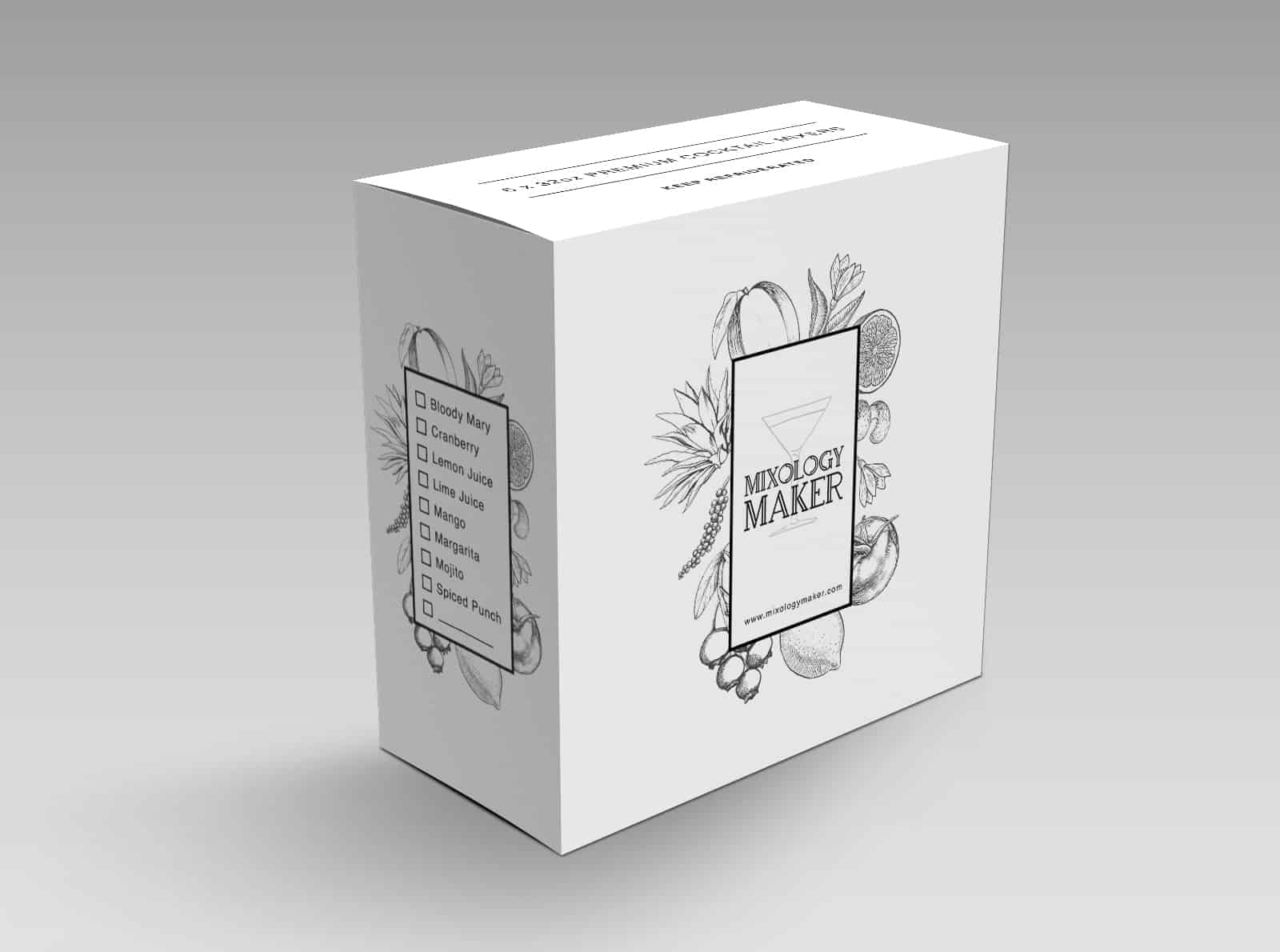
BOX DESIGN
Mixology Maker also needed a box design for six packs of mixers—an aesthetically appealing package that aligned with the brand identity. We used a simplified version of the bottle label to create the same feelings and maintain a cosmopolitan look.
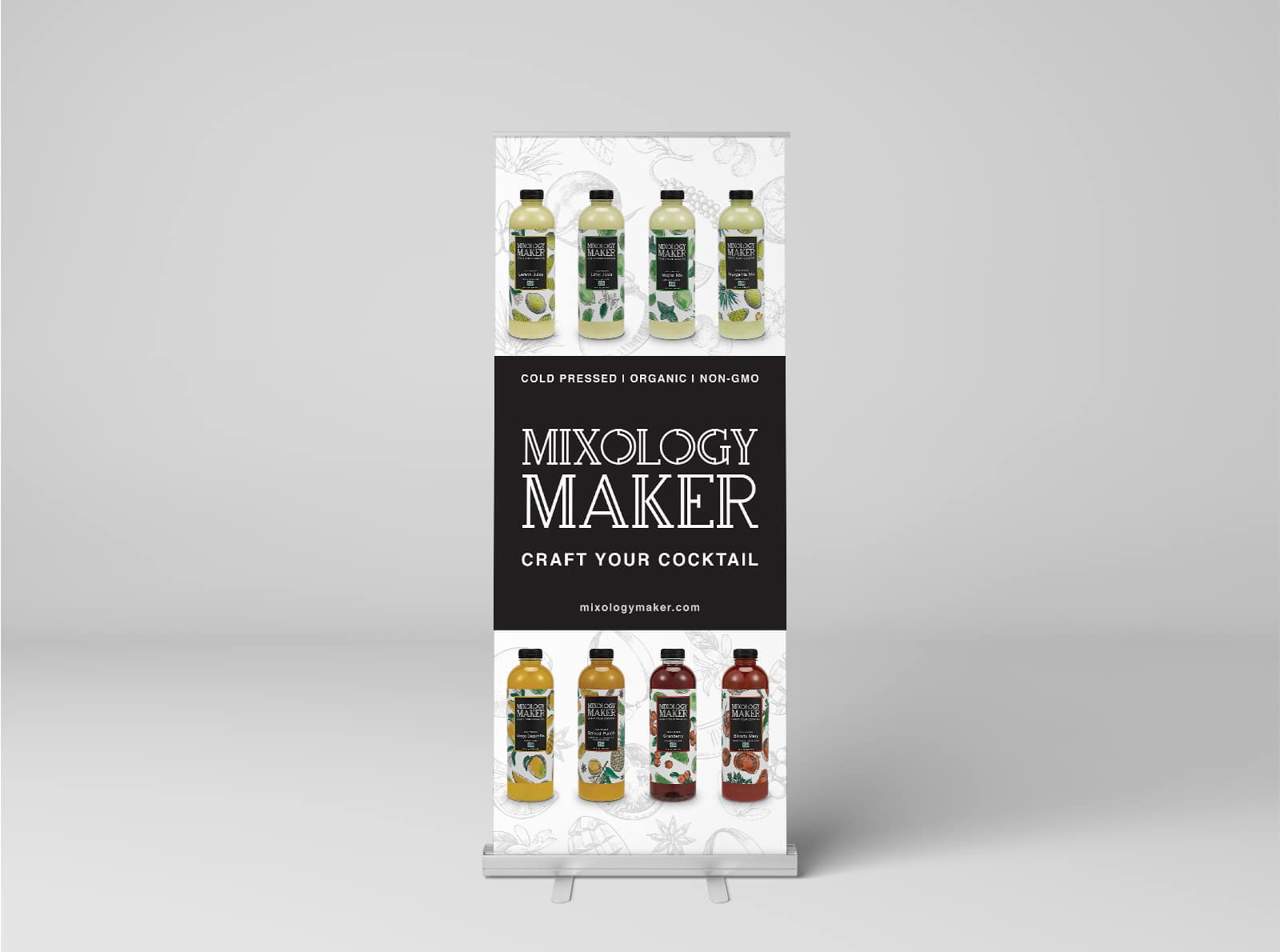
Marketing Materials
We designed a banner for display at markets and expos. It contained images of the actual product as well as an extra layer of hand sketched fruit images. The brand name and tagline are the focus to spread awareness and draw attention.
We also created decals for refrigerators that displayed Mixology Maker in the stores. They were eye-catching and intriguing and set the brand apart from similar products.
The results
Crème de Mint’s drink packaging designs produced a feeling of fun, merriment, and quality, setting the brand apart from competitors and appealing to the target audience. As a result, we created the foundation for the brand’s success with our work for the company’s existing brand—Expressed Juice.
Crème de Mint’s designs produced a feeling of fun, merriment, and quality, setting the brand apart from competitors and appealing to the target audience. As a result, we created the foundation for the brand’s success with our work for the company’s existing brand—Expressed Juice.