How does a small juice brand get noticed in a competitive industry? That was the challenge presented to Crème de Mint, a brand-enhancing food packaging design agency, when Expressed Juice prepared for the launch of their brand. Crème de Mint designed award winning packaging for the Miami juice brand that mirrored its quirky personality and aligned with the founder’s vision. They also created eye-catching promotional materials that made sure Expressed Juice was anything but one of the crowd.
Expressed Juice had big ideas for their product—raw, cold-pressed juice that nourished and restored the body. They weren’t the average juice company. In particular, the cold-pressed process ensured that every bottle was packed with vitamins and nutrients.
They were targeting a young Miami crowd for their product packaging. The plan was to distribute their juices from electric carts in front of nightclubs, bars, and concert venues, providing replenishing juices to customers on the move.
The Vision: Eye-Catching Award Winning Packaging Inspired by Miami
The founder of Expressed Juice had a vision for his business, but he needed a blueprint to get there. He was passionate about the nourishing benefits of the juice, and he believed that even the busiest of customers deserved that nourishment.
Crème de Mint knew that the packaging for the juice brand needed to reflect its distinctive qualities—bold, brash, and exuberant.
With this in mind, our goals were to:
Show the Miami brand’s individuality through unique product packaging and design.
Emphasize the health benefits of the product with imagery evoking nature and freshness.
Create an edgy atmosphere that would appeal to the target audience.
Setting the Miami Juice Brand Apart With Award Winning Packaging
Initially, our challenge was to find a way to distinguish the Miami juice brand with the product packaging. How could we make sure customers would pass over the big brands and opt for Expressed Juice in a sea of juice options?
We decided to play up the fun side to create packaging that would never blend in on a shelf. Our goal was not only to create award winning packaging, but to stand out from the crowd.
Designing a Unique Bottle With Layered Meaning
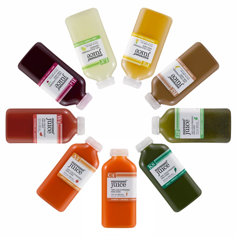
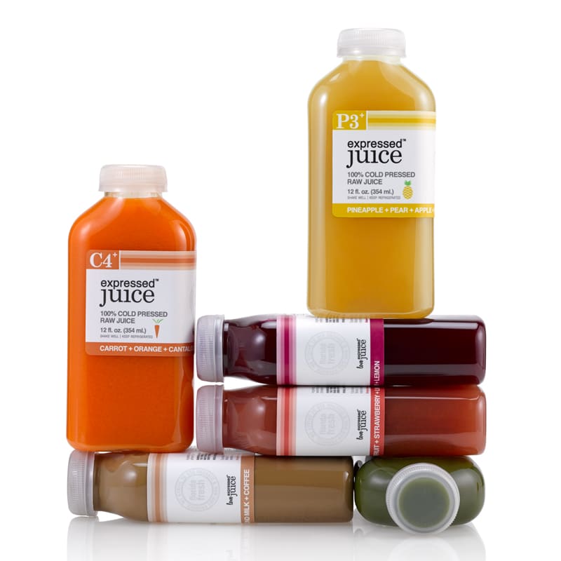
To create the award winning packaging, we didn’t want to rely on the same bottle as every other juice company—a traditional square of Boston round shape. Both the client and design team agreed that the shape of the bottle should mean something, to reflect the brand itself.
Playing on the nightclub theme along with the healing concept, we created a bottle reminiscent of a flask and a medicine bottle. It was different, edgy, and eye-catching. In essence, this bottle would attract a young crowd and make the act of drinking feel like an experience. There was also a portable element for consumers on the go—they could slip it into their back pocket and take it along with them.
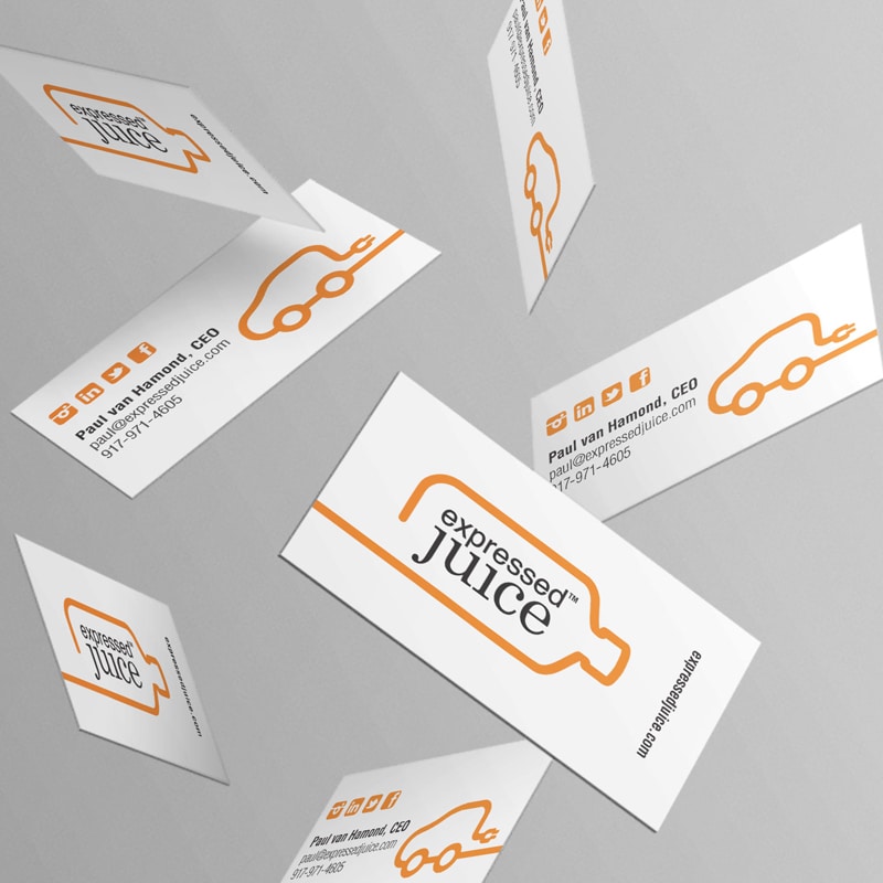
Crème de Mint also tied the bottle into the logo, using a bold orange outline of the package to create a unique visual element and draw the eye.
Fruit-Inspired Colors and Authentic Typography
For the primary brand colors, we chose black, white, and carrot-orange. The orange was a nod to fruit and juice that evoked warmth, excitement, and youth, while the black and white tied in the racing theme of the electric carts.
The primary fonts were Helvetica and Century Schoolbook, both practical fonts that reflect authenticity and openness. We also incorporated Honey Script as a tertiary typeface for the word “love” in the logo, a script font that symbolizes friendly connection. “Love Expressed Juice” represented the brand’s commitment to their customers.
Curated Chemistry
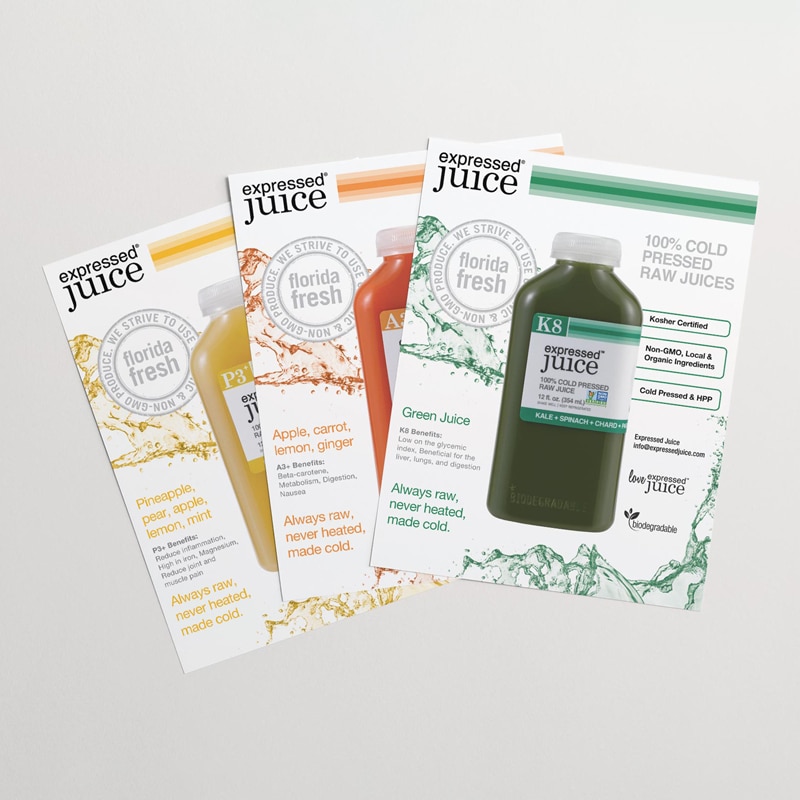
While we loved bringing a fun element to the design, we also wanted to preserve the image of Expressed Juice as a wholesome, raw, natural health option. So, we incorporated the fruit and vegetable icons and tied their unique selling proposition right into the label—“100% Cold Pressed Raw Juice.”
As an extra twist, we added symbols suggestive of the periodic table to capture the elements in the juice. For example, we added a letter to represent the primary fruit, along with the number of ingredients.
For example, we added a letter to represent the primary fruit, along with the number of ingredients. That imagery contributed both to the nourishing essence and the cool mood of the brand. All the elements combined together to create the award winning packaging for the juice brand.
Promoting a Cohesive Beverage Brand
Promoting a new brand requires consistency, strategy, and execution. In addition to award winning packaging, Crème de Mint designed promotional materials that allowed Expressed Juice to market, share, spread, and grow.
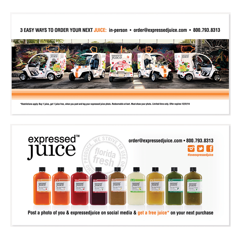
In addition to creating award winning packaging, we create design for Expressed Juice’s refrigerated carts. The electric carts were a challenge—we wanted Expressed Juice to pop. After all, the carts weren’t just a vehicle for distribution—they were a prime place to market the company. So, we designed the carts to show the natural, fruit focus of the brand, with bright citrus and succulent berry images to elicit feelings of freshness, sweetness, and vibrant health.
But we wanted the carts to have an edge to them, too. We added a racing stripe down the front, symbolizing the “on-the-go” nature of the brand and their commitment to providing healthy beverage options even during the busiest times. The racing stripe was also incorporated on the bottles to create a comprehensive brand energy.
The business cards incorporated the elements of the brand that made them stand out—the electric carts and the unique flask-shaped bottle. The outlines of those images catch the eye, while still maintaining a clean look for the cards.
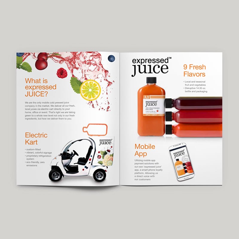
The brochure is designed to communicate health and wholesomeness. The appealing fruit pictures reflect the real fresh ingredients used in the juice. Inside the brochure, images of the carts and the juice bottles themselves give insight into the unique aspects of the brand.
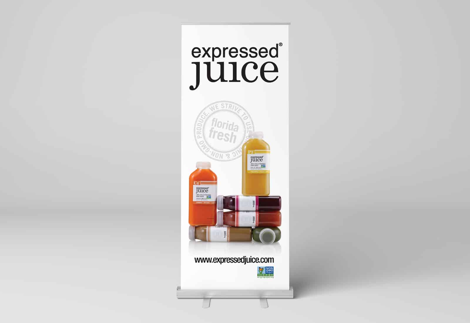
The banner displays the award winning packaging, highlighting the bold juice colors and teasing the flavor within the juice. The “Florida Fresh” emblem reflects the brand’s commitment to providing real, fresh juice.
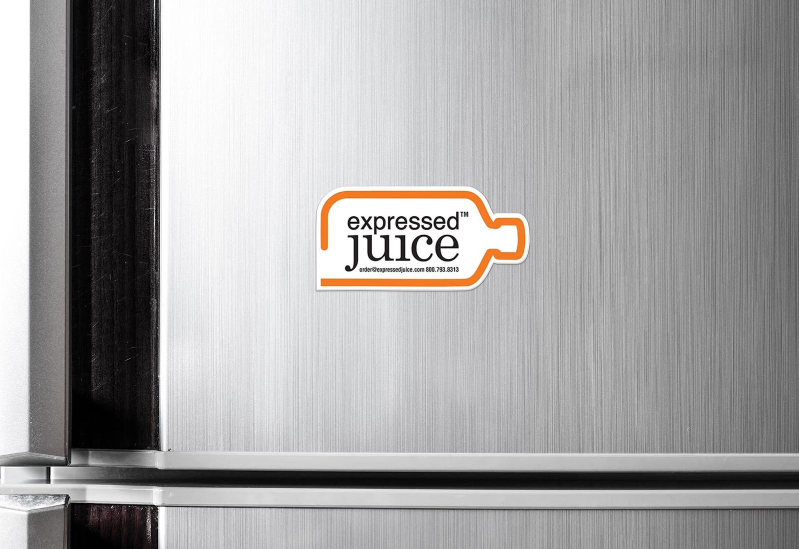
The magnets are shaped like the bottle itself, providing an interesting shape and tying into the brand image, with a bright orange outline to command attention.
Creme de Mint also designed cruise line flyers to provide insight into the brand and offer marketing potential. They also created table talkers for Royal Caribbean, promoting cocktails made with Expressed Juice products.
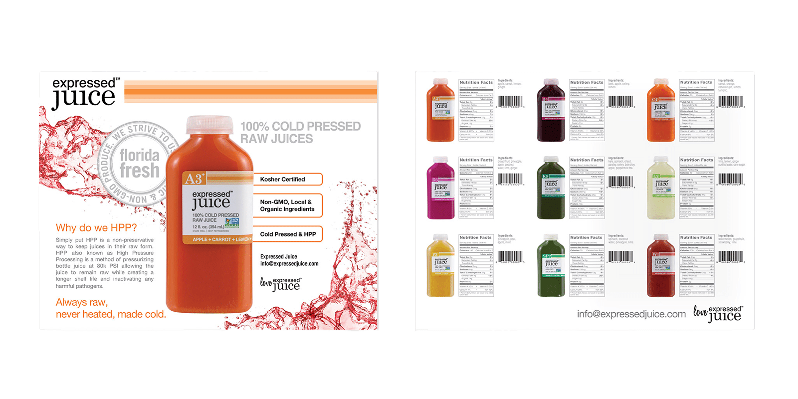
The sell sheets communicate the value of the products—real, cold-pressed juice, and offer a look at the different flavors and nutrition benefits. The award winning packaging made it stand out from its competitors.
Postcards allowed the brand to market their products and encourage social media engagement with their customers, spreading brand awareness and growing their web presence.
The results: Award Winning Packaging
Crème de Mint’s designs for Expressed Juice gained attention from customers and earned several awards. Specifically, the award winning packaging design won the 2015 PRINT Regional Design Annual award, the 2015 Core77 Design Award for Packaging, the 2015 Silver ADDY Package Design Award, and the 2015 American Package Design Award from Graphic Design USA.
The award winning packaging for the juice brand was so successful that bars and restaurants immediately began buying the product. They loved the flask analogy and knew their customers would enjoy it.
The product sold well at farmer’s markets and food expos. In fact, the launch was so successful that Expressed Juice never even used their electric carts to distribute their juice. They had so much business they had to shift distribution methods and adapt to the next level of business. Consequently, the carts became a powerful tool for brand awareness. They drove the carts to farmer’s markets and local events to spread the brand’s name and garner new interest.
Years later, the brand has expanded and grown, carrying the success of their launch and remaining a fan favorite at markets, expos, and shows. They now own another line of cocktail mixers, Mixology Maker. But the award winning packaging designs from Crème de Mint remain, setting them apart, catching eyes of restaurants, bars, and individuals, and keeping them as busy as ever.
Creme de Mint and Lauren have been critical since the formation of our brands. In both having the unique ability in understanding and interpreting our ‘brand speak.’ I’d highly recommend bringing Lauren on to any project in the CPG space.