A Captivating Package Design for an Innovative Sports Massager
Beurer is the #1 leading healthcare brand in Europe, providing at-home medical and massage equipment, including pulse oximeters, thermometers, TENS units, and toning belts. They needed sports packaging design for the brand that would command attention, appeal to their active, fitness-oriented audience, as well as communicate the purpose of their new product. They launched a fascia releaser—a massager which releases the connective tissue surrounding muscles, bones, and nerve cells. This has the beneficial effect of decreasing soreness and tenderness and increasing mobility and muscle elasticity. They also needed Facebook ads that would catch the eye of sports-lovers and encourage them to purchase the product.
- Package design
- Facebook ad
THE PROJECT:
Sports Packaging
Design
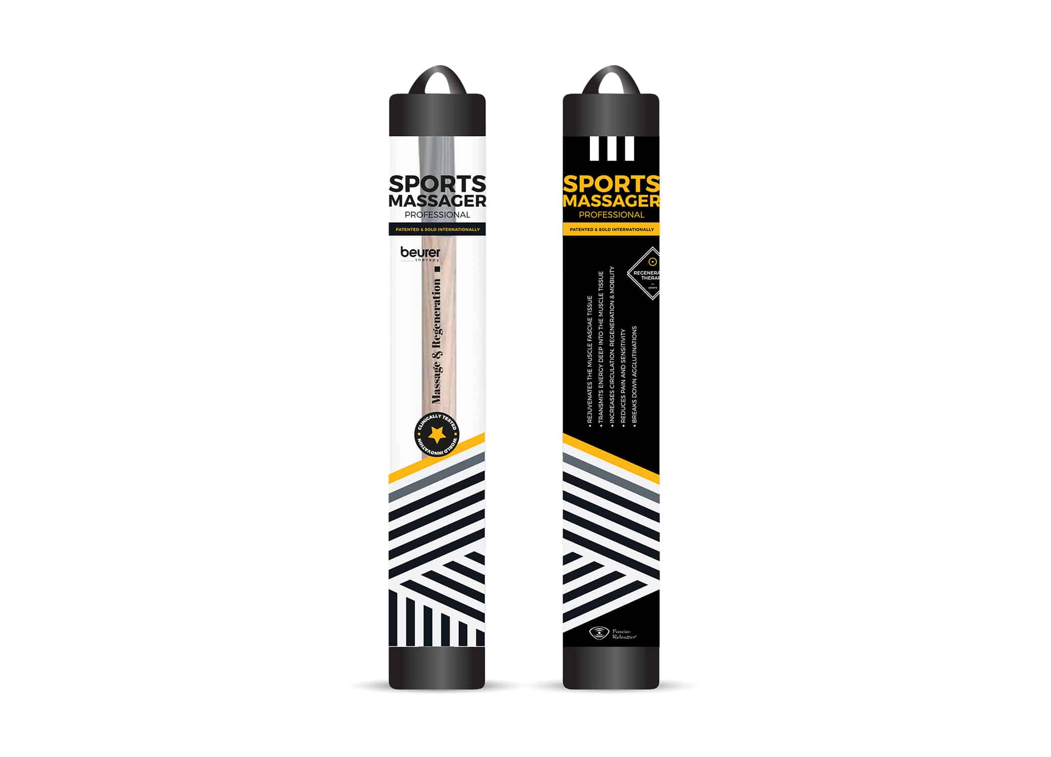

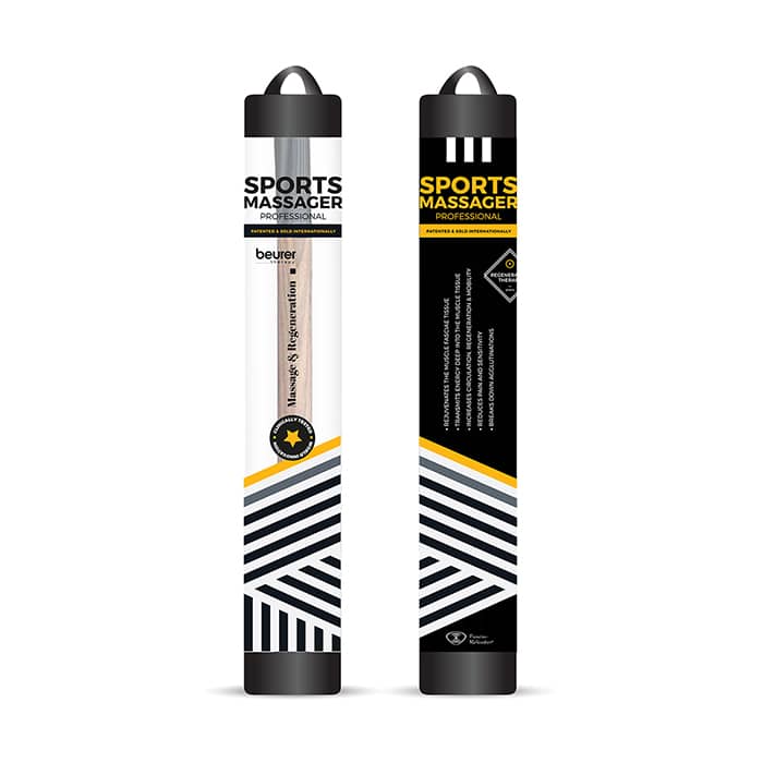
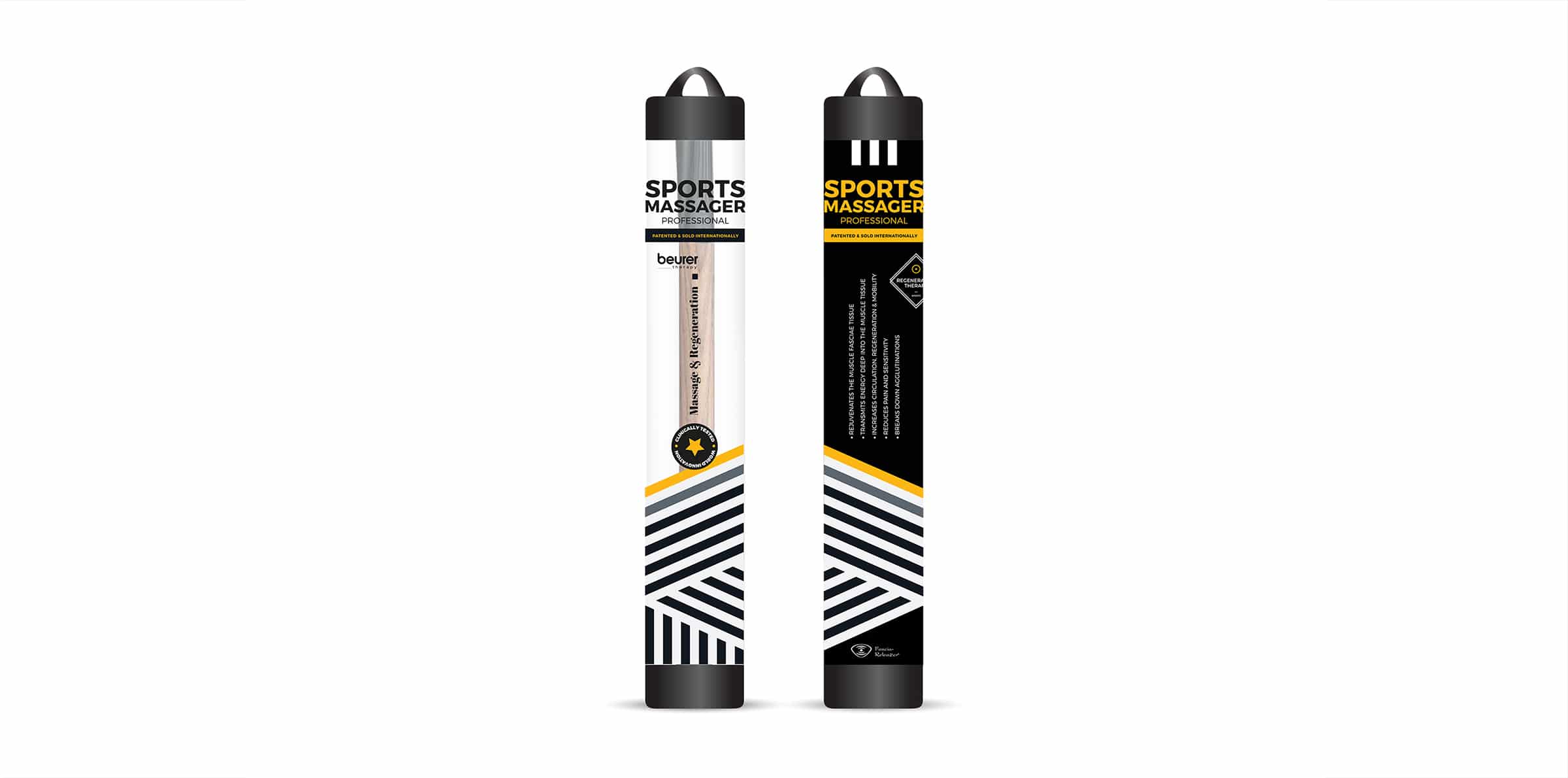
Fascia massage is a popular fitness trend that helps sports enthusiasts become more flexible, more active, and work through sports-related pain. We wanted to design a package that was eye-catching but also highlighted the product itself. The black and white angled stripes draw attention, while the pop of yellow carries the eye to the transparent window, showcasing the product.
We designed the sports packaging so that the consumer could read it whether it was displayed horizontally or vertically. The copy on the front of the packaging is minimal, communicating the product’s purpose—massage and regeneration. The back of the sports packaging offers more detail on the benefits of the product in an easy-to-read, bulleted list.
The star symbol contains the copy “clinically tested, world innovation,” capturing the product’s uniqueness and credibility. In addition, the bold typography and black and white color palette evoke strength and power, while the yellow reflects energy.
Facebook Ad
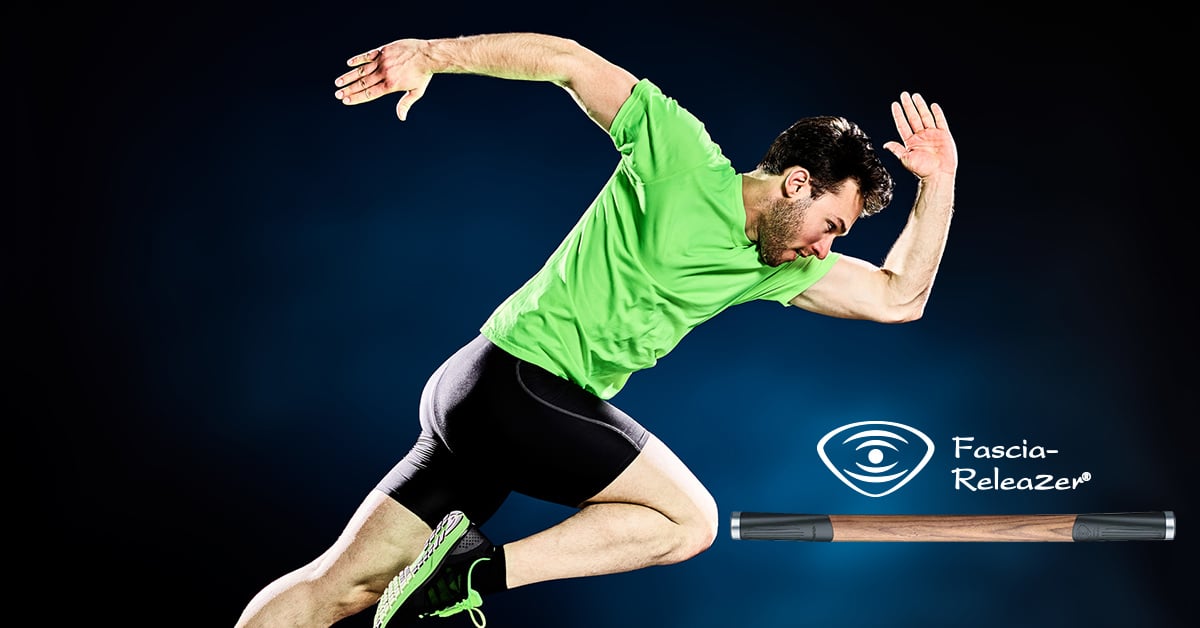
We designed the Facebook ad image and wrote the copy. The mid-motion image conveys action, fitness, and strength. The bold neon green against the dark background disrupts the newsfeed. The image is shown in the corner, piquing interest and curiosity.
The ad text, “Is your body struggling to achieve what your mind wants to?” plays on the consumer’s goals and frustrations. The headline, “The Art of Working Out” instills curiosity, while the newsfeed description creates a story that offers a solution to the consumer’s frustrations and a path to achieve their goals:
The ordinary athlete is a technician. The master is an artist. The Fascia ReleaZer helps you go beyond the ordinary to achieve artistry.
The Results
Our sports packaging design set the stage for a successful launch of the innovative sports massage product, capturing attention and revealing the benefits. The ad we created aligned with the brand’s vision for the product and appealed to the target audience.
Are you looking for a trusted branding agency to create your eye-catching brand image? Contact us today.


