Funny Bunny: A Happy Style for a Startup Baby Brand
Funny Bunny is an online business that provides baby products targeted at new and expecting parents. The founder came to us before the launch of the brand’s first product—a baby wipes warmer. She needed baby wipes packaging design as well as a booklet design for the baby wipes warmer that would appeal to new parents. She also needed a logo design that would reflect the brand image and essence as she grew and expanded her offerings. She planned to offer more products for babies and parents in the future. Finally, she needed all the designs to establish her brand as a trusted, baby-safe brand that cared about providing quality products.
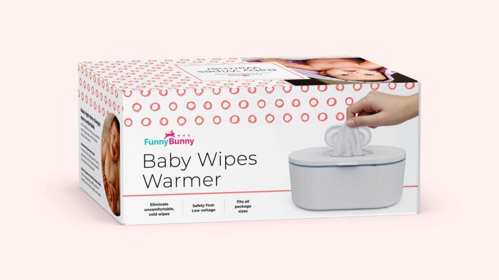
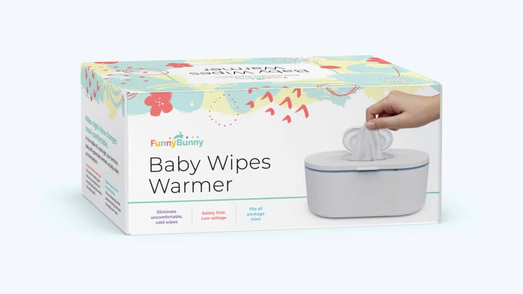
The presentation showed how all elements of the baby wipes packaging design would work together to establish the brand identity and differentiate Funny Bunny amongst its competitors in the baby product industry. To begin with, we designed a brand presentation that detailed our vision for the brand. In addition to rendering our ideas for the Instruction Booklet, we also developed 4 distinct brand design concepts for the baby wipes packaging design. Two of these concepts are shown below including concept 1, Cute & Colorful and concept 4, Playful and Abstract.
CONCEPT ONE: CUTE AND COLORFUL, BRIGHT WITH COZY FEELING
CONCEPT TWO: PLAYFUL AND ABSTRACT, WITH UNIQUE CUTE ILLUSTRATIONS
BRAND IDENTITY AND LOGO
BEFORE
AFTER
Crème de Mint, our proven branding agency, wanted to design an eye-catching, fun-loving logo—something that captured the interest of new moms and reflected the brand’s love of providing valuable products for happy babies and parents.
The bunny icon is inspired by the name of the brand, “Funny Bunny,” while the simple shapes represent exploration and learning for little ones. The bright brand colors—fuschia, purple, blue, orange, and green—evoke the happiness, excitement, and wonder of a new baby.
We wanted to design a logo that evokes happiness, excitement, and wonder of a new baby.
We wanted to design a logo that evokes happiness, excitement, and wonder of a new baby.
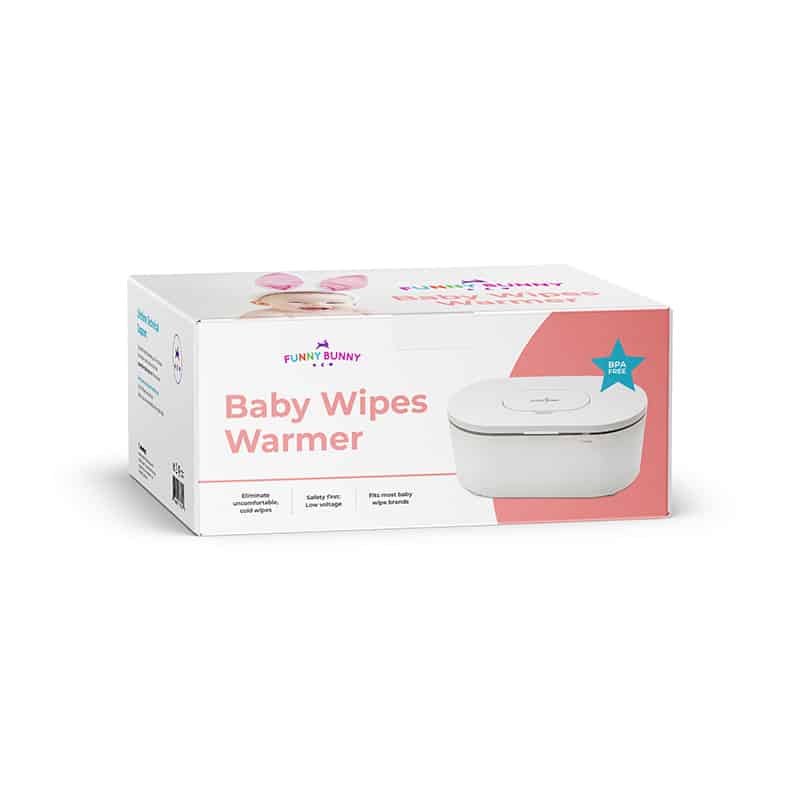
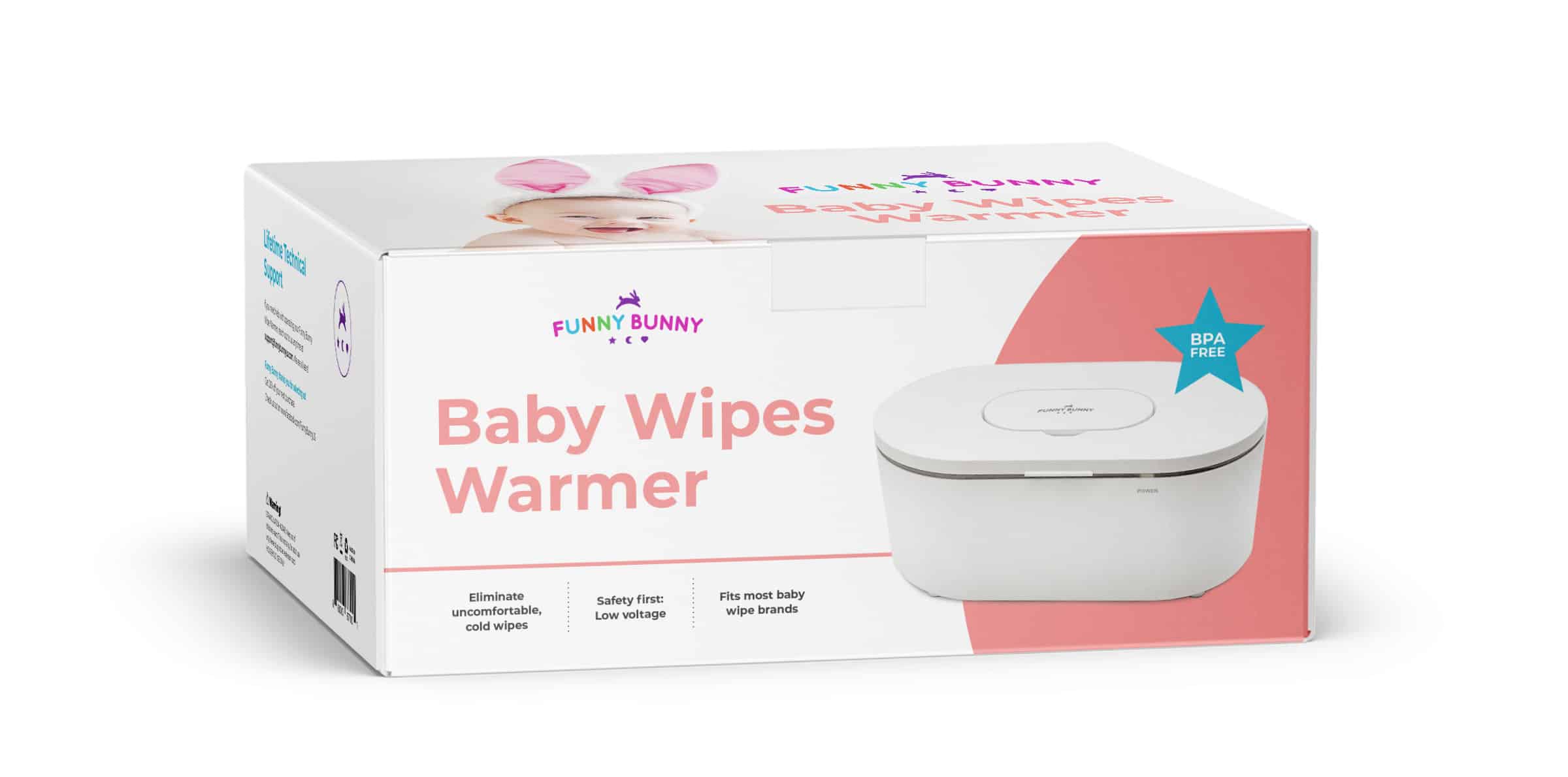
Package Design
The packaging design is gender neutral, stylish, and energetic. Happy, kitschy baby photos capture attention, while the dynamic color blocking leads the eye to the product. The retro color palette gives a nostalgic vibe to this modern baby wipes packaging design, creating a comforting effect that appeals to parents.
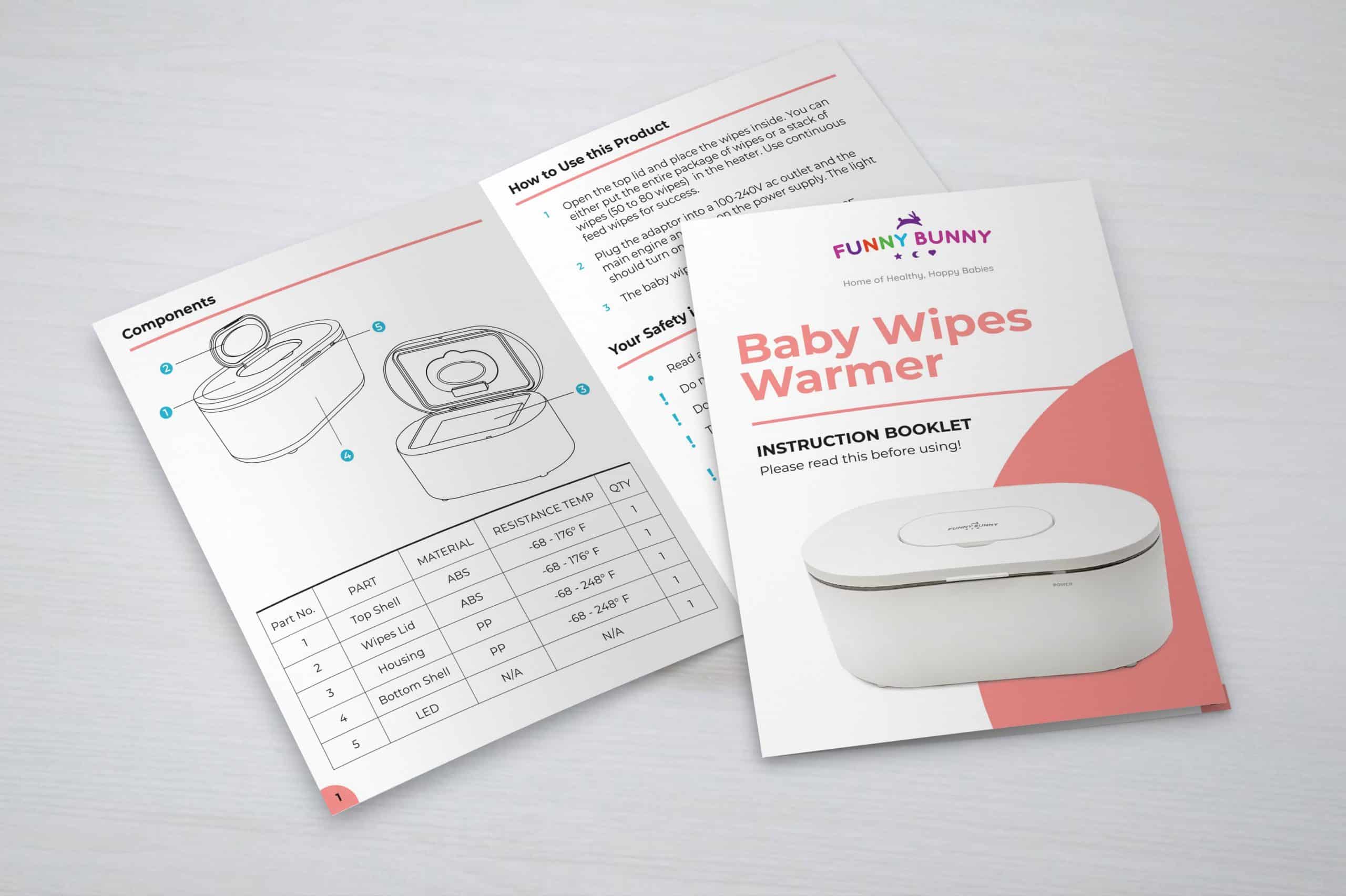
The Instruction Booklet Design
We used the same retro, stylish design for the cover of the instruction booklet, providing a cohesive brand experience. The pops of salmon color under the page numbers and beneath the booklet headers create an energetic edge.
They were very creative and delivered a product that I’m happy with.