An Organization Built on Community and Empowerment
Women in Design (WiD) is a community for women working in, or passionate about design that needed a non profit logo design for their organization. The organization offers community, networking, advice, and education for designers working in the building industry, including interior designers, architects, and engineers in the Denver area.
The founders are dedicated to inclusion, choosing not to require licensing or certification in order to join. They are open to members of all genders but maintain the goal of empowering women in the industry.
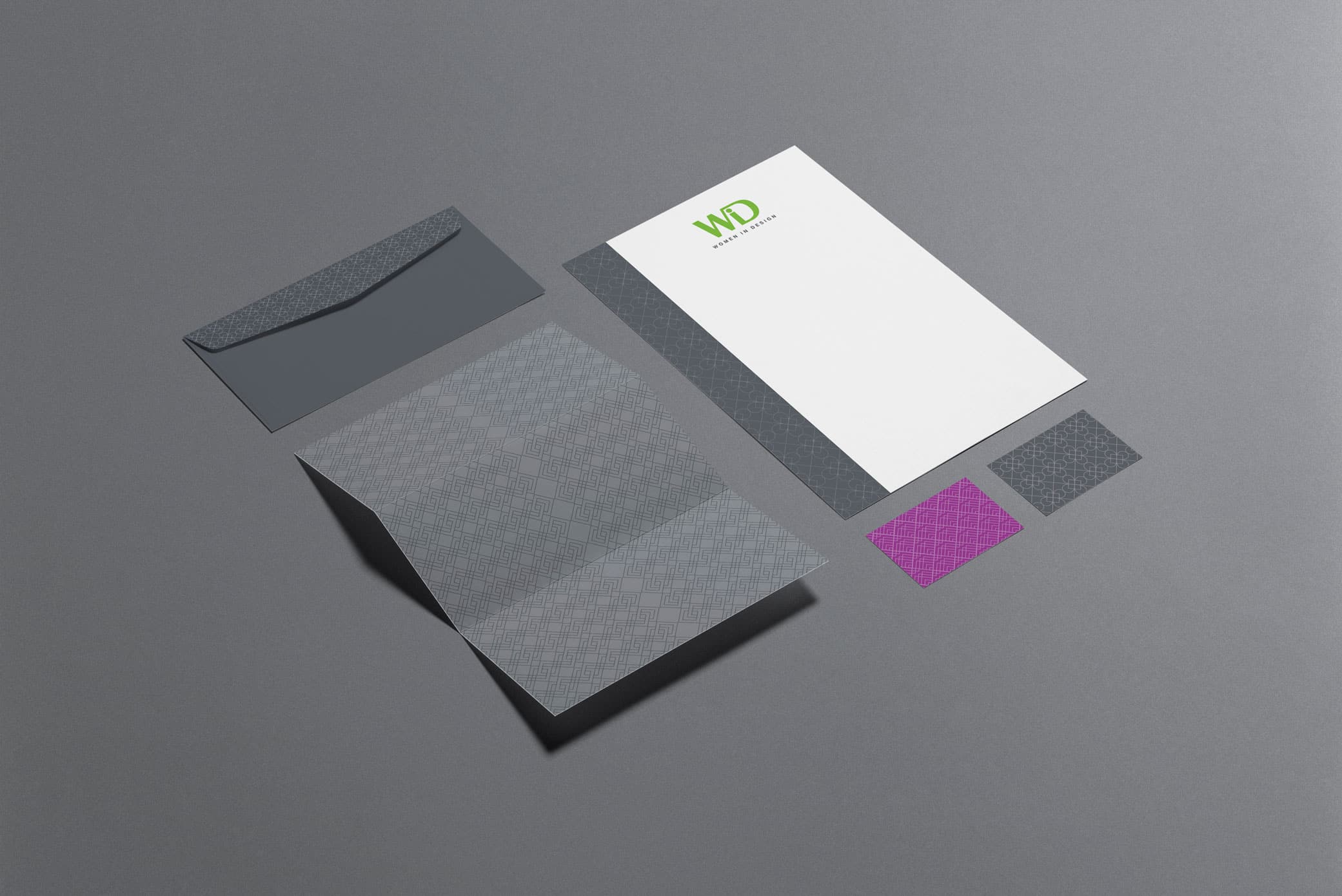
Above all, the group wanted a design that would highlight their commitment to diversity, reflect their passion for design, and appeal to women working in the industry. They also needed business cards and postcards to help spread awareness and grow the community.
THE PROJECT: Non Profit Logo Design And Brand Identity
The “WiD” connects together, creating intriguing angles in the non profit logo design
that are reminiscent of building design trends.
The connection also represents the community coming together and offering support.
The “WiD” connects together, creating intriguing angles in the non profit logo design that are reminiscent of building design trends.
The connection also represents the community coming together and offering support.
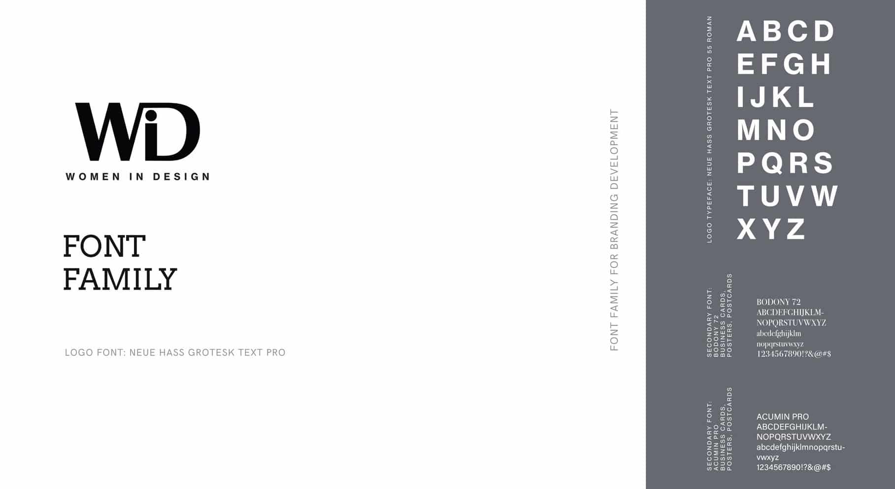
For the typography of “Women in Design,” we chose Neue Haas Grotesk, a simple sans serif font reflecting the professional element of the group.
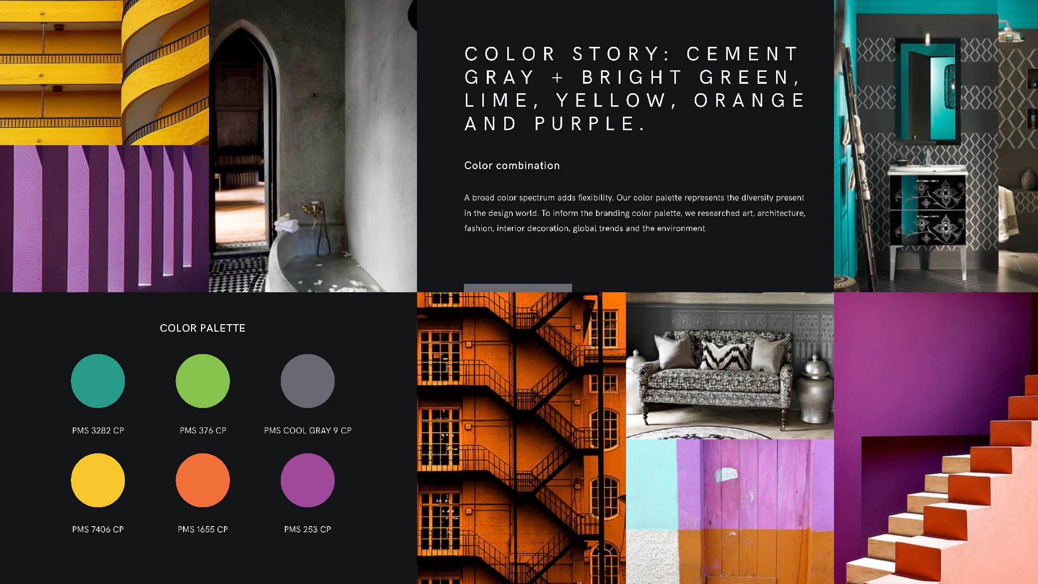
As a visionary branding agency, Crème de Mint selected vibrant brand colors—teal, green, orange, yellow, and purple, along with a cool gray for balance. The colors represent the diversity of the design world, inspired by art, architecture, fashion, and interior design.
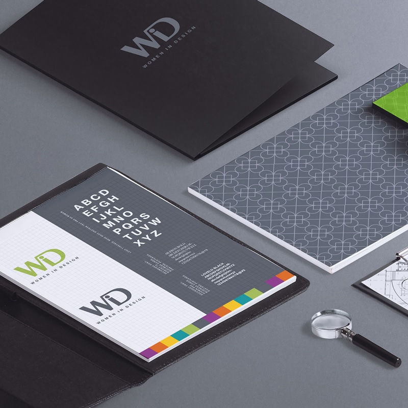
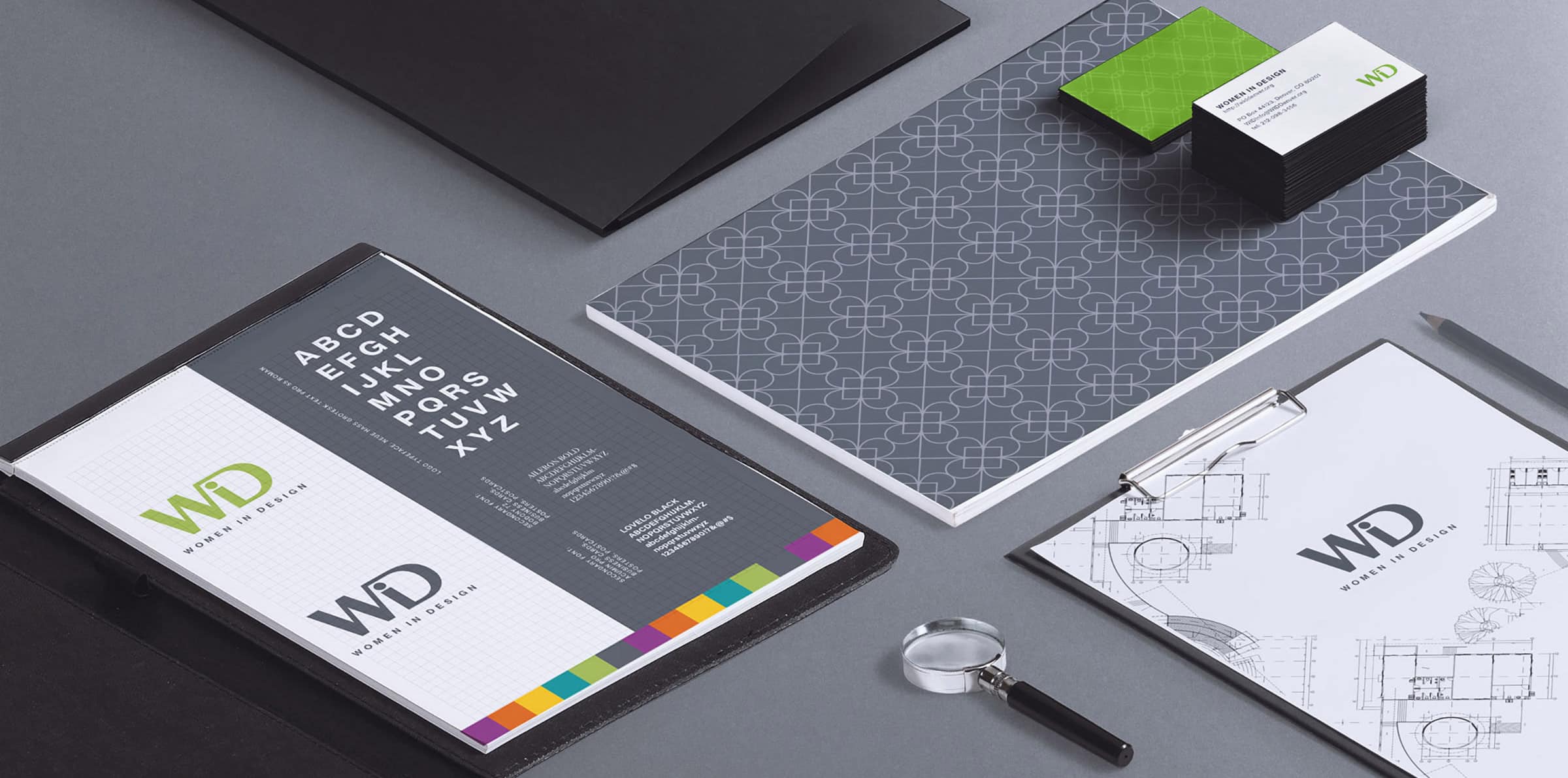
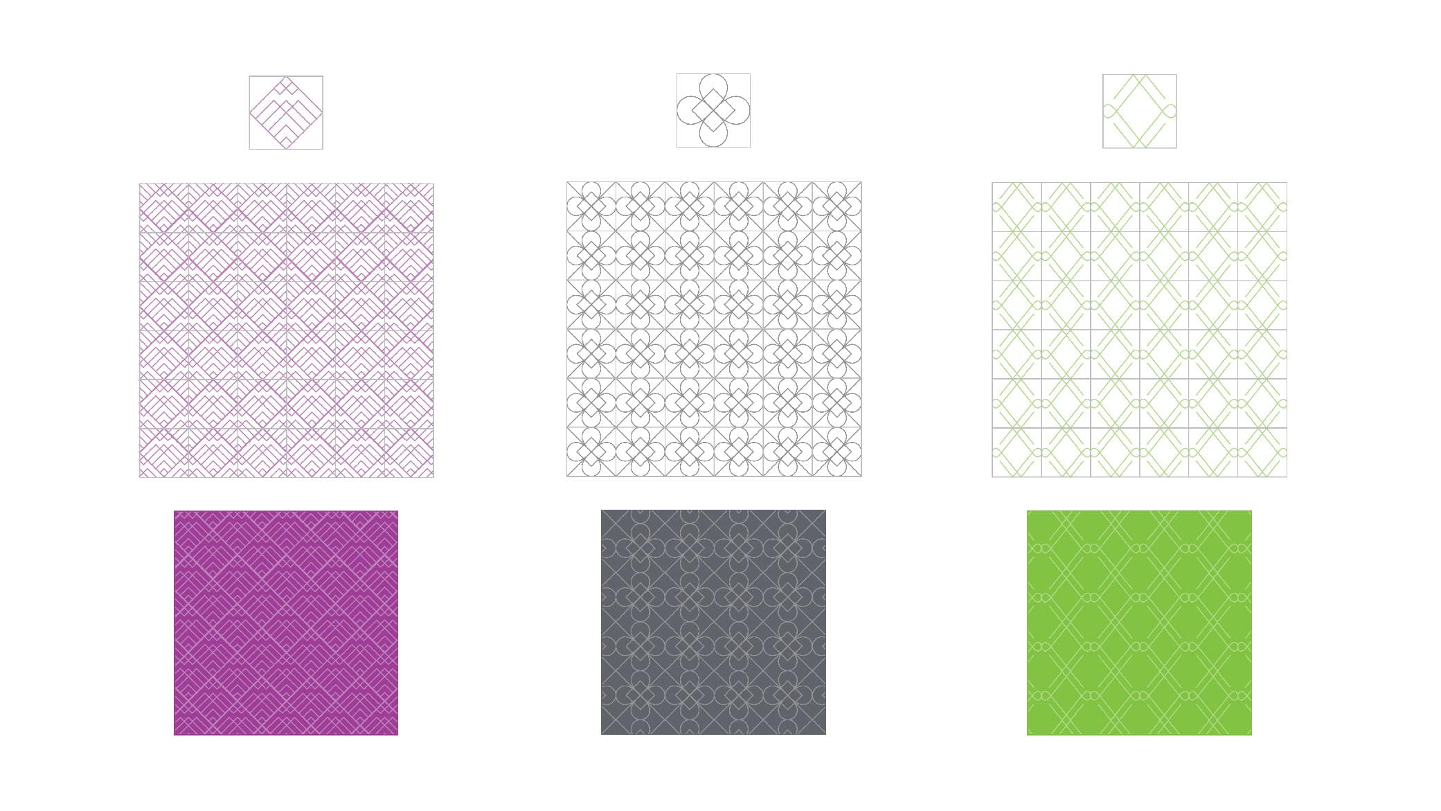
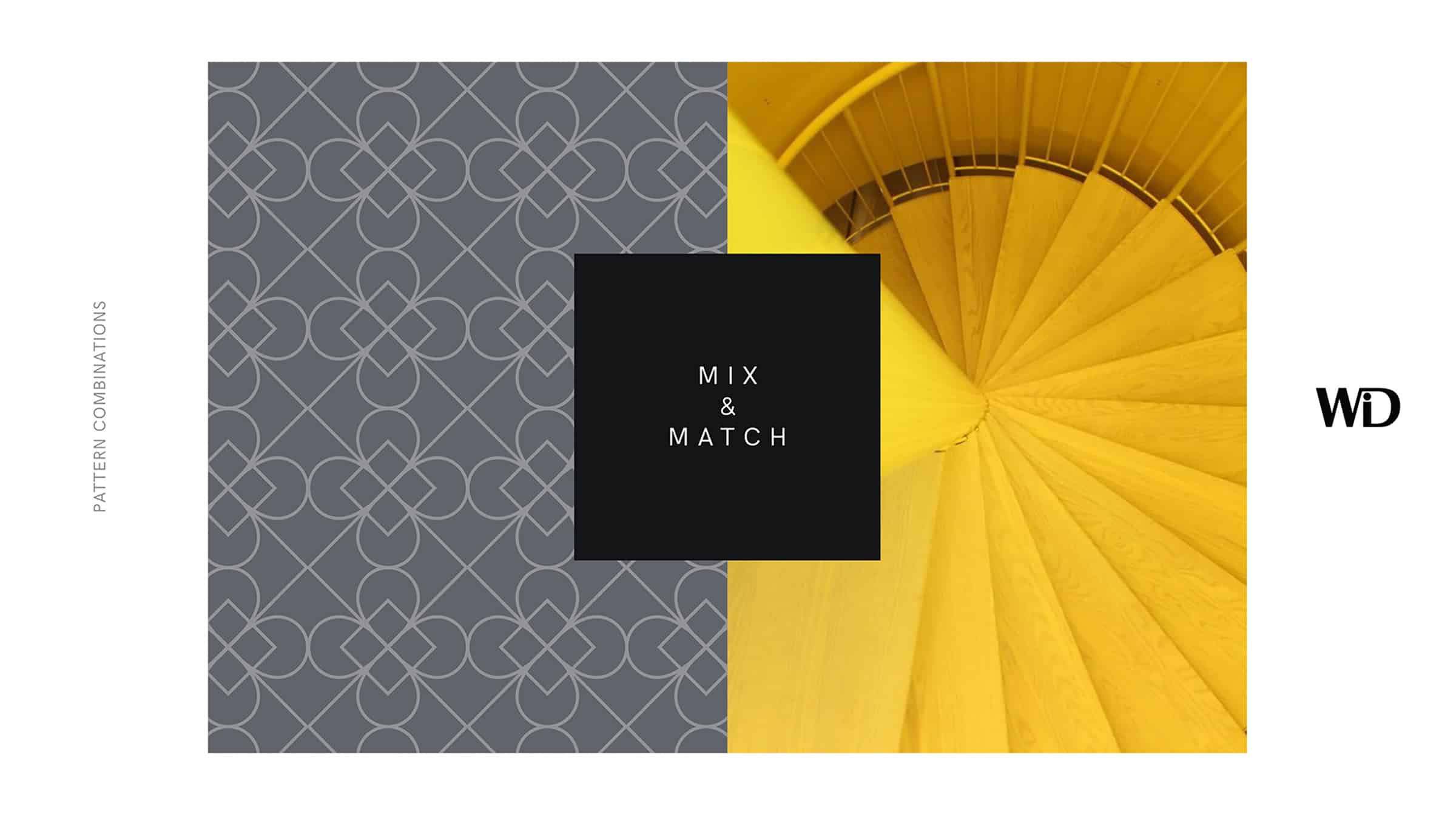
We also designed brand patterns to use in the print materials. Each square represents a member of the WiD community, coming together to create a beautiful, powerful image.
We wanted the design to capture the beauty of the design world and its importance in everyday life.
Brand Presentation
We created a brand presentation that dove into our inspiration and research, highlighted the brand elements, and demonstrated how the elements worked together. This ensured that the branding was aligned across all the projects and communicated the branding process to the founders.
Print Design
We also designed eye-catching business cards and postcards, incorporating the brand patterns that aligned with the brand image and conveyed the organization’s professionalism.
The results
Our designs represented the qualities of the organization—community, empowerment, support, and diversity. The non profit logo design we created for the professional organization contributed to a consistent brand image and resonated with women in the Denver design community.