The Challenge: logo and website design for Vision Framework
Vision Framework needed a logo and website design that reached the audience and positioned the brand as a professional company.
The owner, Marina, is a systems pro and a productivity expert. She helps purpose-driven, heart-centered entrepreneurs get 10-20 more productive hours a week, stop leaking money, and prevent stress-fueled breakdowns, helping people get from point A to B more quickly with structured businesses that get great money-saving results.
She needed a logo and website design that spoke to entrepreneurs and small business owners, establishing her as a reliable and trustworthy authority that could help them revitalize their business and free themselves up through her productivity strategies.
THE PROJECT: brand identity and logo
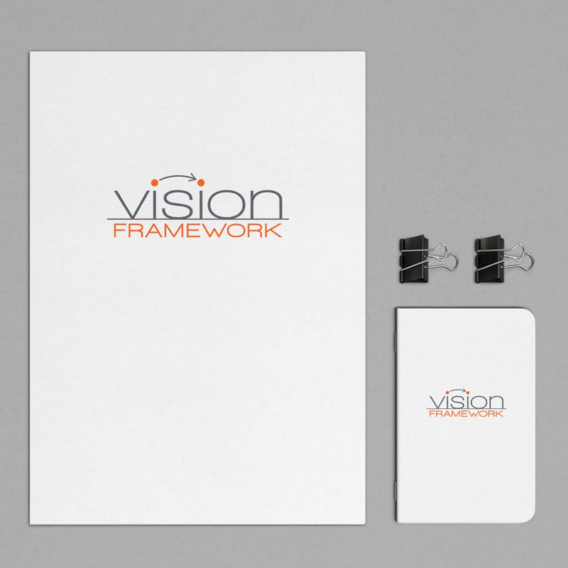
Crème de Mint, our strategic branding agency, wanted the logo to capture the essence of productivity, reflecting organization, systems thinking, and momentum. The arrow between the dots above each “I” represents Vision Framework taking the companies they work with from one step to the next. The line underneath “Vision” reflects structure and foundation—the same way that Vision Framework gives structure to the client’s vision.
For the typeface of “vision,” we modified Walkaway Expanded—a rounded font that gave a caring touch and softened the imagery of the logo. The uppercase angular typeface of “framework” symbolizes structure.
The brand colors of orange and gray represent enthusiasm and logistics. Vision Framework uses both to help entrepreneurs create businesses that work for them without working them into the ground.
Website Design
We designed a formal but friendly website, using orange image backgrounds and footers to evoke warmth and openness. We wanted business owners to appreciate the professionalism and expertise without feeling that Vision was cold or uncaring.
The layout of the website was clean and orderly, connecting to Vision’s systematic and organized brand.
The results
Our designs set the stage for owner Marina to establish Vision Framework as an authority in productivity—a partner that cares about its clients and understands what it takes to help them create systems, revamp their business, open their time and energy up, and become more profitable.
Loved working with Lauren! I’m a fairly picky client, so for starters I reviewed over a dozen portfolios before choosing Crème de Mint. Lauren designed my logo, and I was super happy both with the way she works, and the results she provided. She’s clear as day, creative, and very, very attentive to your business vibe and message. Lauren worked with me, listening, guiding, giving shape and color to my raw vision. Five stars.