
A Lively Package Design for an Innovative Beauty Concept
Qweeni Cap is an innovative shower cap that allows women to wash as much or as little of their hair as they wish. The founder turned to Crème de Mint, an experienced packaging design agency, for a fun, engaging hair product packaging design that would both appeal to millennials and communicate the product’s purpose clearly and succinctly.
- Package design
THE PROJECT:
Unique Hair Product
Packaging Design
The creator of the product suffered from oily hair at the front of her head. She dreaded the infamous white film from dry shampoo, so she was forced to wash her hair at the sink where she could target the oily spots in her hair. She decided there had to be a better way to manage oily hair between full washes and salon visits. So, she created the Qweeni Cap—a shower cap with a pull-through pocket at the front. Women can simply pull forward the amount of hair they want to wash, leaving the rest covered with the cap. That means no more dry shampoo or fighting with hair at the sink.
Package Design Concepts
The biggest goal of the package design was to demonstrate how the product functioned and why it was valuable. For innovative products, packaging is the key to success. If consumers can’t understand what a product does, they will simply move on to another option.
To start, we created a brand presentation for the client with 3 different design concepts: minimal & chic, playful & clean, and cute & sassy.

CONCEPT 1

CONCEPT 2

CONCEPT 3
Final Packaging Design
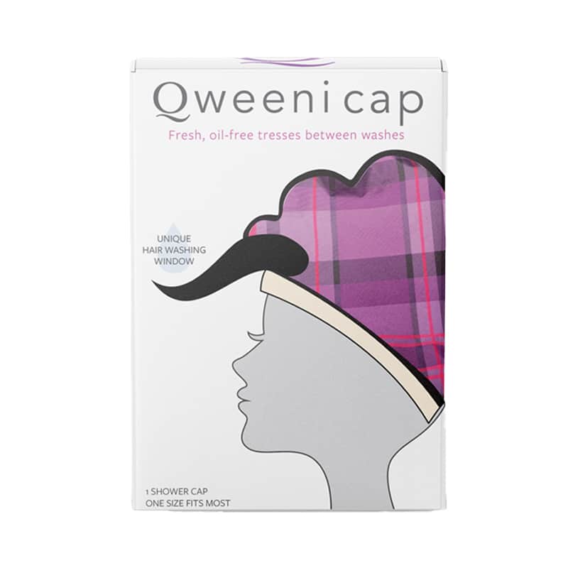
We designed the hair product packaging with a silhouette image of a woman wearing the cap. The woman is lightly shaded in an understated gray, allowing the pink and purple of the cap itself to pop and shine. The image intrigues consumers, making them want to take a closer look.


The taglines were also crucial. They needed to be catchy and inviting while also offering an explanation of the product. We created the taglines “The Shower Cap with a Hair Flap” and “Unique Hair Washing Window for ‘In-Between’ Days.” They both give an indication of the product’s purpose and entice the consumer to turn the box over and learn more.
On the back of the package, we provided a more detailed explanation, including simple sketched images that showed multiple ways to use it—washing just the bangs, or washing just the ponytail. The copy is clear and succinct, telling the consumer what the product is for and how to use it.
On the sides of the box, we added a playful crown pattern—a nod to the name of the brand and a fun element that inspired consumers to treat themselves as queens.
The typography of the original “Q” logo is elegant and majestic, adding an extra royal touch, with a simple, sans-serif secondary font to balance the image and leave the focus on the “Q.” We enhanced the existing logo by adding complementary elements in the packaging, mirroring the line under the “Q” with the curve of hair on the box.
The results
Our hair product packaging design set the stage for this unique startup, providing a package that commands attention and visually communicates the function of the innovative product.
Are you looking for an innovative beauty packaging design company to help you with your new product? Contact us today.

The creative design given was outstanding. They listened to us regarding the style of packaging design we needed. Communication between everyone was great. They brought my concept of what I had an idea for product packaging and made it better than I expected.
— Brian Paternostro, Qweeni Cap


