Nature-Inspired Supplement Packaging and Website Design
GREENWORKS
Nature-Inspired Supplement Packaging and Website Design
Greenworks was prepared to launch a new line of natural wellness supplements. As a new brand, they needed sustainable supplement packaging that looked and felt high-end, matching the quality of the products. They also needed a website that would strike a chord with wellness enthusiasts and set them apart as a quality brand in the industry.
The brand was dedicated to bringing a new, powerful, potent supplement to the market. The founder believed that earth is the essence of healing. She discovered holistic healing through her own wellness journey, but found it difficult to track down credible products at an accessible price point. This led her to form Greenworks.
She and her partner wanted to create and sell high-dosage supplements targeted towards an audience who was searching for holistic wellness solutions and a healthy lifestyle. They envisioned a simple, relaxing mood that conveyed earth, nature, and healing.
The goal was to launch a supplement line on their own website as well as Amazon, eventually establishing an in-store presence at natural food stores such as Whole Foods.
Crème de Mint, our award-winning branding agency, created upscale, premium packaging that was simple, clean, and good for the planet—just like the supplements themselves, along with social media imagery, website design, and branding that highlighted the brand’s natural, earthy roots.
Bringing a New Wellness Brand to Life
Greenworks provides quality, potent supplements that harness earth’s healing power. Crème de Mint wanted to create elevated supplement packaging and designs that reflected the high-end quality and emphasized the brand’s differentiator—high dosages for maximum efficiency.
In a booming supplement industry, it’s easy to get lost in the crowd. Clear, focused branding would set the stage for the brand’s success.
Crème de Mint designed a brand presentation to paint the picture of the brand—including the inspiration and “why” behind the logo, packaging, color, and typography choices.
This presentation allowed the company’s founders to envision what their brand could blossom into.
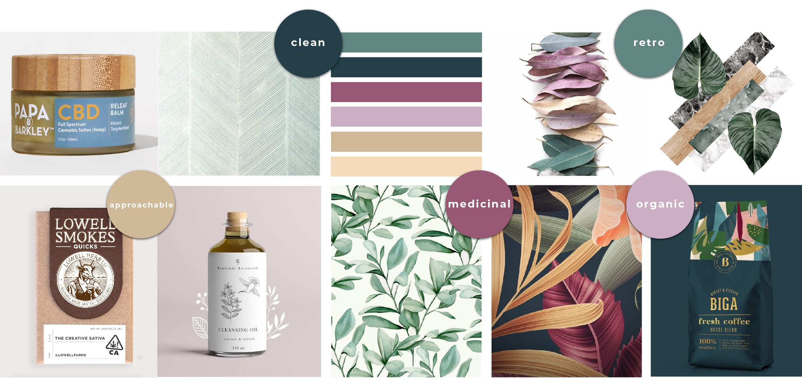
The concept for the branding was future apothecary—an approachable, dependable brand dedicated to clean, organic, natural healing. The designs combined modern simplicity with vintage-inspired floral patterns.
A Message of Healing and Hope
To establish the future apothecary-style brand, Crème de Mint centered the brand messaging around the healing power of the earth. They wanted to cultivate a simple, yet strong brand.
They created the tagline “Simple by Nature. Powered by Earth” to reflect the idea that the earth provides potent potential for natural healing—potential that Greenworks had harnessed.
Crème de Mint wrote website copy that revealed the brand’s commitment to quality, potency, and purity.
The copy offers understanding and inspiration to the target audience—those who suffer from health issues and have been failed by Western medicine. Potential consumers can see hope that with Greenworks they will finally experience holistic wellness.
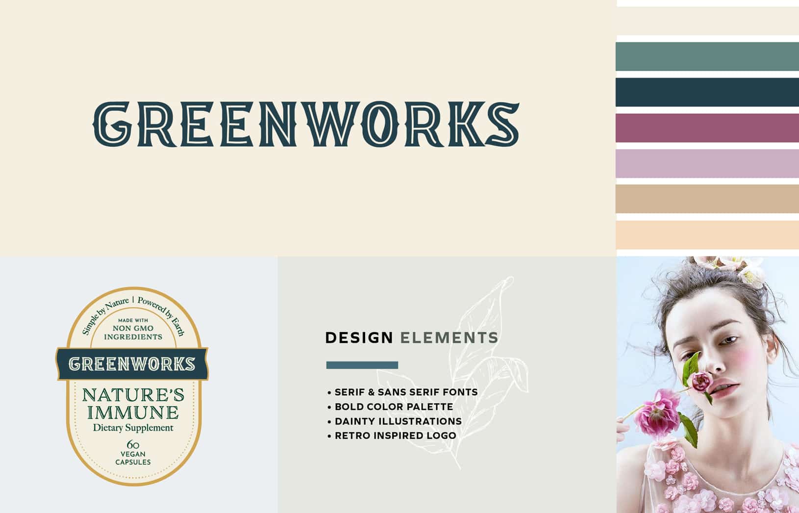
A Retro-Botanical Logo
Crème de Mint wanted to design a logo celebrating the brand’s pure, high-quality ingredients while also inspiring trust and connection.
The retro feel of the logo evokes an image of a trusted old-fashioned drugstore—a nod to the healing powers of the product. The logo draws inspiration from C.O. Bigelow—a reliable, traditional New York apothecary. This communicates the brand’s dedication to healing and health.
The custom leaf details within the “O” and the curve of the “G” symbolizes botanical essence, providing an intriguing visual and connecting to the company’s mission.
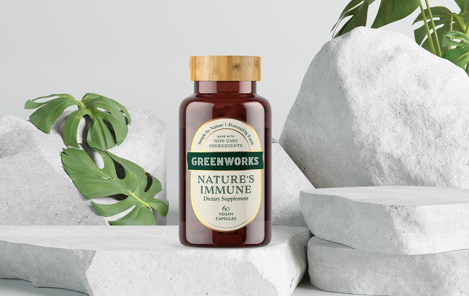
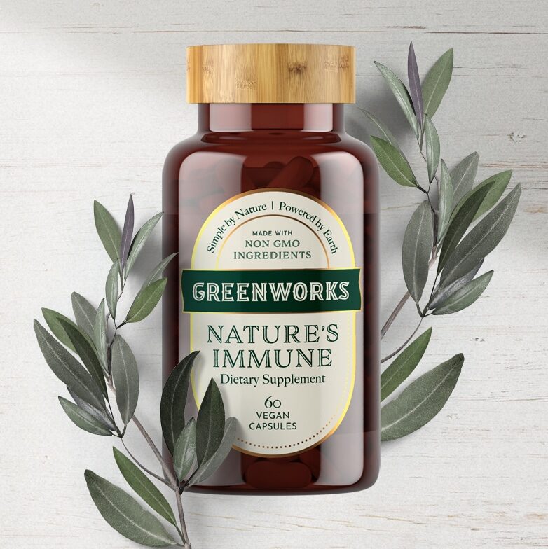
Premium and Purposeful Supplement Packaging
The founders of Greenworks believe in sustainability and environmental responsibility. They wanted a package that could be repurposed—something that people were proud to display, both during the use of the supplements and after.
Crème de Mint wanted to honor that mission while also creating a package design that looked and felt high-end.
The pops of gold on the supplement label design contribute to the luxury brand image, lending a modern feel and commanding attention. But the retro-inspired design remains simple, serving as both a reflection of the brand’s purity and ensuring that the bottle can be repurposed.
Along with the visual elements, the label material contributes to the quality of the packaging. Rather than the traditional thin, laminated paper, the label is created on luxury heavy-weight paper with a fabric-like feel.
The dark amber glass bottle with a wooden lid protects the product and serves as an eye-catching container that can be used for years to come.
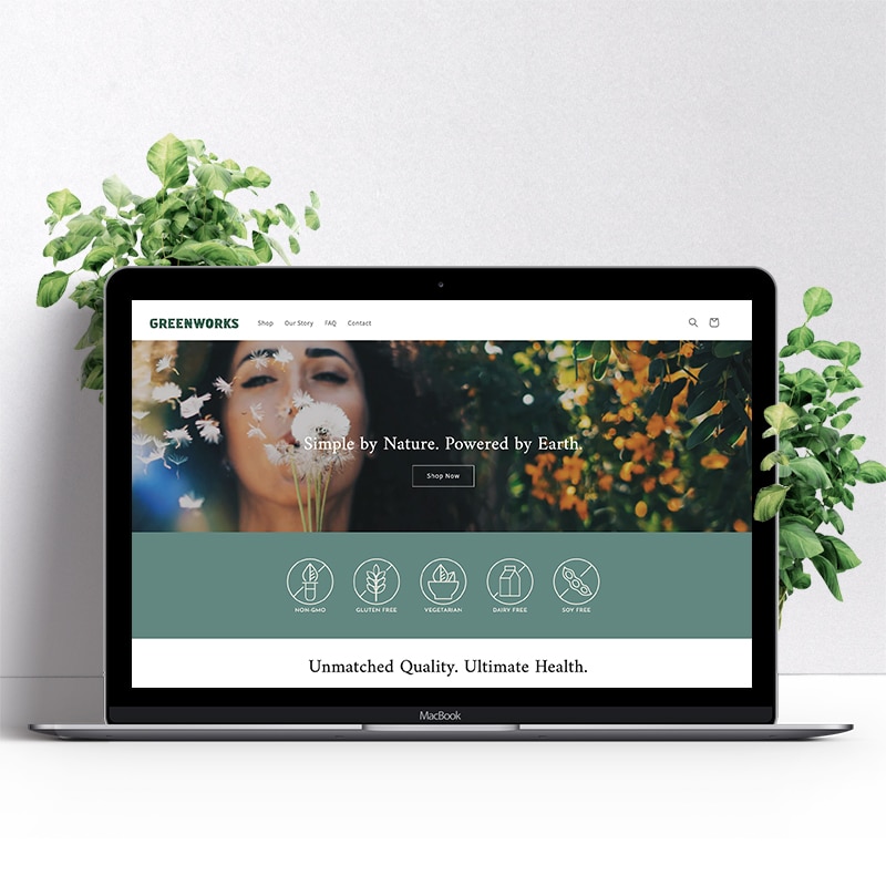
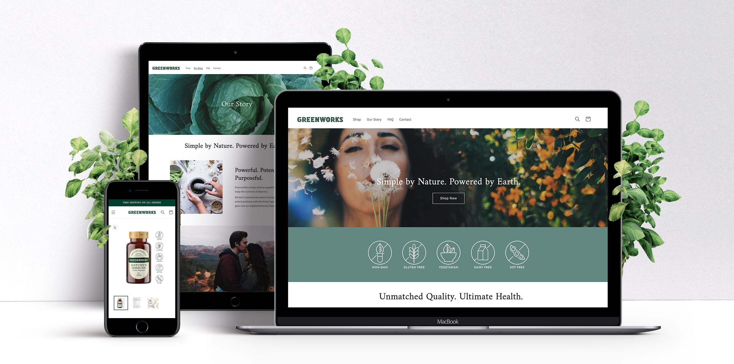
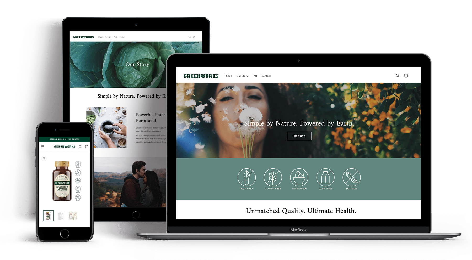
Earthy Website Design that Reflects Integrity
Crème de Mint knew that the target audience needed to trust in Greenworks—to believe that the products are natural, wholesome, purposeful, and, most importantly, effective.
Greenworks’ audience has likely been let down by traditional Western medicine and by other supplements, which charge a high price but offer only ineffective low dosages. The website needed to show that Greenworks is different—potent and powerful, a supplement brand that can be trusted.
Crème de Mint designed a website with nature-inspired images full of life, zest, and energy.
These images inspire the audience to picture a better life, a life without impairment, health struggle, low energy, and illness—a life of true wellness.
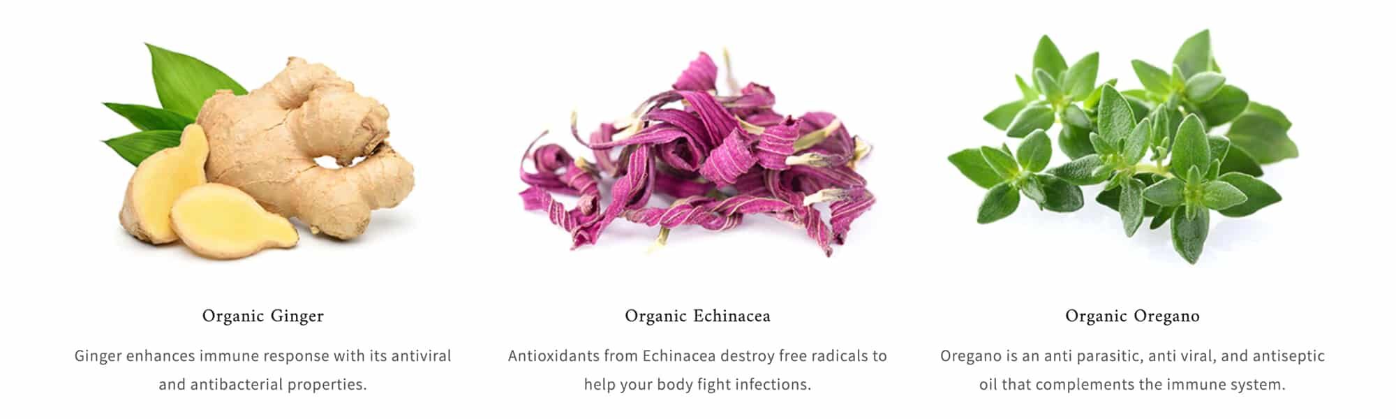
Vivid ingredient photographs remind consumers of the natural purity of the brand.
Bold Typography and Color
The biggest differentiator for Greenworks from other brands is that they offer products that truly work—with a potency much higher than competitors.
The vintage typography indicates trustworthiness and credibility, drawing inspiration from traditional apothecaries.
Crème de Mint wanted the designs to connect to nature and represent that potency. They drew inspiration from natural florals, choosing a brand color palette of rich teal and soft fuschia, complemented by subtle pinks, purples, and blush tones. The colors are grounding, connecting to the power of the earth to heal. The teal color ultimately evolved into a jade green, reinforcing the earthy, botanical feel of the brand.
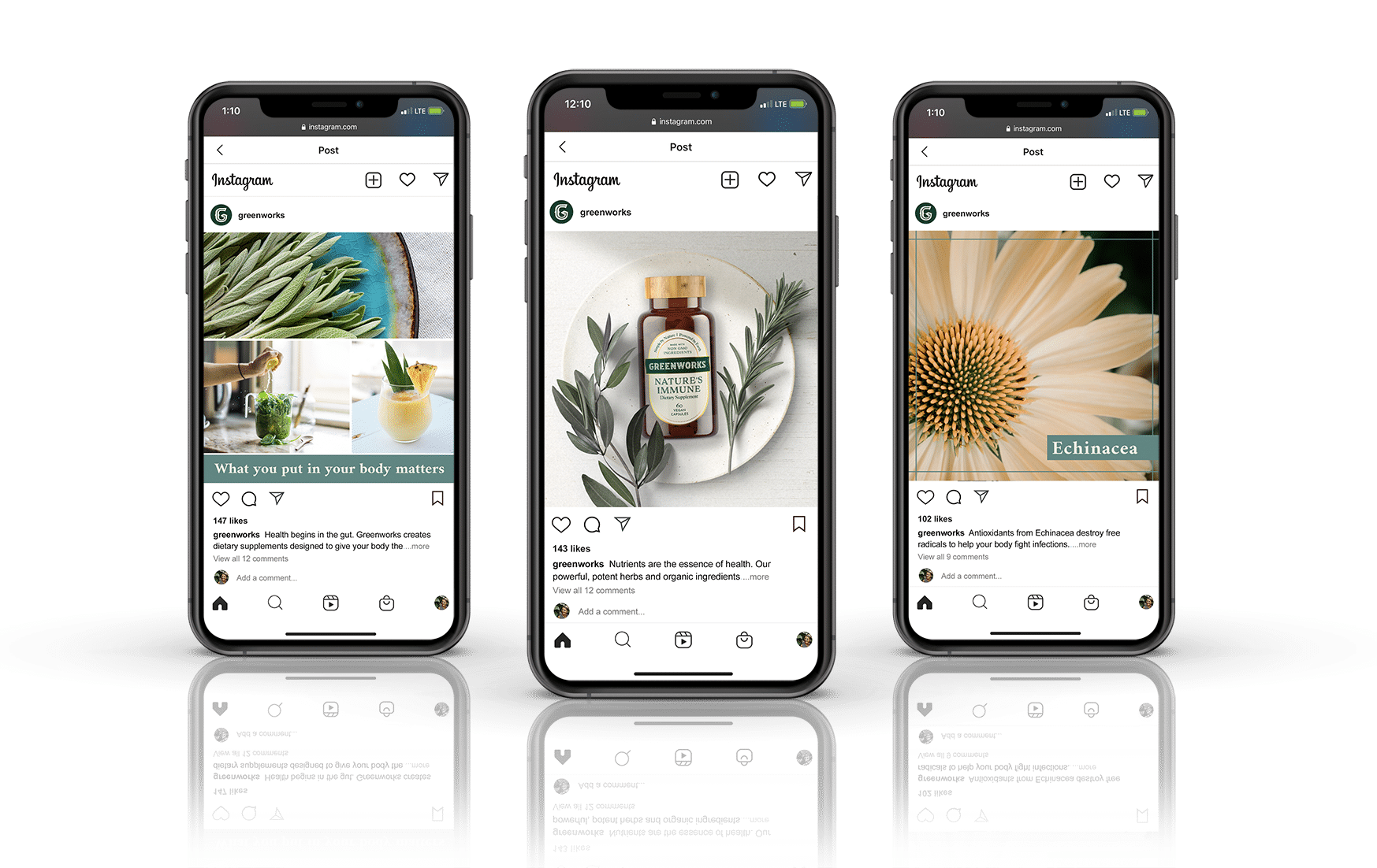
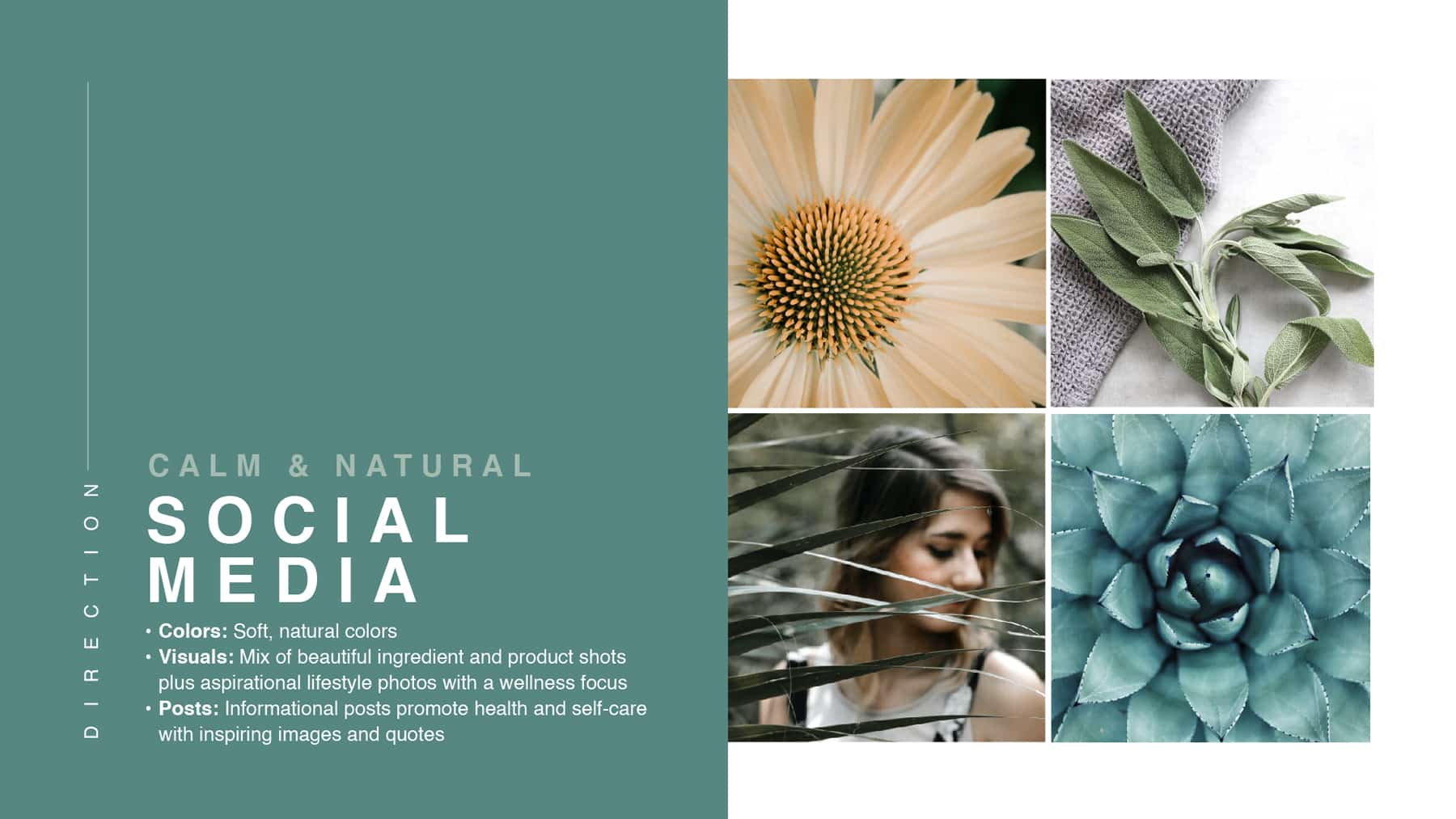
Nature-Inspired Social Media Designs Reinforce the Supplement Brand’s Image and Packaging
Greenworks had strong potential in social media marketing—as a premium supplement brand, the founders wanted to use their online presence to capture more leads and build a loyal following of customers.
The target audience of consumers interested in holistic healing and a journey of wellness is active on social media, often searching online for trustworthy brands and effective products.
Crème de Mint created a social media brand kit featuring the supplement packaging, key ingredients, and images that reflect freshness, wholesomeness, and wellness.
The natural herbal and floral imagery provides a calming, soothing feel. Visually appealing ingredient and product shots establish the earthy brand image, while aspirational lifestyle photos inspire a life of wellness and position the brand as leaders in the holistic health movement.
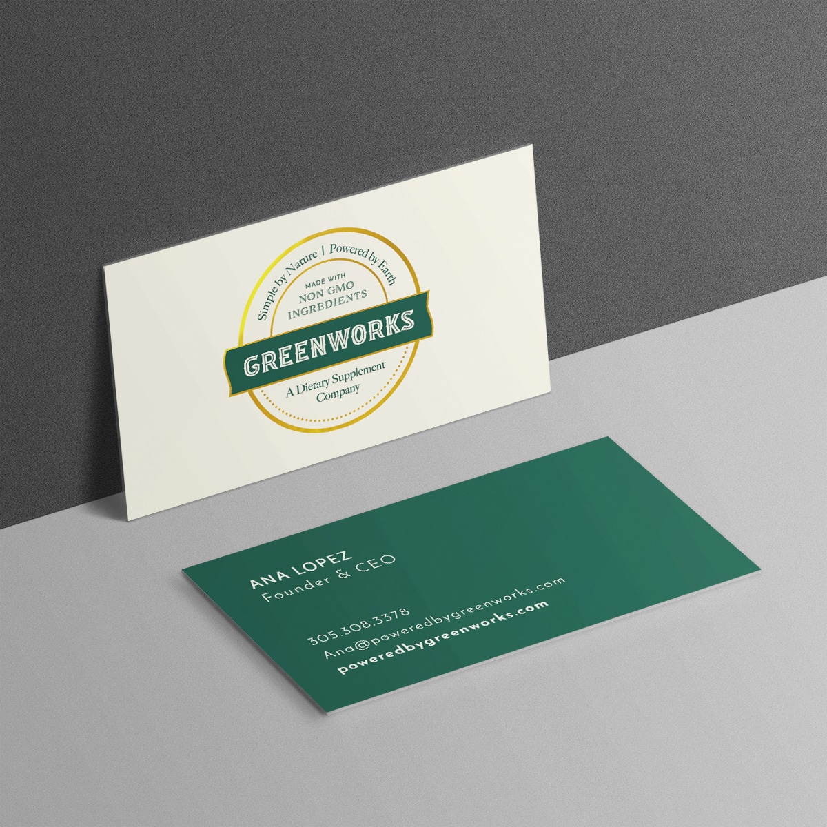
Print Materials To Reinforce the Brand Image
As they launched their brand, Greenworks also needed to appear established and credible. Crème de Mint designed elevated business cards that aligned with the brand image and provided the founders with a premium brand image for marketing and networking.
The green and gold in the logo pop against the cream background on the front of the card, while the dark green back of the card stands out and draws the eye to the founder’s information.
The Results: Premium Supplement Packaging and an Elevated Website Set the Stage
Crème de Mint’s work on the supplement packaging design, brand identity, website, and messaging laid the foundation for a successful launch into the wellness industry, positioning Greenworks as a favored brand for holistic health products.