
Medical-Inspired Designs for a Pharmaceutical Grade CBD Company
Opticann is a company dedicated to providing pharmaceutical grade CBD products based on science and research. They needed designs for their hemp company that reflected what set them apart—scientific backing and data-driven development. Their products include CBD capsules, creams, and oils designed to help people who suffer from chronic conditions manage their pain. The company’s products merge plant medicine with modern medicine, based on scientific backing and data-driven development.
Along with a new logo design for the medical hemp brand, the company also needed package design for their sub-brand, ArthroCBD—medicinal CBD products designed to relieve pain from arthritis.
- Logo design
- Mood boards
- Simple brand presentation
THE PROJECT:
Medical-Inspired Designs for a
Pharmaceutical Grade CBD Company

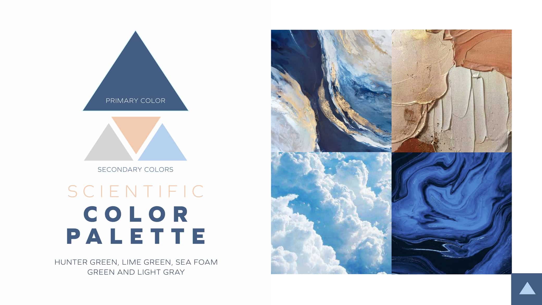
Crème de Mint, our strategic branding agency, envisioned a scientific icon that represented the expertise and research behind the products, and established the brand as a trustworthy source for pain management. We designed a mood board that highlighted our visual inspiration, our research, and the color palette we chose, and communicated the concept to the founders of the company.
LOGO CONCEPTS


The original logo looked clean and professional, but it didn’t communicate the benefits of the products or the brand’s commitment to scientifically-backed alternative healing solutions.
We created several concepts for the logo design: a science-driven direction using icons such as serotonin molecules to highlight the relationship between science and medicine, an abstract concept that evoked safety and health, a healthy movement icon that represented ease, flow, and flexibility, and a clinical, modern design that communicated trustworthiness.
Logo Design


BEFORE
AFTER
Through collaboration with the founders of the brand, we ultimately decided on the healthy movement direction, refining the logo to create an eye-catching design that represented the freedom and agility of a life without pain. The “O” icon symbolizes flexibility and athleticism. The brand colors of deep blue with pale blue accents evokes trustworthiness and reliability. For the typography, we selected Keller Sans, a strong sans serif that feels medicinal but modern.
Brand
Presentation

We also designed a presentation deck for the brand to present to CVS that communicated their research, background, and benefits. The presentation established a professional feel and positioned the brand as experts in the medicinal CBD industry.
The results
The new logo design aligned with the vision the founders had for Opticann—a reliable, customer-centric, scientifically-backed pain solution. It appealed to the target audience, chronic pain sufferers, communicating the benefits of the product and encouraging trust in the brand.
Are you looking for a trusted branding agency to create your eye-catching brand image? Contact us today.


