
A Package and Logo that Stands Out on the Shelves
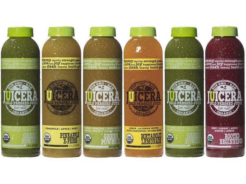
Juicera, a South Florida juice company that sells in Whole Foods wanted a unique brand identity—they were tired of their product looking like everything else on the shelf. They turned to Crème de Mint, a brand-enhancing food packaging design agency, to revamp the juice packaging design and branding for their specialty juice company. Juicera wanted something that leaped off the shelves, captured attention, and made sure that their products got noticed. They wanted their product to stay colorful and simple, but in a way that didn’t just blend in.
- Brand identity
- Tagline
- Business cards
-
Label design for 9 juices
(8-oz & 12-oz) & 2 shots
- 4-pack display (4 flavors)
- Trade show banner
- Truck decal
- Print ready artwork mechanicals
- Private label designs
THE PROJECT:
Juice Packaging Design
and Branding for Juicera
We wanted to establish a distinct brand voice for Juicera—something that captured the essence of the brand, showed what made them special, and engaged customers as they walked by.
Brand Identity and Logo Design

BEFORE

AFTER
As an emerging juice startup, Juicera needed to stand out in a crowded industry. But their original logo was cluttered and unclear.
We emphasized Juicera’s commitment to providing the best-tasting quality juices to their customer by playing up the “U.” The “U” mimics a glass, bringing forth an image of freshly squeezed juice rather than one made from concentrate. We added a droplet into the “U” to symbolize filling that glass, just as Juicera fills the needs of “U,” the customer.
For the typeface, we chose GT Adriana Bold. The heavy strokes pop on the packaging, and the curvature of the letters is reminiscent of fruit.
Package Design

BEFORE

AFTER
The original packaging looked similar to other juice brands and missed an opportunity to highlight freshness and fruitiness.
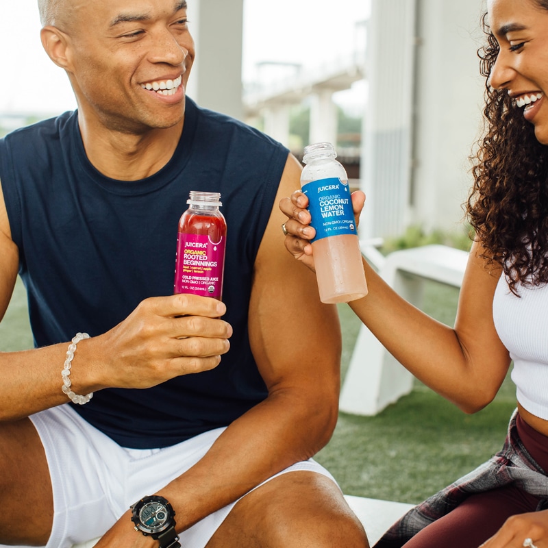
The final juice packaging design is clean, bright, and eye-catching. The half-moon die-cut symbolizes a fruit wedge and a drop of juice, highlighting the freshness and natural element of the juice. Juicera is 100% juice with no added water—pure, fresh, and true to the fruit.

We also created the tagline “made true for you” as an extra call-back to the wholeness of the product and Juicera’s commitment to the customer. We based the tagline off of customer feedback—what people loved about Juicera was that it was fresh and full of flavor, the same quality of freshly-squeezed juice you could make at home. Those responses revealed what made the brand special—it felt as if it was truly made for the customer.


Promotional Materials
Juicera also needed new promotional materials to reflect the updated imagery. We designed business cards, van decals, and banners that aligned with the revamped brand identity, providing a cohesive look for marketing.


The results
The end product not only stood out from the rest of the juice on the shelf—it also stood for what made the brand great. The colorful, minimalistic, bold packaging reflected the brand’s mission and attracted customers. Whole Foods, the brand’s primary vendor, admired the designs and knew they resonated with their clientele. The updated juice packaging design contributed to Juicera’s success and growth. Since our work on the project, Juicera has expanded to over 150 locations, including restaurants, hotels, and grocery store chains.
Are you looking for a creative packaging design company to help you with your new product? Contact us today.
For more resources, check out our food packaging design guide.


The team never stops until things are perfect.
— Lori Robinson, Co-founder of Juicera


