Award-Winning Package Design for an Exotic Juice Company
FARAFINA
Award-Winning Package Design for an Exotic Juice Company
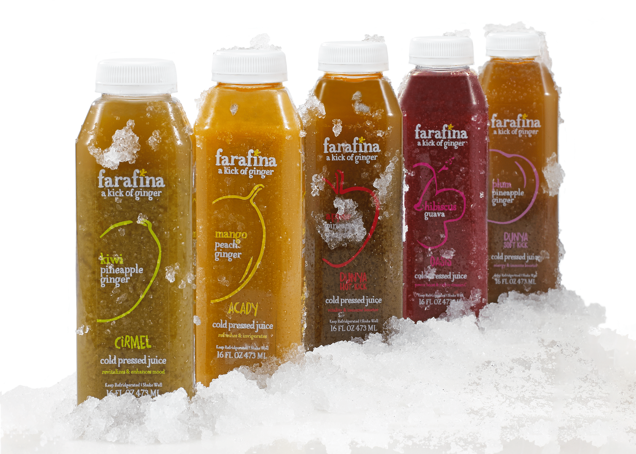
Farafina is a juice company that incorporates ginger and African fruits into their products. In fact, the brand name Farafina means world, and the company is committed to producing unique, high-quality juices, weaving exotic flavors into their delicious beverages. The organic juice company looked to Crème de Mint, a creative packaging design company, for their expertise in creating new branding and packaging.
Organic Juice Packaging for an Exotic Juice Company
Farafina wanted the juice to be sold in stores known for natural and organic food brands—Whole Foods, Trader Joe’s, Wegmans, and Yes! Organic. So, they needed packaging, tagline, and a logo design that would capture the attention of health-conscious consumers, highlight what distinguishes them from other juice brands, and communicate the quality and nutritional impact of their products.
Brand Identity, Logo, and Tagline
We wanted our designs to reflect the energy, both of the brand itself and the energy the customer gets from consuming quality, whole, nutritional fruit juices.
Package Design
The vibrant, hand-drawn, rustic illustrations communicate the juice’s freshness.
At the same time, each illustration highlights the main fruit in the juice. The clear labels are symbolic of the company’s transparency while also allowing the consumer to see the appetizing colors of the juice inside.
In addition, we incorporated more lively, zestful handwritten typography into the packaging—Trash Hand for the secondary tagline “Drink Exotic” (a nod to the unique African fruit base).
The Results
Crème de Mint’s designs reflected what made Farafina different from other juice options and gave the brand its own distinct brand image and identity. As a result, the packaging design won the 2018 American Package Design award from Graphic Design USA and received the runner-up packaging award from the 2018 Core77 Design Awards. For more on design, check out our food packaging design guide.