
Positioning a CBD Company as a Trusted Medical Authority
OptiCann is a company dedicated to providing high-quality CBD products based on science and research. The company developed the brand ArthroCBD—medicinal CBD products designed to relieve pain from arthritis. ArthroCBD needed labels for their medical CBD product that would establish them as a trustworthy and data-driven source for pain relief using CBD.
- Logo design
- Package design
- Mood boards
- Simple brand presentation
- Print artwork mechanicals
MOOD BOARDS

For ArthroCBD, the company used scientifically-backed formulas to develop a CBD liquid gel capsule, four times more powerful than most other CBD brands. Their product was designed to help people manage their pain so they can stay focused on enjoying their lives. ArthroCBD targets active people struggling with chronic arthritis pain that choose to research alternative treatments for their condition.
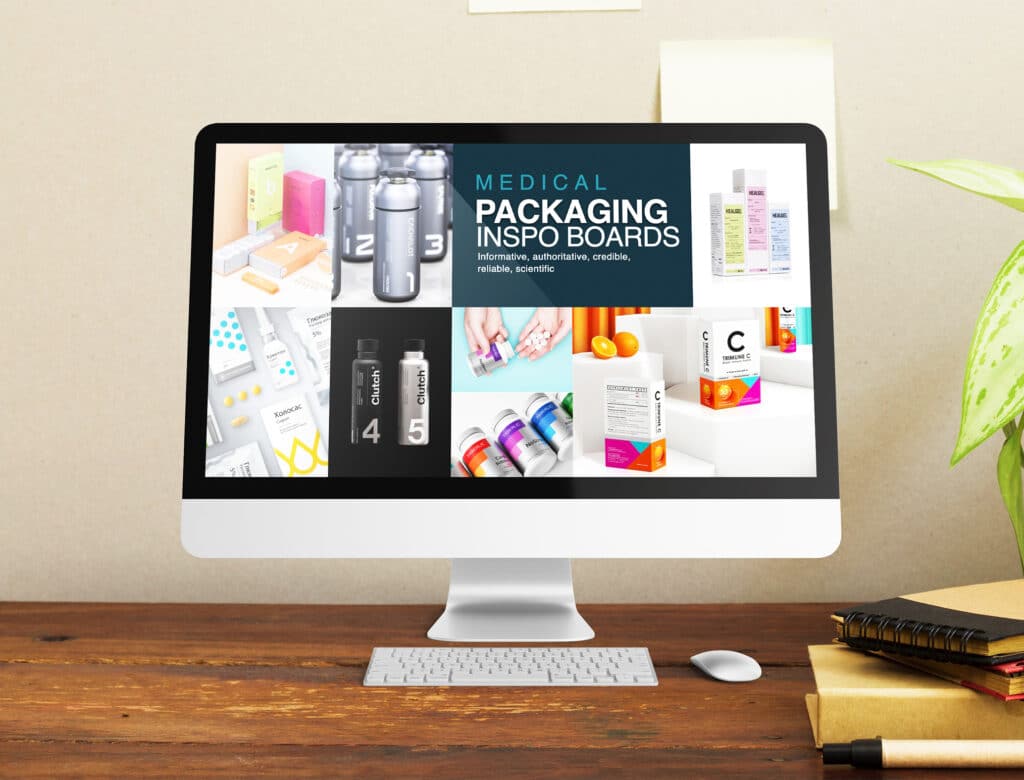
We envisioned two distinct paths for ArthroCBD’s branding. The first was one that tapped into the natural side. This was achieved by incorporating plant images and highlighting the product as an herbal supplement. The second one was more clinical and medicinal, aligning with the look of traditional pain relievers and medicines.
We created mood boards that captured each of those visions, with inspiration, imagery, colors, and font exploration. This provided the founders with a visual look at the branding possibilities. It also helped them determine which one aligned with their goals for the brand.
Brand Identity and Logo

After creating the mood boards and gathering feedback from the founders on their vision for the brand, we wanted the designs to reflect the brand’s credibility and commitment to quality—something that would feel clinical and authoritative.
The diagonal angle across the “A” symbolizes a bent knee, a nod to overcoming the pain and limitations of arthritis.
For the typography, we modified Montserrat Ultra Light, a sans serif font with a clean, modern look.
We chose the navy blue brand color to capture a medicinal feel that positioned the brand as comparable to popular pain medicines, while the orange adds warmth and personalization, symbolizing the act of bringing CBD into the treatment plan.
CBD LABELS PACKAGING DESIGN


The packaging is designed to instill trust and communicate the product’s effectiveness. The image of a woman stretching her leg to the sky captures the hopes of the target market—to live a pain free and active lifestyle.
The phrases “backed by science,” “clinically studied 4x absorption,” and “proven long lasting” assure the consumer that this brand is reliable—they’ve tested, studied, and worked to formulate a high-quality CBD product.
The package is simple, keeping the focus on the image and benefits of the product.
Once we decided on the medical branding approach, we designed a branding presentation that provided a cohesive look at the elements and dived into our research and reasoning behind the designs. This created a unified brand image and illustrated the branding concept.
The results
As a result, our designs for ArthroCBD laid the groundwork to position the brand as a trustworthy and credible option for pain relief. The packaging and logo captured OptiCann’s vision and goals for the brand, appealed to the target audience in focus groups, and highlighted the brand as a reliable medical source for arthritic pain management.


