The Challenge: New Retail Packaging Design for a Vase Product
Amaranth Vase Company created an innovative vase that solved a common problem for flower-lovers. He approached Crème de Mint for an update to his new retail packaging design, something that would speak to women interested in home decor and communicate how the product could make it easier to keep floral arrangements healthy, thriving, and beautiful.
the project
The founder of Amaranth Vase grew tired of traditional vase design that caused changing the water to be a headache. Emptying a vase and trimming the stems of fresh flowers requires pulling your entire bouquet out, disrupting the arrangement and impairing the beauty. This is a problem that all lovers of fresh flowers and home decor face, but nobody was providing a solution. Instead, vases were using the same design from thousands of years before.
The founder decided to create the answer—a pull-apart vase that offers easy access to stems and water without disturbing the placement and presentation.
Package Design
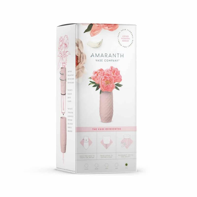
The original packaging was devoid of color, leaving a cold and impersonal feel. It also failed to communicate the purpose of the product on the front of the package. We understand that packaging is a mini-billboard for a product. Great package designs explain what makes the product unique and powerful right away. Crème de Mint designed a brand presentation to paint the picture of the brand-including the inspiration and “why” behind the packaging, color, and typography choices.
BEFORE
AFTER
Our package design for the vase product displayed a vibrant pink bouquet, catching the eye right away. We added images of petals and florals above the logo for an added touch of elegance and beauty.
We also included a graphic that commanded attention and explained how the product worked. “The Vase Reinvented” indicated that this was something different than the average vase. The image showed how the vase allowed the customer to easily change the water and trim the stems.
On the side of the package, we replaced the small step-by-step graphic with a large image showing the vase in action.
This made it easier for the customer to envision how the product worked. The vase also came in five color options—pink, blue, black, gray, and white. We designed packaging for each color.
print design
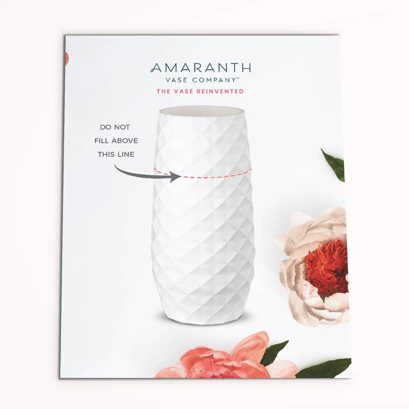
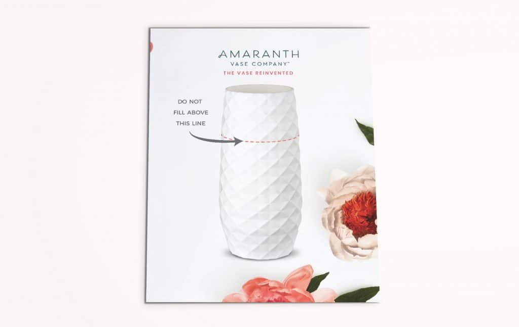
We also designed instructional postcards that aligned with the brand image and gave important tips for use. We added floral images for a romantic, fun touch.
the results
Crème de Mint’s designs set the stage for Amaranth Vase Company to grow and share the cutting-edge vase design with the world. The vase has gotten media attention, including a mention on Good Morning America’s Deals and Steals.