Bringing an Organic men's Skincare Vision to Life
When the founder of Zach Madison couldn’t find men’s grooming and skincare products for men with sensitive skin, he decided to launch his own line. He needed a logo and packaging design for the skincare line that reflected his mission.
As he searched for skincare products for himself, every product he tried caused razor burn and irritated his skin. He started looking into what the available products were made from and realized that men’s products were full of harsh chemicals and unnecessary ingredients.
Nobody seemed to be making quality, naturally-derived skincare products for men. The founder set out to change that. The result was Zach Madison—an organic skincare line created with men in mind.
The brand needed designs that reflected the founder’s modern vision and resonated with men in their 20s-40s who wanted better quality skincare products that wouldn’t cause razor burn and irritation.
- Logo design
- Package design
- Mood boards
- Print artwork mechanicals
Mood Board

Crème de Mint created mood boards that showed the target audience, imagery, and color palettes so that the founder could visualize the possibilities for his brand. The luxury, organic shave care line goal was to inspire comfort and confidence — a bump-free, red-free, ingrown hair-free smooth shave for every bad boy. Zach Madison wanted to create the ultimate shave experience for every man who cares about looking good.
Brand Identity and Logo
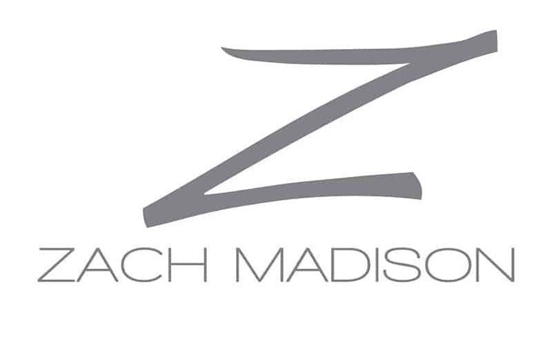
The brand was contemporary, modern, and stylish. Crème de Mint, our cutting-edge packaging design company, wanted the logo to match that same feeling. Our logo design is organic, minimal, and fashionable. We emphasized the “Z,” creating memorable dynamic imagery that stood out.
PACKAGING DESIGN
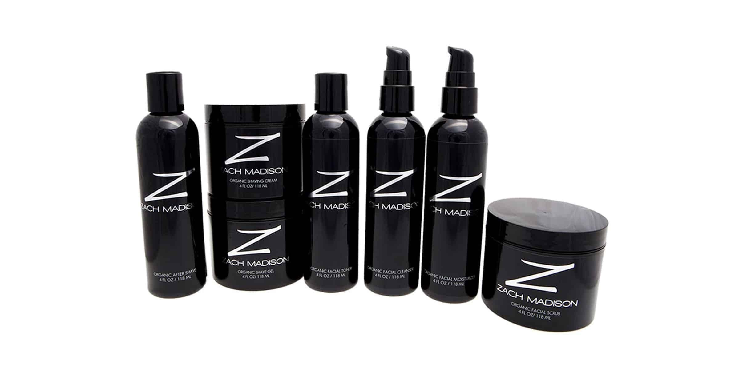

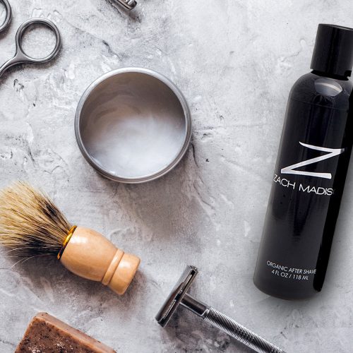
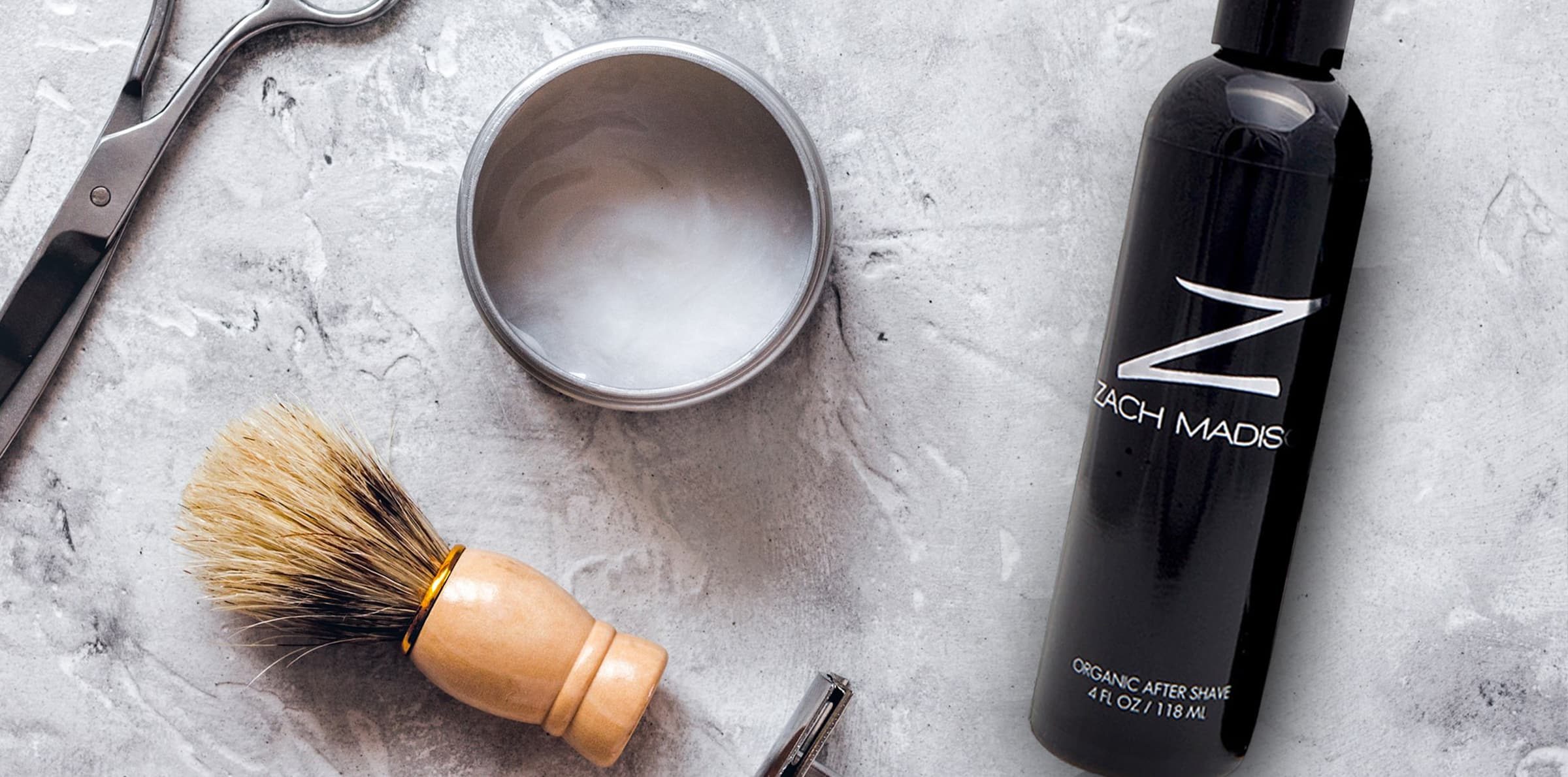
The silver “Z” pops on the sleek black bottles, instantly commanding attention. The packaging is minimalistic but high-class, reflecting the products’ organic simplicity and upscale essence. The clean, uncluttered design creates an upscale feel and keeps the focus on the logo..
The results
Above all, the package and logo design helped establish Zach Madison as an elite product line for men’s skincare, filling a niche for men that wasn’t being served. As a result of our work, the products looked elegant but masculine, simple but powerful.


