The Challenge: Logo & Business Card Designs for a Naturist Yoga Studio
Yoga in the Buff was a clothing-optional co-ed yoga class dedicated to providing a supportive environment for people of all genders, ages, and body types. The founder believed that doing yoga while naked was a path to self-expression, acceptance, personal development, and the release of ego. At the same time, she wanted to attract a wide range of clientele. She believed that everybody could benefit from her classes and she wanted all people to feel comfortable at her studio. She hired Crème de Mint, a collaborative branding agency, to design a logo, yoga business card designs, as well as other marketing materials to help build the foundation for her brand.
THE PROJECT: BRAND IDENTITY AND LOGO
Yoga in the Buff needed a logo that reflected the company’s values—freeing the body and spirit through the power of yoga and promotional flyers that appealed to a variety of people, piqued their interest, and encouraged them to attend a class.
Since the brand was founded on the idea of freedom and expression, we wanted the logo to feel unrestrained and empowering. We designed the icon, a sketched torso and legs in the traditional lotus pose—a symbol of well-being and enlightenment. We emphasized the breasts to tie into the uninhibited nature of the brand. The image has visible curves to highlight the belief that all bodies are beautiful. The legs entwine into the infinity symbol to represent limitlessness.
For the color palette, we selected a lively green and gray, evoking health, spiritualism, and release. The Vanitas Black typeface of “Yoga in the Buff” is bold but inviting—the looptail “g” is reminiscent of the curves of a body. For the tagline, we chose Univers 45 light, a fresh and clean font.
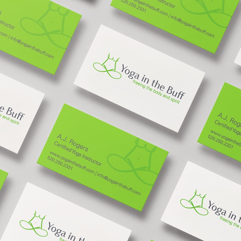
BUSINESS CARD DESIGN
Crème de Mint, our premium branding agency, designed business cards that aligned with the image of the brand and made a memorable impression. On the front, the green lines of the logo popped on a clean white background, while the monochromatic green back inspires a fresh, healthy feel.
PRINT DESIGN
The founder wanted to attract an audience of all ages. We designed two distinct flyers to appeal to different age ranges. The first was targeted toward a youthful demographic, featuring a young woman and capturing a traditional yoga essence.
The second was designed to appeal to an older demographic, encouraging them to attend retreats.
The beach imagery paints a picture of fresh air, restorative health, and an enjoyable experience for an older clientele.
magazine ads
We also designed flyers and magazine advertisements to promote individual retreats. These were engaging, offering a path to freedom, relaxation, and peace.
The results
Crème de Mint’s designs helped the brand establish themselves as a unique yoga solution and promote their classes and events. They were able to reach a range of customers, attracting men, women, old, young, and everything in between. As they grew, they offered retreats, getaways, and body image workshops to promote their mission and spread the positive energy of love and yoga.
To say Crème de Mint’s work is exemplary is an understatement. Lauren made putting a logo together easy and fun. She is an amazing artist who knows the business in and out. I will definitely come to Crème de Mint for all of my business needs!