A Logo With a Unique Body Twist
- Logo design
- Business cards
The Challenge:
Logo Design for
a New Yoga Studio
TLC Yoga was a Tucson-based studio committed to sharing the health and wellness benefits of yoga with the community. The owner came to Crème de Mint, a trusted branding agency, for a yoga studio logo design that would reflect her values, incorporate her personality into her brand, and set her studio apart from the competition. She wanted a distinct logo that would encompass her favorite yoga pose—the crow pose.
The project:
Brand Identity
and Logo
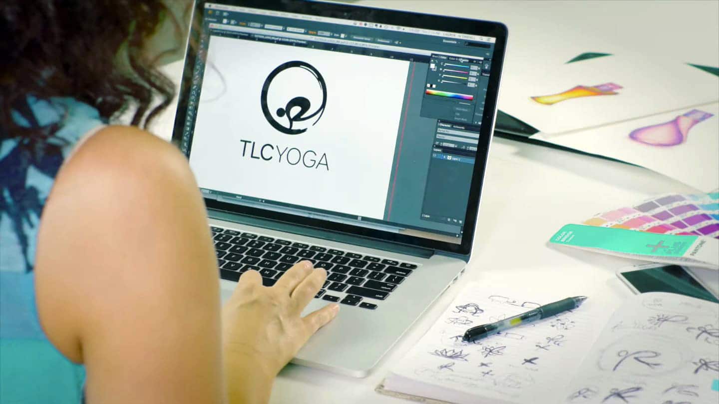
The crow pose is a symbol of tranquility. We wanted to utilize the crow pose in the yoga logo design and reflect tranquility, teaching, and the art of mindfulness.
We designed the pose within a zen circle. Zen circles (ensō in Japanese) are symbols of teaching, reality, and enlightenment. These unique shapes are balanced, continual, and yet often irregular, simple but with complex meanings. They evoke power, dynamism, and stillness. Together with the crow pose, the logo reflected the ultimate goal of yoga—grounding your mind and body while seeking wisdom and peace.
The red and orange color palette reflected warmth, energy, wellness, and spirituality. The yoga studio logo combined a modified version of Booster Next FY Medium in the word “TLC,” a bold font that invoked a sense of power, with Booster Next FY Light in the word “Yoga,” balancing the logo and representing the stability and equilibrium that yoga creates.

business
card design

The results
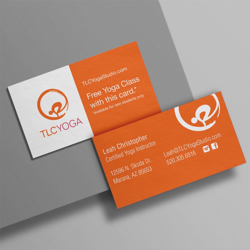
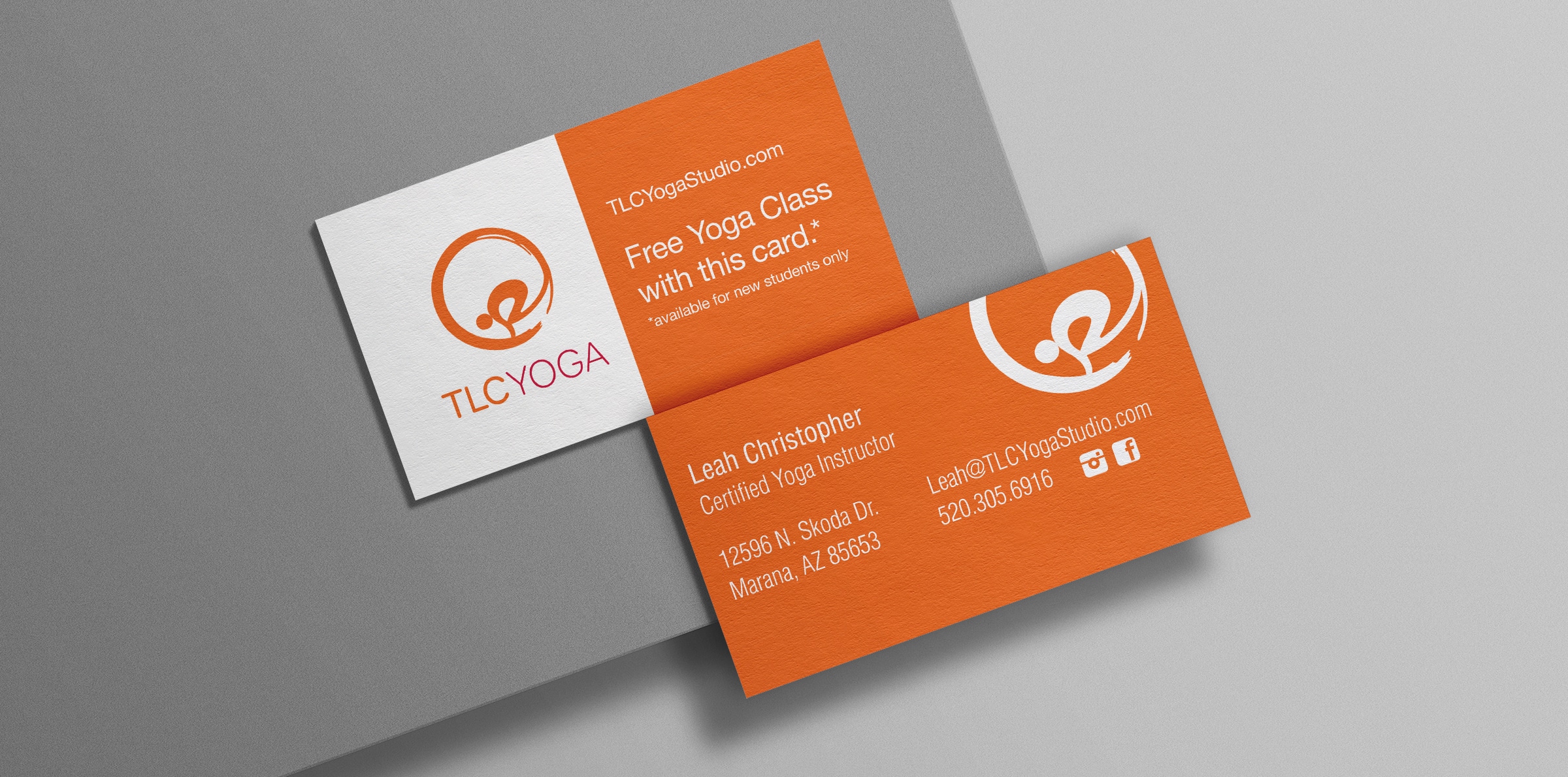
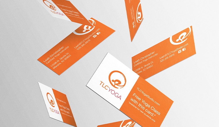
The strong, meaningful, iconic logo and the eye-catching, memorable business cards Crème de Mint designed created a cohesive brand image. As a result, their work allowed the owner to share her story and her business with potential yoga clientele.
Are you looking for a strategic branding agency to create your eye-catching brand image? Contact us today.
