Lana Isaacson
Warm & Welcoming Designs for a Family Therapist
PROJECT INFO
Creative Deliverables
- Logo design
- Tagline
- Brand presentation
- Social media design
- Website design & inspiration
- Business card design
- Bookmark design
- Poster design
- Print artwork mechanicals
The Challenge:
Logo Design for a
Mental Health Professional
Lana Isaacson is a therapist specializing in marriage and family counseling and addiction counseling. She uses research-based strategies and a holistic approach to help her clients come together, strengthen their relationships, and find peace and empowerment. As a mental health professional, she needed a logo design and website for her business, as well as print materials that highlighted her caring, loving, holistic approach. Crème de Mint, a trusted branding agency, offered their expertise in marketing and branding, creating a unified brand image for her business.
THE PROJECT
The original designs lacked cohesion and personality, failing to establish a brand around the business. We wanted to create a branded image that resonated with members of the community and positioned Lana as a trusted and compassionate authority who could help them reunite and recover.
Brand Identity
and Logo

BEFORE
AFTER
Her original branding was not cohesive and did not reflect her expertise or her passion for helping families come together.
The mental health logo design reflects Lana’s ability to guide others through painful struggles and addiction. The abstract icon symbolizes both a heart and a parent holding a child, evoking warmth, trust, comfort, and connection.
The typography of “Lana Isaacson” is Myanmar MN, a sans-serif font that feels open and welcoming. The tagline font is Myriad Pro, an orderly and cleans sans-serif that balances the logo.
We created a tagline that instills hope and a belief in a better future:
Reconnect | Rebuild | Rediscover
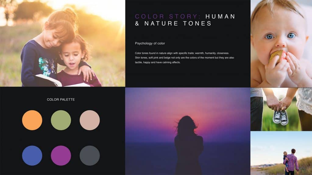
For the brand colors, we chose a palette of human and nature tones—purple, gray, blue, green, peach, and orange, representing warmth, humanity, and closeness.
business
card Design
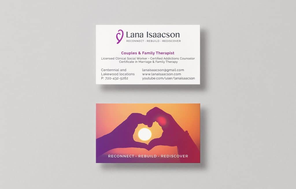

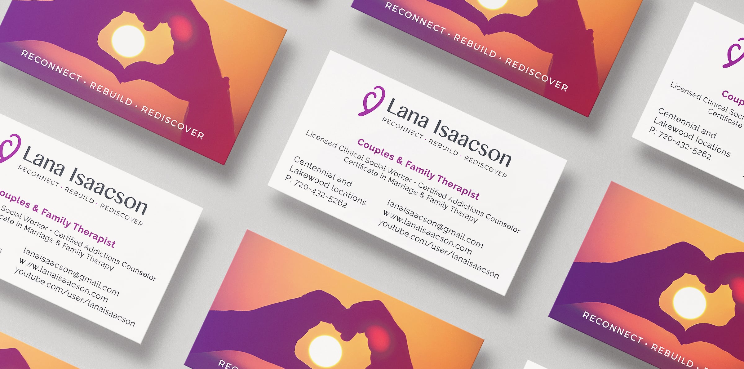
The business card design is inspired by love, hope, and family. The front is clean and minimal. The imagery on the back of two hands forming a heart represents family coming together. The sun symbolizes light at the end of the tunnel. The purple and orange colors of the sunset bring warmth and optimism, appealing to clients who are struggling through a dark time.
ADDITIONAL PRINT DESIGN
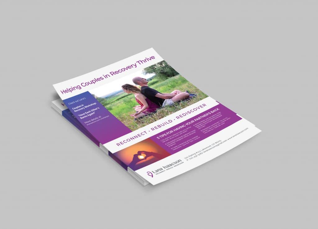
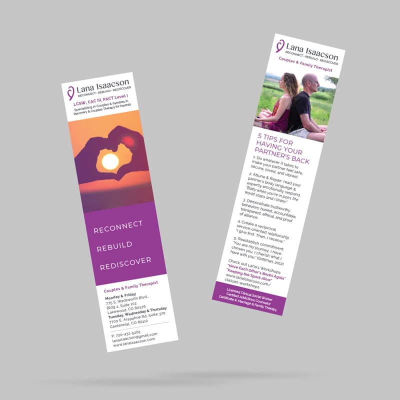
We also created posters and bookmark designs that aligned with the branding, designed to communicate hope and healing to struggling community members.
BRAND
PRESENTATION
We designed a brand presentation that compiled the visual aspects of the branding—the logo, the color story, the fonts, and the business cards. We also included mockups for other potential uses of the brand imagery, including a website concept and social media branding. The presentation ensured a cohesive brand strategy and provided Lana with a visual understanding of how her branding could be applied across other channels.
The Results
As a result, our designs created a unified brand image for Lana’s business and communicated her purpose. Most importantly, it highlighted her passion for reconnecting families who have lost their bond, rebuilding struggling and broken relationships, and rediscovering each other.
Are you looking for a creative branding agency to create your unified brand image? Contact us today.
