The Challenge: Logo and Packaging Design for a Fresh Food Delivery Company
Ibérico Club is a Florida-based company that provides authentic Spanish food directly to consumers across the United States. They decided to expand their offerings with the launch of Paella Valenciana: “made to order” by an award-winning Spanish Maestro Arrocero. The company then prepared the food traditionally in their Miami kitchen before shipping directly to the customer’s door. To help get the word out, they called upon Crème de Mint to design a new logo and packaging for their new fresh food delivery service. The packaging designs needed to capture an air of authenticity and tradition while aligning with the sophisticated Ibérico brand. They also needed to be economical and practical to print and produce.
THE PROJECT: Brand Identity and Logo
To begin with, we wanted the designs to be artisanal but simple, showcasing the company’s commitment to quality food. We also wanted a retro style that evoked tradition and trustworthiness. To that end, we helped the client explore the possibilities for Paella Valenciana’s branding and packaging with a presentation that showcased various design concepts, including colors, fonts, and imagery.
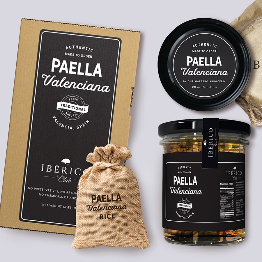
For the Paella Valenciana line, we developed a clean, bold, and retro logo built on a simple timeless color palette of black and white.
The logo design is reminiscent of a chalkboard you would see posted outside a restaurant in Spain. We also used Hanley Sans and Hanley Script typefaces, vintage-inspired fonts that created visual appeal and reinforced the chalkboard concept.
As part of the Ibérico Club brand, we also created the Tapas Academy logo. Tapas Academy teaches their students how to prepare tapas like a pro through video recipes, how-tos, and tips.
We wanted the logo to feel fun but polished.
The food images along with the tagline ‘join the party,’ evoke an entertaining feel, while the serif and script typeface combo adds an exciting visual.
Package Design
For home delivery food services, the food packaging design is important. Certainly, customers want to feel like they are part of an exclusive, classy experience as they open the ingredients and prepare to cook. We used mixed materials to cultivate a sophisticated, enticing, and high-end feel, indicative of the quality of the brand and ingredients.
The packaging is also designed to pop online, utilizing strong contrasting white on black and bold typefaces that emphasize a fresh, hand-crafted approach.
The results
As a result, Crème de Mint’s package design created a sense of authenticity and reflected the brand’s mission to bring quality Spanish food to people’s homes. The final designs are cultured, clean, and the perfect balance of traditional feel with a modern look.