GreenLeaf Pharma: A powerful design for an Australian Medical Cannabis Company
GreenLeaf Pharma is a telehealth company based in Sydney, Australia that issues prescriptions for medical cannabis as an alternative treatment for patients. The brand was dedicated to offering affordable holistic medicine to Australian citizens. The founders also planned to open a physical pharmacy in the future. In order to establish a tailored brand identity design for the medical cannabis company, they turned to the design team at Crème de Mint.
GreenLeaf Pharma needed branding specific to medical cannabis, starting with a logo design that captured the value of their services. Secondly, the logo needed to emphasize the health-driven nature of their business, while maintaining an inviting and approachable feel. Finally, it needed to appeal to a large age range and allow the brand to grow and expand.
MOOD BOARDS
Before embarking on the design journey, Crème de Mint created mood boards that highlighted the potential branding directions for GreenLeaf Pharma. These provided three concepts for the branding: inviting and relaxed, sophisticated modern, and cheerful and friendly. Each board then showed the branding elements that accompanied the concept, including imagery, color palette, and font. In addition, they identified the target audience for the brand.
The mood boards illustrated the brand options and consequently helped the founders understand and visualize the direction they wanted to take the brand.
Brand Presentation
Once the founders selected the sophisticated modern, and friendly brand approaches, we created a detailed brand presentation that delved deeper into the elements and direction for the brand. The presentation explained the visual language that would make up the brand essence and image. In addition, the medical cannabis branding elements featured a mature color palette, a classic design style, and modern shapes that appealed to the industry’s broad demographic.
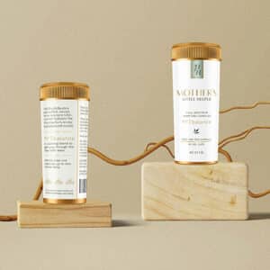
Brand Identity And Logo
We wanted to capture a retro apothecary feel for the logo. It needed to be sophisticated and modern but also warm and welcoming. The crest layout displays a modern feel using a bold geometric outline of a marijuana leaf. The icon provides an elevated edge to the traditional symbol, and further expresses the personality and friendliness of the brand.
The sans serif Raleway Bold font is strong and sophisticated, positioning the brand as a trusted authority. We incorporated the “+” into the letter “H” to represent the brand’s medical value.
The RESULTS
By using mood boards and brand presentation to lay the foundation, we were able to create a powerful logo design for the brand that appealed to the target audience, communicated the brand’s value, and allowed for growth and expansion.