The Challenge: Yoga Logo Design for a Playful Fitness Brand
Firefly Yoga is a passionate yoga studio that leads its students on a pathway of self-awareness and self-care. The studio offers yoga therapy (using yogatic principles to address emotional, physical, and mental well-being) as well as individual and group yoga classes. The founder wanted to appeal to customers who had a love of yoga and who needed spiritual practices to help uplift and guide them with positive energy and love. She needed help with her yoga fitness logo design, as well as flyers that captured the fun, playful, and grounding energy of the fitness brand.
THE PROJECT: BRAND IDENTITY AND LOGO
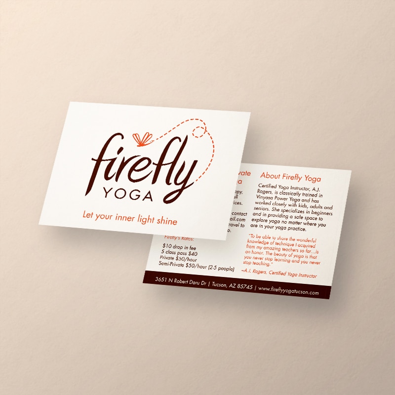
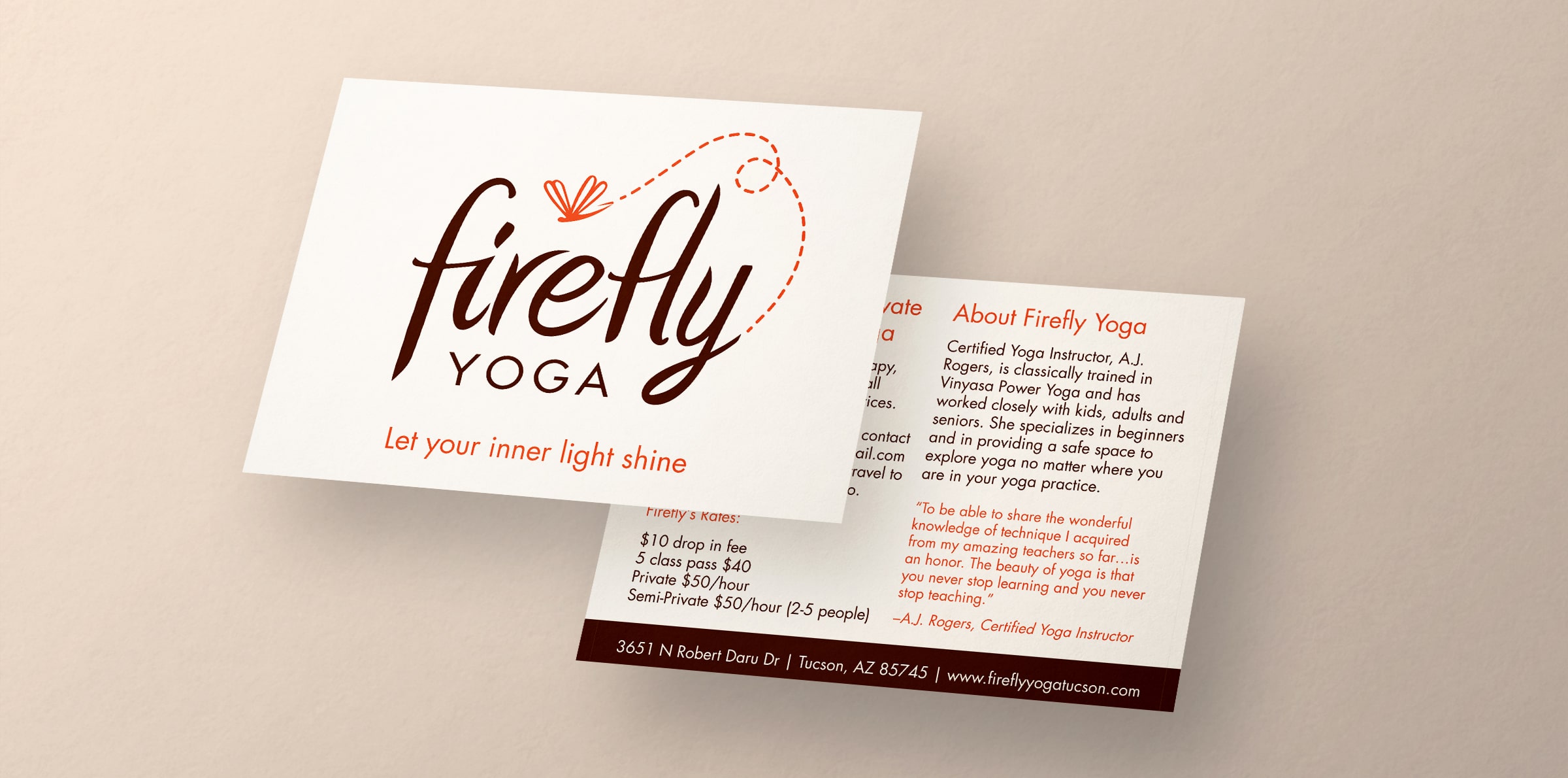
Crème de Mint, our creative branding agency, wanted to highlight the “firefly” in the logo. Fireflies represent illumination, guidance, and wisdom. We created the firefly icon with a dotted flight path to symbolize the freeing path that Firefly Yoga could take its customers on.
For the typeface, we selected Amienne for “firefly,” a whimsical script font that felt personal and lighthearted. We balanced it with Futura Regular for “yoga,” a clean, straightforward font. Together, they symbolized yoga practices—structured, but lively and spirited. We chose brown and sienna orange for the colors. They evoked campfire fun, which tied into the firefly imagery. They also represented warmth and human connection.
BUSINESS CArd DESIGN
The business card design tied into the free-spirited feel of the brand and created a cohesive, professional, polished look for the brand. The logo and the bold brown band capture the eye and encourage the viewer to look closer.
print design
We also designed promotional flyers to spread the word about exciting events at the studio, along with postcards for the brand to mail out to attract customers.
The flyers captured the air of fun and entertainment that the brand wanted to establish.
The results
Our designs laid the foundation for the brand to promote their image and gain the interest of the community. The logo, the business cards, and the marketing materials worked cohesively to show the brand’s essence and appeal to both seasoned yoga-lovers and newcomers who wanted to learn more.
To say Crème de Mint’s work is exemplary is an understatement. Lauren made putting a logo together easy and fun. She is an amazing artist who knows the business in and out. I will definitely come to Crème de Mint for all of my business needs!