Tropical Illustration Meets Design in This Conceptual Chocolate Bar Packaging Collaboration
Part of running a design agency is having an eye for talented artists. So when our founder, Lauren, saw the illustrations that Lyric Papers (an illustration and surface pattern design firm formed by Courtney McClain) had created, she envisioned a collaboration. With this intention, Lauren and Courtney began a cooperative effort to bring Lyric Paper’s unique illustrations into a packaging design concept for a fictitious chocolate bar company.
- Label design
CHOCOLATE BAR
PACKAGING DESIGN
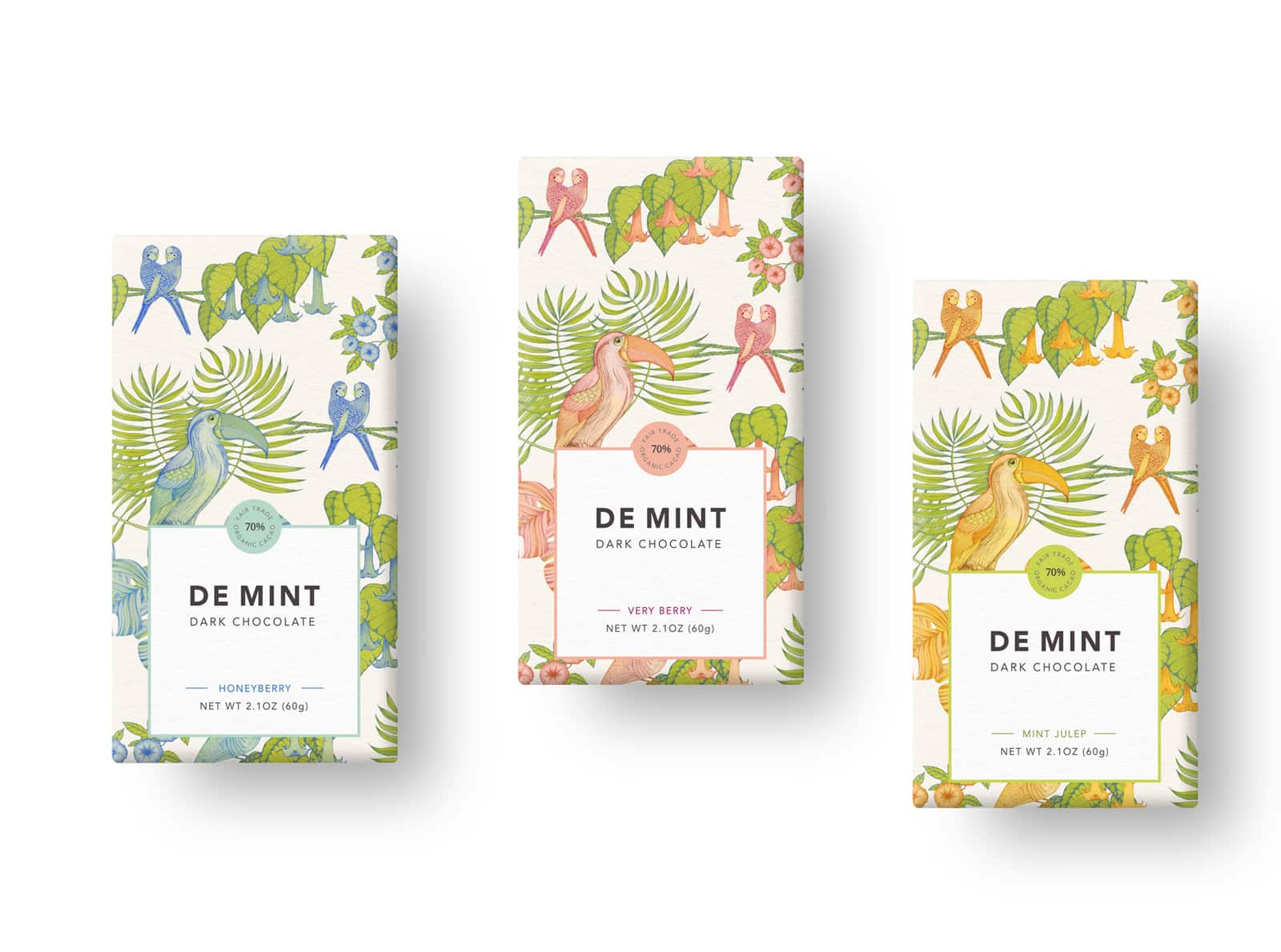
After brainstorming and considering several possibilities for their collaboration, Lauren and Courtney decided to create a conceptual packaging piece for a line of chocolate bars.
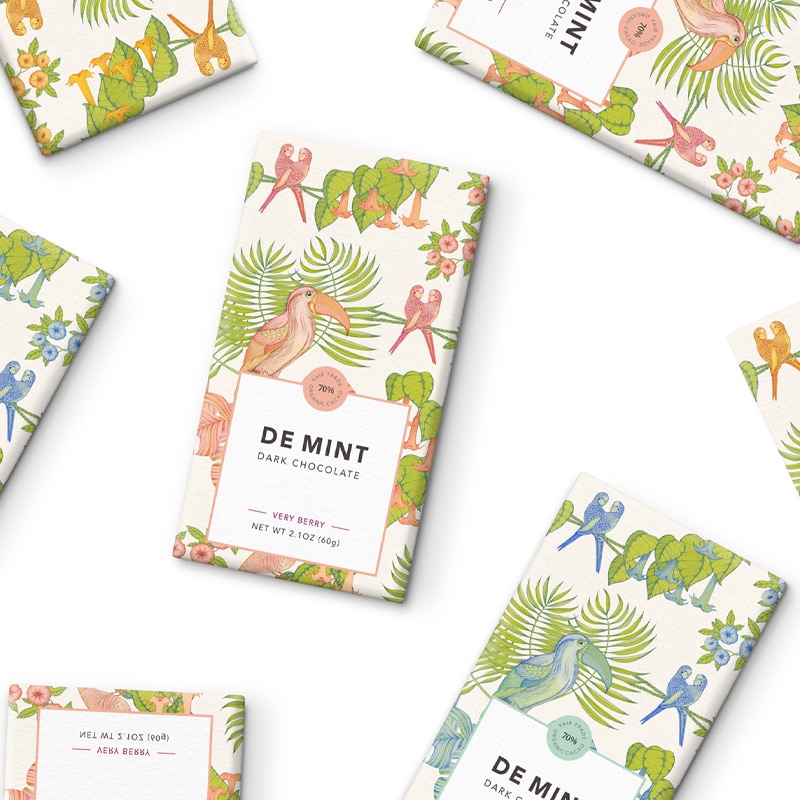
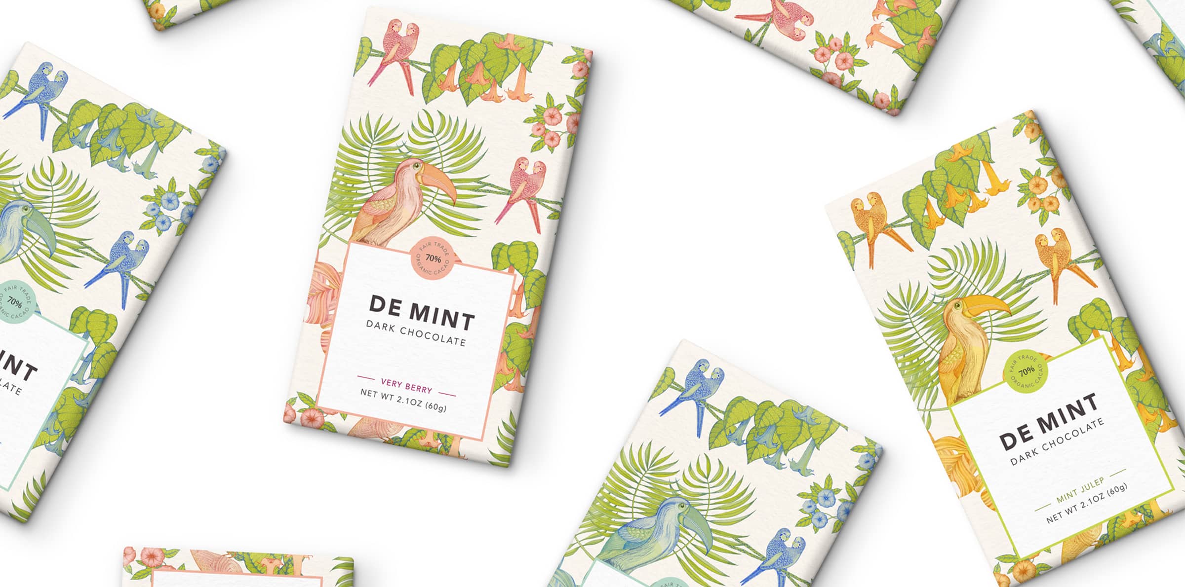
Using Courtney’s illustrations as a launching point, Lauren created a packaging design for a line of chocolates with unique flavors. These flavors, including Honeyberry and Mint Julep, are reminiscent of tropical vacation beverages.
The original artwork was inspired by vintage botanical illustrations. Courtney created a pattern with broad tropical plants, florals, and fauna that evoked fun, beachy, vacation vibes.
Each design features a colorful palette of muted blue, pink, or orange combined with pops of earthy green. The palette highlights the botanical essence of the illustrations. In order to draw attention to the brand name and flavors, Lauren created a contrasting label. The sleek sans serif font on a white background pops against the colorful illustrations.
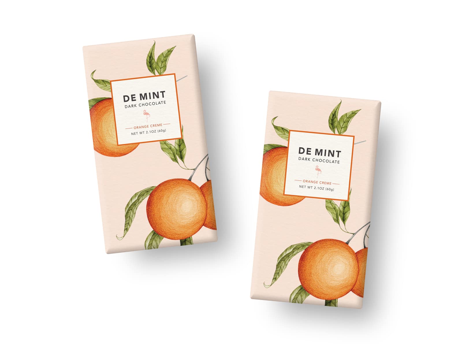
The duo also collaborated on another concept for the envisioned line—an orange creme chocolate.
This illustration was an ode to Courtney’s home state of Florida. The bright, luscious oranges capture the atmosphere of the Sunshine State. (This mutual Florida connection also tied into Crème de Mint’s roots.)
The conceptual package design for this chocolate flavor plays off of the tropical orange theme, featuring the fruit as the focus. An added flamingo logo above the flavor name carries on the Florida theme.
The conceptual chocolate bar packaging design plays off of the tropical orange theme, featuring the fruit as the focus. An added flamingo logo above the flavor name carries on the Florida theme.
The results
This particular design is conceptual, born from a collaboration of two creatives. However, if you are interested in similar design work, or even in these particular illustrations, Crème de Mint can incorporate these themes or designs into the packaging design for your company. Contact Crème de Mint to learn more.


