In addition to choosing a stunning design for your packaging, your package copy needs to sizzle. Over the years, I’ve picked up some key insights into what type of copy works best in the design of your packaging. Designers and copywriters make a dynamic duo…we sometimes end up working side by side and learn a lot about each other’s craft.
Most brands don’t use their package copy well
You’ve probably heard that most consumers make their purchase decision at the point of sale. The copy on your packaging has huge potential to either make or break that sale.
Think about it…is your most unique selling point showcased in a location people see right away? Is it easy to read…or so jumbled that people will just pass it in the aisle? Is your brand story there…or does it sound mass produced?
Your packaging is the mini billboard to your product! Don’t miss out on this opportunity to dazzle your customers…not only in the stores but every time they see it in their homes. Check out your competitors’ packaging and see what draws you and what doesn’t. Avoid doing what you don’t like as a consumer in your own product, and use what you do like as inspiration.
What copy works best on packaging
So how do you most effectively use this precious, limited space?
Here’s three quick tips:
Make it clear
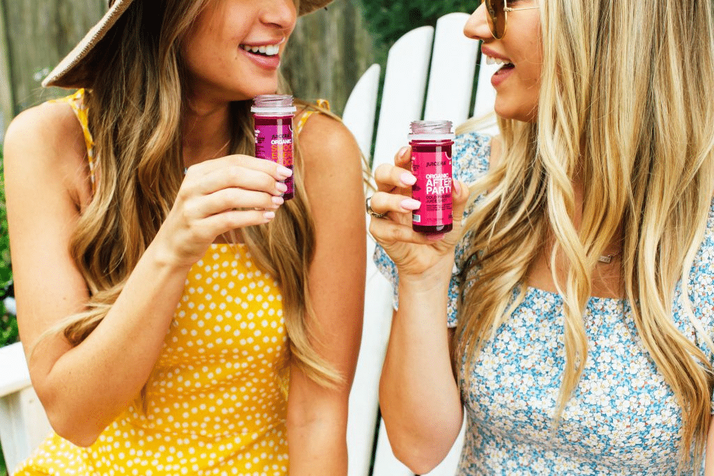
The most important aspect of short copy is clarity. You’ll want to make sure your front panel tells the customer exactly what the product is, and why they want to learn more. Use lists and bullets as often as you can, as opposed to paragraphs. They’ll then hopefully turn your product over to read the rest of your copy. For example on the side label of Juicera I created the copy “Made true for you” with a juice press to connect to the customer that this juice truly is made from fresh fruit and vegetables only…truly 100% juice as although you made it yourself. In addition there is a bullet-pointed list that reinforces this idea.
Get personal
Make sure that somewhere on your package, your brand’s personality is shown. Take, for example, Innocent Smoothies. Their playful personality shines through in their copy by telling customers to call their “banana phone.”
Is there a family story behind your product (a customer fave!)? Or a social cause you support? Make sure to include this! Consumers love to buy from brands with passion, not from someone just looking for a business opportunity. Your packaging needs to make this as clear as your website or fanpage does. Which leads me to…
Call to follow-up action
This is a key point that many brands miss. Be sure to include a call to action to your website, social media, blog…wherever you engage your customers most. You could even offer some sort of coupon in exchange for doing so. Use wording such as “See our full product line at…”, “More usage ideas at…,” “Exclusive discounts at…”, etc.
This section is also a great opportunity to cross-sell other products you may have. For example, if you have more colors or flavors of something, you can list them. Then the customer is reminded of your other options every time they use the product.

Consider getting creative
The above tips are surefire means of increasing your chance of sale. This one’s a little more controversial, but may be worth exploring…just proceed with caution.
Creativity for creativity’s sake is something that’s typically dismissed in the copywriting world. Call to action is always the main goal. However, depending on your product and audience, using creative writing within the packaging copy may help your brand stand out, or build a following.
A perfect example of this is Transport for London’s “Poems on the Underground.” In 1986, American writer Judith Chernaik approached Transport for London with a novel idea: put poetry on the spare advertising space of tube trains. It was a hit and introduced a lot of people to poetry.
This might be a great thing to experiment with if you’re passionate about supporting the arts, or have a creative writing talent yourself. Who’s to say jingles and slogans have to be cheesy? Maybe they can sell and be meaningful…bettering society as a great bonus.
Bringing it home
While the design and visual aesthetics of your packaging is going to draw a consumer’s eye first, your copy is equally as important in making a sale. Don’t be like most brands—engage your customer with clear, well-formatted copy that tells your story and invites a future following. And if you’re really brave, consider including a creative tidbit by your favorite author, or write/commission one yourself.
Here’s a checklist for your package copy:
- Clearly state your product, it’s unique selling points, and brand vision
- Use clean, easy for your customer’s eye to scan formatting, such as lists
- Include a call to a follow up relationship
And if you make food products, here are a few things to keep in mind:
- Include a recipe if there’s space
- Feature signature ingredients
- Cross-sell other flavors/products
How does your packaging copy stand up to your design? And would you ever use a creative piece on your packaging? Comment below…I’m curious what people think!
Crème de Mint has specialized in beauty, food and supplement packaging design for more than 15 years. Our CPG branding agency knows how to create compelling, craveworthy designs that can help your brand stand out! Book a call today to chat with us about your packaging design.


