The thought of rebranding your logo can be daunting—you likely put time, money, and passion into establishing your brand identity. But if famous logo rebranding examples have taught us anything, it’s that the right logo can make all the difference.
There are many reasons why a brand might choose to revamp their logo. Market research, change in brand values or business model, or even just a need to shake things up and bring fresh life to a business can lead to a rebrand.
A logo rebrand isn’t always the right decision, however, especially for well-known brands. So how do you know if the time is right for you?
To answer that question, let’s take a look at nine famous logo rebranding examples that made a big impact on well-known brands.
#1: Apple: Small Changes to a Successful Logo
The Rebrand
Anybody who used a computer before the late 90s is likely familiar with Apple’s first well-known logo—a rainbow silhouette of an apple with a bite taken out of the right side. Their original logo was complex and convoluted, and they pivoted to the rainbow within a year. This logo was strong—eye-catching, minimalistic, memorable, and recognizable.
However, while the iconic rainbow logo (one of the most recognized logos in the world) captivated users, changes in technology required an update. When computers shifted from thick gray plastic to sleek, metallic, and stylish, a logo rebrand was inevitable.
Apple kept the original shape and elevated it to a simple, monochromatic look in 1998. Since then, it’s undergone a few color changes, while maintaining the simple single-color look. The current version is silver or chrome.
The Takeaway
Apple could have dug in its heels and refused to update, especially with such a well-known logo. But they wanted a more sophisticated, elegant look. They kept what really made their logo recognizable—the simplistic shape—and modernized it.
There are a few lessons from Apple’s rebrand. The first is that simple is always stylish—the more complex a logo is, the harder it is for customers to resonate with it. The original Apple logo would likely not have fared as well.
The second takeaway is not to be afraid of a rebrand. If a practical reason arises to make a change, it’s time to revamp.
Finally, when you are undergoing a logo rebrand, it’s best to choose something iconic about your logo and preserve it. If you don’t, you run the risk of customers not recognizing your products.
#2: Starbucks: Combining Elements of Two Logos

The Rebrand
It’s hard to imagine anything other than the well-known Starbucks logo representing the coffee powerhouse. But the brand’s logo was once very different.
Starbucks was originally called Pequod (the ship in Moby Dick). The brand kept the nautical theme when they changed the name—using the mermaid with two tails (a rougher version than the current one) as the focal point of the logo. The circular logo was brown to represent coffee beans—their only offering at the time.
A man named Howard Schultz worked at Starbucks but wanted the brand to sell espresso instead of just beans. This conflict led to Schultz forming his own coffeeshop—Il Giornale. His logo was circular, green, with white stars.
If that sounds familiar, it’s because Schultz bought Starbucks in 1987. The brand then merged the two logo concepts into one—cleaning up the mermaid, and keeping the green with white stars color theme.
Since then, the logo has undergone minor changes but kept the same iconic look.
The Takeaway
Merging two ideas is a great way to revamp a logo—especially if your business is bringing on new people or combining with another brand. If that’s not the case, perhaps you can think about old logo ideas you had in mind for your brand.
Think about what elements work best from each version to create something new and powerful.
#3: Dunkin’ Donuts: Changing With the Times

The Rebrand
While the original Dunkin’ Donuts used a traditional 1950’s maltshop-inspired font (devoid of the pink and orange we associate with the brand today), they pivoted styles in 1960. The second iteration used the brand’s name in a circular image laid over a pink coffee mug.
That logo was difficult to read, with an unappealing angled font. In 1976, the brand shifted again—this time to the pink and orange we know and love. They later added a to-go coffee cup into the logo, using the logo from ‘76 as a base.
In 2019, however, the brand announced another major change. As the company shifted more toward a focus on specialty coffees, including cold brew and nitro, they decided to drop “donuts,” becoming simply “Dunkin.’”
The Takeaway
Like Apple, this rebrand is a great example of changing the logo to change with the times. When companies last for decades or more, it only makes sense to refresh and keep things new.
If your business undergoes a change in focus (such as from primarily selling donuts to focusing more on coffee), your original logo might not work. However, see if you can maintain those special recognizable elements, like Apple and Dunkin’ did.
#4: Pepsi: An Innovative Logo Preservation
The Rebrand
Pepsi has gone through many logo iterations over the years, beginning all the way back in 1898 when the company formed. Back then, the original logo lacked the red, white, and blue sphere of today.
Instead, it was a traditional old-timey font spelling out “Pepsi Cola.” The first big rebrand occurred in 1950, positioning the brand name on a red, white, and blue bottle cap. In 1973, the bottle cap was removed, leaving the round symbol we still associate with the brand to this day.
Since then, each logo iteration has maintained that image, ultimately dropping all other elements in favor of a minimalistic design.
The Takeaway
Sometimes preserving a popular logo element comes in an unexpected way. The designer who took the bottle cap and transformed it into a well-known icon understood this. Turning something concrete into something abstract reminiscent of the original can be a successful logo strategy.
#5: Coke: Logo Rebranding Examples With Small Changes

The Rebrand
Pepsi isn’t the only cola brand to successfully rebrand over the years. Coca-cola has also shifted brand identities several times.
The first major iteration came in 1950, when the logo went from black to the vibrant red the brand is known for now. Though the font was updated over time, it has always maintained a nostalgic font, a reminder of its longstanding history (except for a 1985 logo rebrand that was quickly changed).
Additional elements were added, including the glass bottle icon in 1993. However, today’s logo is a simple brand name in the classic vintage font.
The Takeaway
Sometimes your brand doesn’t need a full overhaul. Aside from the color, today’s logo is almost identical to the version from 1905.
This serves as a lesson that sometimes a slight refresh is all you need to breathe new life into your brand identity.
#6: Lego: A Long Journey to a Powerful Logo

The Rebrand
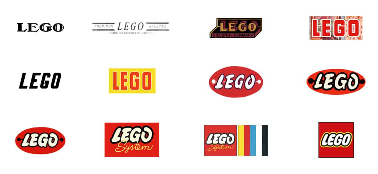
The original Lego logo is unrecognizable to the brand today. But the brand itself was very different, originally producing toy models. In 1950, two years after Lego started producing blocks, they shifted their logo to a more fun style, weaving in the red color.
Still, the brand continued to recreate the logo many more times, In 1954 they adopted a specialized font that gave way to the more modern iterations.
The brand added other elements before settling into the simple but eye-catching version from 1998 still used today.
The Takeaway
Don’t be afraid to iterate. If your logo isn’t working, if it isn’t connecting to the identity you want for your brand, keep changing and tweaking. Eventually, you will hit a logo that powerfully connects to your audience.
#7: Gap: One of the Worst Logo Rebranding Examples of All Time

The Rebrand
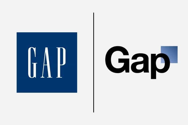
From 1990 to 2010, Gap maintained its iconic logo—a simple white serif font that popped in front of a navy background. However, in October of 2010, the brand unveiled a logo rebrand.
The new logo was completely unrecognizable—a bolg sans serif black typeface with a blue gradient square in the corner.
Unfortunately for Gap, customers did not appreciate the attempt to modernize the logo. The fallout was so great that the brand reverted to the original logo within six days of the change. The logo has remained the same since. It is now considered one of the worst logo rebrand attempts of all time.
The Takeaway
What went wrong with Gap’s “contemporary” logo? The change was too much, too fast. Customers don’t want to lose everything they know about a brand’s identity overnight—it’s too jarring, and creates a disconnect.
Established brands must find a way to bridge the gap (no pun intended) between an original logo and a rebrand if they want customers to make the journey with them.
#8: Levi’s: Modern Meets Vintage

The Rebrand
One of the most longstanding and well-known denim brands, Levi’s has rebranded many times. The original logos were fitting for the time—following 1800s logos trends. As the brand moved into the modern world, they maintained vintage elements through muted colors and nostalgic fonts.
In 1968, the brand released a major logo rebrand with a twist—the shape of the new logo was a throwback to the ribbon shape of the 1892 logo.
The Takeaway
Levi’s brand identity evolution is a great example of a brand going with the flow, changing the logo to have a modern appeal while preserving the vintage style that customers love. The current logo is a pleasing blend of contemporary and old-timey.
#9: Doritos: Contemporary With Classic Fun

The Rebrand
Known for being a party chip, Doritos has always worked to present a fun logo that stands out from other brands. The brand has always favored vibrant warm hues and color contrast.
In 1992, Doritos pivoted from its older look, adopting a triangle shape reminiscent of the product itself. However, they kept a splash of red color to preserve the eye-catching appeal.
In 2013, the brand modernized the logo, sharpening the edges of the triangle and shifting to a contemporary font. The dash of color gradient pops on a black background.
The Takeaway
Stick with what works and ditch the rest. Doritos has always appealed to a youthful audience with warm friendly colors. Their modern iterations never move away from that style. The refreshes they have created captured the fun feel while presenting a more sleek look.
The Bottom Line From These Logo Rebranding Examples
When looking to rebrand your logo, it’s important to reflect on the why behind the change.
Are you trying to resonate with a different audience? Is your brand changing its offering? Or is your current branding and marketing strategy not producing results?
The answer to those questions will guide you through your rebrand.
As you can see from these famous logo rebranding examples, your logo can make or break your connection with your customers. Make sure your redesign takes your audience into consideration.
Looking for a designer to rebrand your logo? Check out our post on what you need to know before you hire one!
Crème de Mint has specialized in beauty, food and supplement packaging design for more than 15 years. Our CPG branding agency knows how to create compelling, craveworthy designs that can help your brand stand out! Book a call today to chat with us about your packaging design.


