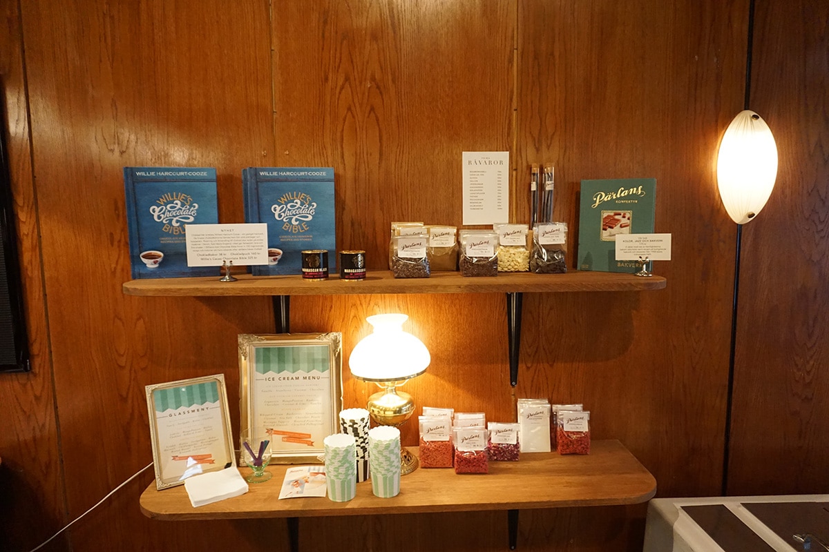
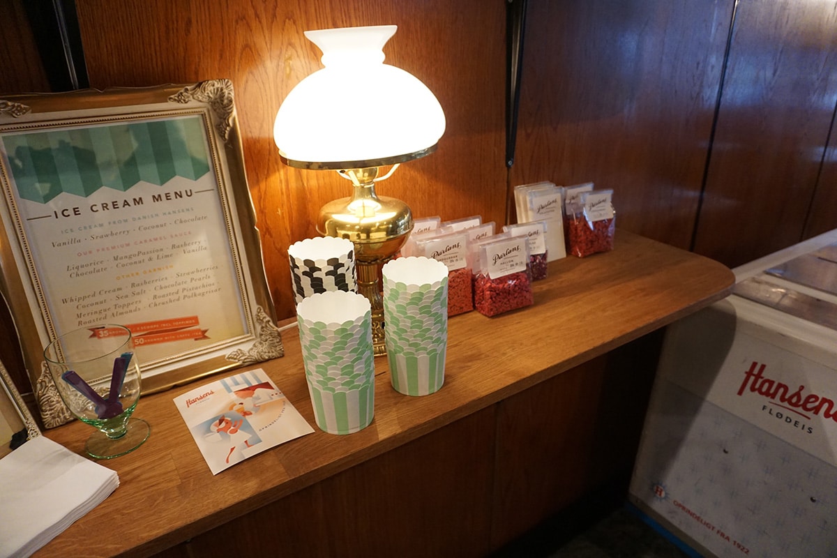
When I was visiting Stockholm this summer, I wandered into a delightful little candy shop called Parlins Konfektyr. From the moment I walked in I felt I was taken back in time to a little shop like the grocery store my grandfather had when I was growing up.
The design of Parlins Konfektyr is impeccable–sophisticated, cozy and everything designed and put in its place. All the products are neatly stacked and spaced evenly apart. The wooden walls mixed with the muted green ceiling and the yellow glow of the lamps give me a warm cozy vintage feeling. I stop and admire the vintage logo and the hand-lettering of the round signage is beautiful and I am reminded me that I am in a place far from home. Yet there is also an unmistakable familiar feeling.
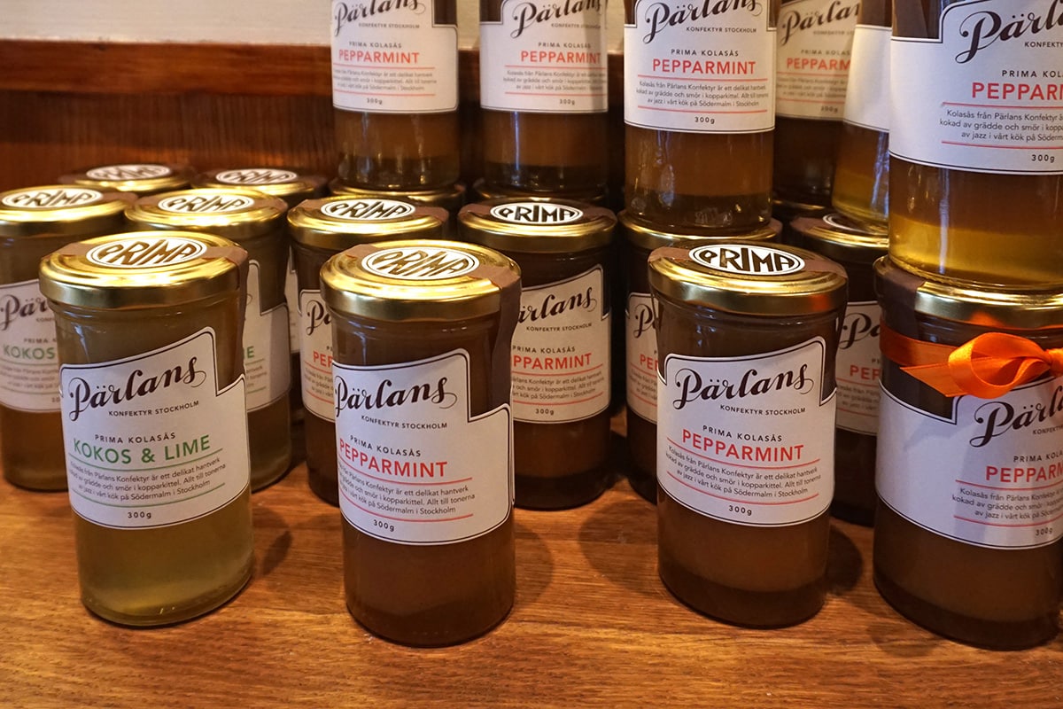
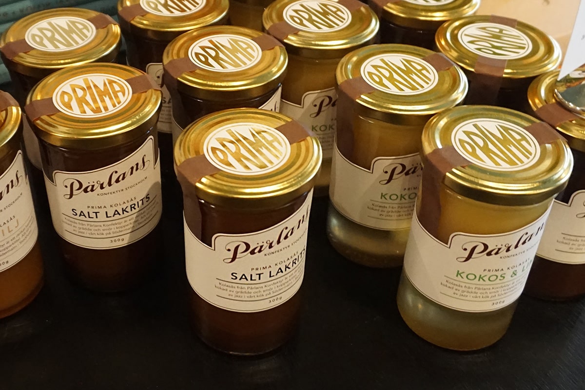
I notice a few English words pop out at me. Everything looks delicious and ready to be picked up and eaten. The packaging follows this vintage and earthy feel, with craft paper and twisted candies begging you to pick them up. A flavor pops out at me and again I notice the ever popular licorice flavor of Northern Europe. This flavor would never be a hit in the US.
To the left of the shop through the window I see a kitchen. Here is where the magic happens, where all the candy in the store is made for all to see. No one is there now, but I can only imagine when it is in full swing.
I love this little store. I am so happy to have stumbled across this little gem.


Are you looking for an award-winning food packaging design agency to help you with your new product line? We’d love to help you! Contact us today.
For more resources, check out our food packaging design guide.


