


Celebrating Excellence: HOW International Package Design Award
We are thrilled to share the exciting news of our recent achievement: winning the prestigious HOW International Package Design Award for our outstanding work on the Tio Gazpacho brand. This esteemed recognition is a testament to our commitment to excellence and innovation in branding. As an award-winning branding agency, we take pride in delivering exceptional results for our clients.
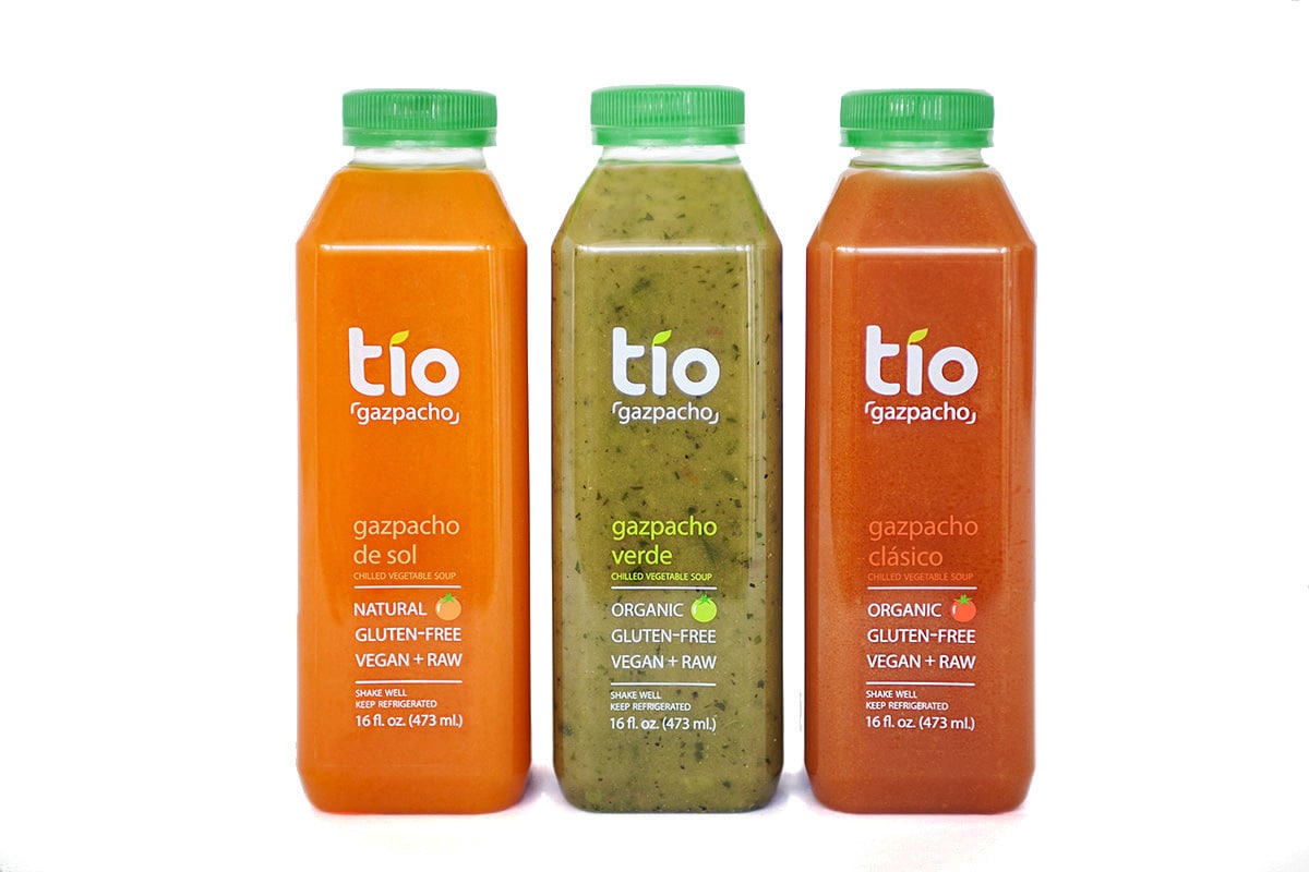
Revolutionizing Tradition: Tio Gazpacho Brand
Tio Gazpacho, a groundbreaking product in the market, revolutionizes the concept of traditional Spanish gazpacho by offering it in convenient juice bottles, allowing customers to “drink their veggies” on-the-go.
Innovative Design: Symbolism and Versatility
Our award-winning design features a bold and modern logo, with the dot in the “i” cleverly modified to resemble a leaf, symbolizing the fresh organic vegetables within the soup while also paying homage to the Spanish language. The clean and minimalist label design highlights the premium quality of the ingredients.
Honored Recognition: Among Industry Leaders
We are honored to be among the distinguished agencies worldwide recognized for our creativity and expertise in branding.
Ready to take your brand to the next level? Our award-winning packaging agency is here to lend a helping hand and make your vision a reality.
Are you looking for an award-winning food packaging design agency to help you with your new product line? We’d love to help you! Contact us today.
For more resources, check out our food packaging design guide.