


We are proud to share we have been awarded two American Package Design Awards from GD USA for package design for Simply Sharon’s and Expressed Juice. It is a tremendous honor to be selected and awarded for our dedication to excellence, and we are overflowing with joy at this achievement!
Award-Winning Brand & Package Design for Simply Sharon’s
For Simply Sharon’s, a gluten-free, dairy-free, and vegan dessert company, our award-winning food packaging design agency crafted a brand identity deeply rooted in the owner’s personal story. The company name is dedicated to the owner’s late mother, Sharon. Both the owner and her mother have a condition that is helped by staying out of the sun and by eating gluten-free, dairy-free and vegan. Inspired by her mother, we wanted to include that story within the logo. The parasol symbol as the apostrophe in the logo not only creates a dessert-like feeling, but also includes their story. The packaging is as green and eco-friendly as it is healthy–using a biodegradable, compostable plastic pouch and recycled paper and vegetable inks for the tag. In turn bringing together the brand characteristics that match the core beliefs of the company.
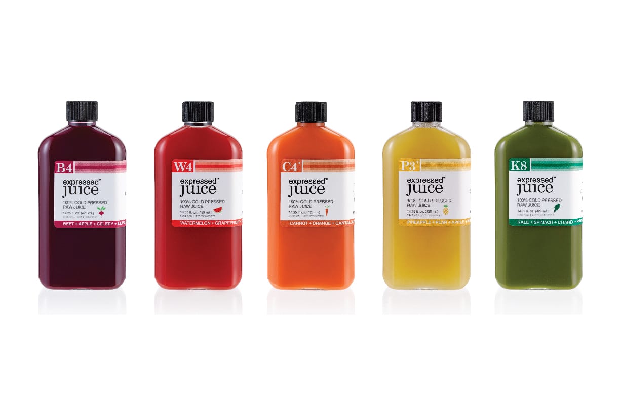
Award-Winning Brand & Package Design for Expressed Juice
For Expressed Juice, a Miami-based cold-pressed juice company renowned for its innovative approach, our award-winning packaging design agency embraced creativity and uniqueness.
The sleek, flask-shaped bottle, designed to fit seamlessly into pockets, sets it apart from conventional juice containers, exuding a modern and edgy vibe akin to alcohol flasks. Our branding system, characterized by vibrant racing stripes and distinctive icons representing bottles, carts, fruits, and veggies, not only captures attention but also fuels inquiries and partnerships, showcasing the power of distinctive design.
As an award-winning branding agency, we are dedicated to bringing your brand to life with creativity, passion, and purpose.
Let’s collaborate today to elevate your brand presence and make your vision a reality.
Are you looking for an award-winning food packaging design agency to help you with your new product line? We’d love to help you! Contact us today.
For more resources, check out our food packaging design guide.