Designs that Laid the Foundation for a Longstanding Brand
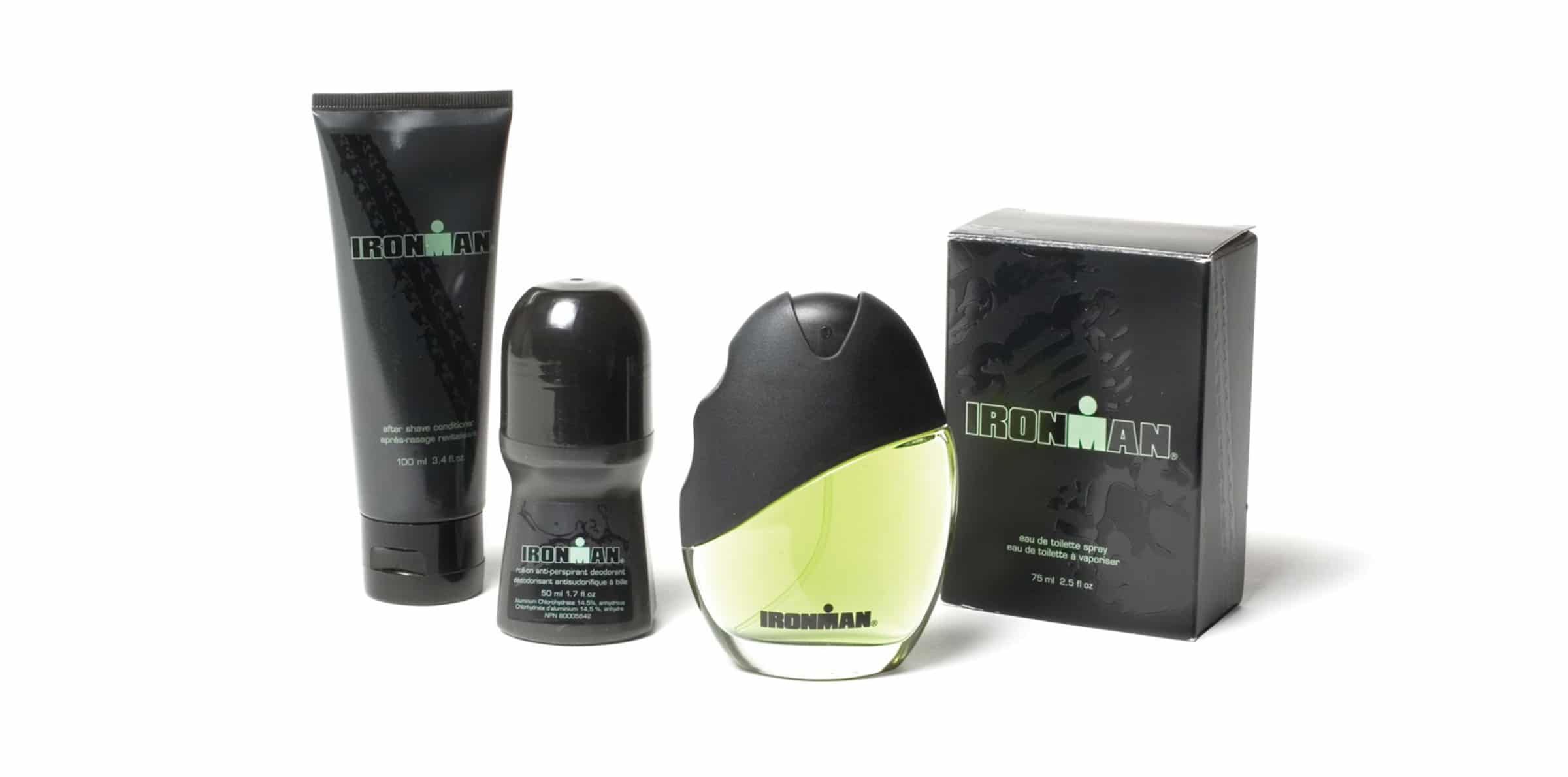
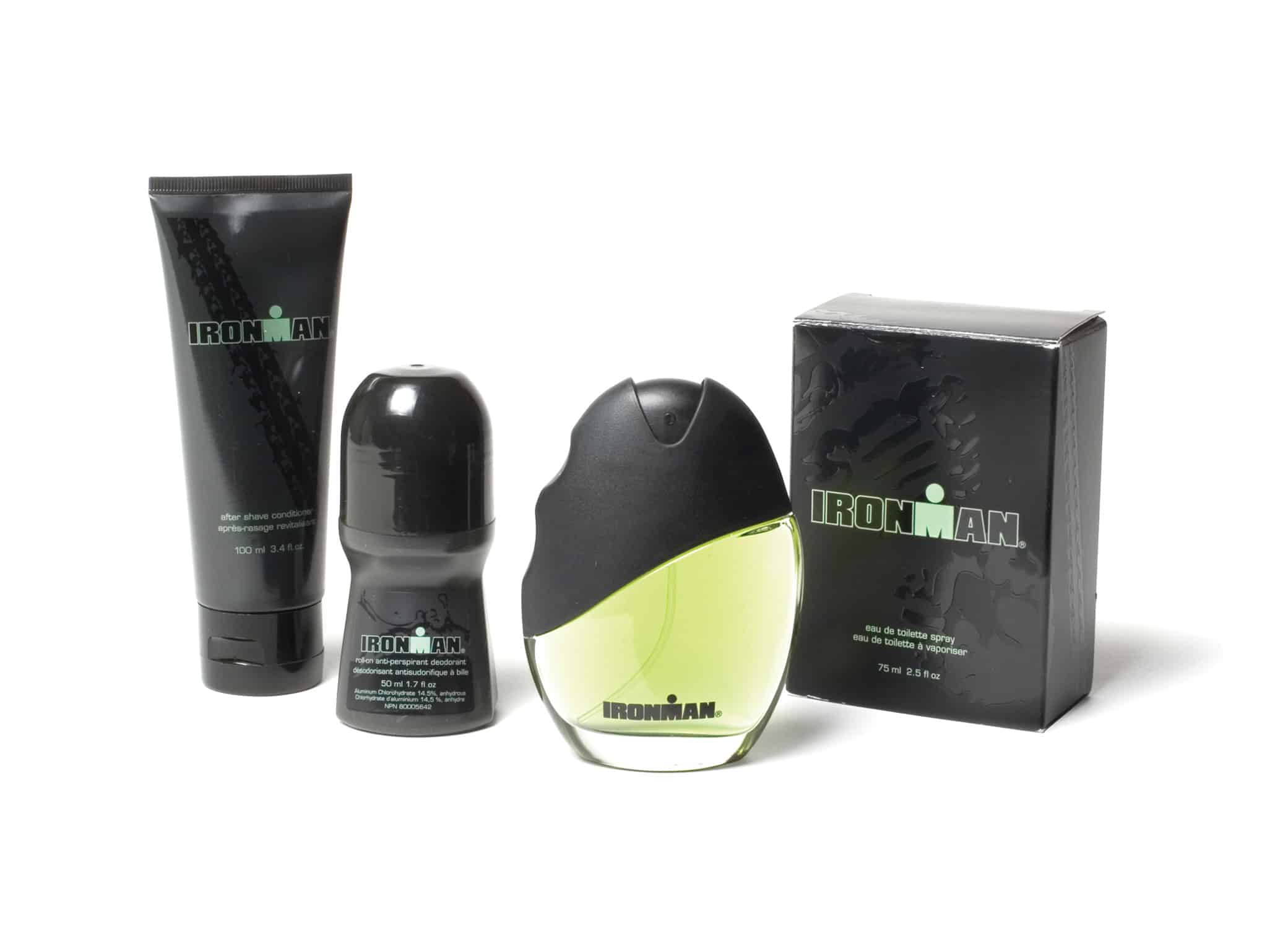
Avon launched a new fragrance line in 2008—Ironman. The line drew inspiration from the Ironman Triathlon, a long-distance race including swimming, cycling, and a marathon run. As a matter of fact, the Ironman is one of the most strenuous one-day sporting events in the world. Ironman by Avon is a woody, spicy fragrance for men. The line was created to reflect the intensity, strength, and endurance of the triathlon—a scent for the sporty, athletic man. I managed the cologne packaging design and product design for the men’s cologne, determined to capture those elements.
The Project: Men’s Cologne Packaging Design for Ironman
In the first place, I wanted to use running, swimming, and bike visuals as symbols of athleticism that would pique curiosity and share what the brand was about.
For example, the black and bold green color palette represents strength and stamina. Sleek yet sporty designs tell a story of a man who can tackle a challenge and command attention.
The grip on the side of the bottle also adds a unique textured element and creates a sense of power as you hold it.
The results
The cologne packaging design and bottle design laid the foundation for a successful launch. Matt Miller, Ironman competitor, became the face of the brand. As a result, the Ironman brand became a well-established Avon line, with a release of two more scents in 2011 and 2012, continuing with the same theme of the cologne packaging design and bottle design from the original fragrance.