Whisking a Strong Brand Story Into a Bakery’s Designs
Wara Quinoa is a gluten-free bakery that uses Bolivian royal quinoa as the base of their desserts. The brand needed a logo and food packaging design, along with an aesthetic website design that appealed to the target audience and communicated the brand’s belief that healthy, delicious desserts begin with quinoa.
The founder discovered the power of quinoa when her husband became ill. His doctors advised him to change his diet. The founder decided to return to her Bolivian roots, serving him royal quinoa, just as her mother had done when she was a child. His health improved immensely, and she realized that quinoa was a healthy, wholesome ingredient that could benefit others.
Determined to overcome the idea that “healthy” had to mean bland, she began baking with quinoa, creating delicious cookies and muffins. She eventually decided to turn her hobby into a business, targeting health-conscious individuals and those who couldn’t eat gluten due to allergies or dietary restrictions.
We wanted to highlight the cultural roots of the brand. The logo design is inspired by Bolivia’s coat of arms and encompasses several Bolivian elements that connect to the brand story. Royal Quinoa is a trademarked name that refers exclusively to quinoa grown around the Salar de Uyuni (the world’s largest salt flat) on the high plains of southern Bolivia.
Indigenous Andean farmers began to cultivate quinoa 4,000 years ago. They relied on nature to create the powerful grain, bringing only llama dung, fortitude, and faith to the process. Today, the quinoa farmers of the Salar follow the traditions left behind, producing 100 percent organic, sustainable quinoa. We wanted to bring this authenticity to the Wara Quinoa brand story and logo design.
The valley and llama icons pay homage to this story. The word “wara” is Bolivian for star—we added the five stars to further connect to the brand’s roots. The bright flowered quinoa plants tie the logo together and provide a pop of color to draw the eye.
The bold handwritten font provides an ancient and earthy feel. The pink dot above the eye ties back into the plants themselves.
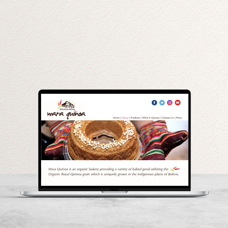
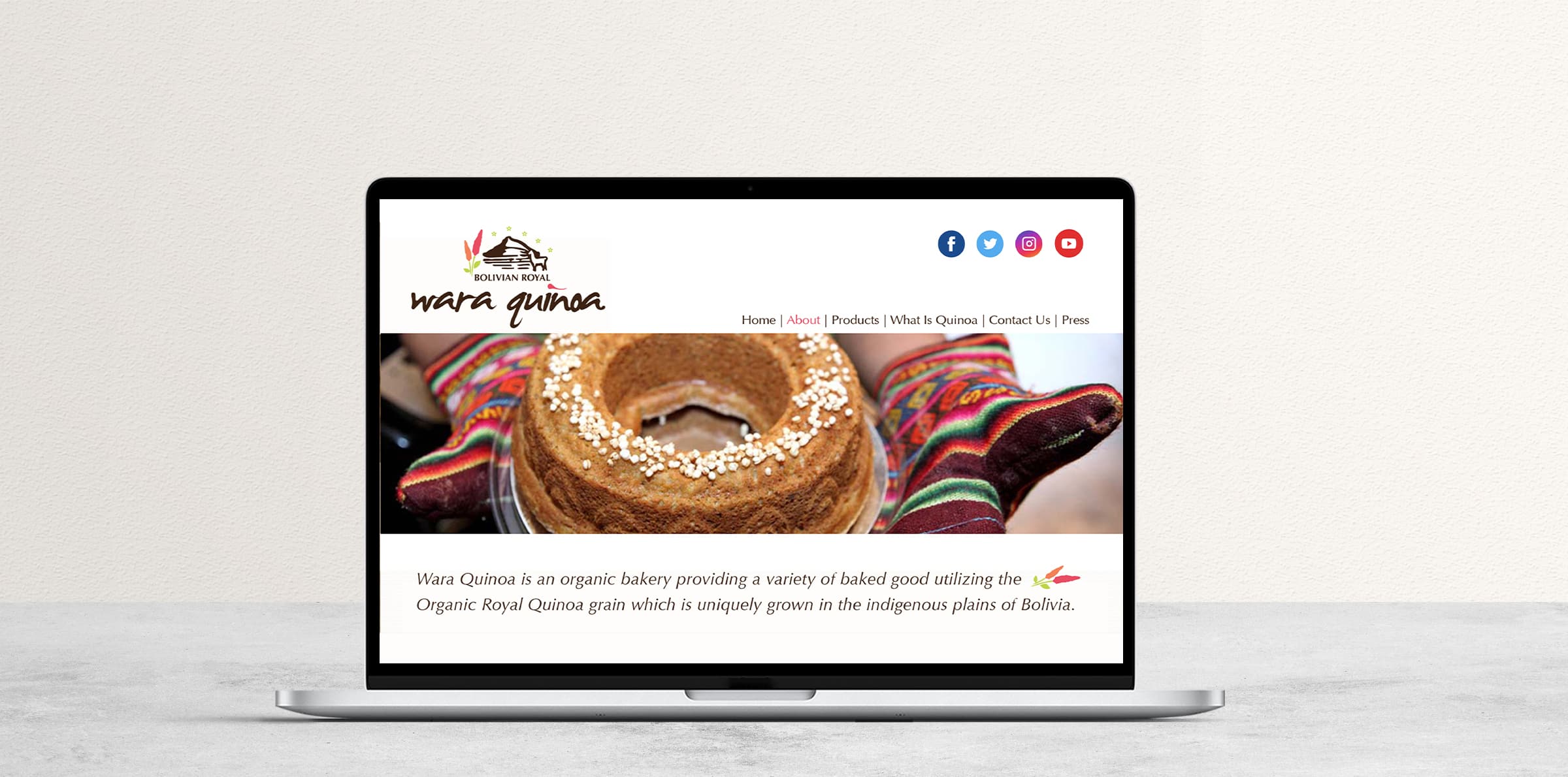
AESTHETIC WEBSITE DESIGN
The aesthetic website design highlights the unique origin of the brand and the natural, healthy process that goes into the creation of both the quinoa and the desserts themselves. The images of vibrant quinoa plants and organic quinoa grain assure the consumer that these products are based on real, wholesome food. The hero image features one of the brand’s delicious quinoa bundt cakes, while the vivid colors of the oven mitts evoke comfort, energy, and culture.
The results
Our aesthetic website design and branding set the stage for the small bakery to grow and expand. They gained a loyal online client base—with more than 10,000 social media followers and were featured on Bolivian television programs.